/ curatorship / art direction /
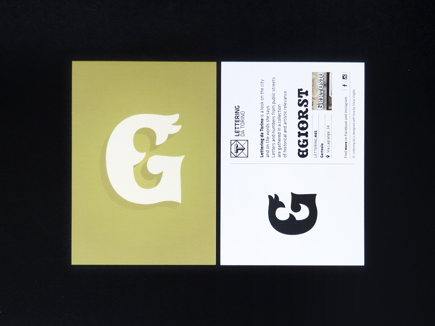
Lettering da is a look into the city and the words she says. Signs, inscriptions and street plaques guide us silently along the streets, but with a wealth of unexpected shapes and colors, which needs time to be appreciated. The project collects letters and numbers from public streets, in a photo album with historical and artistic relevance. But the project does not stop there, offering a formal and structural review of some letterings, redesigned and compared to similar typefaces.
The project is adaptable to any city: the logo provides a variable typographic element, to be identified with the treated city’s initial. The first development was Lettering da Torino, born in 2012 and still active on Facebook and Instagram. The aim is to lay the ground so to design complete alphabets derived from urban letterings.