biffi

Michele Pellegrino - Una parabola fotografica

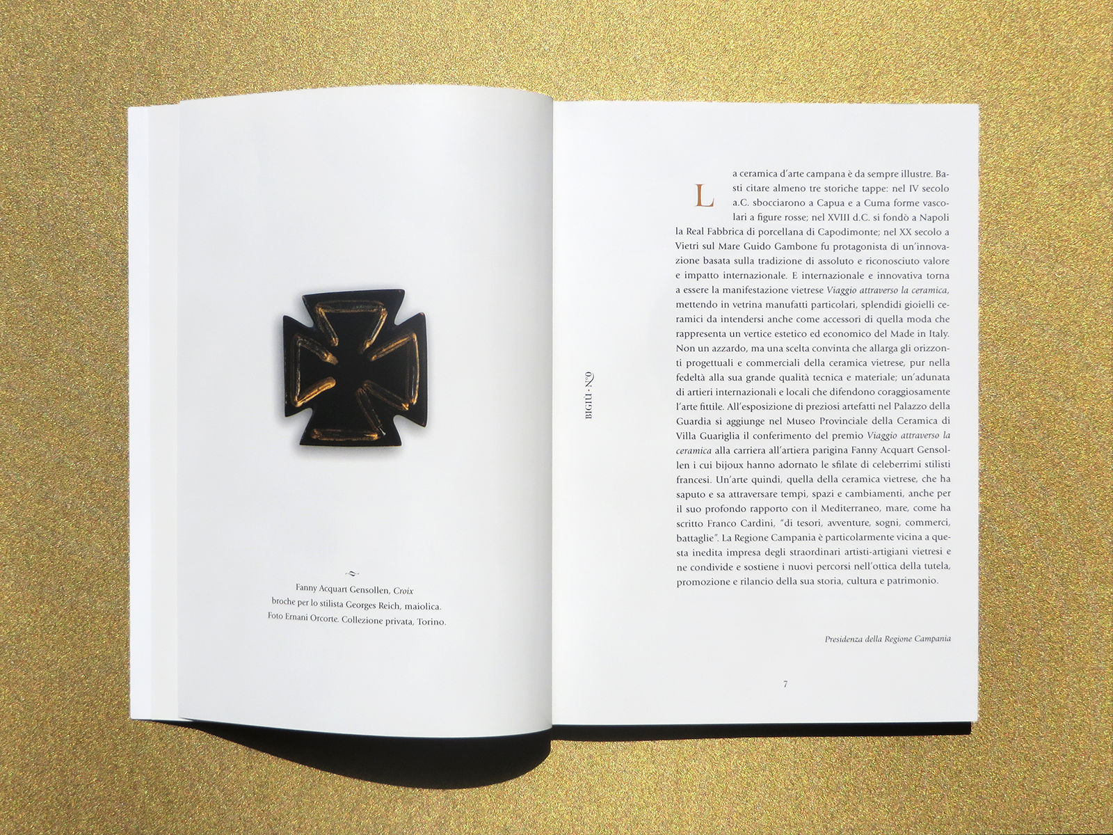
/ exhibition design /

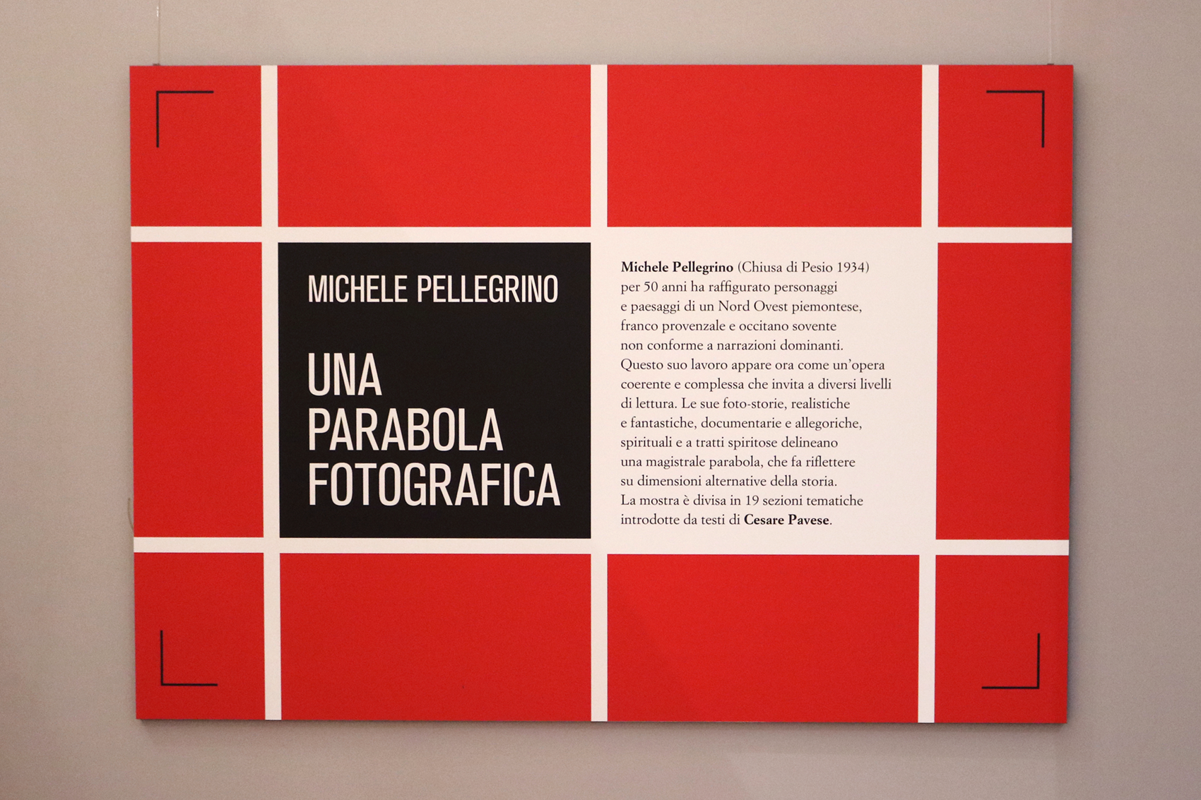
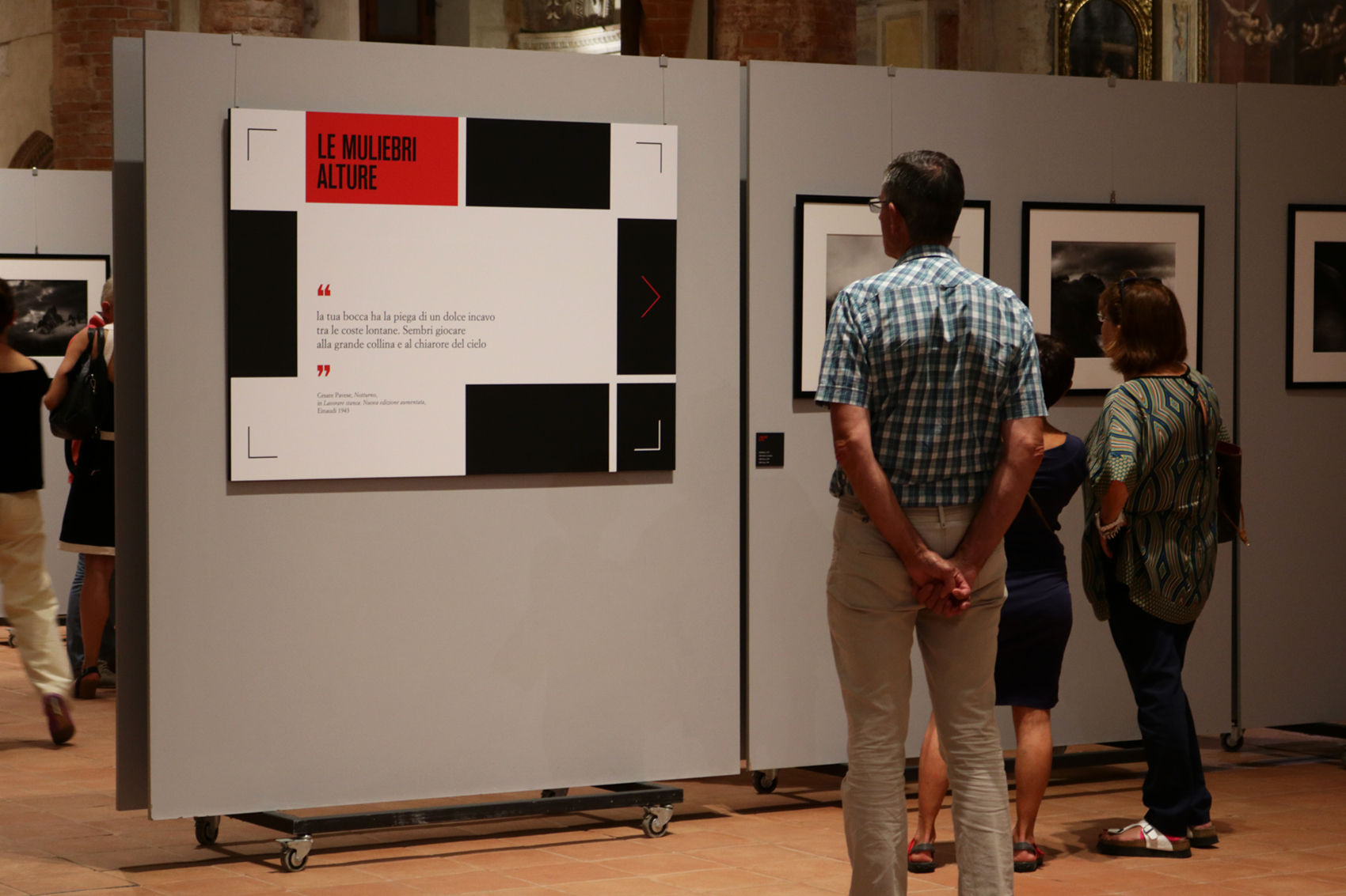
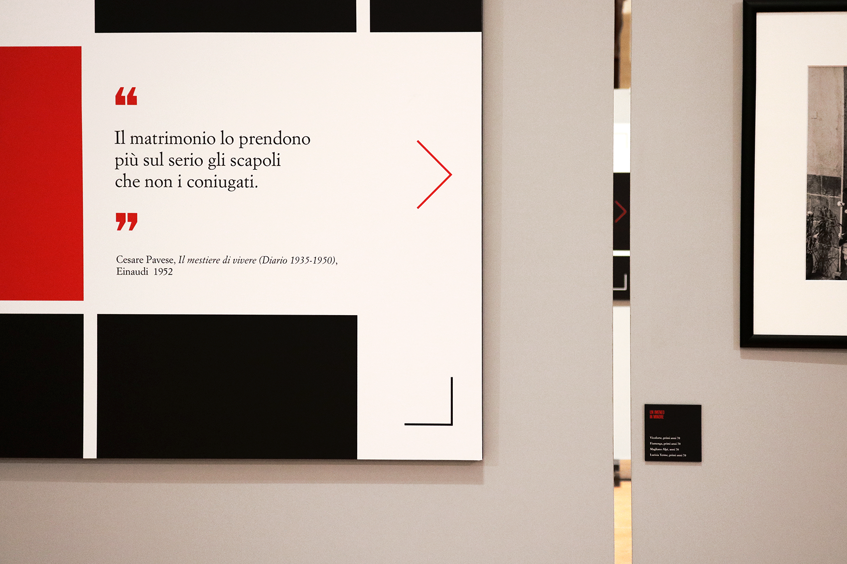
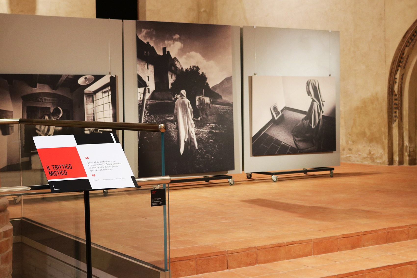
The photographic exhibition is about Michele Pellegrino's work and has the particularity of being introduced by Cesare Pavese quotes. These texts are focused on a symbolic vision of human existence, common theme in Pellegrino's work. 
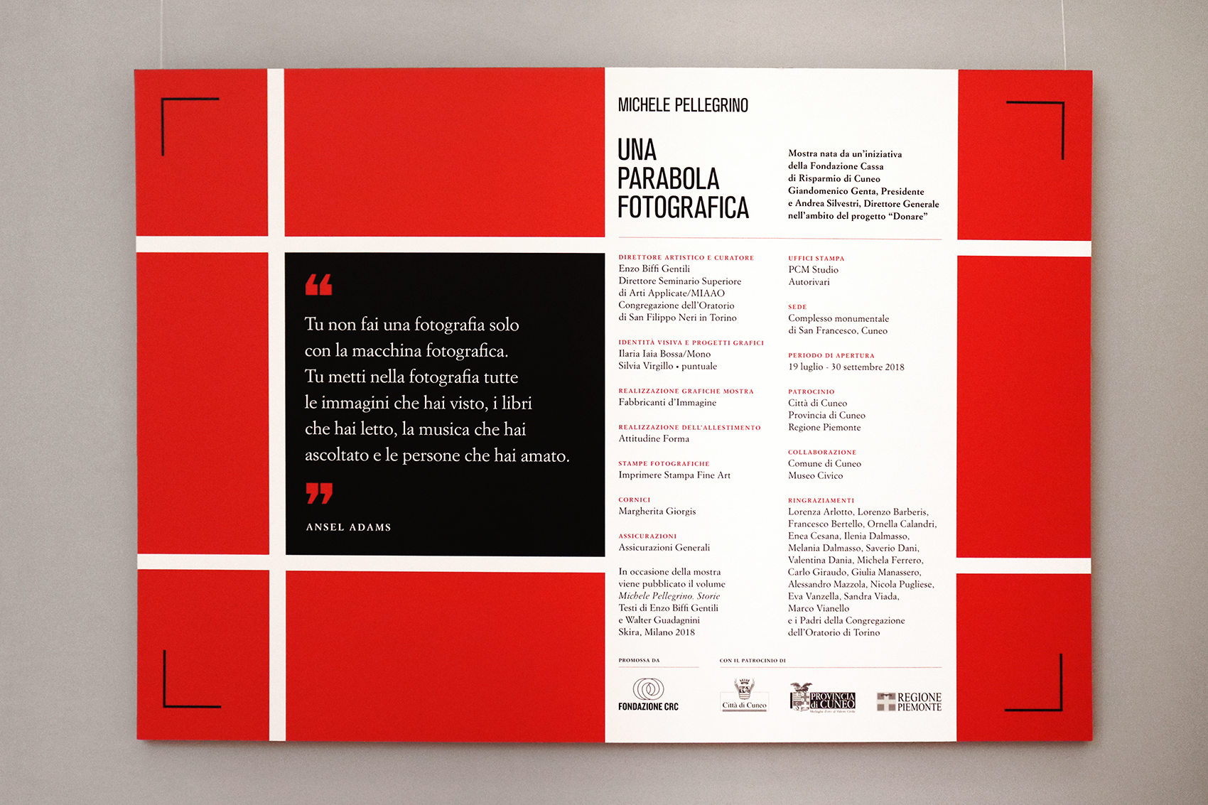
The graphic project focuses on this literary juxtapposition and takes visual inspiration from Italian editorial masterpieces: Bruno Munari squares (designed for Einaudi, Pavese’s publisher) and Simoncini Garamond are rearranged in a grid that seems both an editorial layout and a photographic frame.
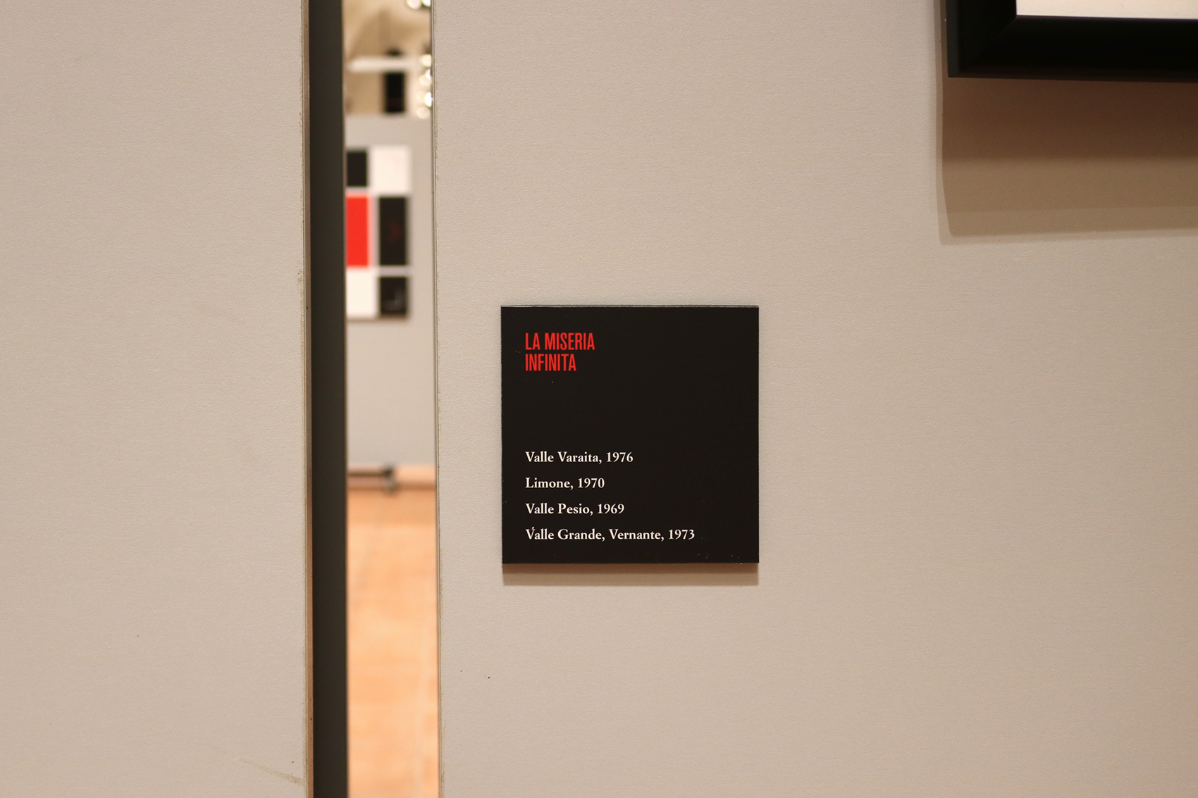
The project highlights the thematic sections, giving visual relevance to the literary quotes that introduce the pictures. 

July 19 - September 30, 2018
Complesso monumentale di San Francesco, Cuneo 
Curated by Vincenzo Biffi Gentili and promoted by Fondazione CRC


pellegrino_parabola_fotografica

TIPIdeVOTI

/ poster design /

TIPIdeVOTI is a typographical artwork in which fictional politics combines with typography.
Designed for PolisGraphics exhibition as a poster and folded to be freely distributed to visitors, the artwork is an imaginary list of candidates, whose names relate to typographical features, used as graphic elements to illustrate their face.

VIRGILLO_tipidevoti_poster

Exhibition: PolisGraphics. Arti applicate “impegnate”
11-31 Ottobre 2017 - MIAAO, Galleria Sottana - Via Maria Vittoria 5, Torino
Curators: Enzo Biffi Gentili, Michele Bortolami, Tommaso Delmastro


Artieri Fantastici

/   art direction   /    exhibition identity   /   editorial design   /

The three-year project Il cuNeo Gotico was created to claim a little known architectural supremacy in Cuneo: the presence of relevant neo-gothic and neo-medieval monuments. Artieri Fantastici is an exhibition dedicated to applied arts related to Cuneo, and with the Compagnons du Tour de France as representatives of a venerable and esoteric craftmanship tradition. 

Exhibition curated by Enzo Biffi Gentili (MIAAO, Torino) and sponsored by Fondazione CRC.

Medieval gargoyles and a deep blue for Artieri fantastici, with its collection of artifacts, artistic objects and illustrations, with the manufacture as common theme.

The three exhibit sections (Hommage au Compagnonnage, Sette cappelle per sette sorelle and Quattro fantastici artieri del tratto) have been designed so to be easily recognized, thanks to colours and backgrounds used in the graphic panels.

Exhibition graphic system designed in collaboration with Francesca Infantino.


Bigiù

/ catalogue design /

The 2016 edition of Viaggio attraverso la ceramica di Vietri sul Mare is named Bigiù. It is an exhibition dedicated to italian and european ceramic jewellery, curated by Seminario Superiore di Arti Applicate and MIAAO (Torino). 
Here is the catalogue, collecting some jewels presented at the exhibition, which opened on June 4 at Vietri sul Mare. The main typeface is Turquoise (Resistenza.es), with its brushy nature-inspired ligatures and ornaments.


Neogotico Tricolore

/ editorial design / book layout /

Neogotico Tricolore, Letteratura e altro deals with the italian neogothic literature history and evolution. It presents ten academical texts about the theme, and some illustrations, collected in three different sections.
Red, black and gold are the three main colors used, while green, red and white – italian flag colors – appear in endpapers. Capital letters and full color pages are the distinctive elements of this editorial project, that references to antique books in binding and layout. The book has been designed for the cultural project Il cuNeo gotico, promoted by Fondazione Cassa di Risparmio di Cuneo and curated by Enzo Biffi Gentili with Giorgio Barberi Squarotti, Valter Boggione and Barbara Zandrino.