digital

Una sola Terra festival

/ logo design / visual identity /

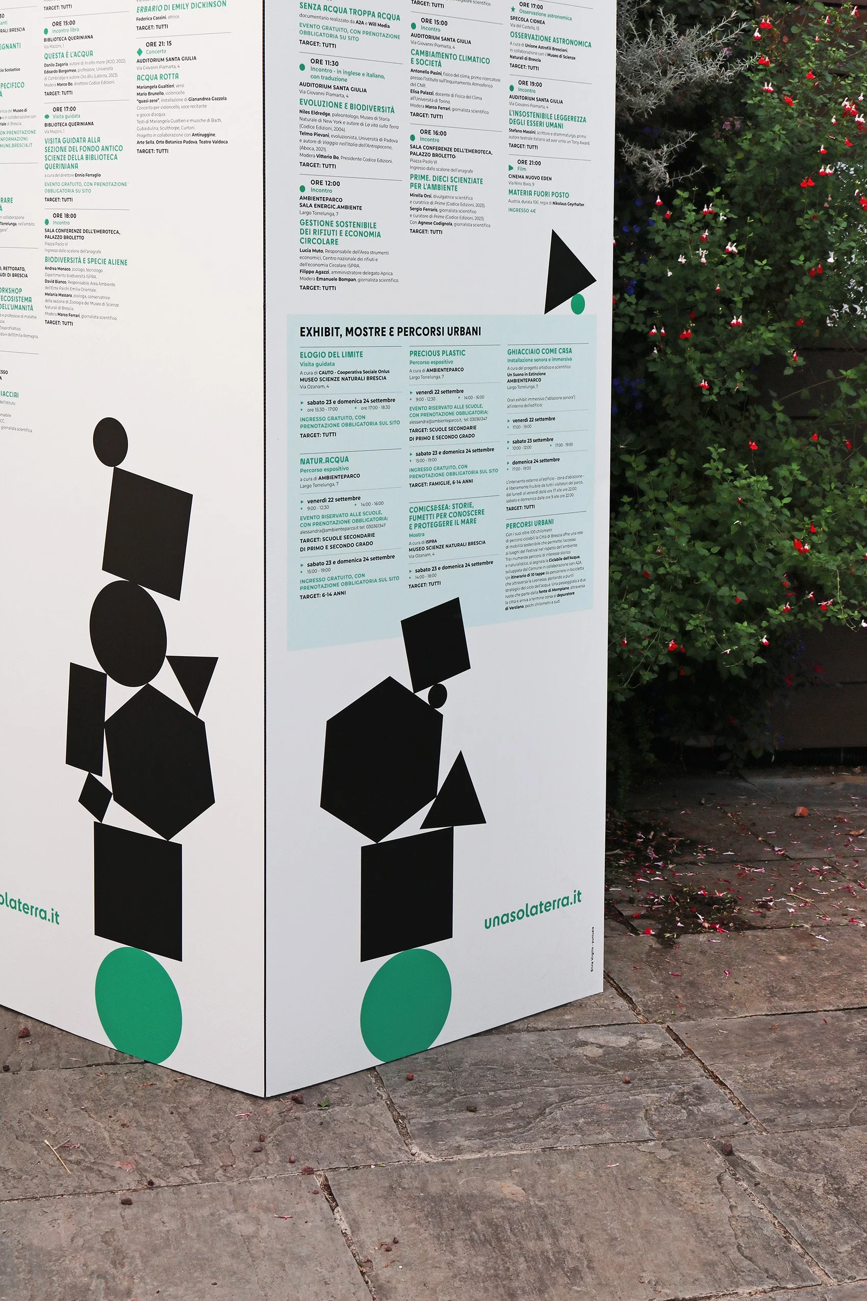
Una sola Terra (only one Earth) is a festival
about sustainability, environment and biodiversity, held in the city of Brescia, Italy.


Una sola Terra logo concept

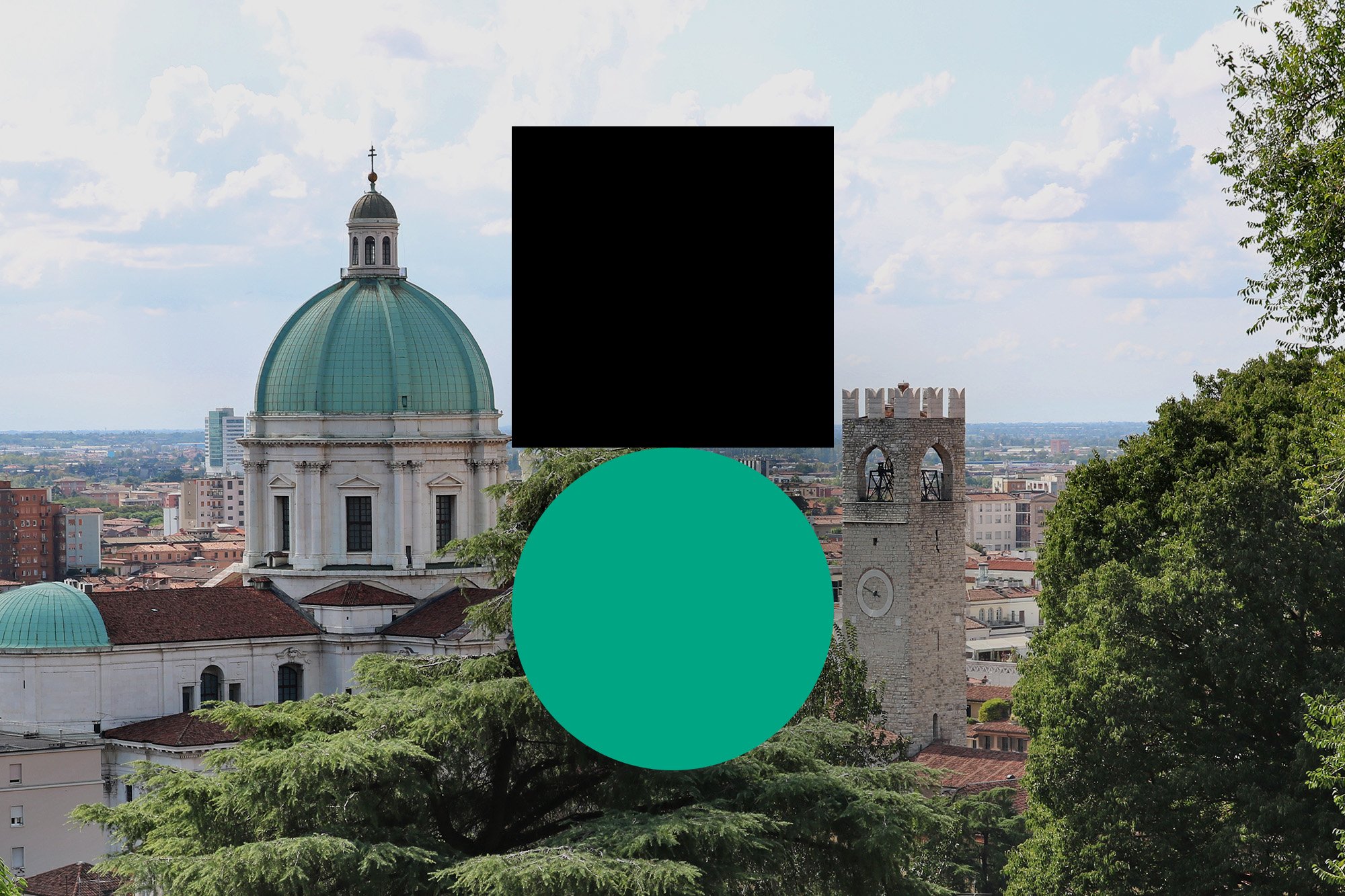
The logo symbol geometrically depicts a weight standing on Earth, just like our actions are burden on the environment. The two shapes have the same width and are not optically corrected, so that the black square looks a little bigger than the green circle.

The symbol is accompanied by the name Una sola Terra written in Cy, a font with many alternative glyphs and with both soft and angular shapes.

Una sola terra logo motion

The idea of burden conveyed by the symbol becomes even more clear in the identity system: other black shapes are added together on the logo symbol, creating a stack in a precarious balance.

Social media post design
 

Una sola Terra festival is promoted by
Comune di Brescia, Fondazione Brescia Musei, Museo Scienze Naturali Brescia and Codice Edizioni.


Ascolto for Italianism 2018

/ visual design /

I've been selected to visualize one of the key words for Sandro Cappelletto's speech at 'Le parole della musica italiana' during Italianism creative conference in Napoli. The artwork represents the word "ascolto" in a geometric and abstract way.
Special thanks to Renato Fontana, Italianism founder. 

VIRGILLO_PUNTUALE_italianism_ascolto

QuantuMine

/ visual design /

QuantuMine is a documentary about Mine and offers a standpoint of a basically mental journey, talking about possible universes that materialize in the desert. A tribute to a movie near to science fiction, in which consciousness is the main protagonist. Titles, introductions and subtitles come together with graphics inspired by quantum particles, represented as moving points.

Written and directed by Carlotta Petracci

VIRGILLO_quantumine_title_gif

The documentary is available inside Mine DVD and Blu-Ray, distributed by Eagle Pictures.
Here is the QUANTUMINE official trailer ☛ https://vimeo.com/201108861

The KitchenAid story

/   art direction   /   visual design   /

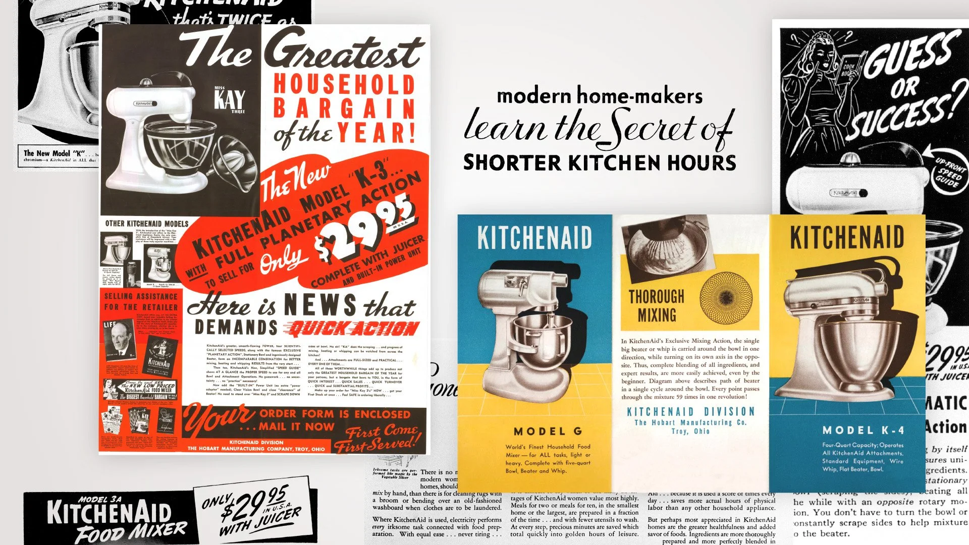
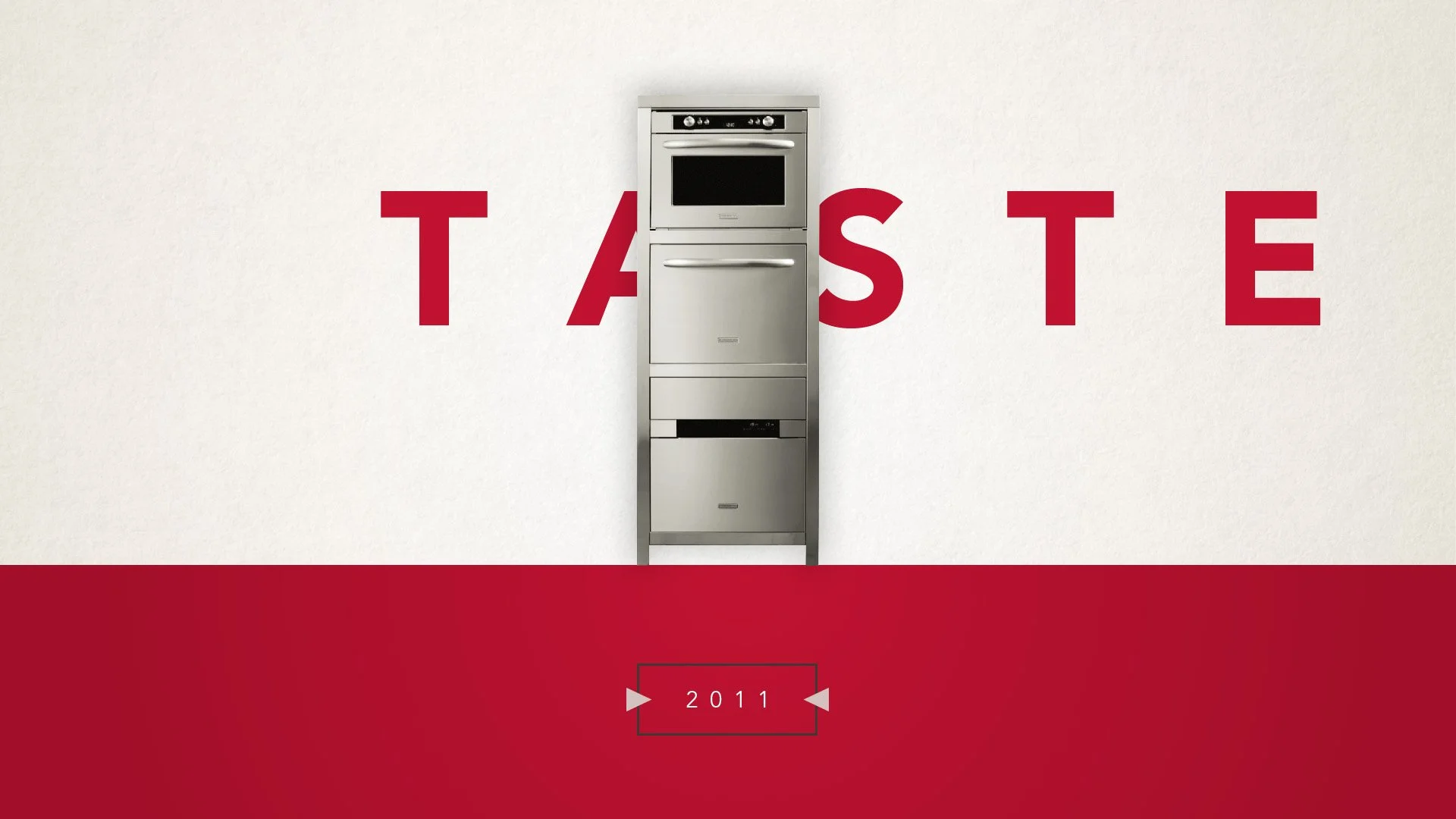
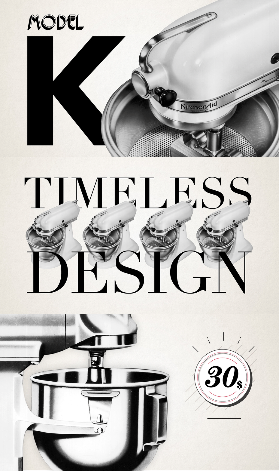
KitchenAid is one of the leading brands for small and major household appliances, born almost a century ago in the United States. The video is about the history of the company; in the gallery some of the graphic solutions proposed for the video are presented, starting from the KitchenAid beginnings to the new collections. Archive images and vintage typography have been used to remark the key moments of the company evolution. 

Creative agency: 515 Creative Shop


The KitchanAid story
in its final and published version.


Sunshine in November - C2C

/ visual design /

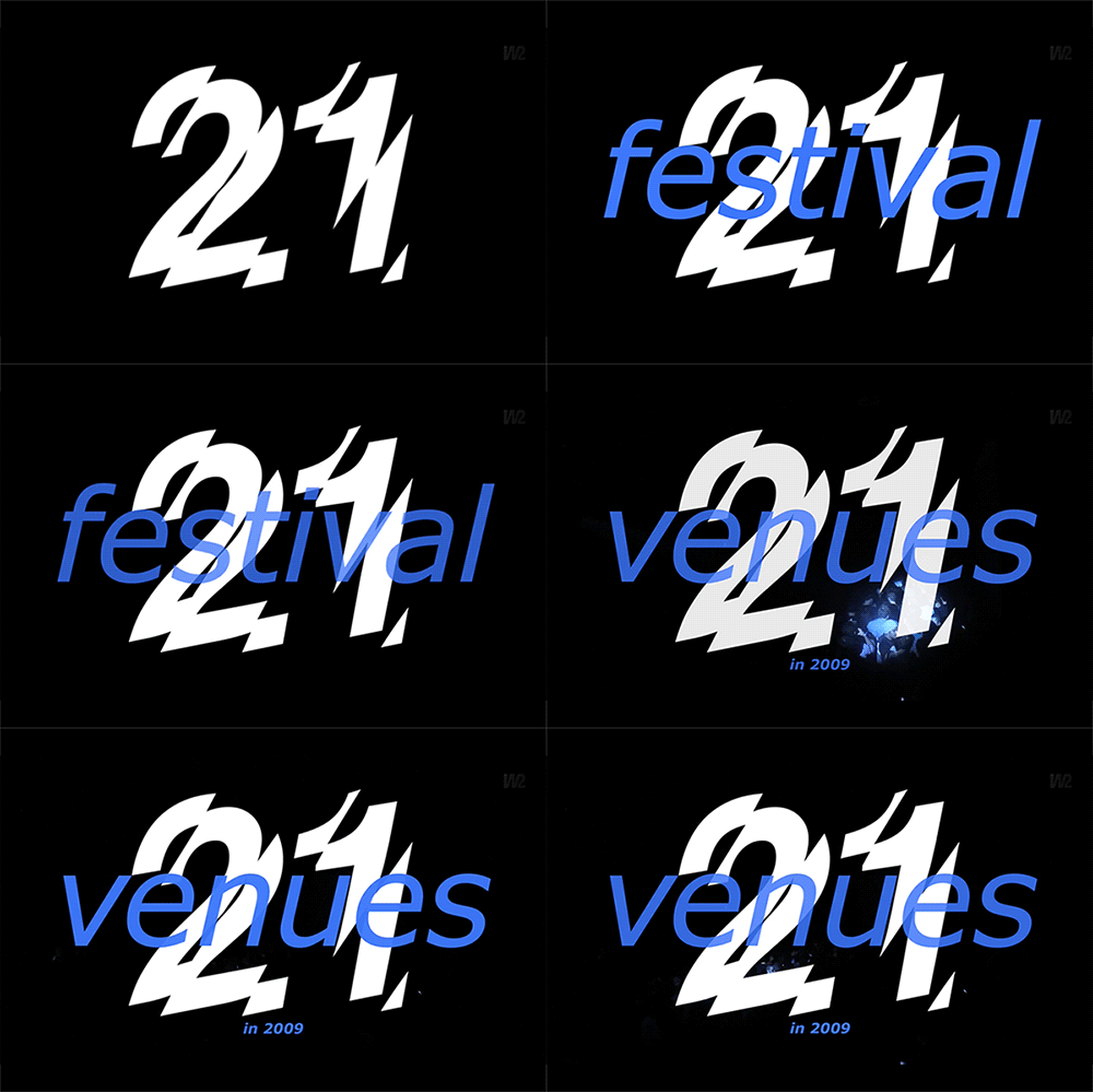
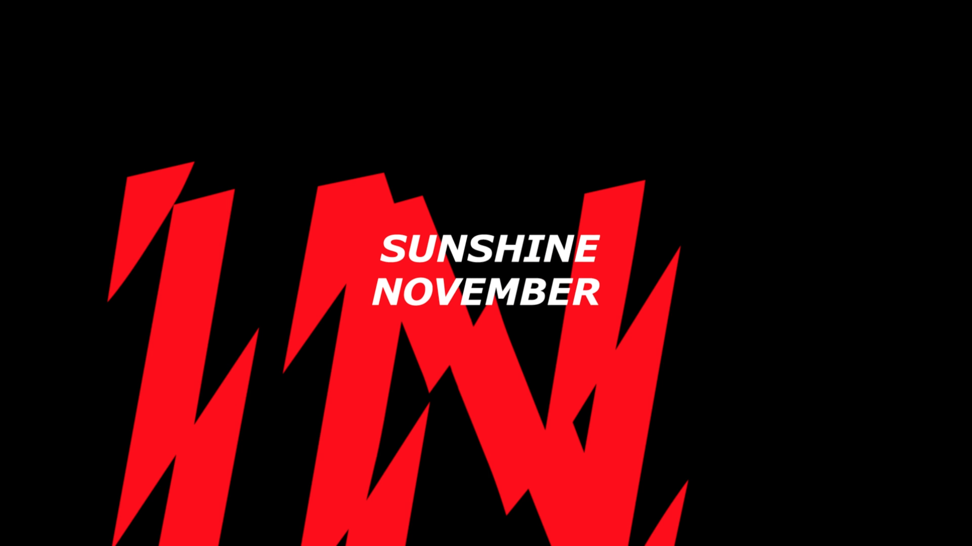
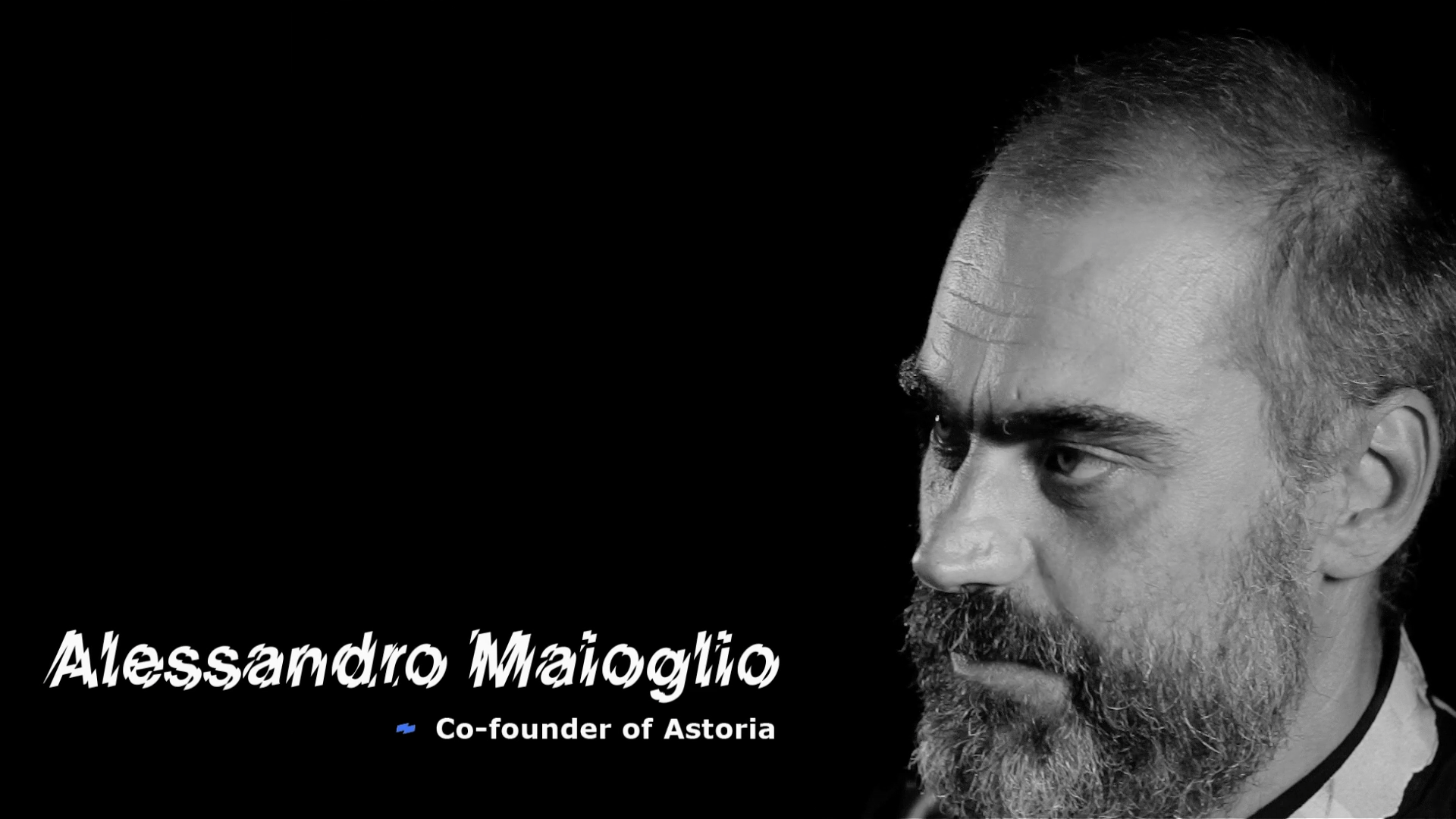
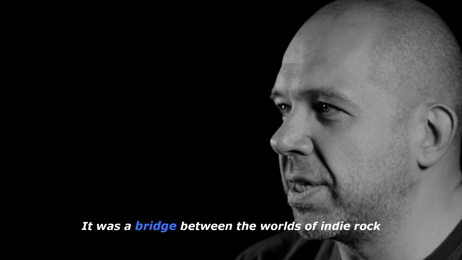
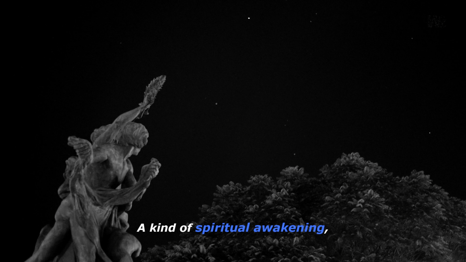
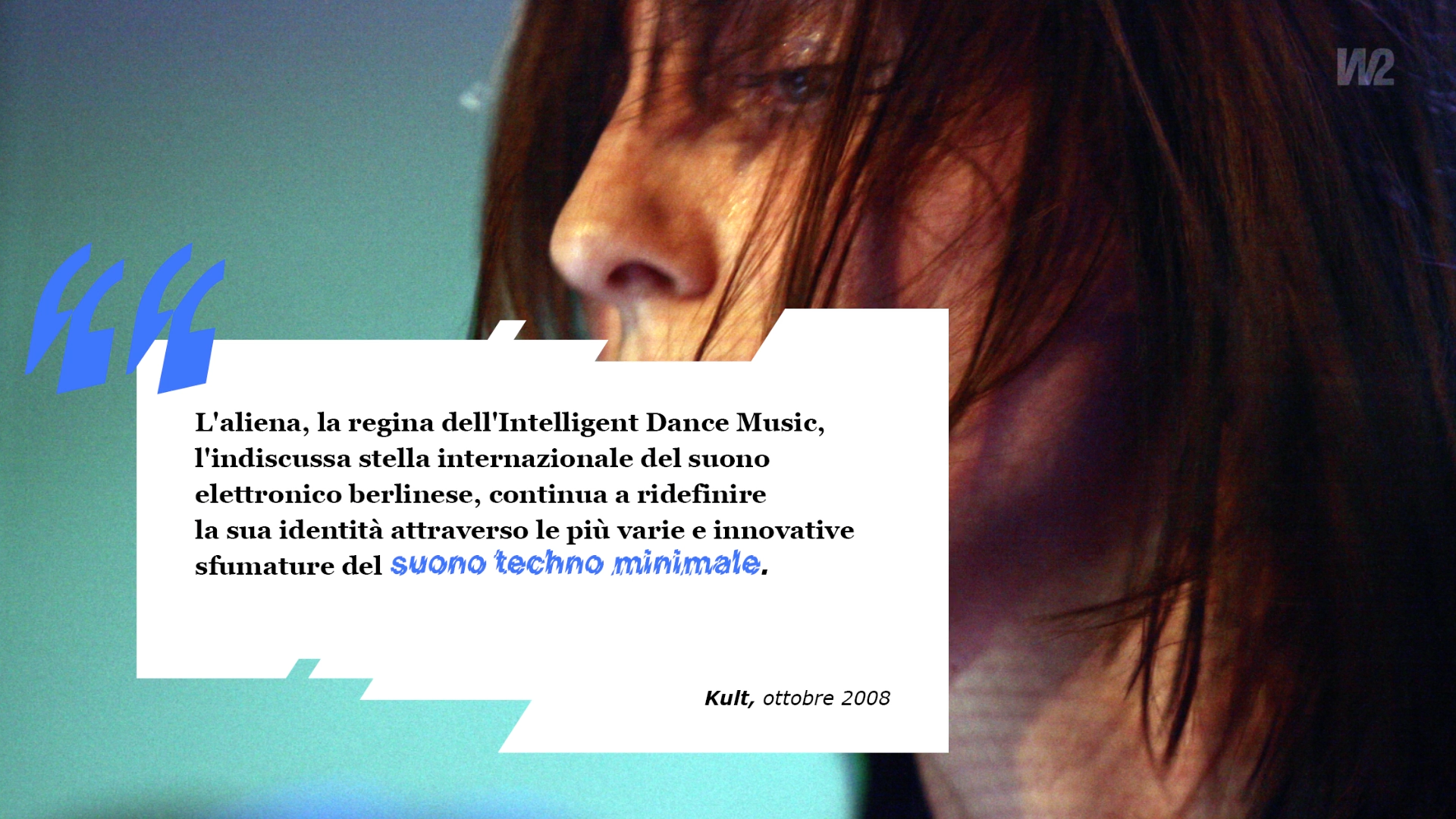
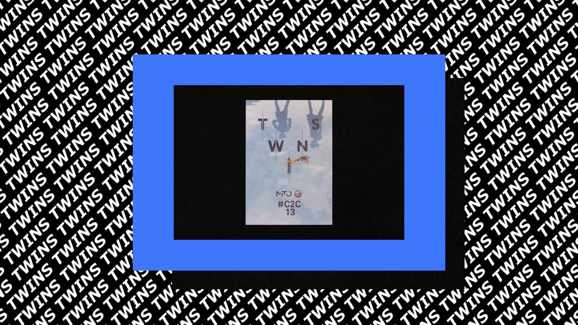
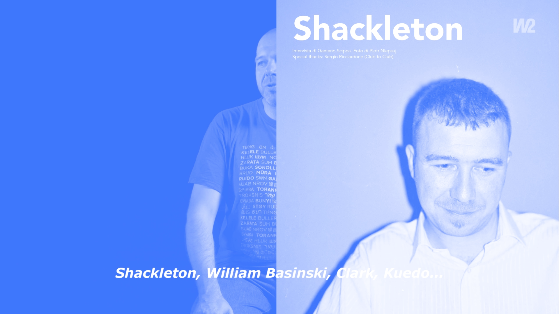
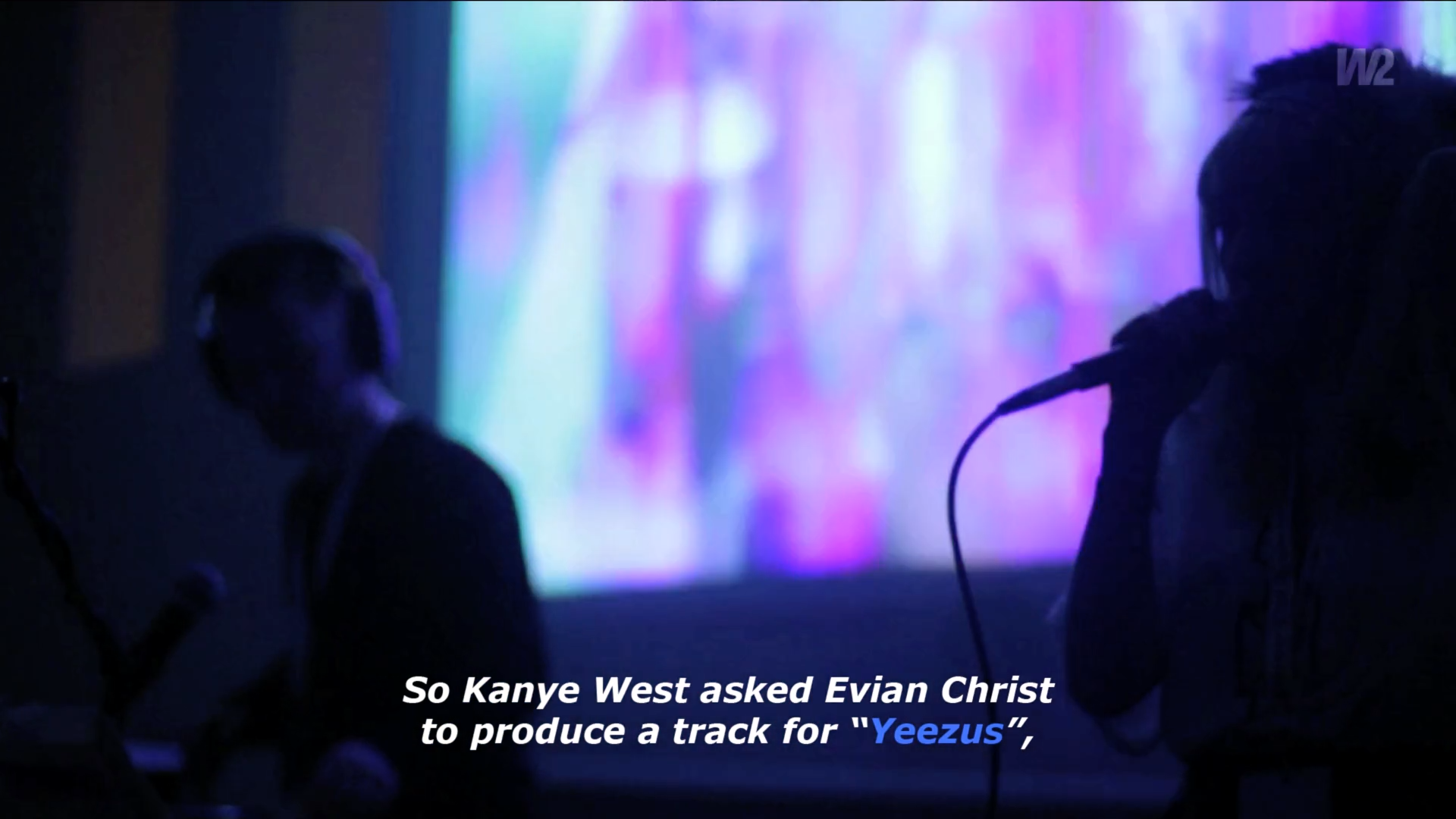
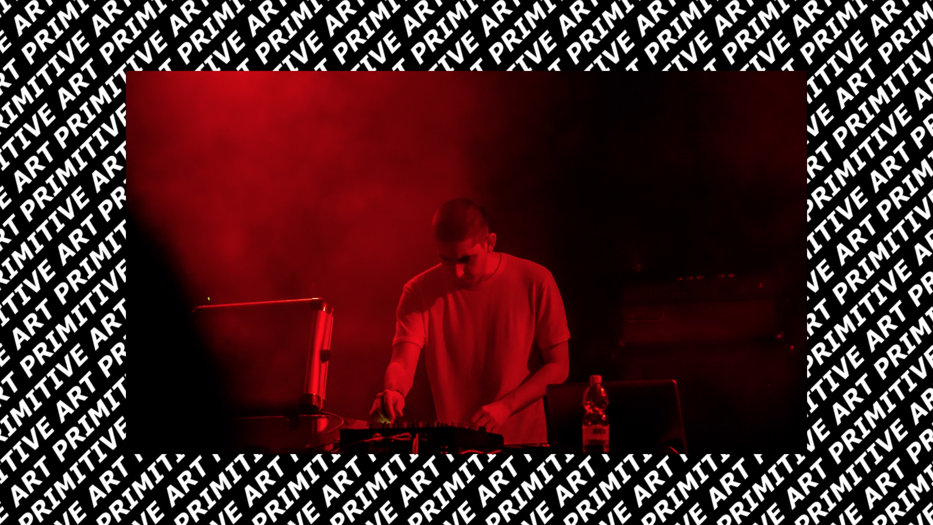
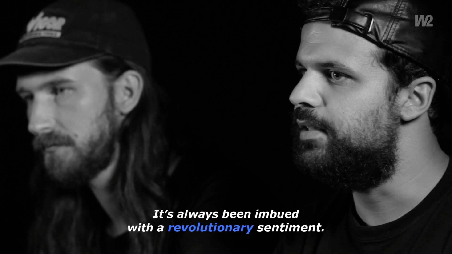
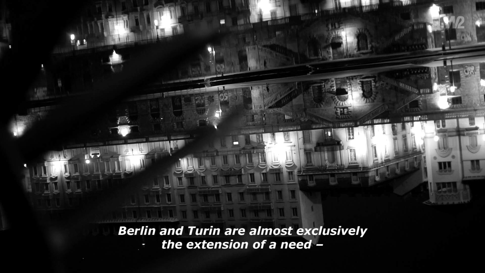
Sunshine in November is a documentary written and directed by Carlotta Petracci. It is about Club To Club festival in Torino, told by those who have witnessed it from the beginning, through their memories and projects.
Opening titles, subtitles and background graphics have been designed to guide this story, through a graphic project that refers to nightclubbing lights, that characterize the electronic music stage.

Written and directed by Carlotta Petracci

VIRGILLO_sunshine_november_c2c
VIRGILLO_sunshine_november_c2c_label


Watch the complete video on Vimeo

A White production
Written and directed by Carlotta Petracci
Photography: Corrado Marchigiano
Editing and post-production: Carlotta Petracci and Corrado Marchigiano
Graphic design: Silvia Virgillo
Sound editing: Alessandro Vendrame
English translation: Michelle Nebiolo