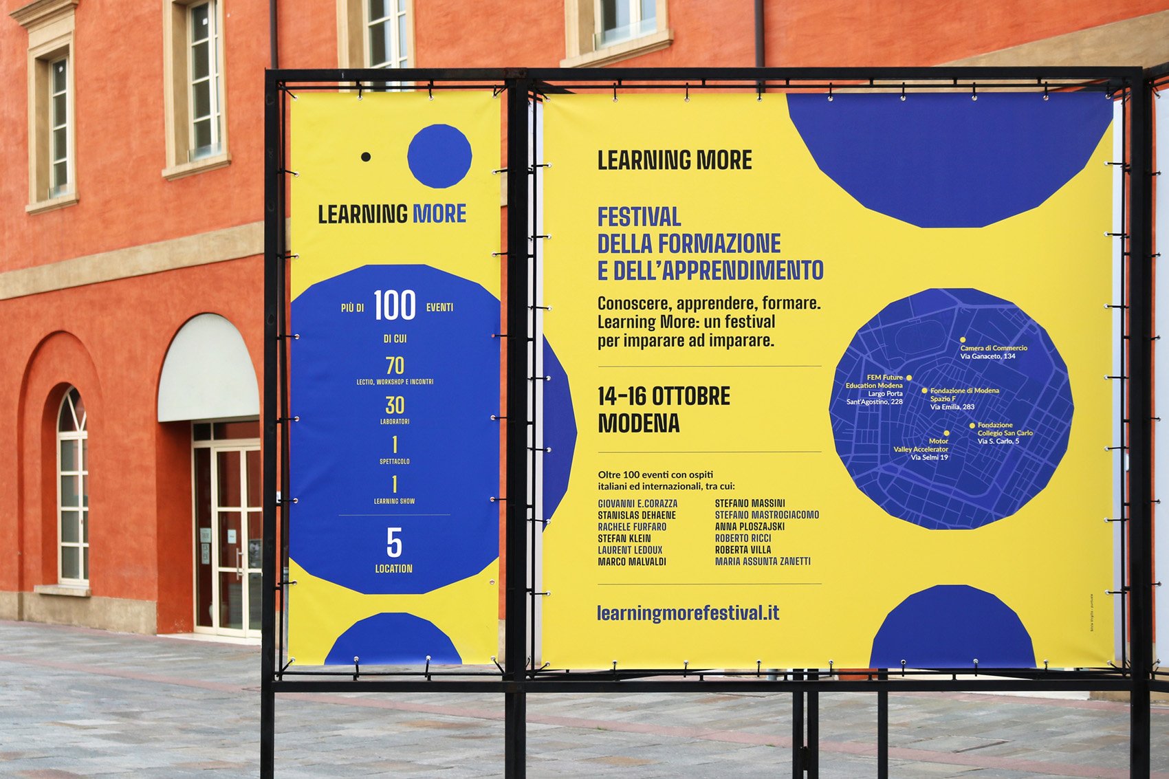
/ logo design / visual identity /
Una sola Terra (only one Earth) is a festival
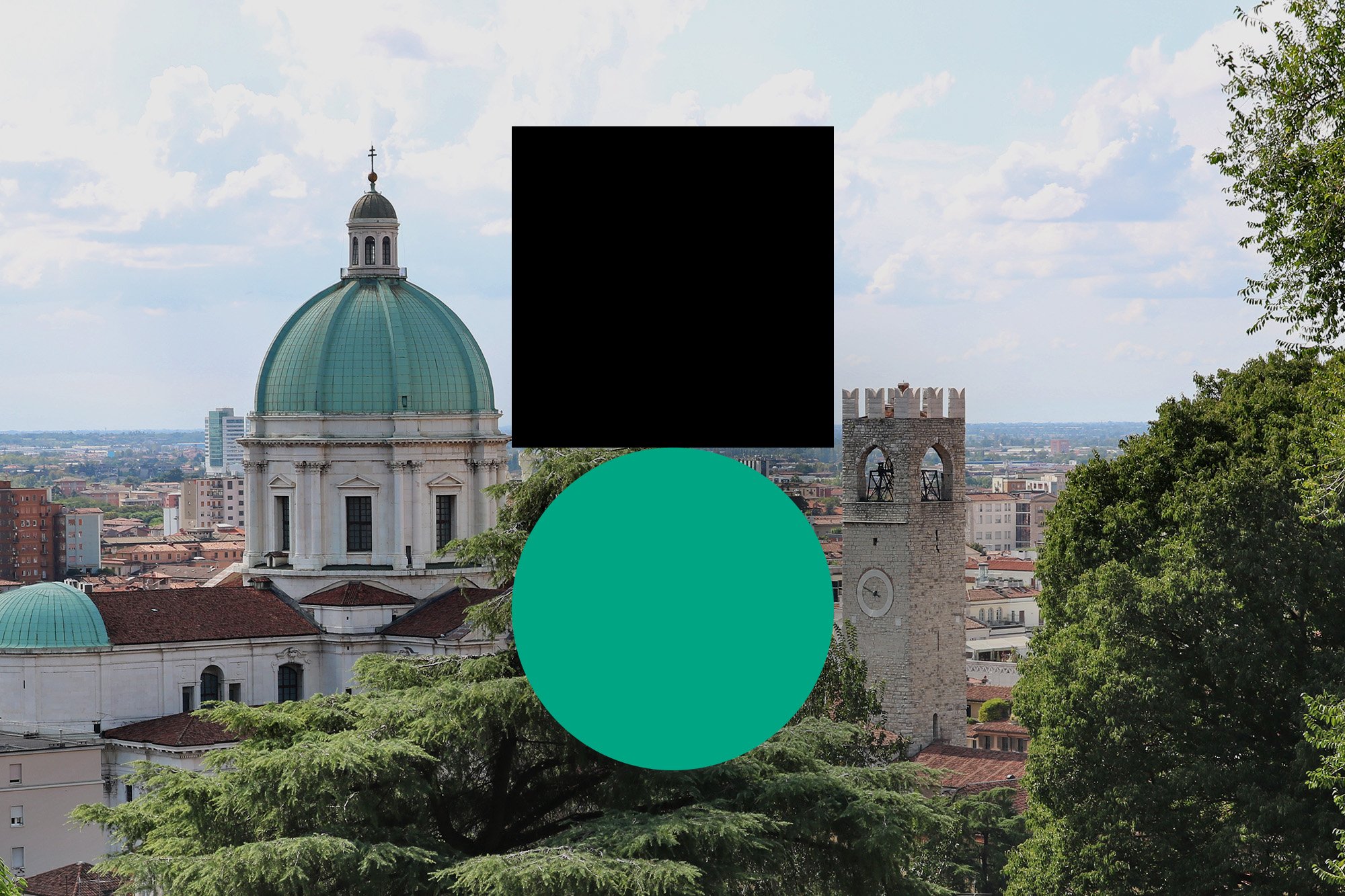
about sustainability, environment and biodiversity, held in the city of Brescia, Italy.

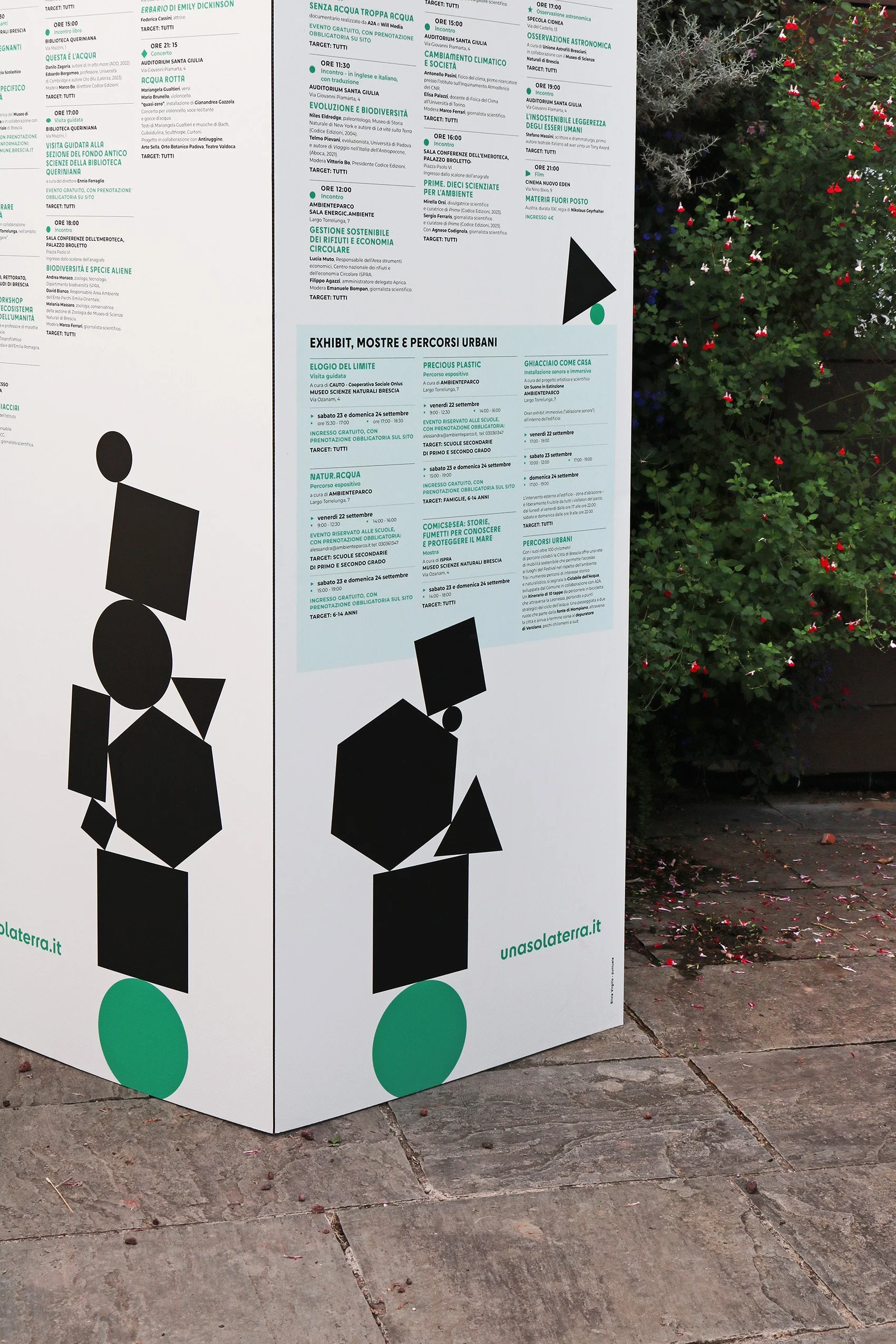
The logo symbol geometrically depicts a weight standing on Earth, just like our actions are burden on the environment. The two shapes have the same width and are not optically corrected, so that the black square looks a little bigger than the green circle.
The symbol is accompanied by the name Una sola Terra written in Cy, a font with many alternative glyphs and with both soft and angular shapes.
The idea of burden conveyed by the symbol becomes even more clear in the identity system: other black shapes are added together on the logo symbol, creating a stack in a precarious balance.


Una sola Terra festival is promoted by
Comune di Brescia, Fondazione Brescia Musei, Museo Scienze Naturali Brescia and Codice Edizioni.