/ editorial design /
In the last months I had a wonderful experience at GQ Italia, dealing with the redesign of some magazine's sections and with numerous articles. With the help of Aldo, Barbara, Dafne, Mattia and Stefania I learned the fundamental skills of editorial design.
Art director: Aldo Buscalferri
Editor in chief: Michele Lupi

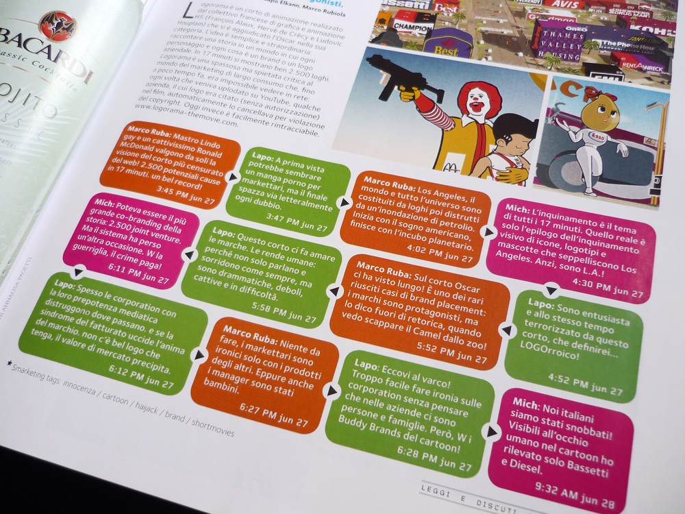
Gcult was the name of the magazine's last section, containing articles about exhibitions, books and cultural events. The request was to make it more appealing, through the design of a header to be included all along the section.

Fly and eat and Carbonara a chi? were two specific columns: the first recommended a place of refreshment overseas, reachable just by air travel, while the second proposed classic food reinterpreted in an unusual way.
The request was to design two pictograms for these two columns: in the first a dish became a globe with a plane flying around it, while in the second an exclamation point indicated the presence of something unusual to watch.
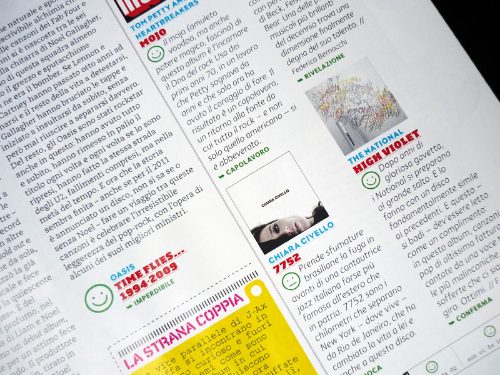

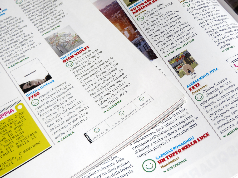
Inside Scanner section some reviews on music, movies and books were presented, with judgments on their quality. To make these opinions more clear, there was the need for a graphic system to indicate immediately the positivity, or not, of the judgment. The request was therefore to design icons that could absolve the task with ease. Different iconic systems were presented, from the most common as the stars, to the more complex such as crowns or scores, represented by hand's fingers. The latter in particular could adapt well to the reviews, but the design was too complex to be used in very small size. So, at the end, smileys were selected, with three different levels of judgment.