magazine

SRM: 20 anni, 20 parole

/ editorial design / illustrations /

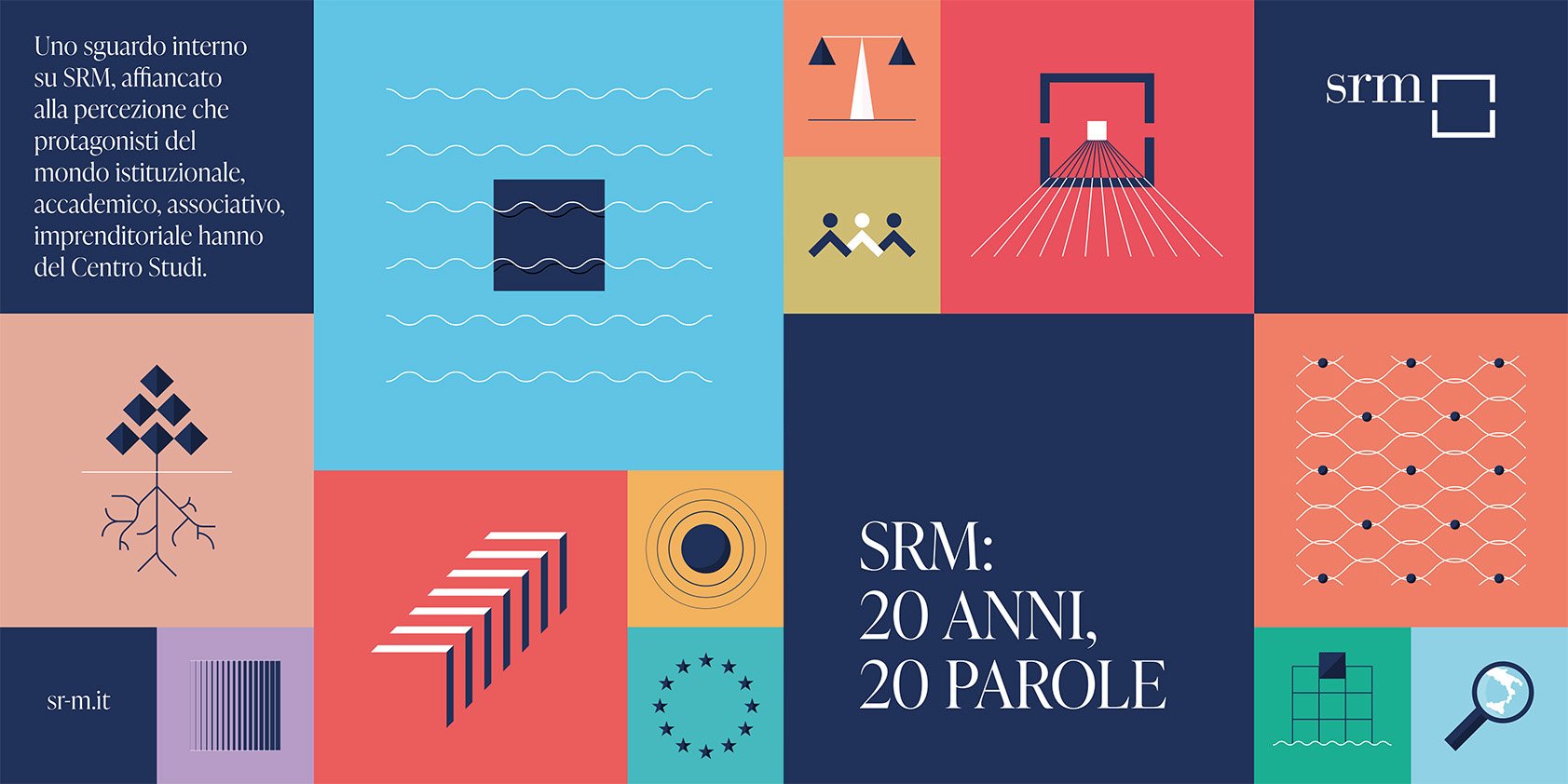
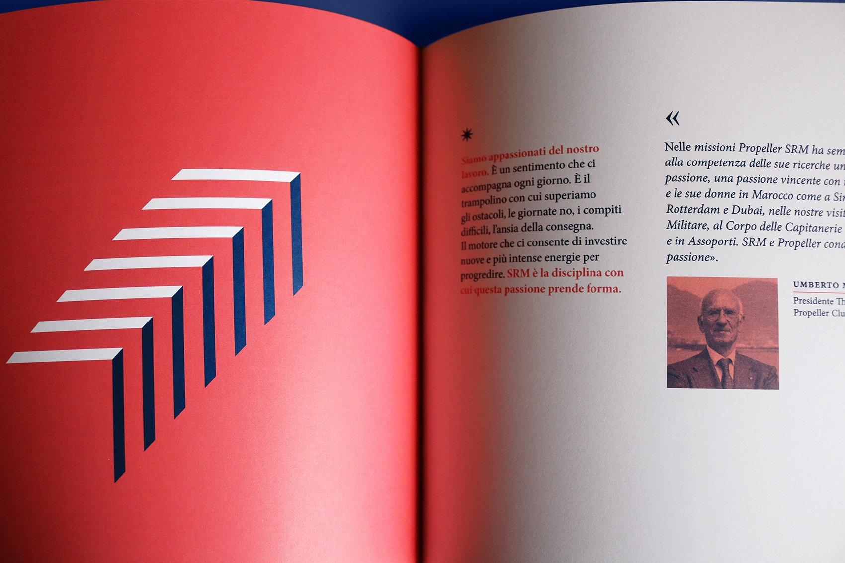
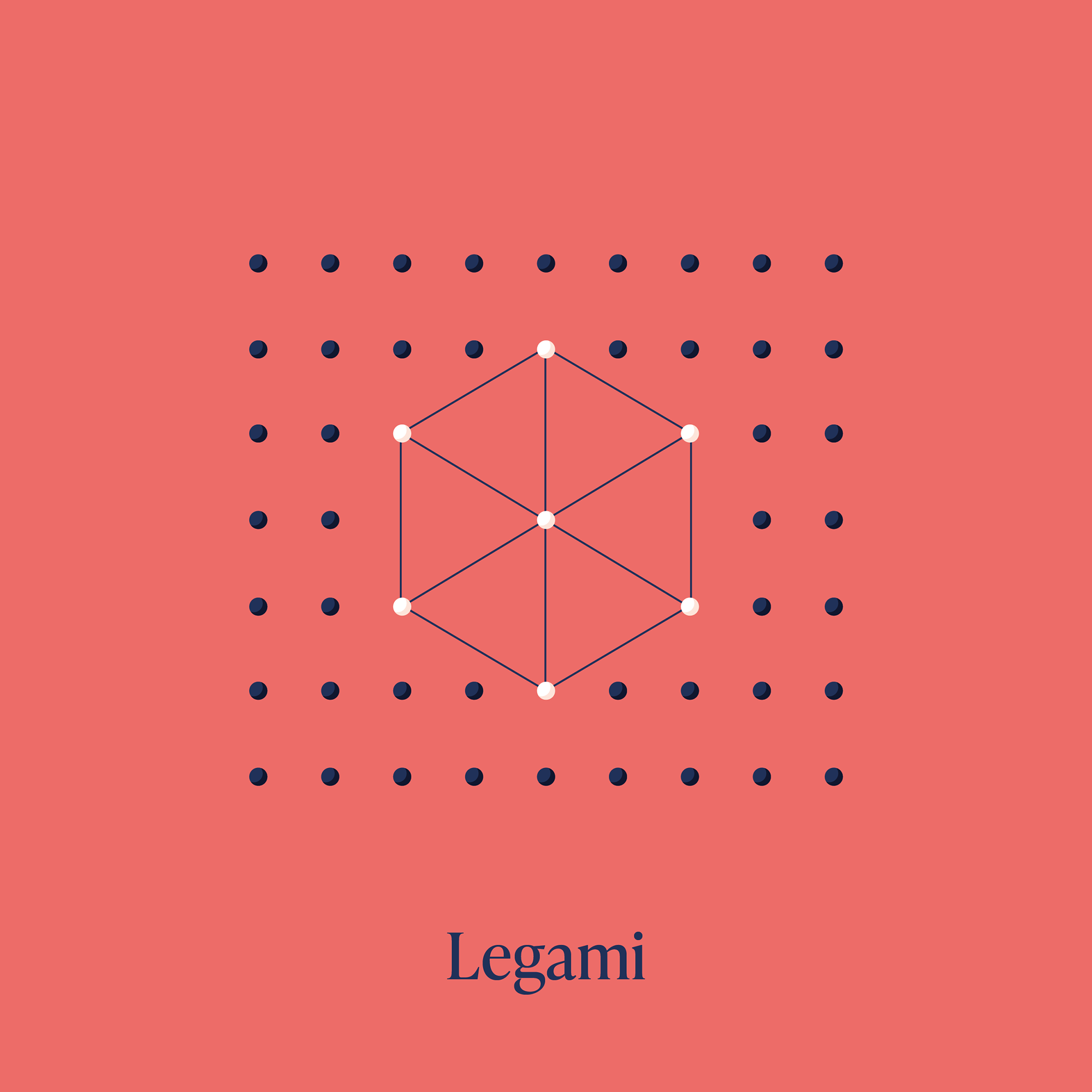
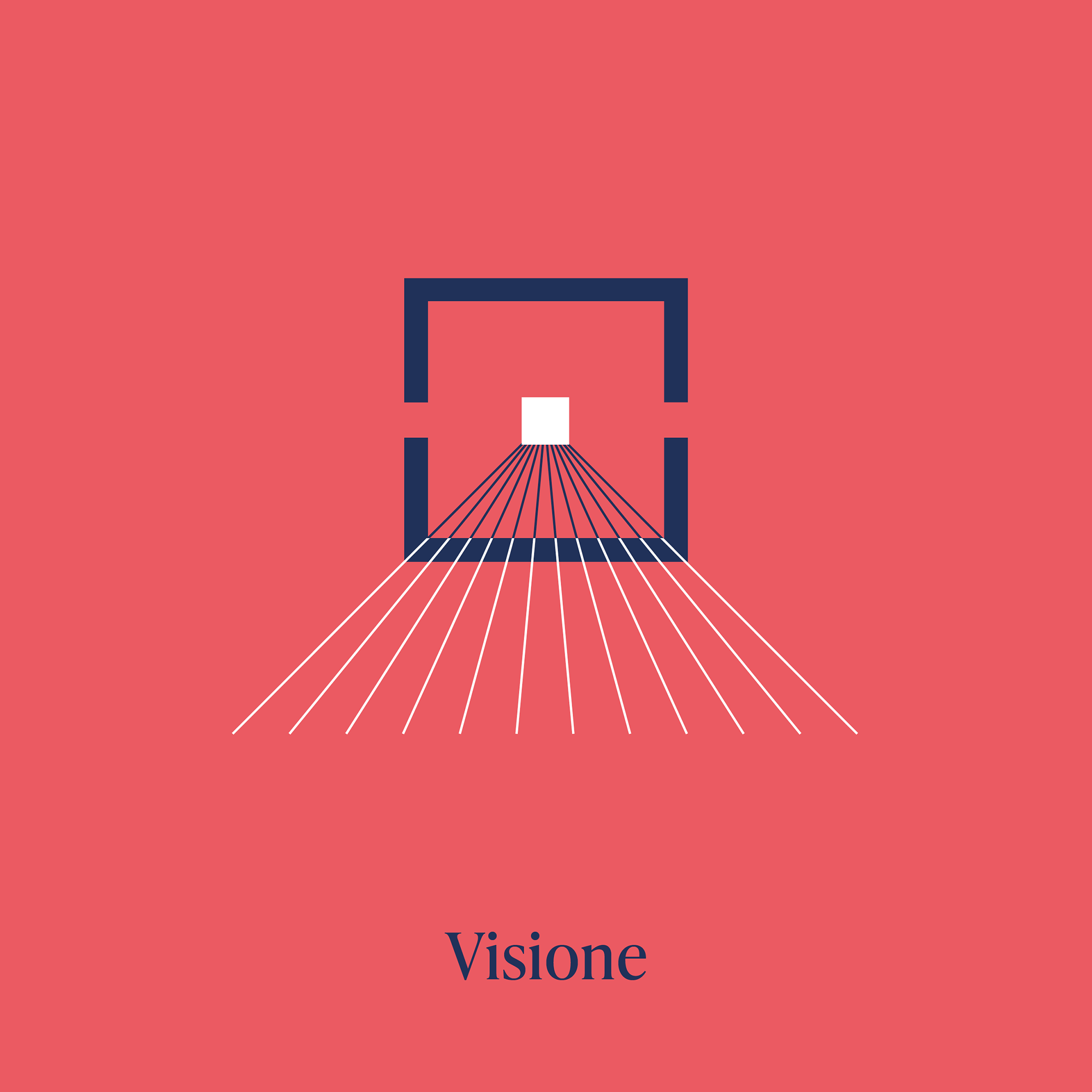
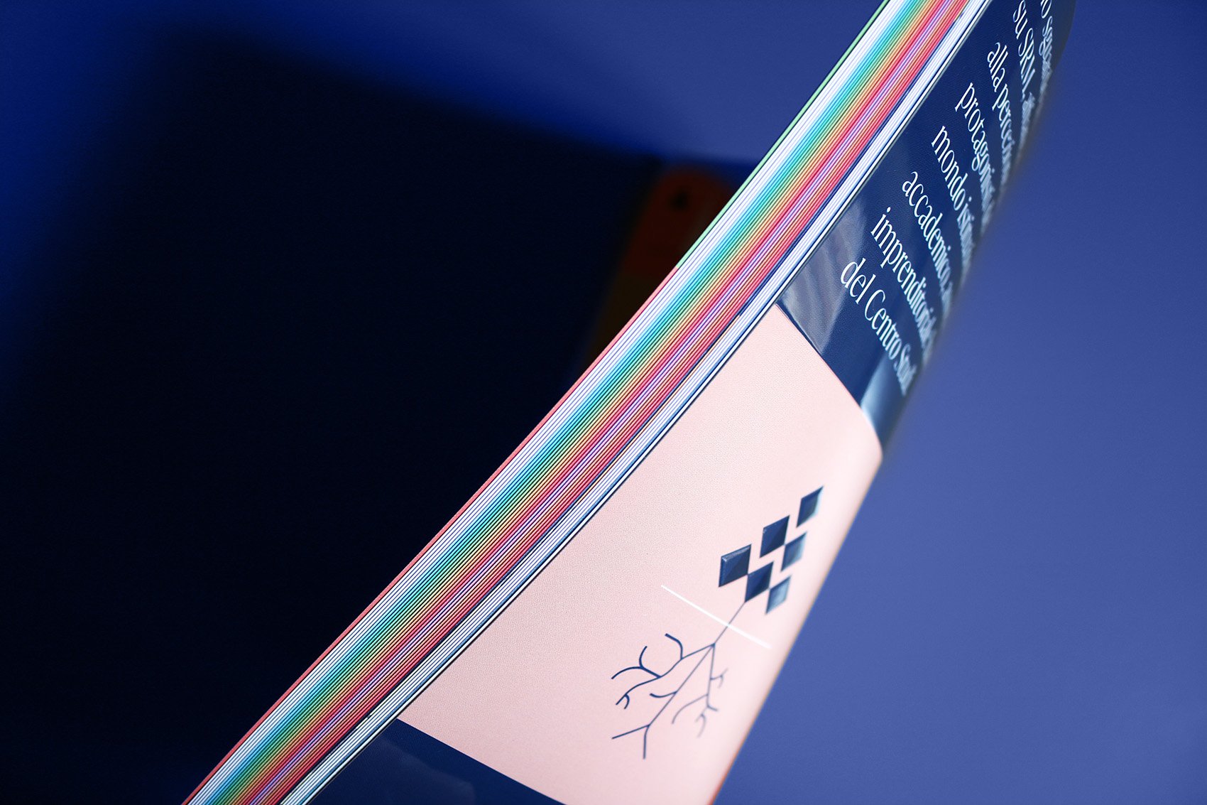
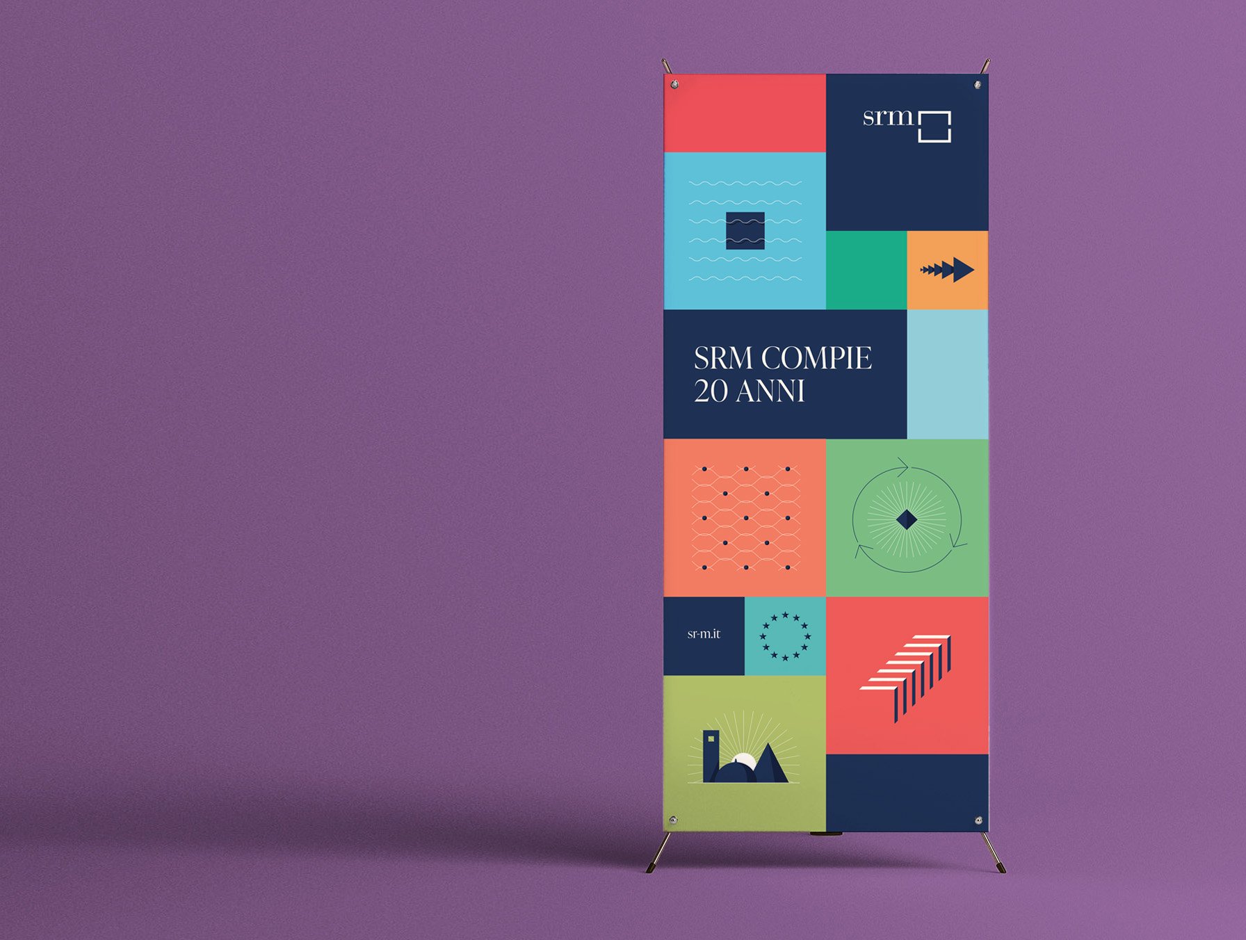
SRM is a research center born in 2003 and focused on the analysis of production and tourism chains as well as on the port-logistics and energy sectors in Southern Italy. For the twenty years anniversary, a celebratory book has been designed, introducing twenty identifying words illustrated and accompanied by perspectives on the Center from institutional, academic, associative and entrepreneurial representatives, who have approached SRM during these years.

SRM is related to Intesa Sanpaolo Banking Group and also supported by the Compagnia di San Paolo Foundation.

 
SRM book cover
Visual with colored squares and illustrations
Book pages
Pages with SRM timeline
Mediterranean illustration
Spread pages about Mediterraneo
Spread pages about Industria
Spread pages about Reti
Vision illustration
Rollup

MUSE Bilancio di missione 2021

/ editorial design / book layout /

The publication is the annual report about the cultural and social impact of MUSE, the Science Museum located in Trento, Italy.
Natural elements from the museum archives are used together with geometric shapes to juxtapose text pages.

A project by MUSE and Codice Edizioni


Kel12 magazine

/ editorial design /

The magazine, property of the tour operator Kel12, has been launched in this redesigned version in September 2015, in order to offer travel reviews and articles about foreign cultures to its customers.

Editor in chief: Stefano Ampollini
Managing editor: Marilena Roncarà
Art director and photo editor: Carlotta Petracci
Editorial designer: Silvia Virgillo
Graphic designer: Anna Tortora
Publisher: Contemporanea srl


GQ Italia - stage


/ editorial design /

In the last months I had a wonderful experience at GQ Italia, dealing with the redesign of some magazine's sections and with numerous articles. With the help of Aldo, Barbara, Dafne, Mattia and Stefania I learned the fundamental skills of editorial design.

Art director: Aldo Buscalferri
Editor in chief: Michele Lupi

Gcult was the name of the magazine's last section, containing articles about exhibitions, books and cultural events. The request was to make it more appealing, through the design of a header to be included all along the section.

Fly and eat and Carbonara a chi? were two specific columns: the first recommended a place of refreshment overseas, reachable just by air travel, while the second proposed classic food reinterpreted in an unusual way.
The request was to design two pictograms for these two columns: in the first a dish became a globe with a plane flying around it, while in the second an exclamation point indicated the presence of something unusual to watch.

Inside Scanner section some reviews on music, movies and books were presented, with judgments on their quality. To make these opinions more clear, there was the need for a graphic system to indicate immediately the positivity, or not, of the judgment. The request was therefore to design icons that could absolve the task with ease. Different iconic systems were presented, from the most common as the stars, to the more complex such as crowns or scores, represented by hand's fingers. The latter in particular could adapt well to the reviews, but the design was too complex to be used in very small size. So, at the end, smileys were selected, with three different levels of judgment.