The KitchenAid story

/   art direction   /   visual design   /

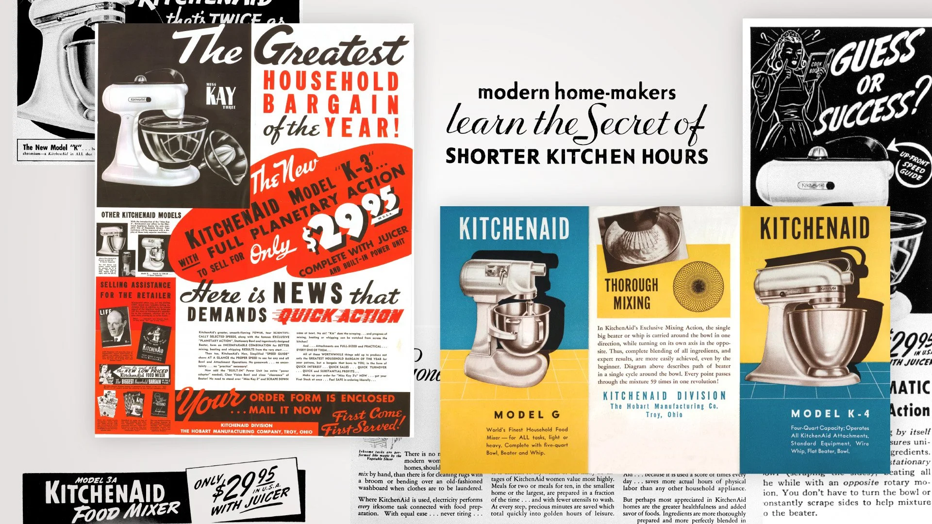
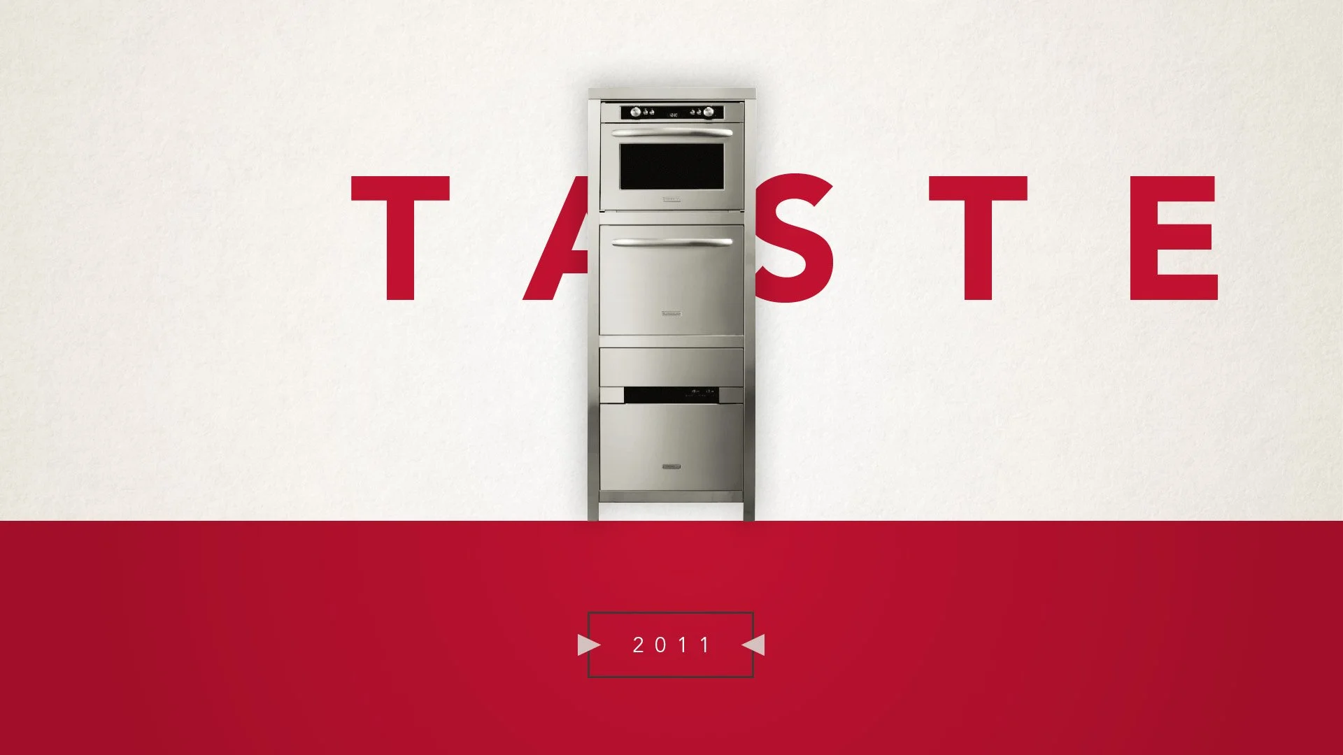
KitchenAid is one of the leading brands for small and major household appliances, born almost a century ago in the United States. The video is about the history of the company; in the gallery some of the graphic solutions proposed for the video are presented, starting from the KitchenAid beginnings to the new collections. Archive images and vintage typography have been used to remark the key moments of the company evolution. 
Creative agency: 515 Creative Shop


The KitchanAid story
in its final and published version.


Neogotico Tricolore

/ editorial design / book layout /

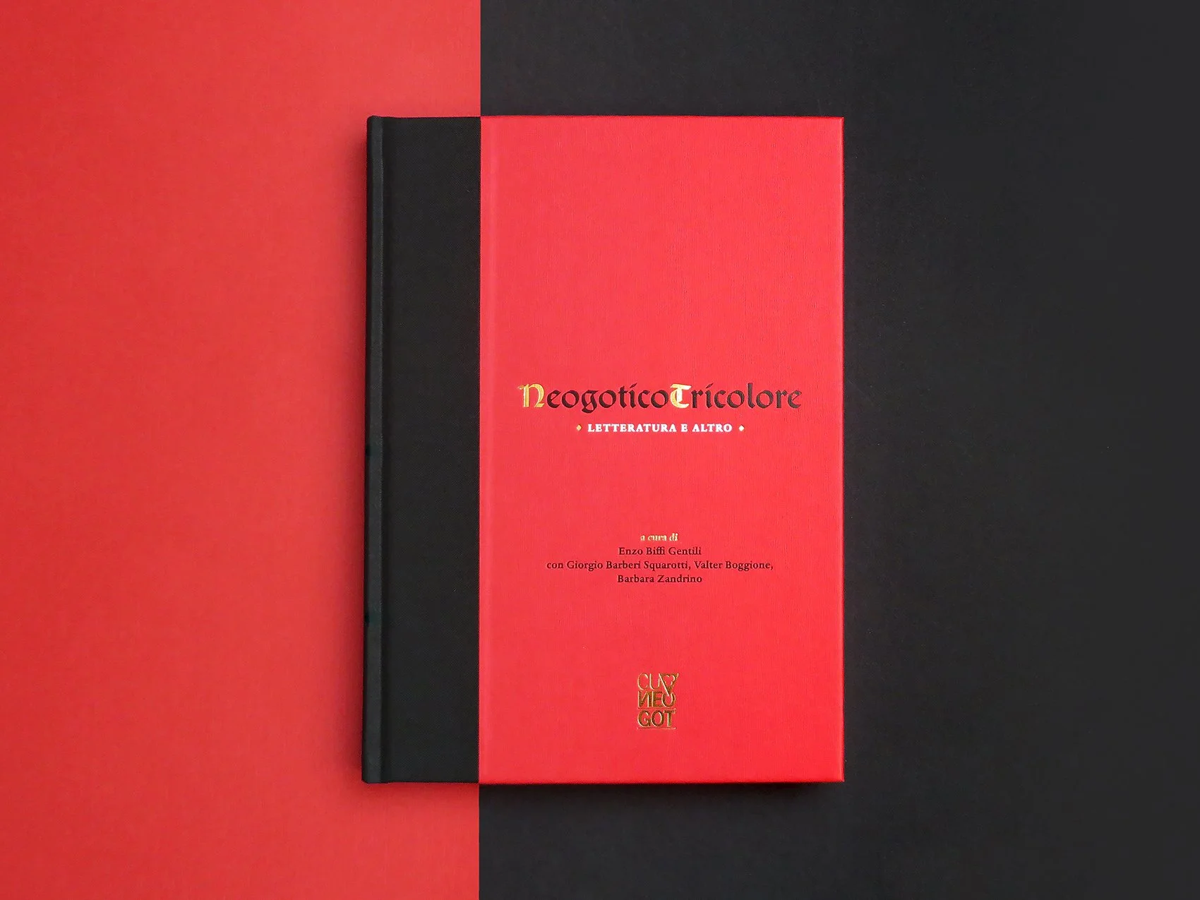
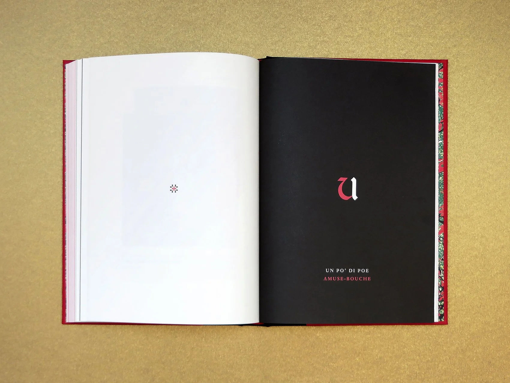
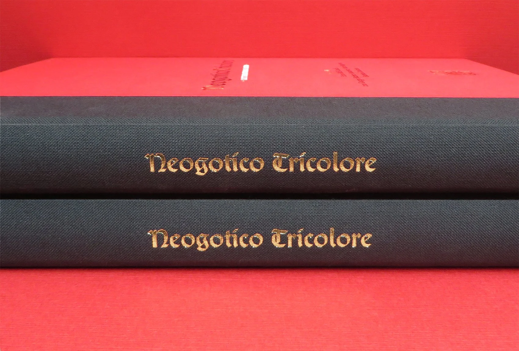
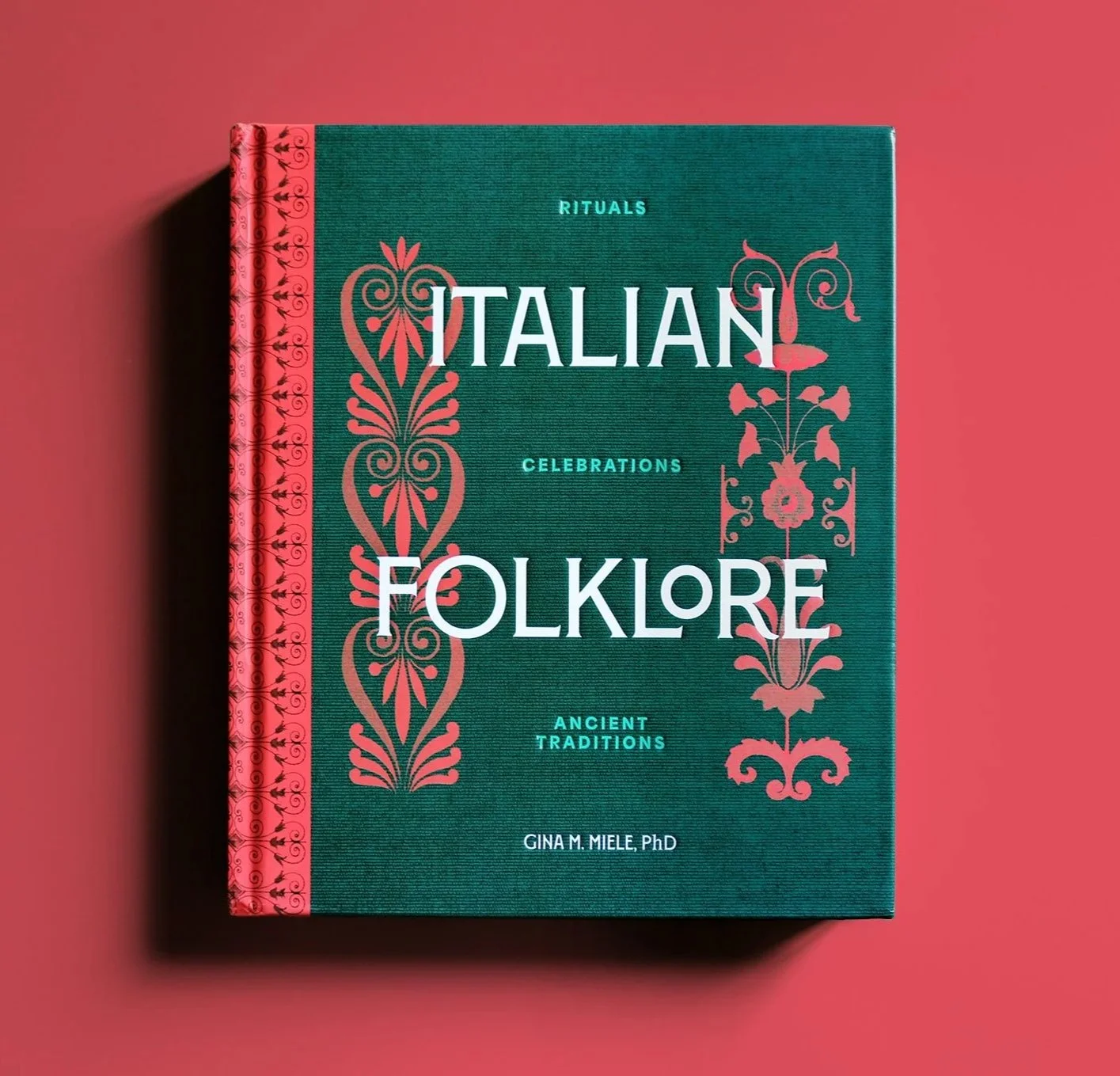
Neogotico Tricolore, Letteratura e altro deals with the italian neogothic literature history and evolution. It presents ten academical texts about the theme, and some illustrations, collected in three different sections.
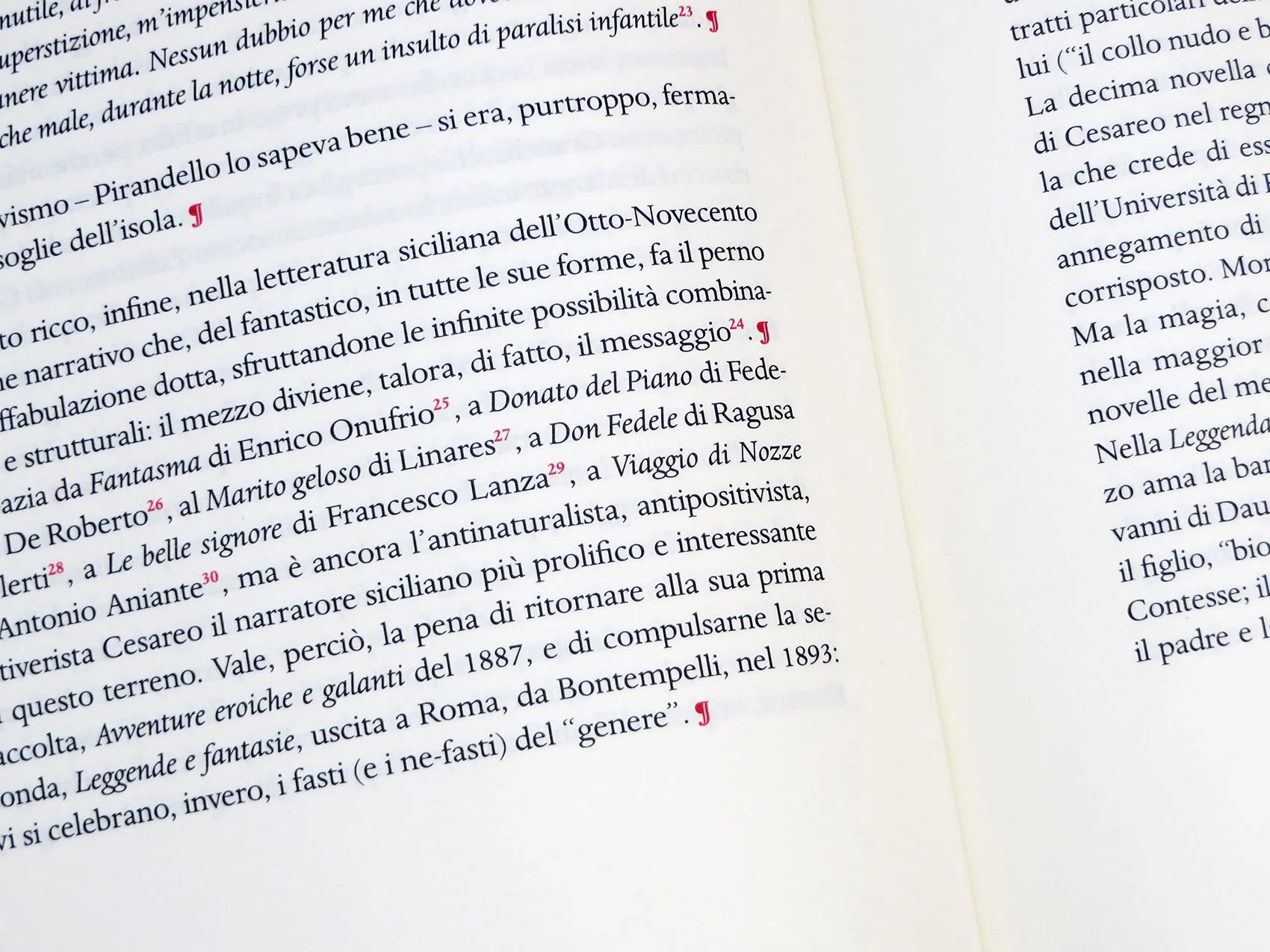
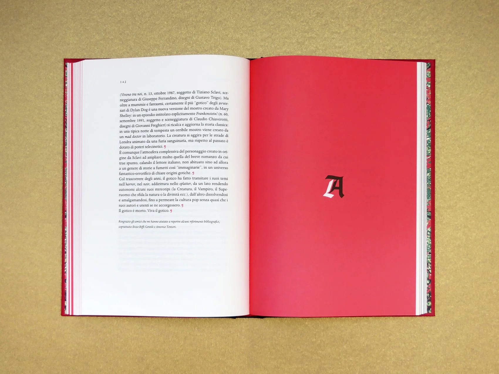
Red, black and gold are the three main colors used, while green, red and white – italian flag colors – appear in endpapers. Capital letters and full color pages are the distinctive elements of this editorial project, that references to antique books in binding and layout. The book has been designed for the cultural project Il cuNeo gotico, promoted by Fondazione Cassa di Risparmio di Cuneo and curated by Enzo Biffi Gentili with Giorgio Barberi Squarotti, Valter Boggione and Barbara Zandrino.


Sunshine in November - C2C

/ visual design /

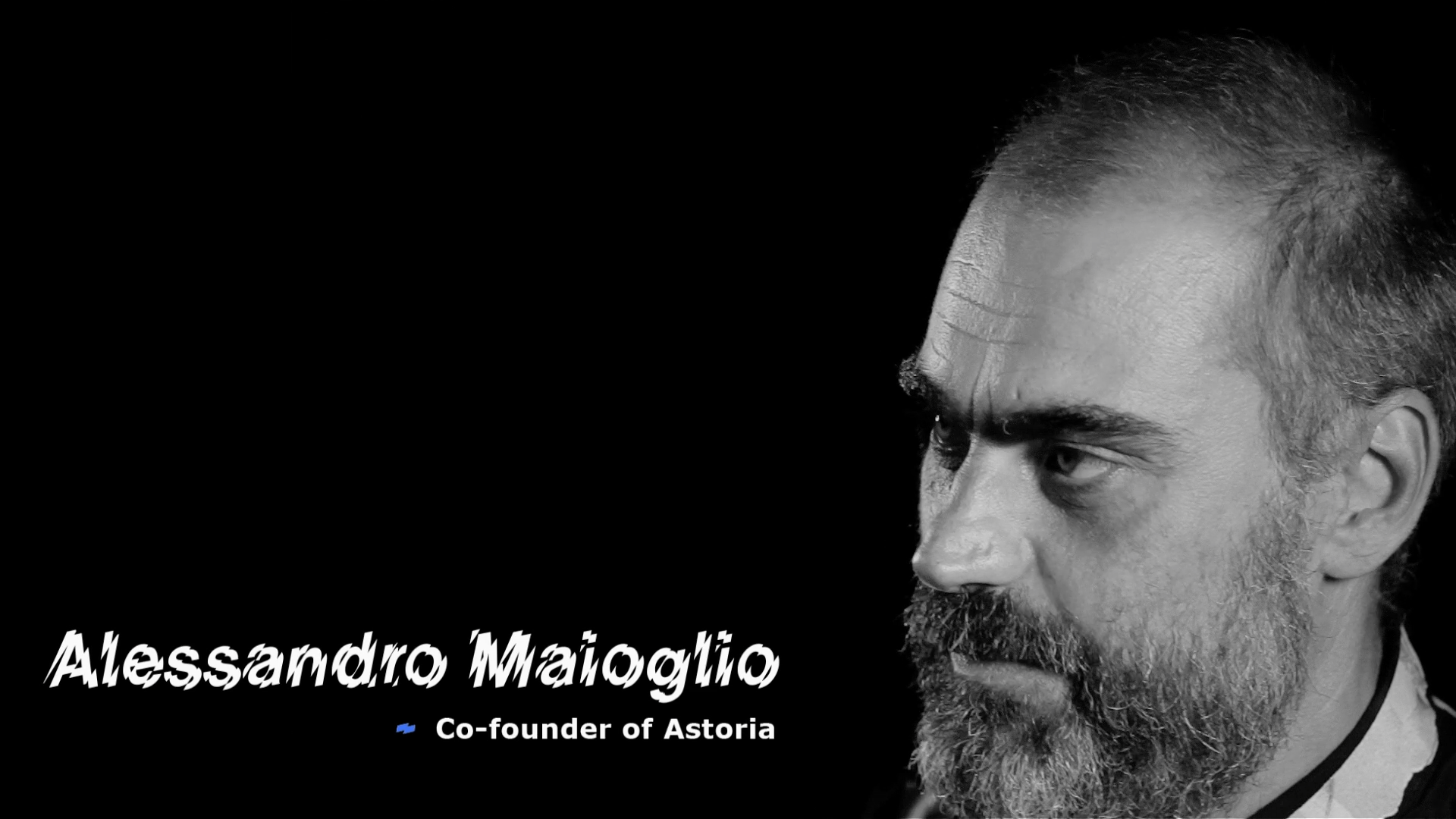
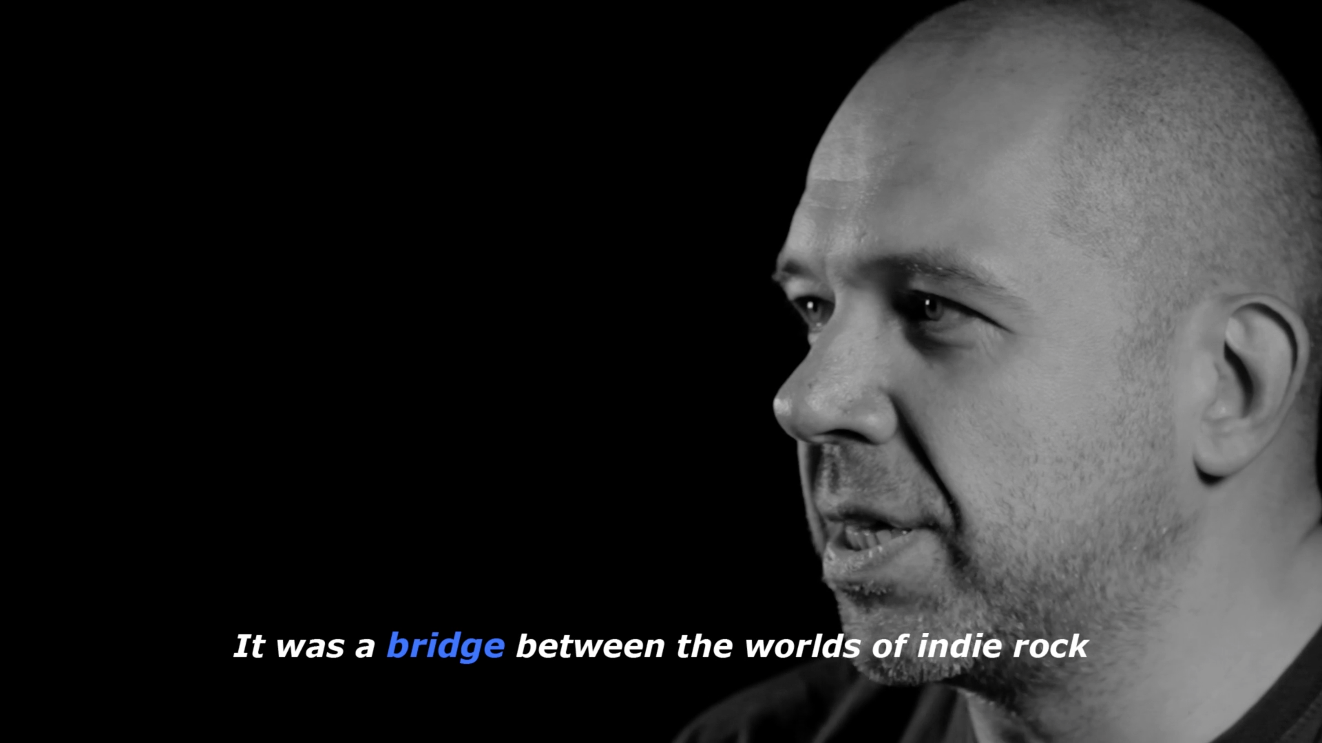
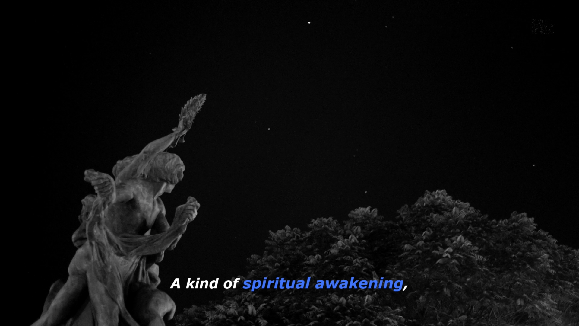
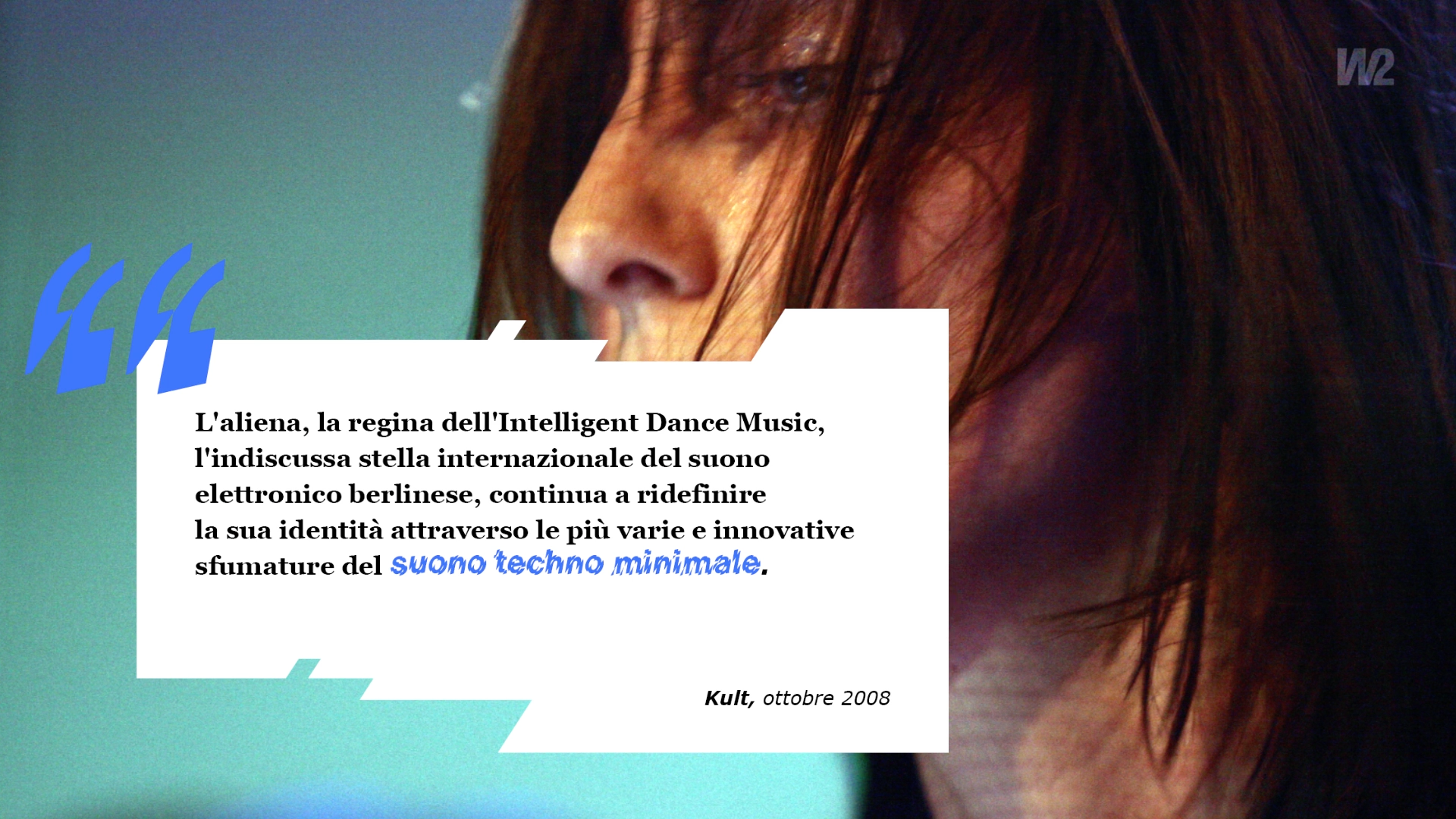
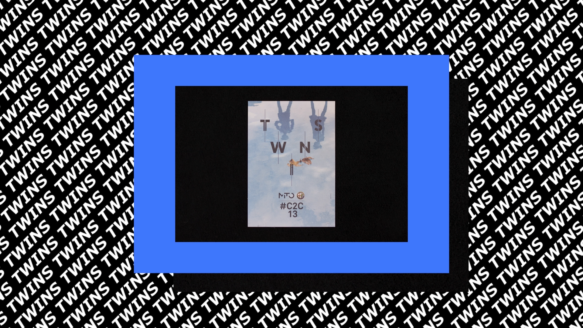
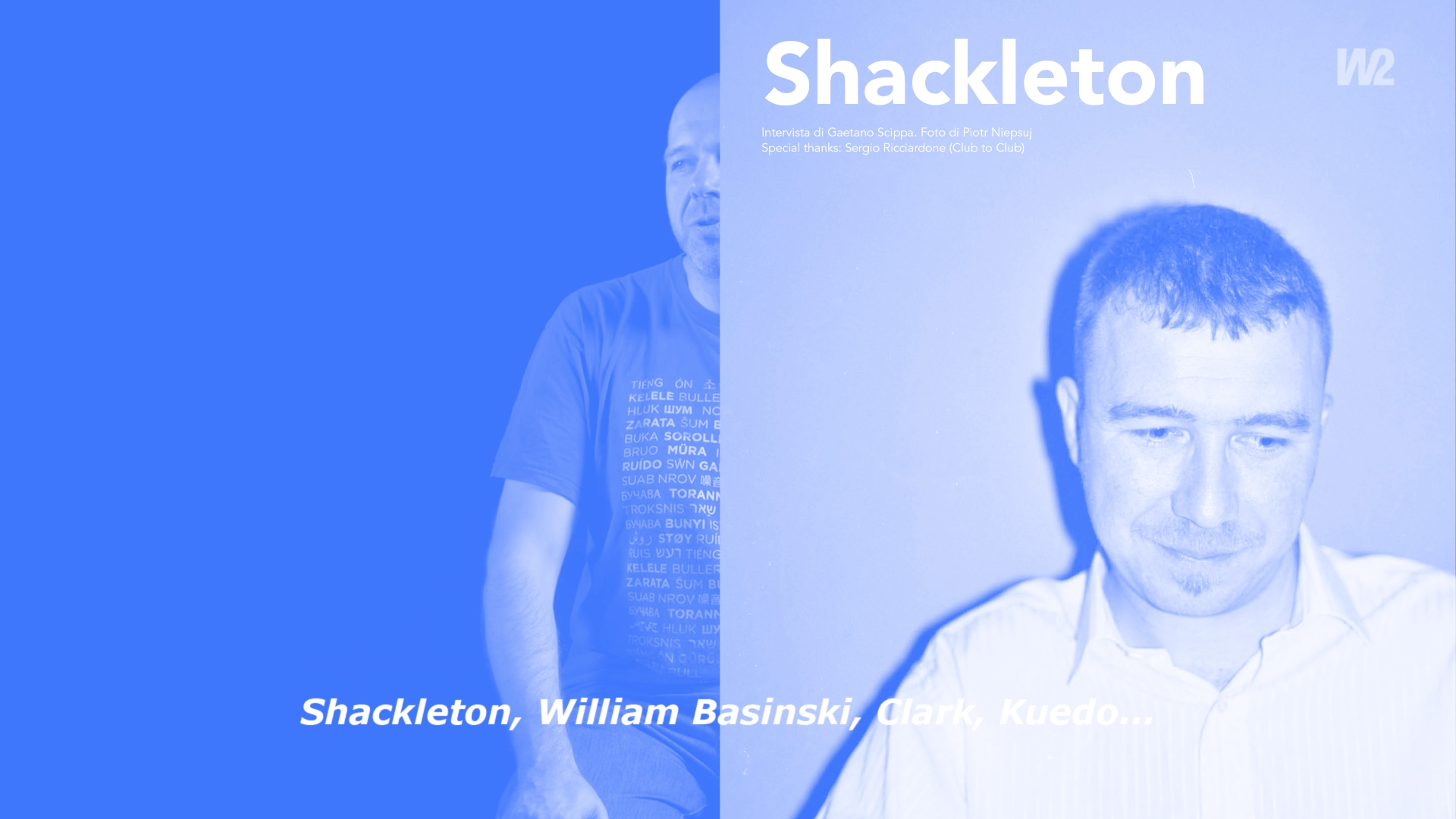
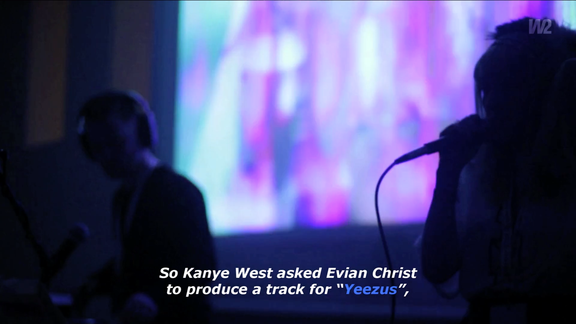
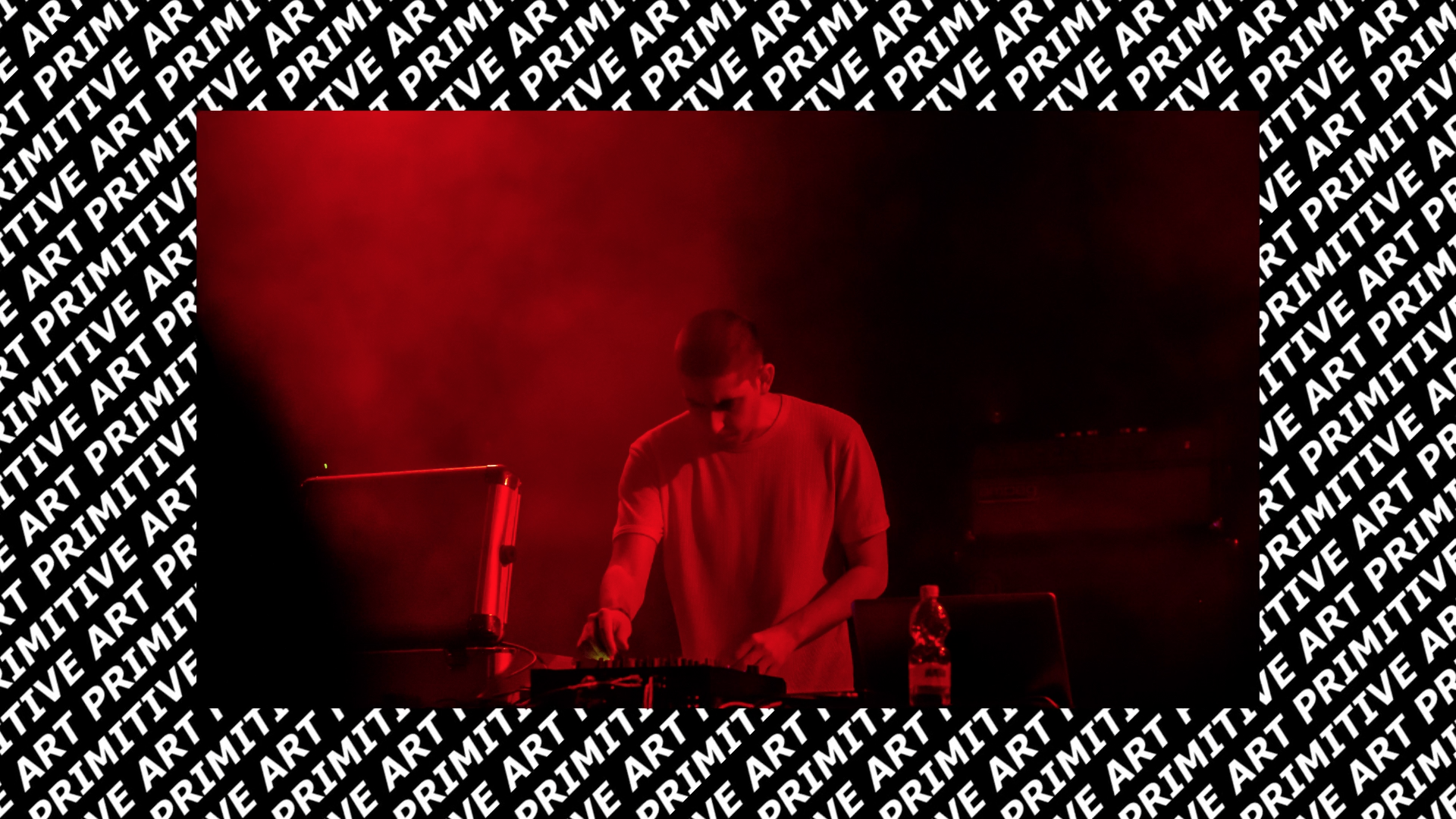
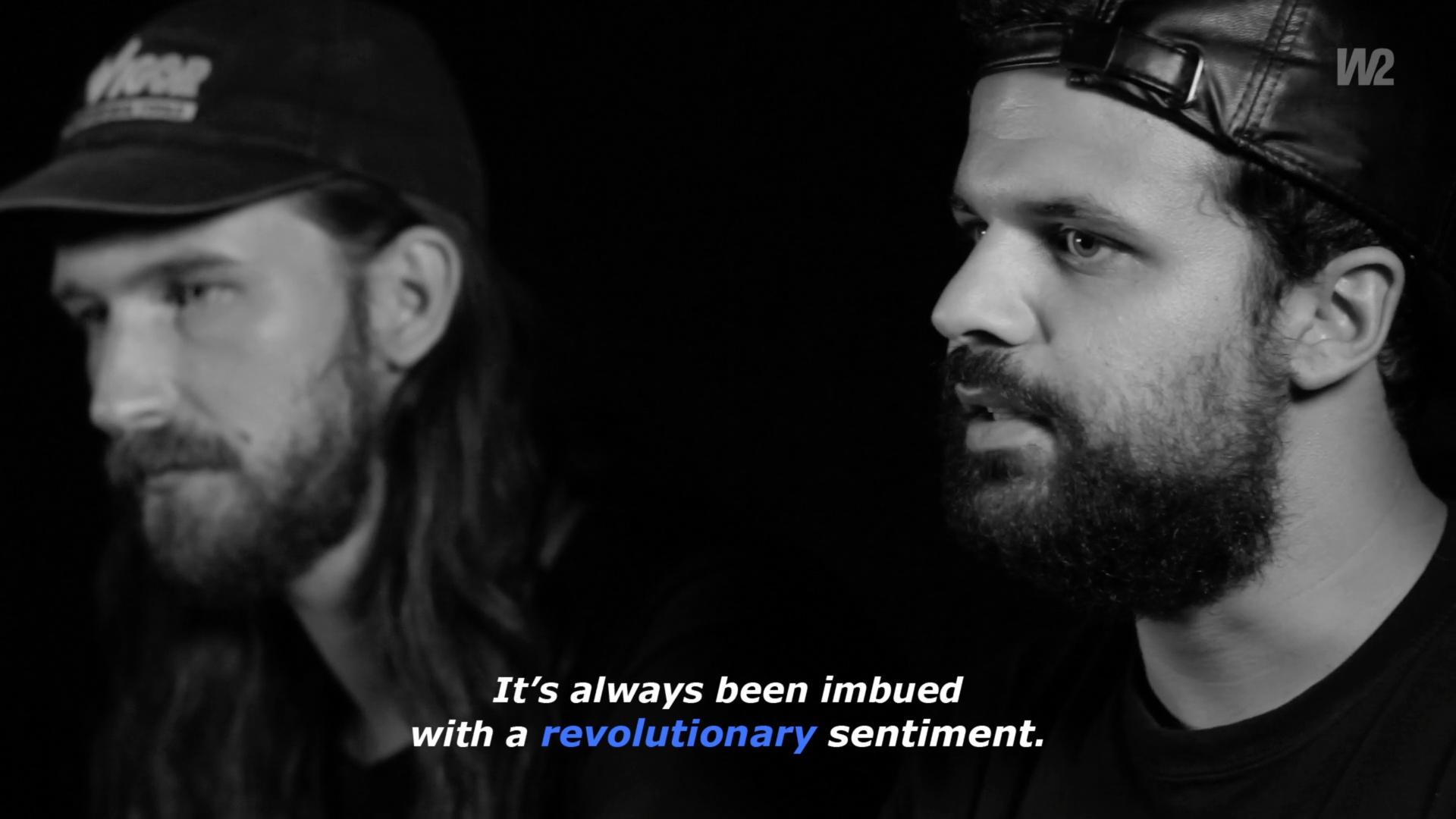
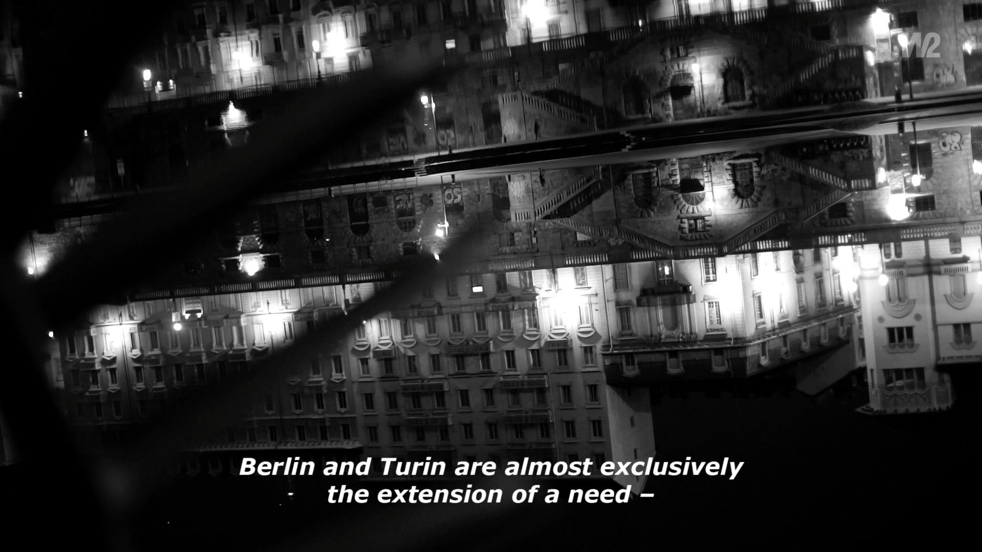
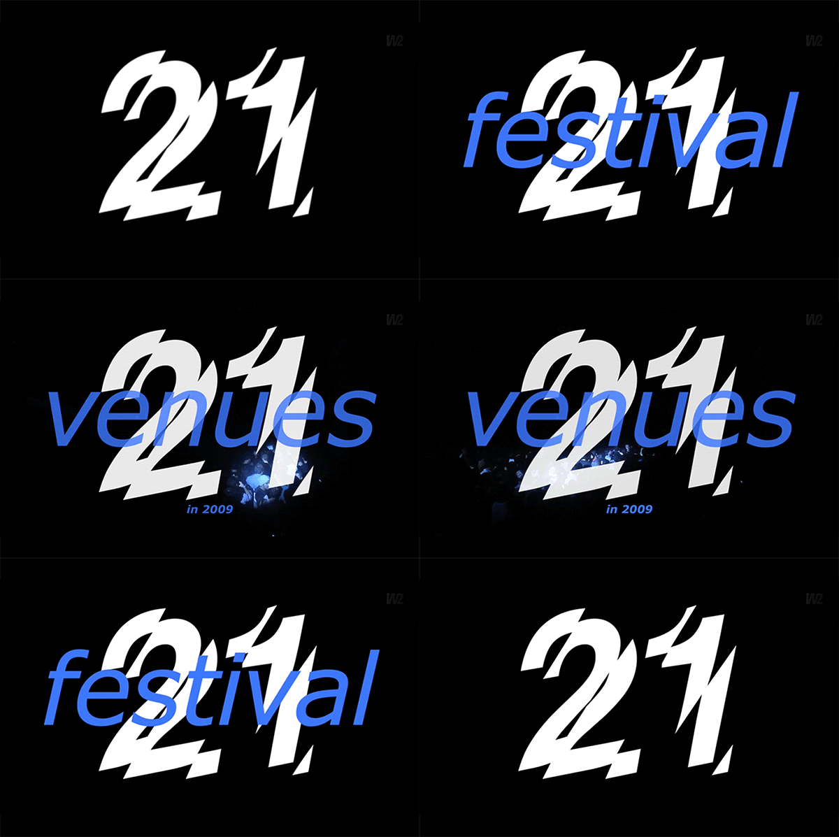
Sunshine in November is a documentary written and directed by Carlotta Petracci. It is about Club To Club festival in Torino, told by those who have witnessed it from the beginning, through their memories and projects.
Opening titles, subtitles and background graphics have been designed to guide this story, through a graphic project that refers to nightclubbing lights, that characterize the electronic music stage.

Written and directed by Carlotta Petracci

VIRGILLO_sunshine_november_c2c
VIRGILLO_sunshine_november_c2c_label


Watch the complete video on Vimeo

A White production
Written and directed by Carlotta Petracci
Photography: Corrado Marchigiano
Editing and post-production: Carlotta Petracci and Corrado Marchigiano
Graphic design: Silvia Virgillo
Sound editing: Alessandro Vendrame
English translation: Michelle Nebiolo

Kel12 magazine

/ magazine layout /

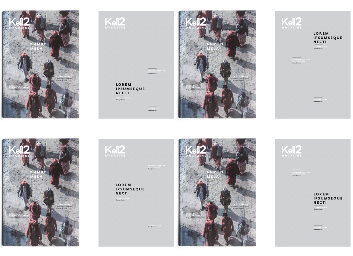
The magazine, property of the tour operator Kel12, has been launched in this redesigned version in September 2015, in order to offer travel reviews and articles about foreign cultures to its customers.

Editor in chief: Stefano Ampollini
Managing editor: Marilena Roncarà
Art director and photo editor: Carlotta Petracci
Editorial designer: Silvia Virgillo
Graphic designer: Anna Tortora
Publisher: Contemporanea srl


carlottapetracci.com

/   digital identity   /   web design   /

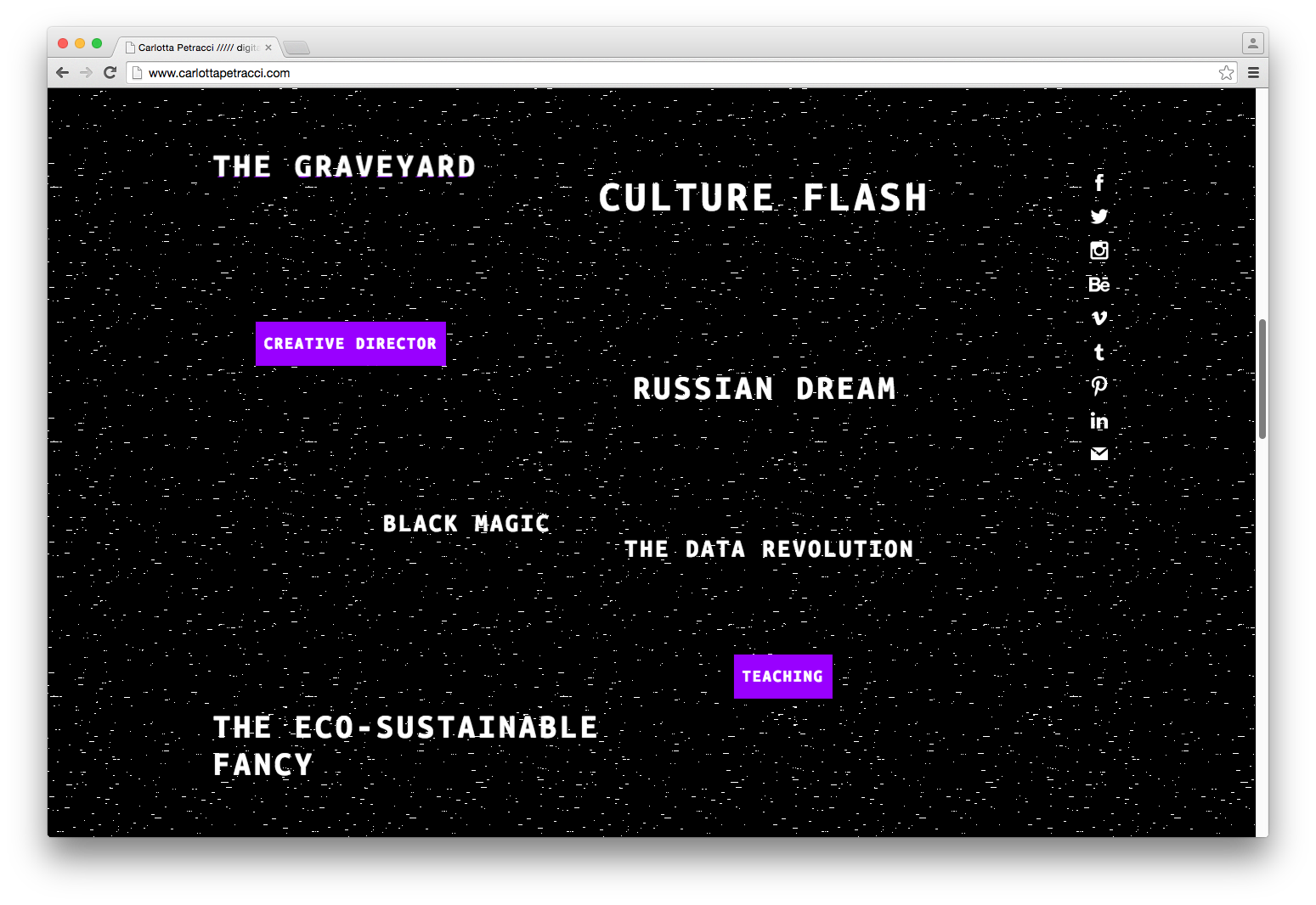
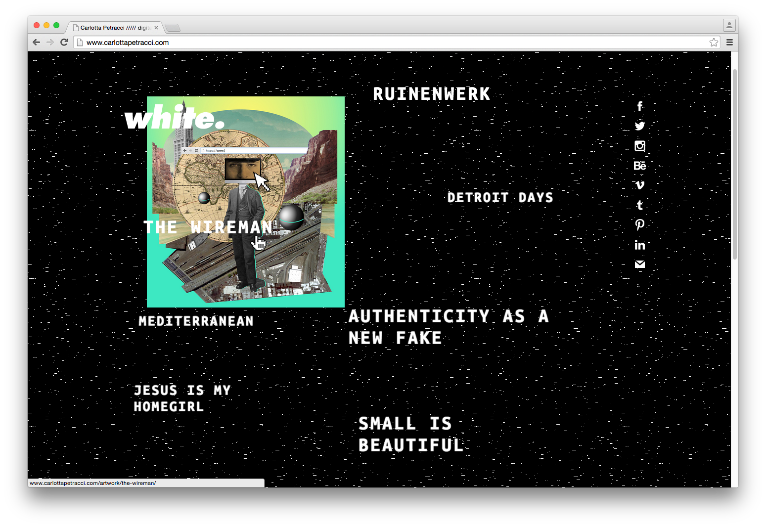
Digital, random, extreme. It's the web identity designed for Carlotta Petracci, italian digital catalyst.
Website coded by Ferdinando Cambiale


GQ Italia - stage


/ editorial design /

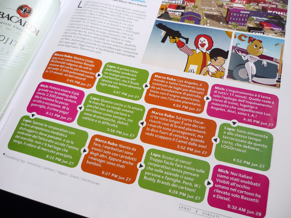
In the last months I had a wonderful experience at GQ Italia, dealing with the redesign of some magazine's sections and with numerous articles. With the help of Aldo, Barbara, Dafne, Mattia and Stefania I learned the fundamental skills of editorial design.

Art director: Aldo Buscalferri
Editor in chief: Michele Lupi

Gcult was the name of the magazine's last section, containing articles about exhibitions, books and cultural events. The request was to make it more appealing, through the design of a header to be included all along the section.

Fly and eat and Carbonara a chi? were two specific columns: the first recommended a place of refreshment overseas, reachable just by air travel, while the second proposed classic food reinterpreted in an unusual way.
The request was to design two pictograms for these two columns: in the first a dish became a globe with a plane flying around it, while in the second an exclamation point indicated the presence of something unusual to watch.

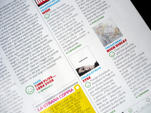
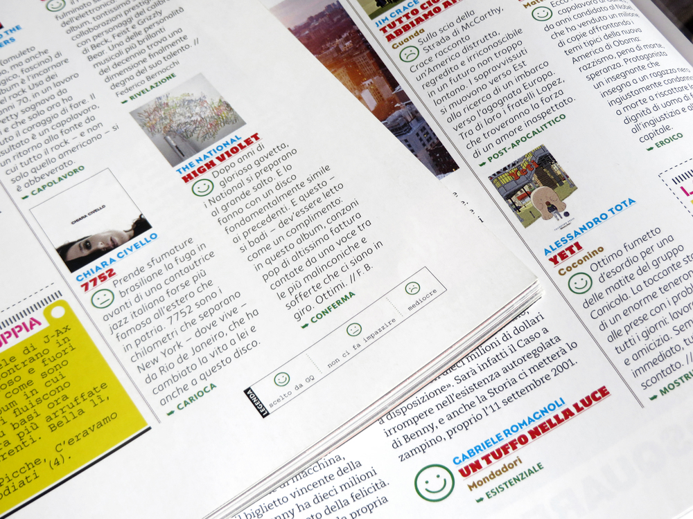
Inside Scanner section some reviews on music, movies and books were presented, with judgments on their quality. To make these opinions more clear, there was the need for a graphic system to indicate immediately the positivity, or not, of the judgment. The request was therefore to design icons that could absolve the task with ease. Different iconic systems were presented, from the most common as the stars, to the more complex such as crowns or scores, represented by hand's fingers. The latter in particular could adapt well to the reviews, but the design was too complex to be used in very small size. So, at the end, smileys were selected, with three different levels of judgment.