/ editorial design /
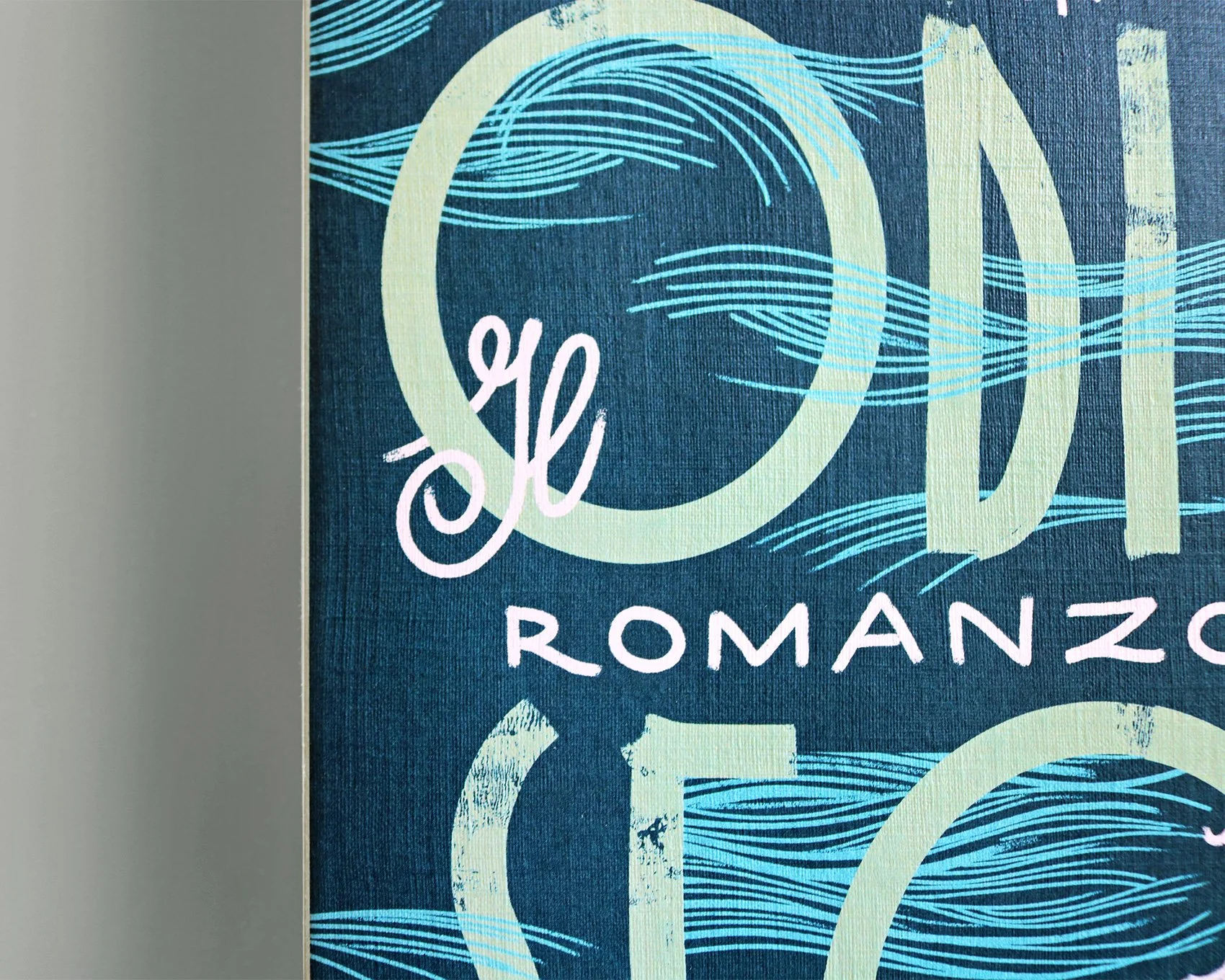
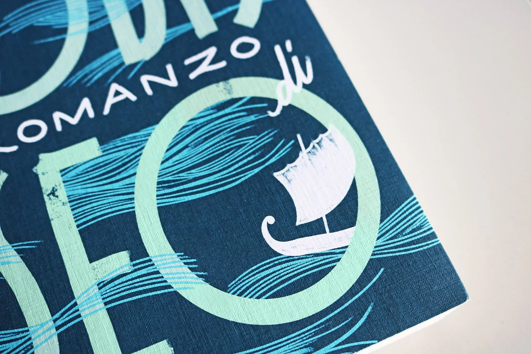
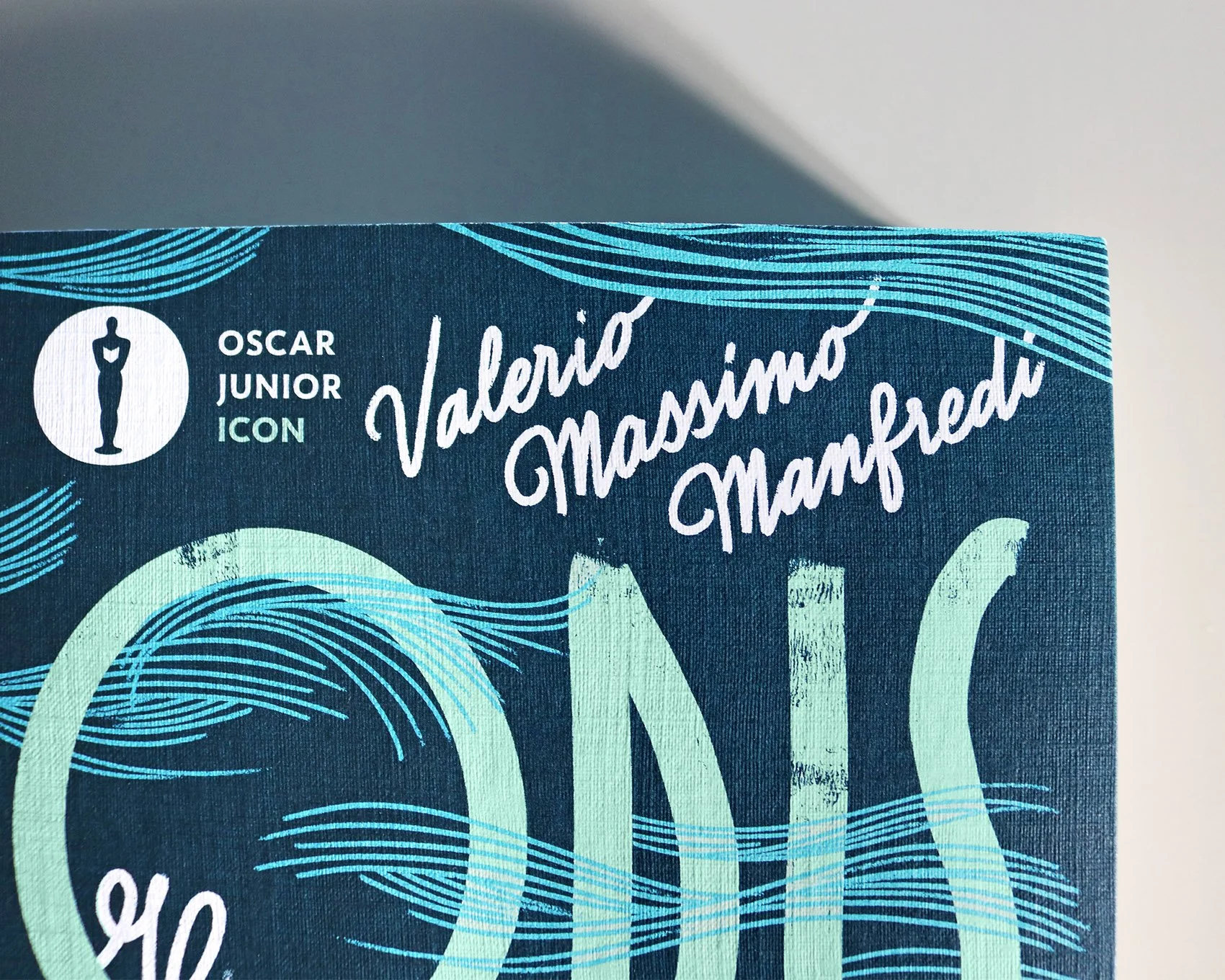
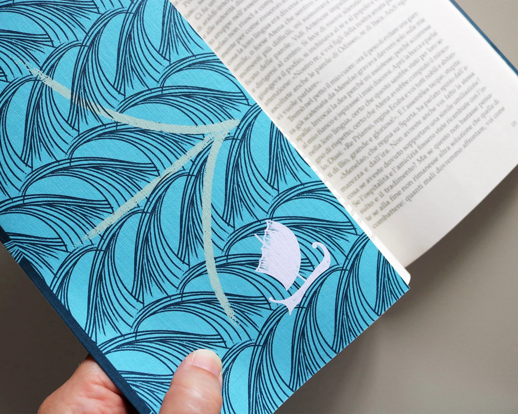
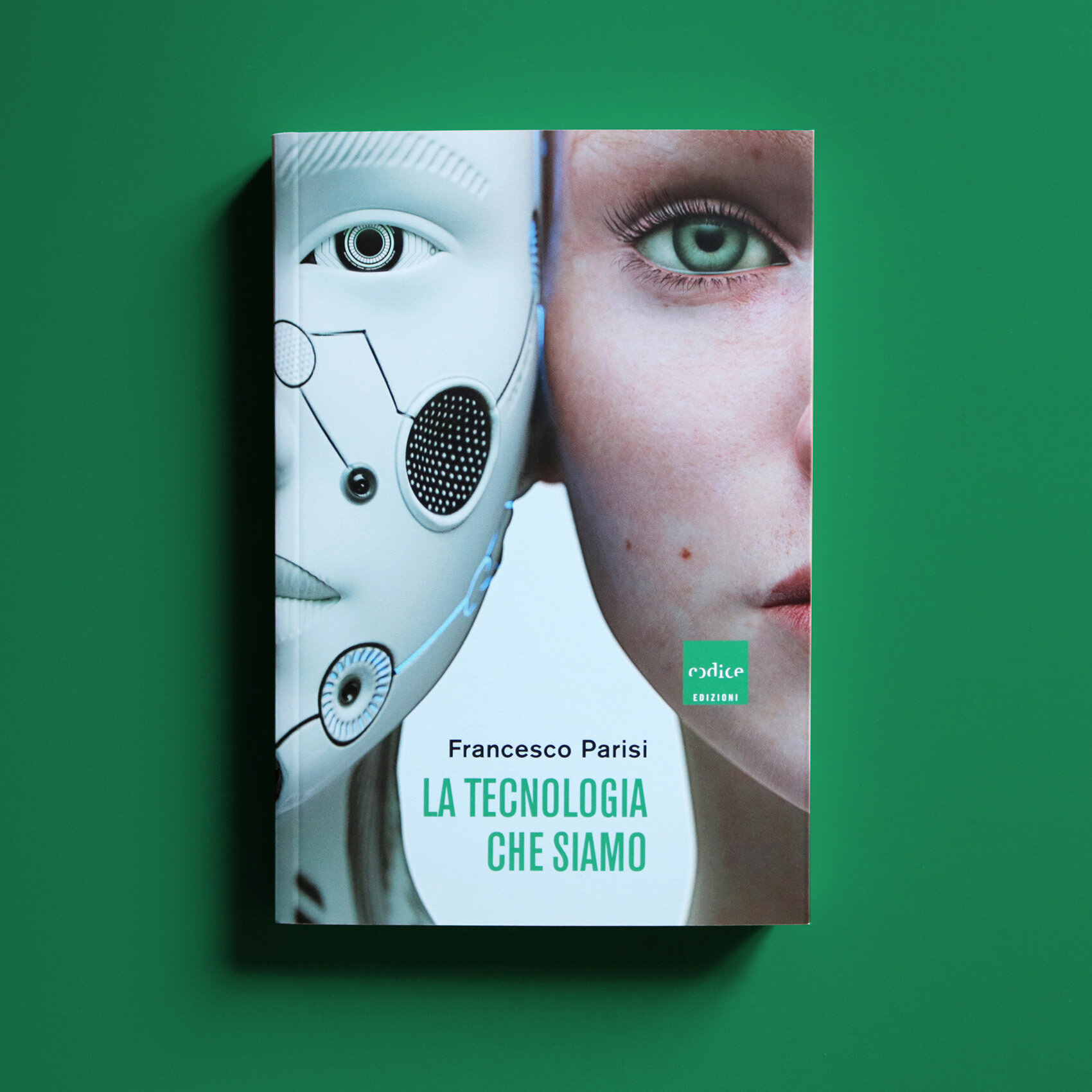
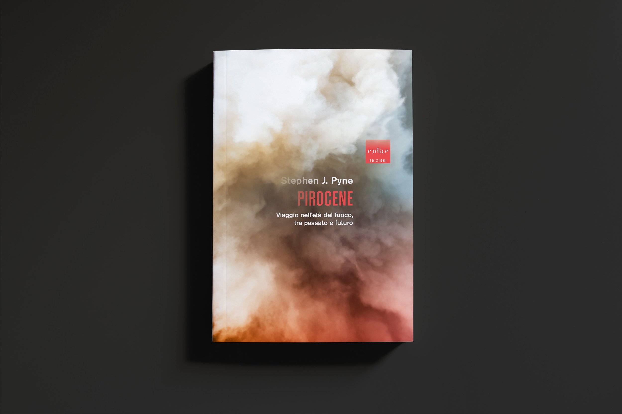
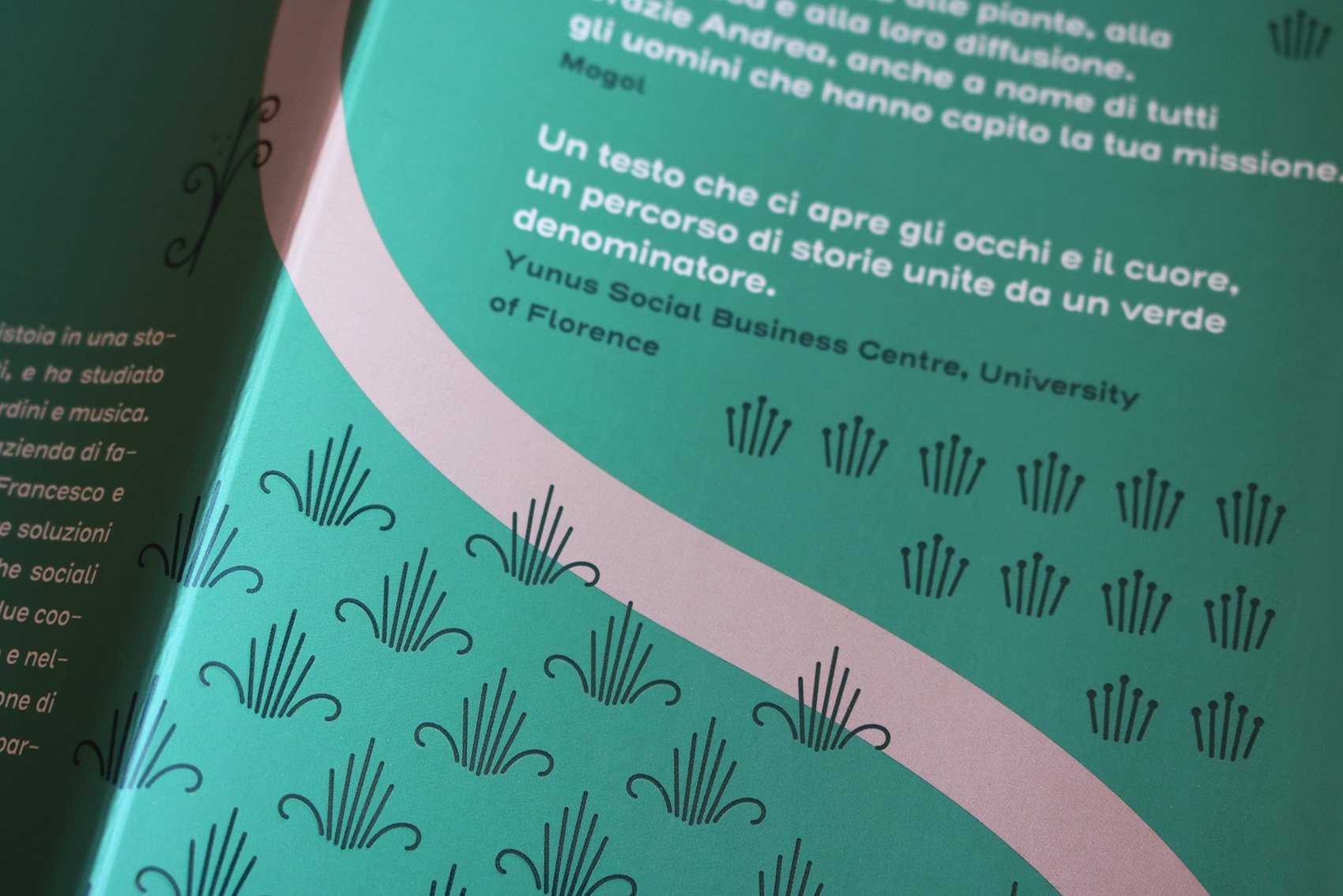
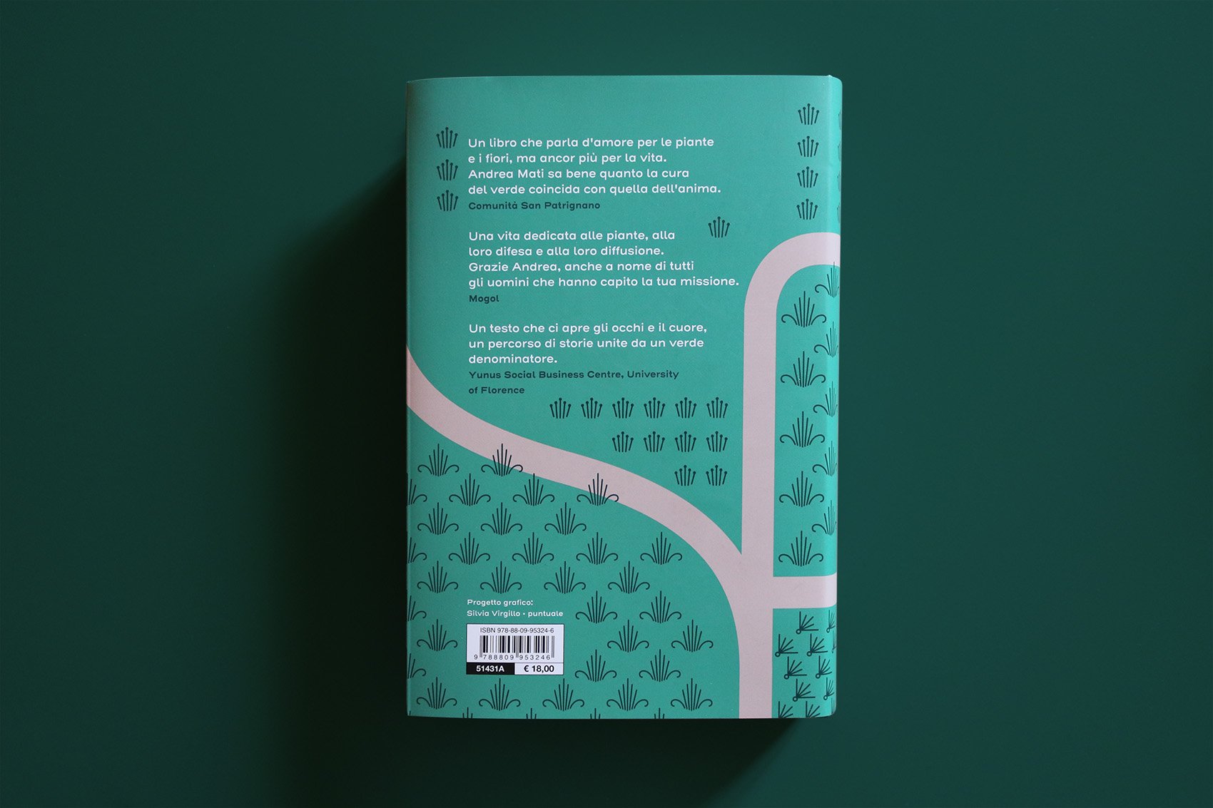
In 2019, Codice Edizioni decided to renew the graphic design of its books across both its scientific and fiction titles. The aim of the redesign was to achieve consistency and recognizability through a simple and flexible layout. One of the key requirements was to make the cover images as clear and prominent as possibile.
The cover layout is based on a grid that echoes the square shape of Codice’s logo, a distinctive element that was left unchanged. There are several possible placements on the grid for the logo and text, while maintaining a consistent diagonal alignment. Images stand out thanks to the absence of frames and decorative elements that could distract from them.