/ book layout / illustration /
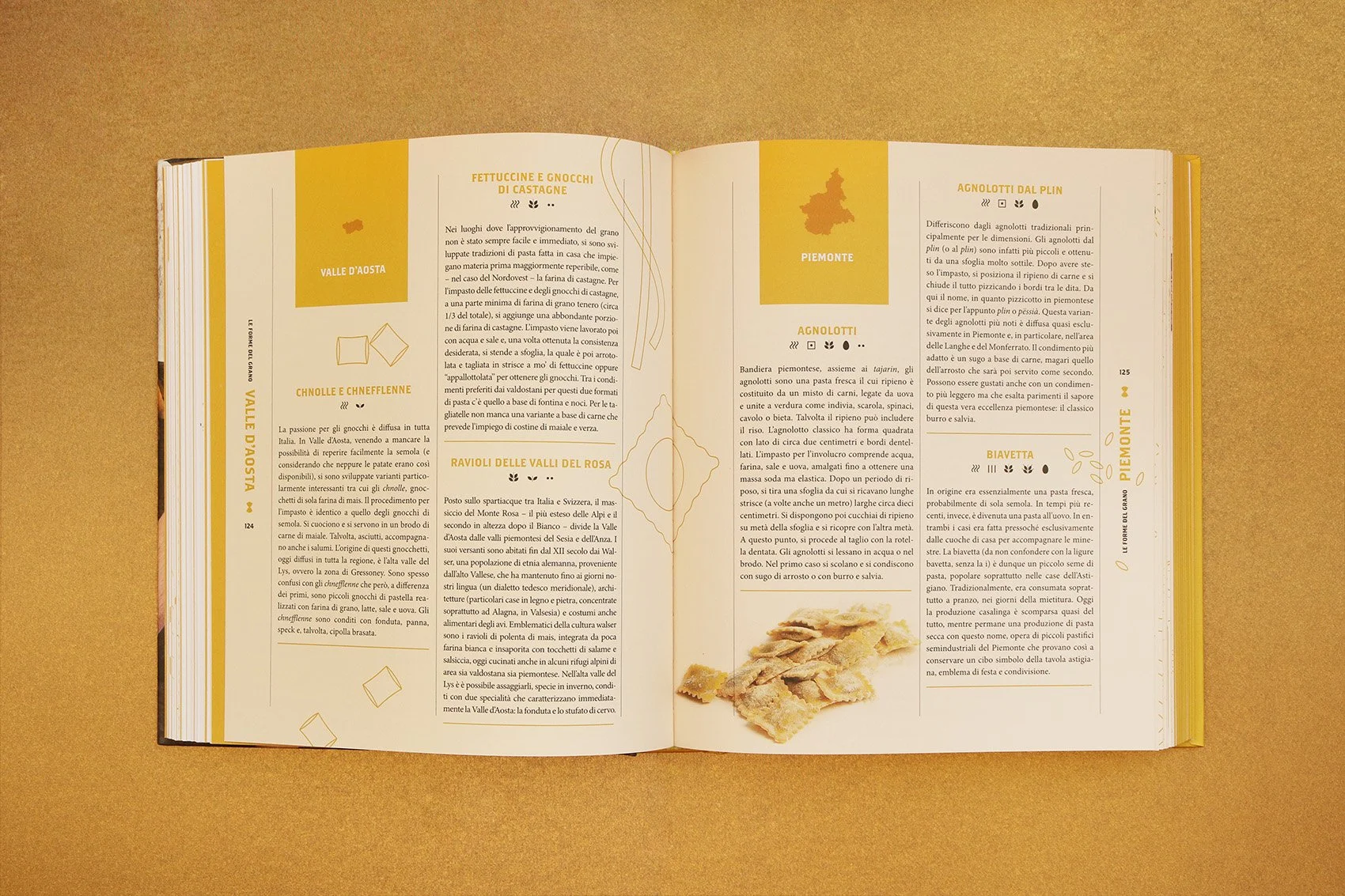
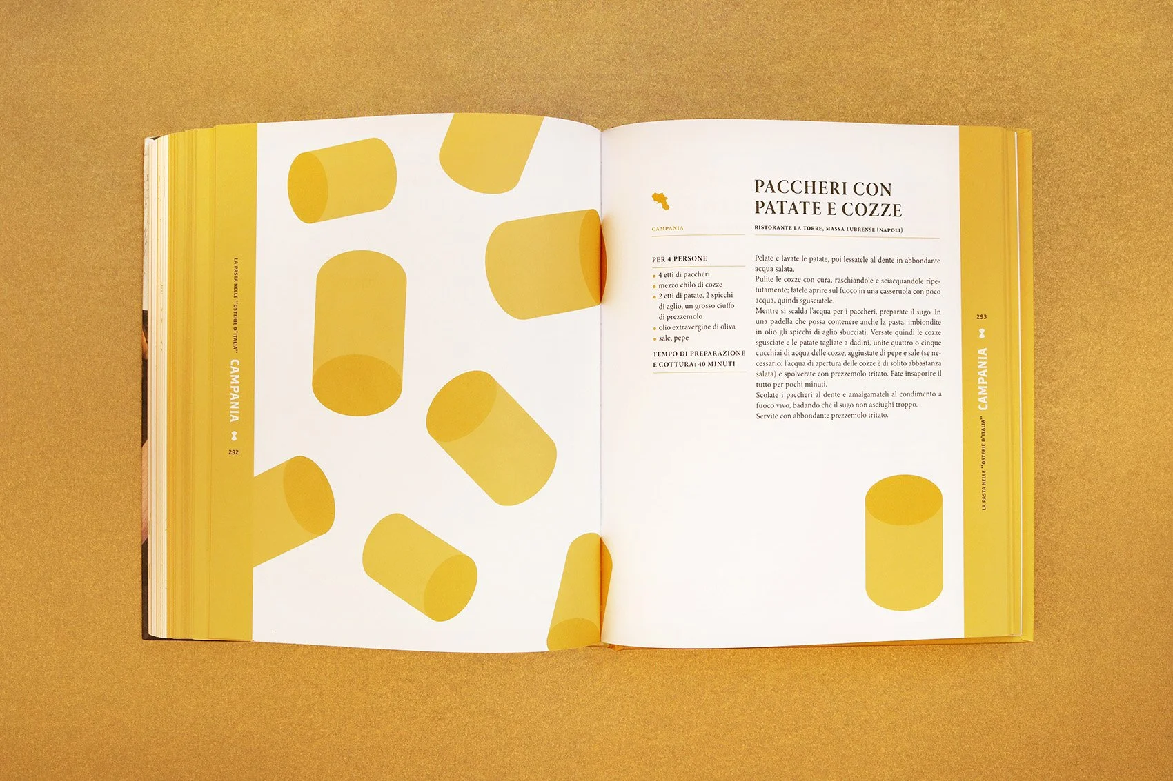
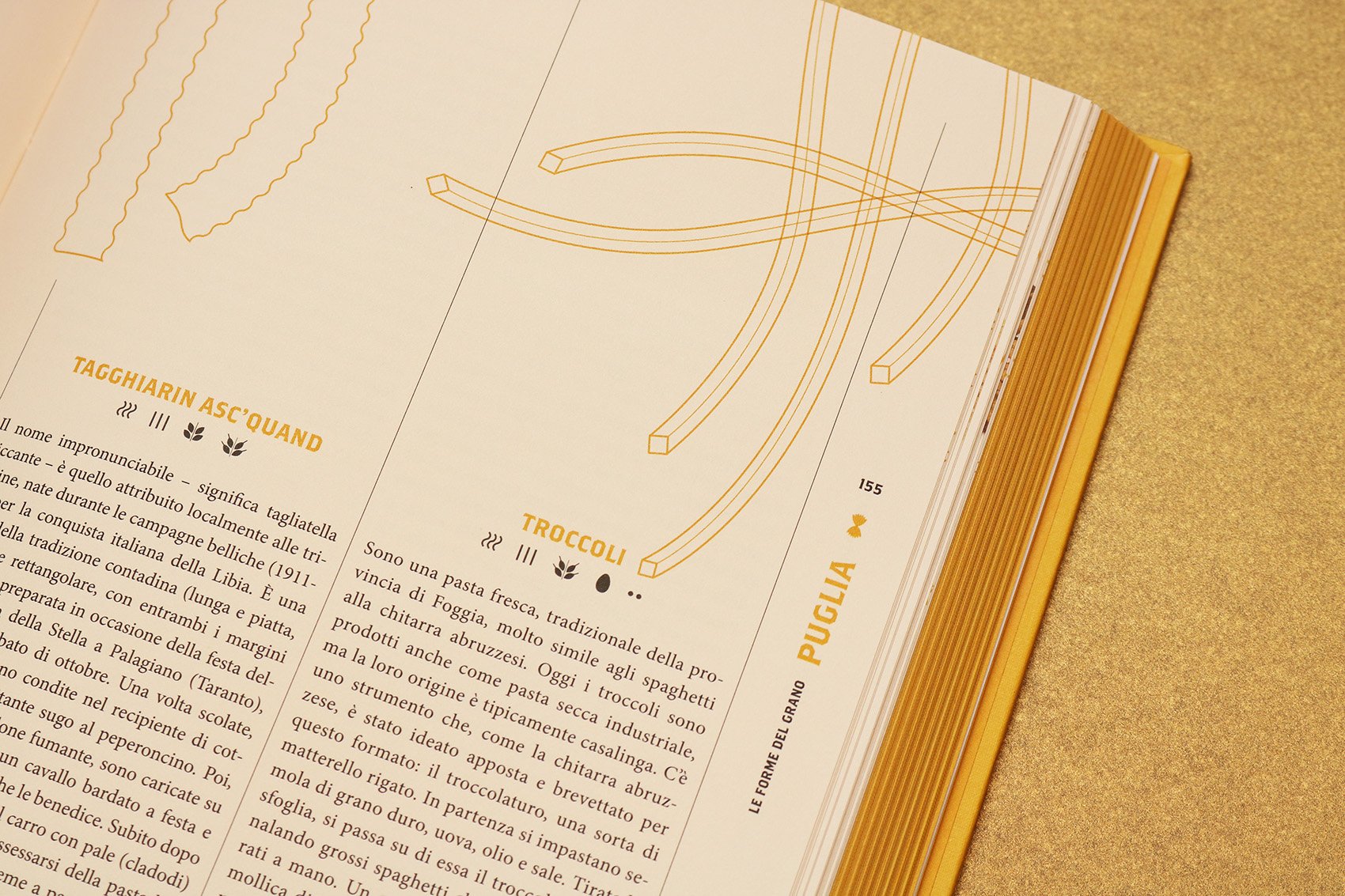
A book about pasta shapes, recipes and stories that have made this food symbol of Italian gastronomic culture.
Published by Slow Food Editore and curated by Antonio Puzzi.
A book about pasta shapes, recipes and stories that have made this food symbol of Italian gastronomic culture.
Published by Slow Food Editore and curated by Antonio Puzzi.
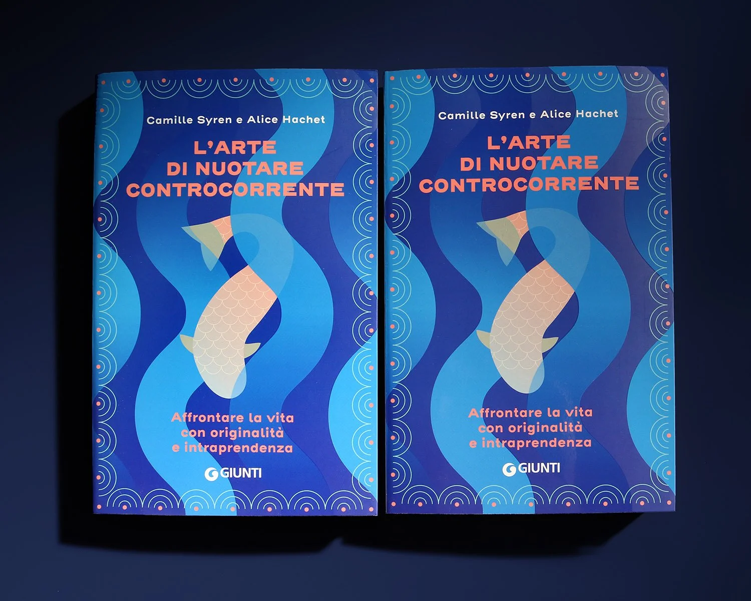
Lagom Swedish lifestyle is centered on balance, simplicity and serenity. The book collects tips related to home-life, health and sustainability, represented by the four icons on cover and on title page.
Published by Giunti Editore
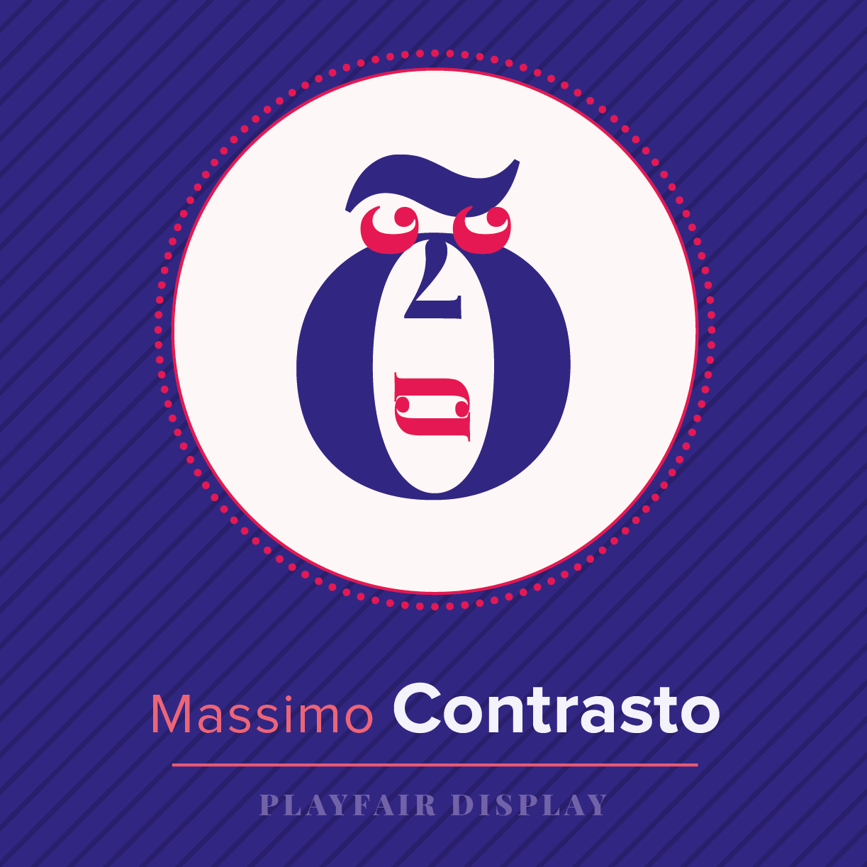
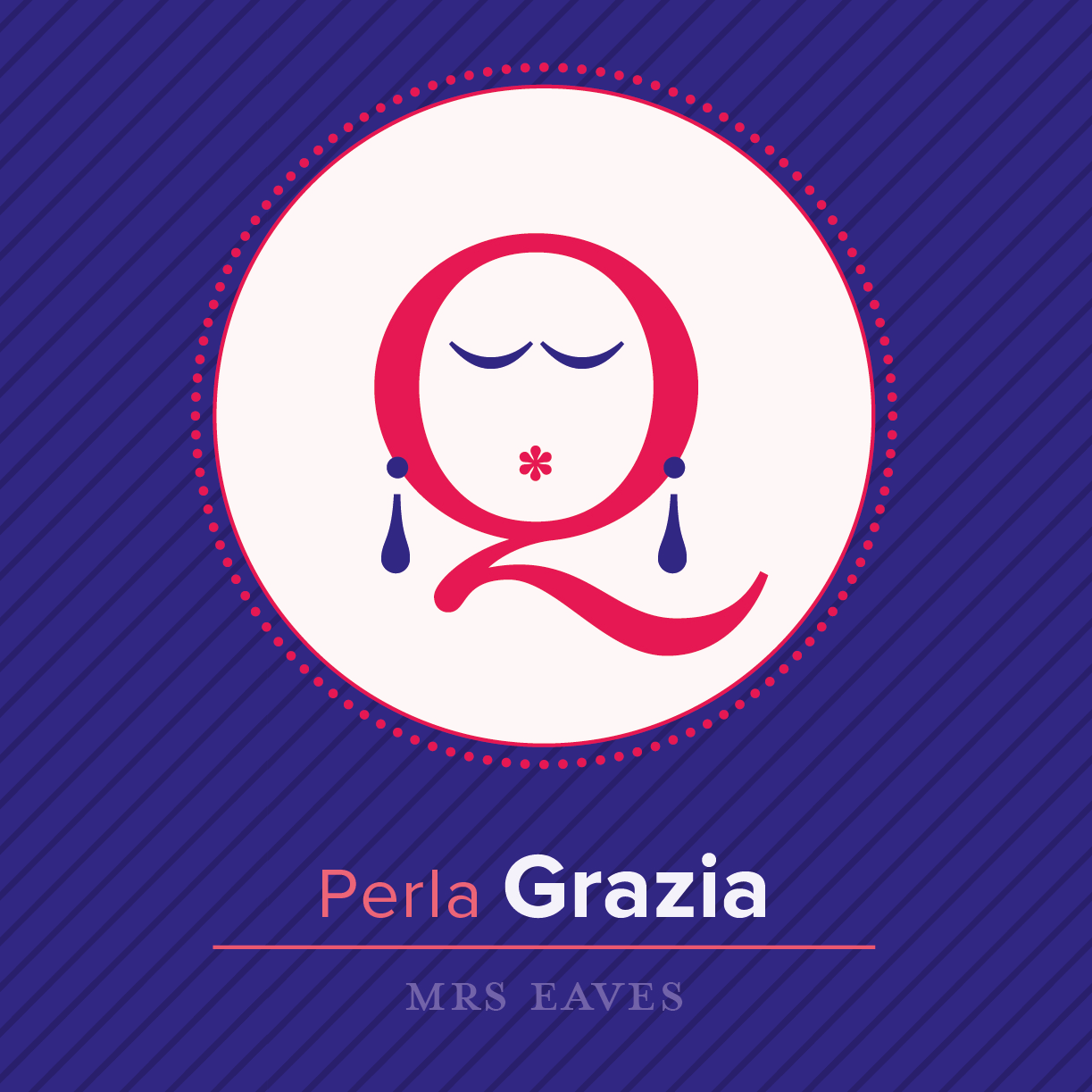
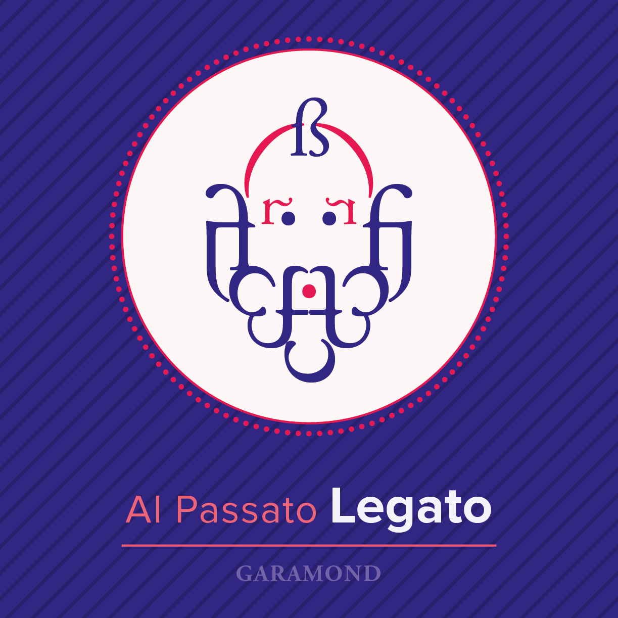
TIPIdeVOTI is a typographical artwork in which fictional politics combines with typography.
Designed for PolisGraphics exhibition as a poster and folded to be freely distributed to visitors, the artwork is an imaginary list of candidates, whose names relate to typographical features, used as graphic elements to illustrate their face.
Exhibition: PolisGraphics. Arti applicate “impegnate”
11-31 Ottobre 2017 - MIAAO, Galleria Sottana - Via Maria Vittoria 5, Torino
Curators: Enzo Biffi Gentili, Michele Bortolami, Tommaso Delmastro
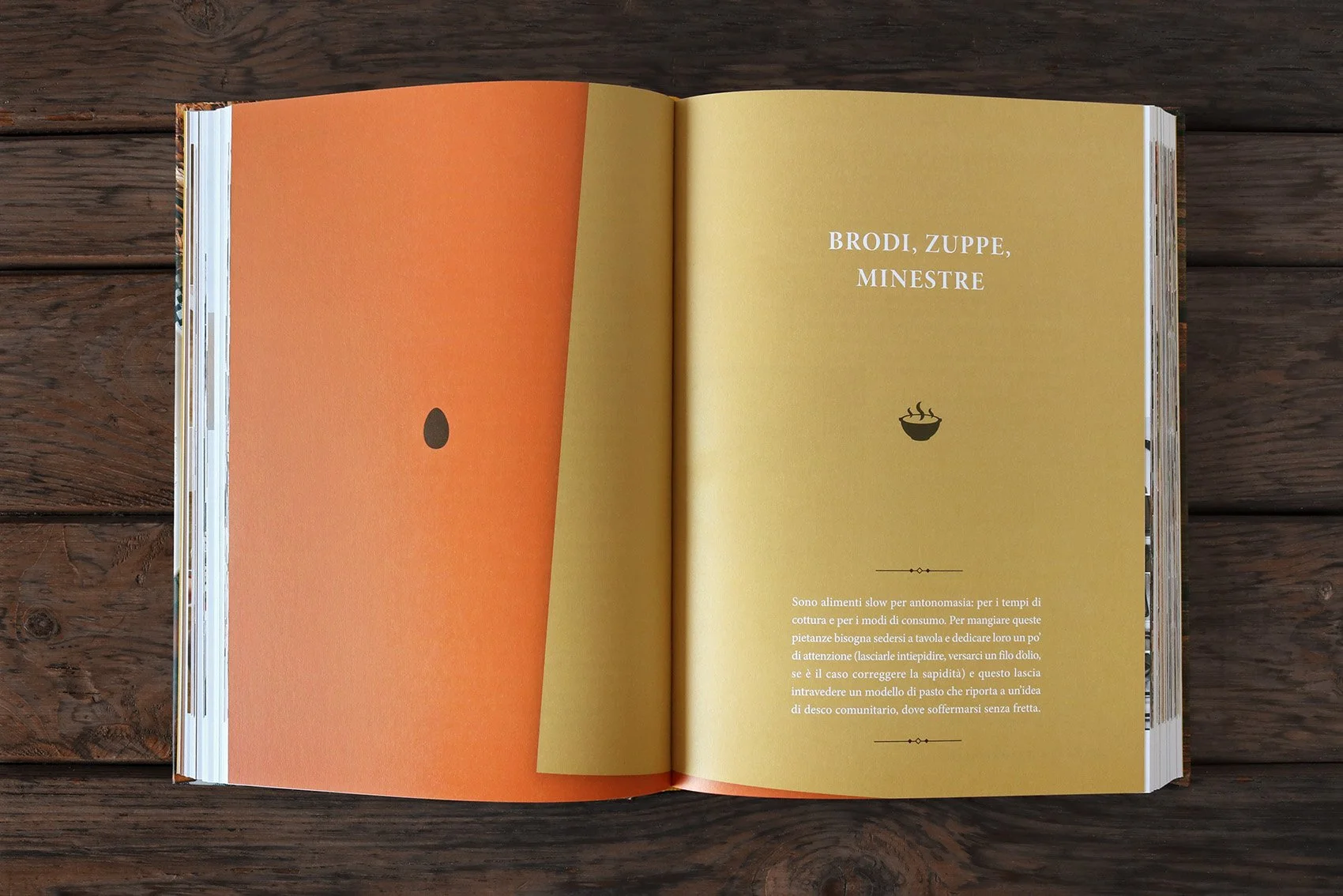
Real cooking classes by Slow Food to approach the kitchen in the way that has been the foundation of its philosophy for years, made of sustainability, quality and passion for the practice of preparing food. In this book recipes and tips about bread, vegetables, soups, pasta, fish, meat and sweets are collected.
All chapters feature an illustrative icon and a colour, while the bended angle is the common graphic element used for both backgrounds and images, as if there were sheets collected in a old recipe book.
Published by Giunti and Slow Food Editore
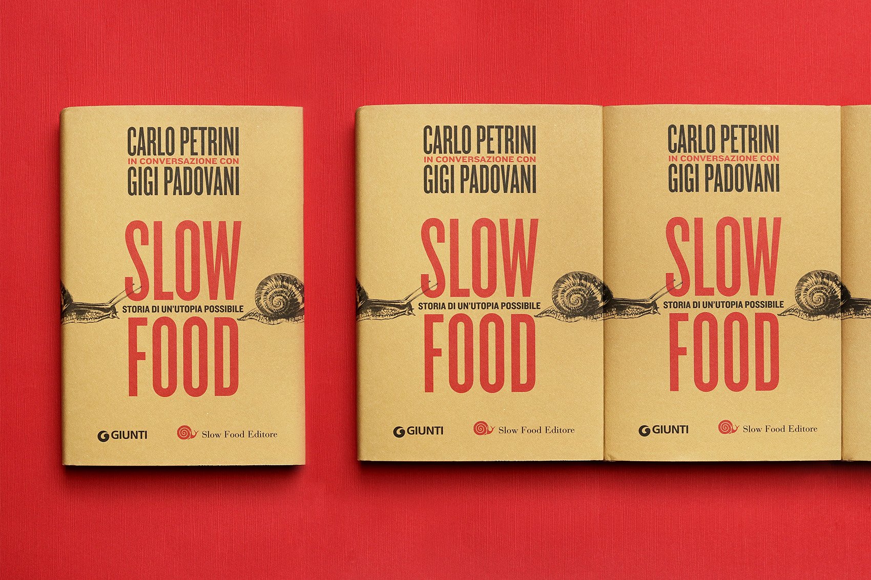
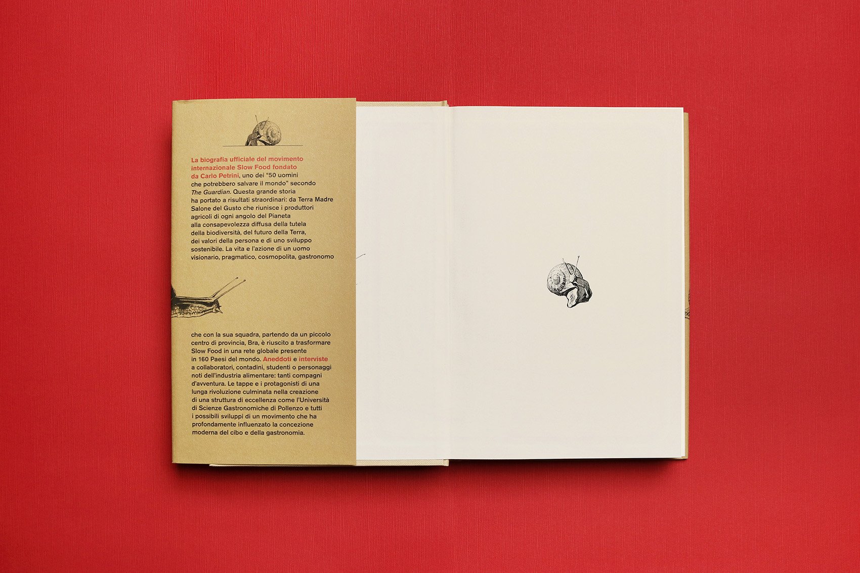
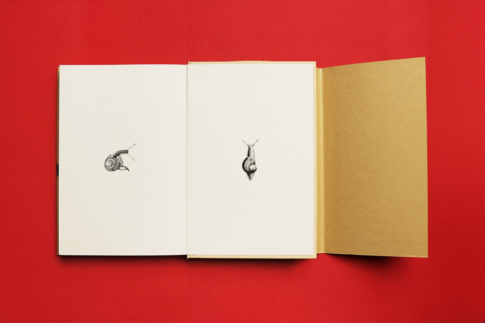
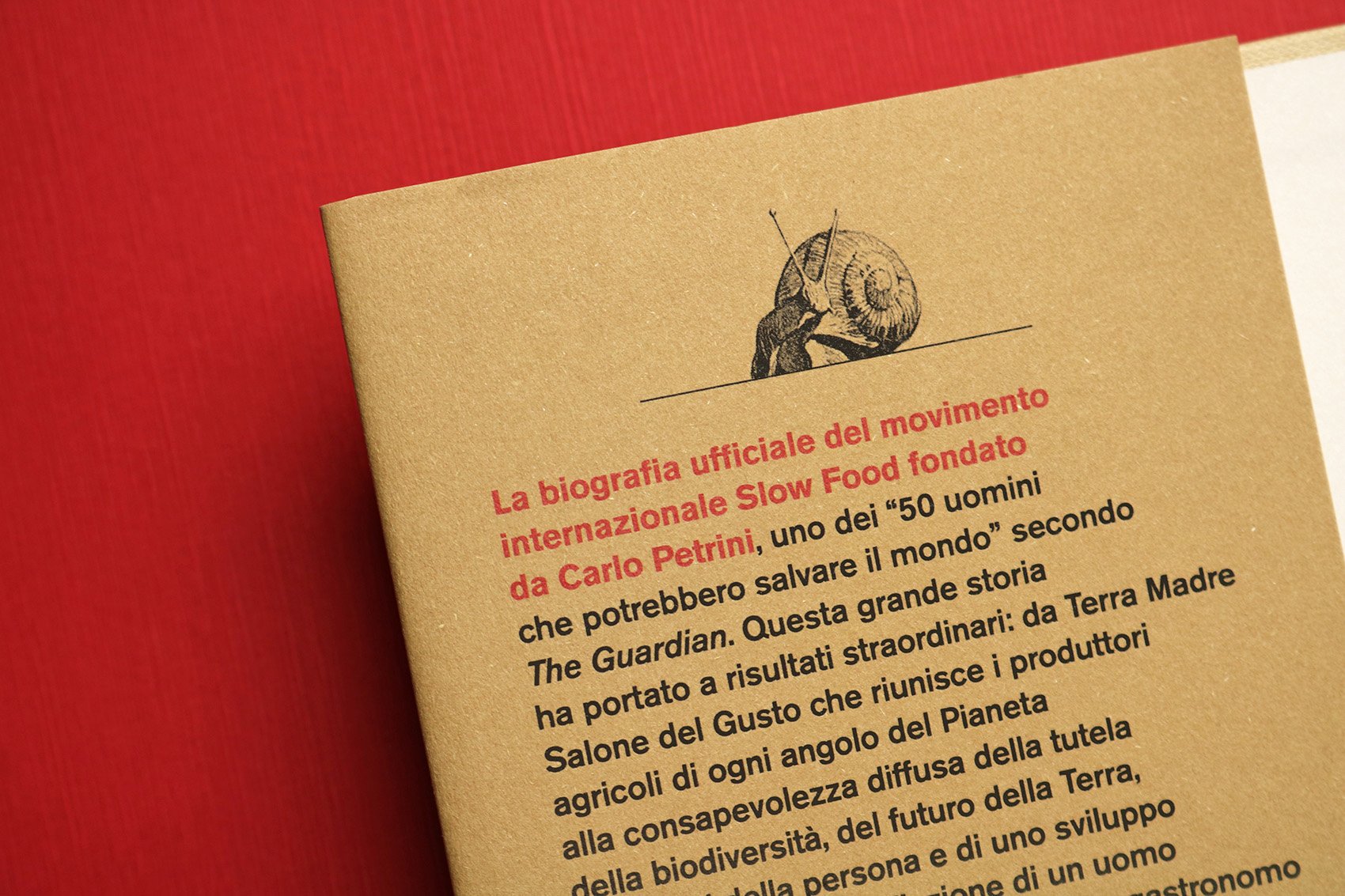
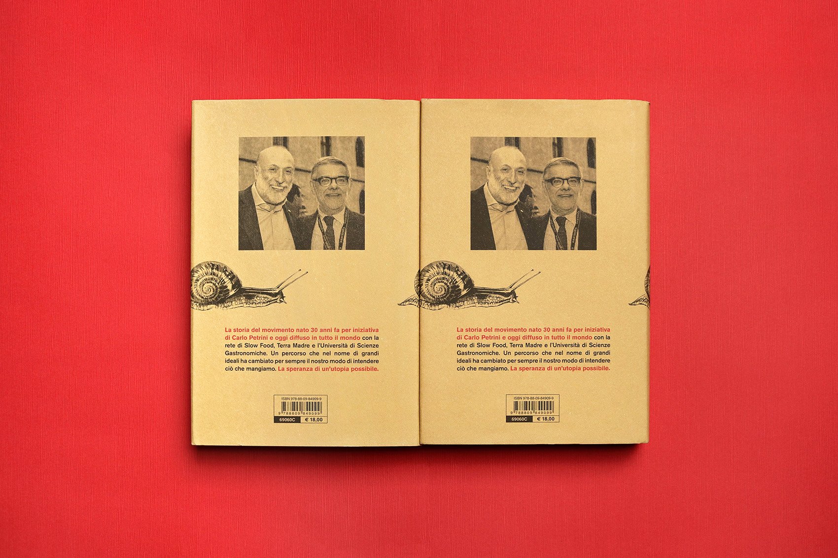
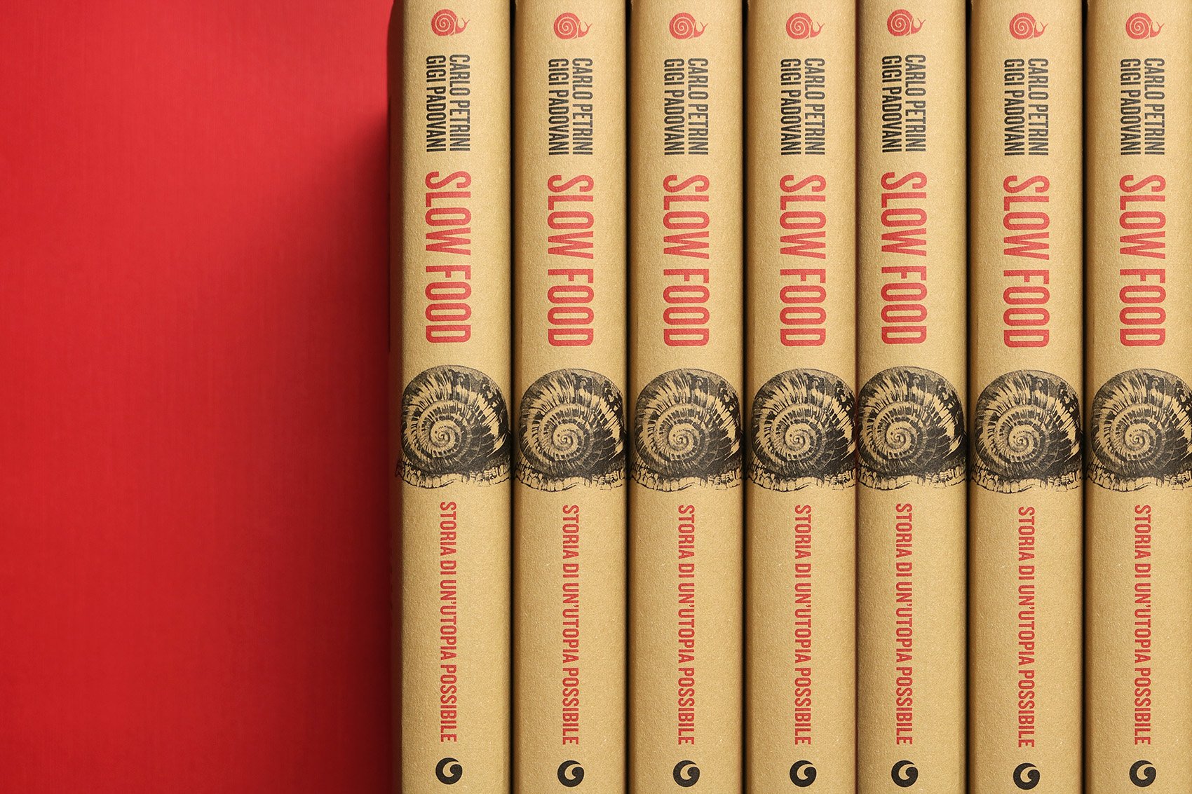
The movement founded by Carlo Petrini has become a global organization, spreading a new food philosophy. The book is about Slow Food history and its charismatic leader, one of the "50 men who could save the Planet" (The Guardian).
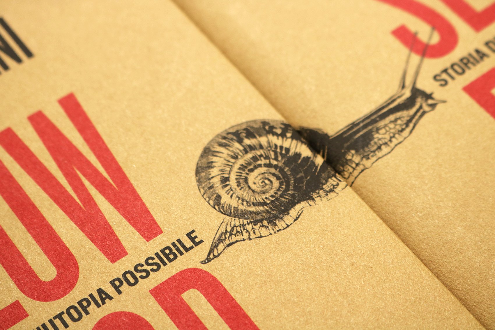
The story goes on and looks ahead, like the snail on the cover, in a continuous journey towards our future.
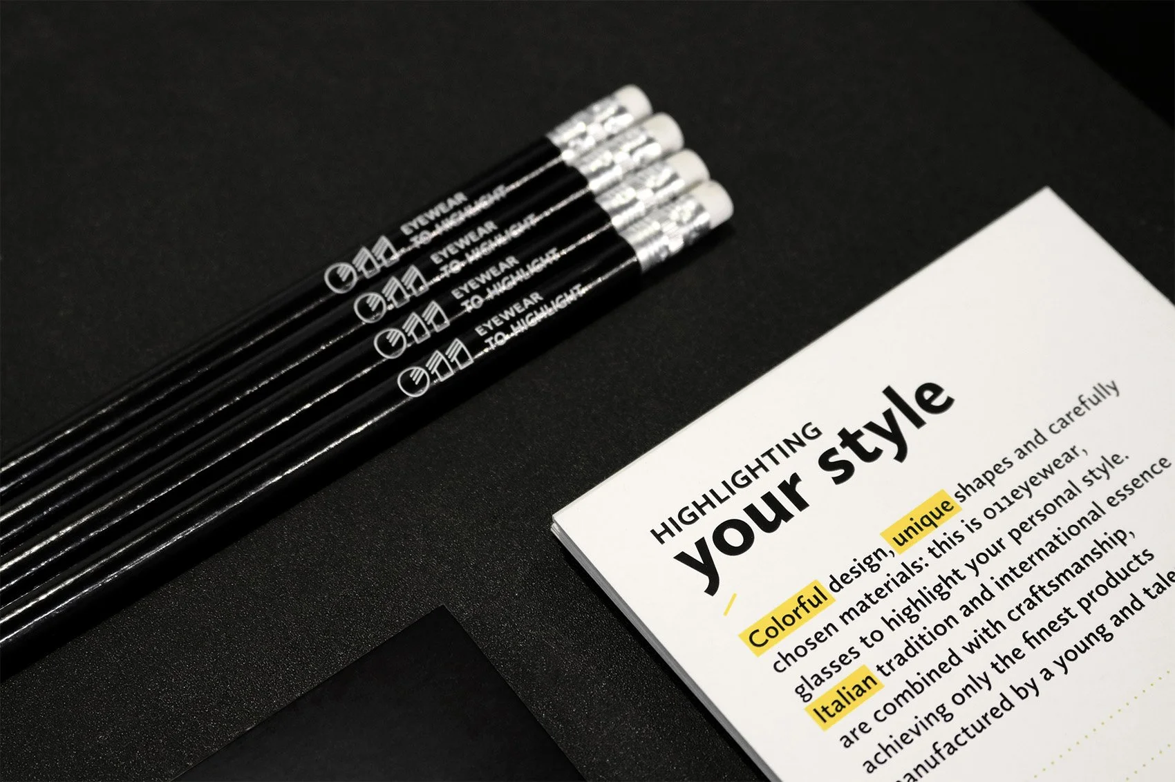
011 is an eyewear brand run by Daniele and Simone Testore; it focuses on a colorful and unique design, mixing classic shapes with original frames.
011 eyewear to highlight is the payoff, chosen to rapresent the brand intent to stand out through a clear and recognizable style.
QuantuMine is a documentary about Mine film. A tribute to a movie near to science fiction, in which consciousness is the main protagonist.
Titles, introductions and subtitles come together with graphics inspired by quantum particles, represented as moving points.
Written and directed by Carlotta Petracci
The documentary is available inside Mine DVD and Blu-Ray, distributed by Eagle Pictures.
Here is the QUANTUMINE official trailer ☛ https://vimeo.com/201108861
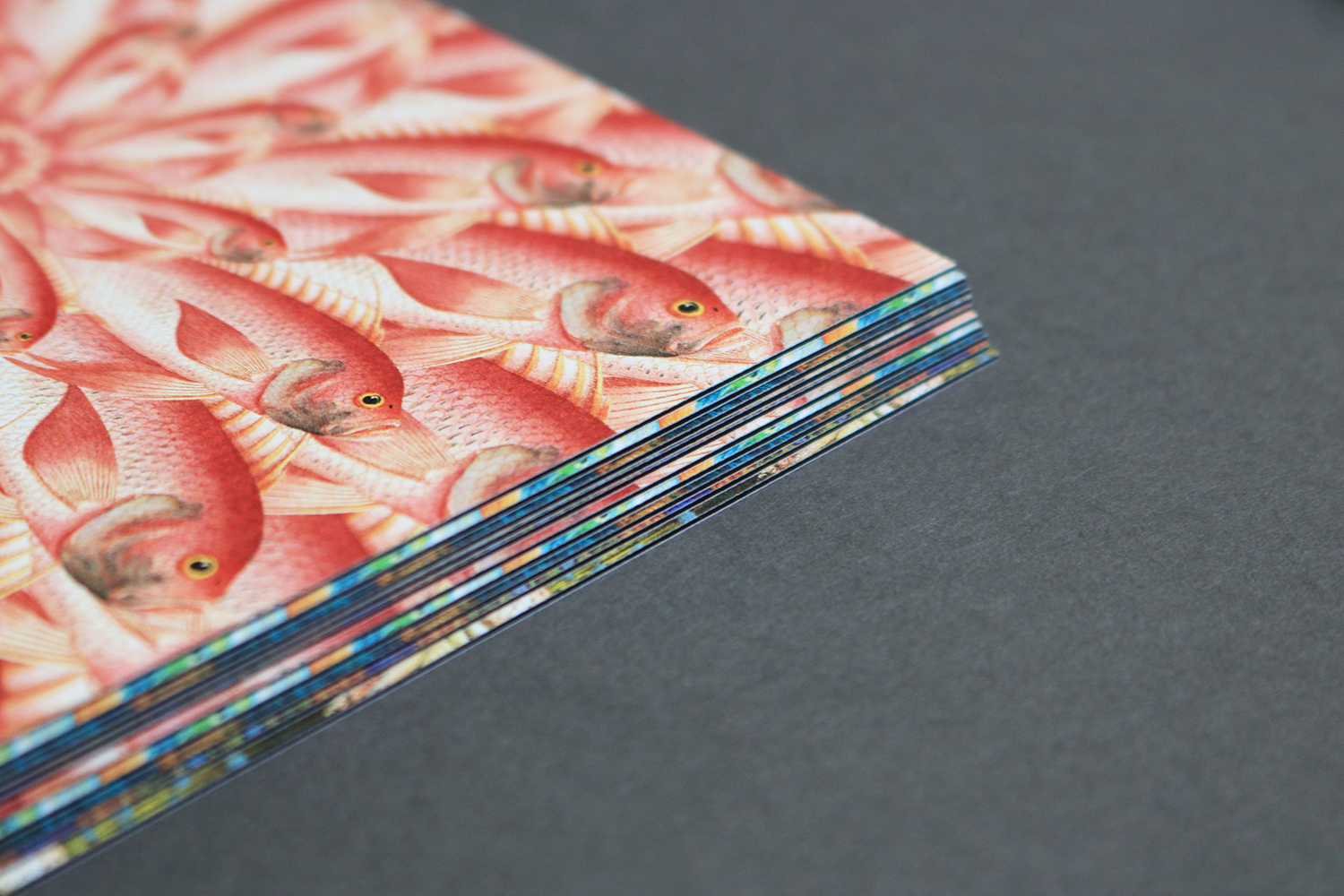
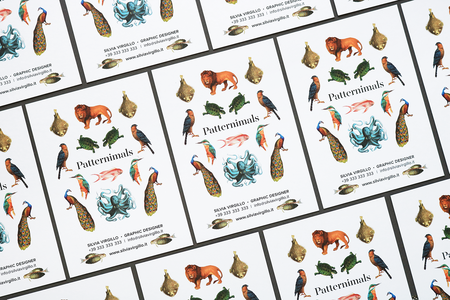
Single illustrations, taken from old-time archives, become patterns.
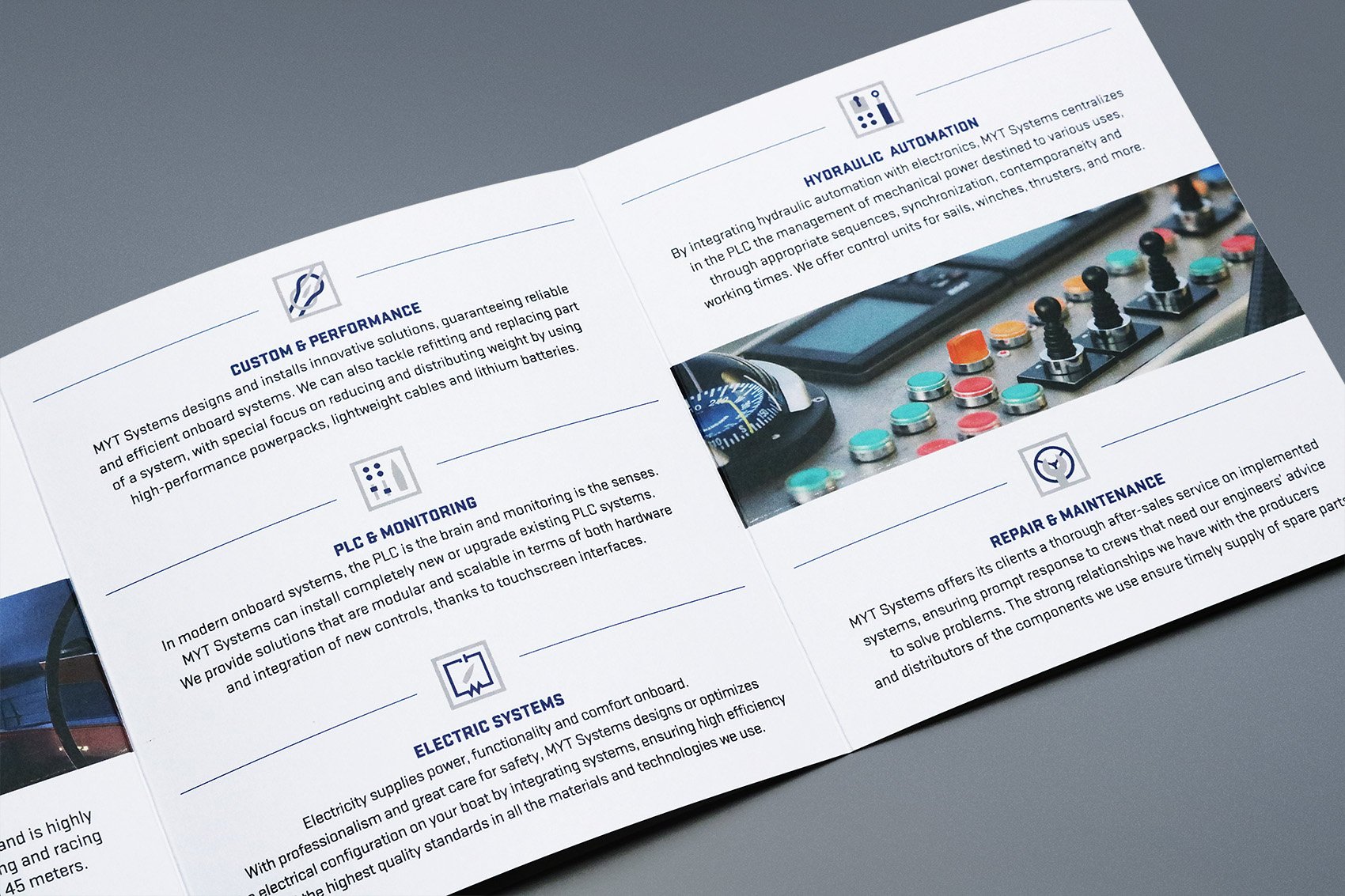
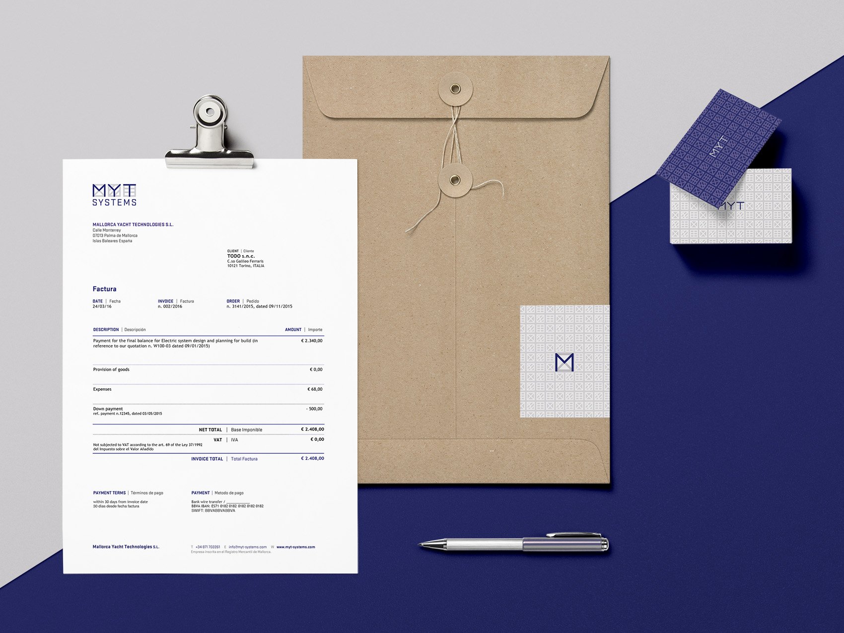
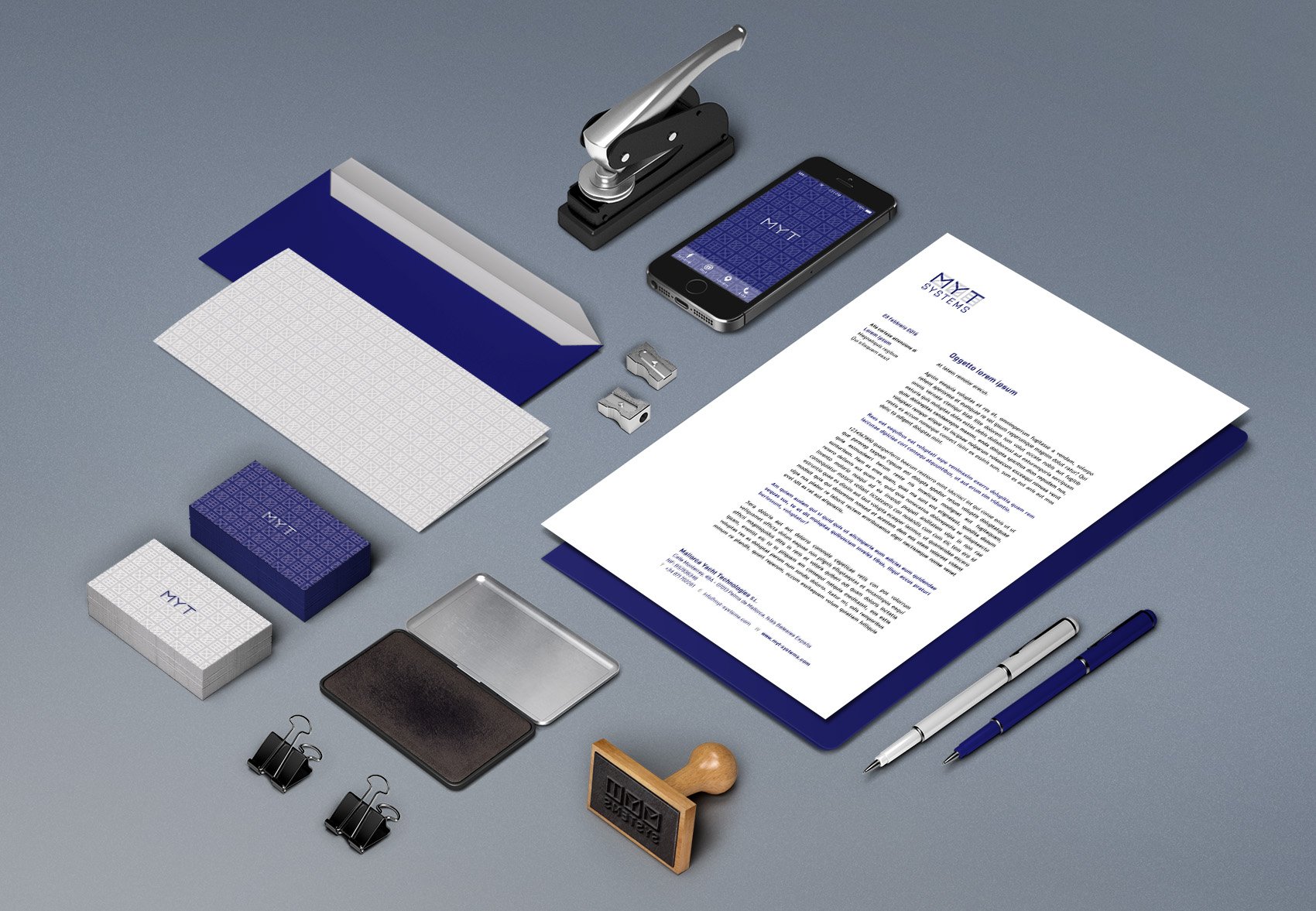
MYT is a spanish company specialized in the design and installation of custom and innovative onboard systems for cruising and racing superyachts, headquartered in Palma de Mallorca, one of the Mediterranean’s most important nautical hubs.
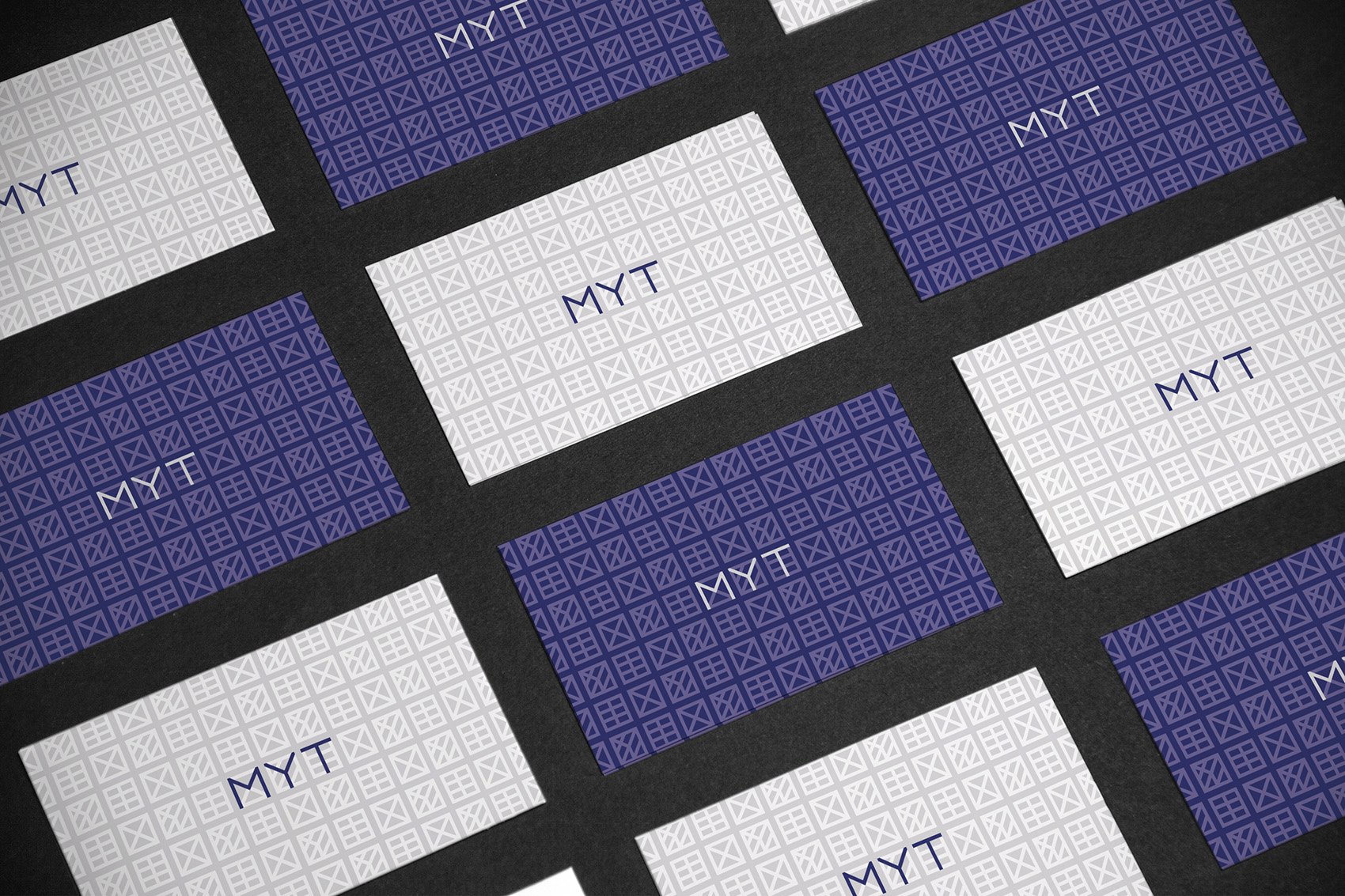
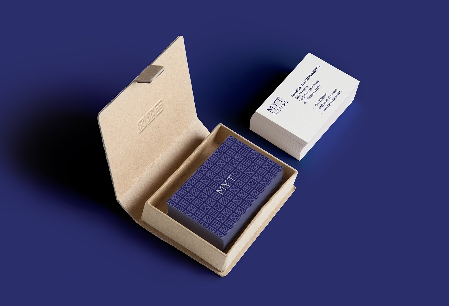
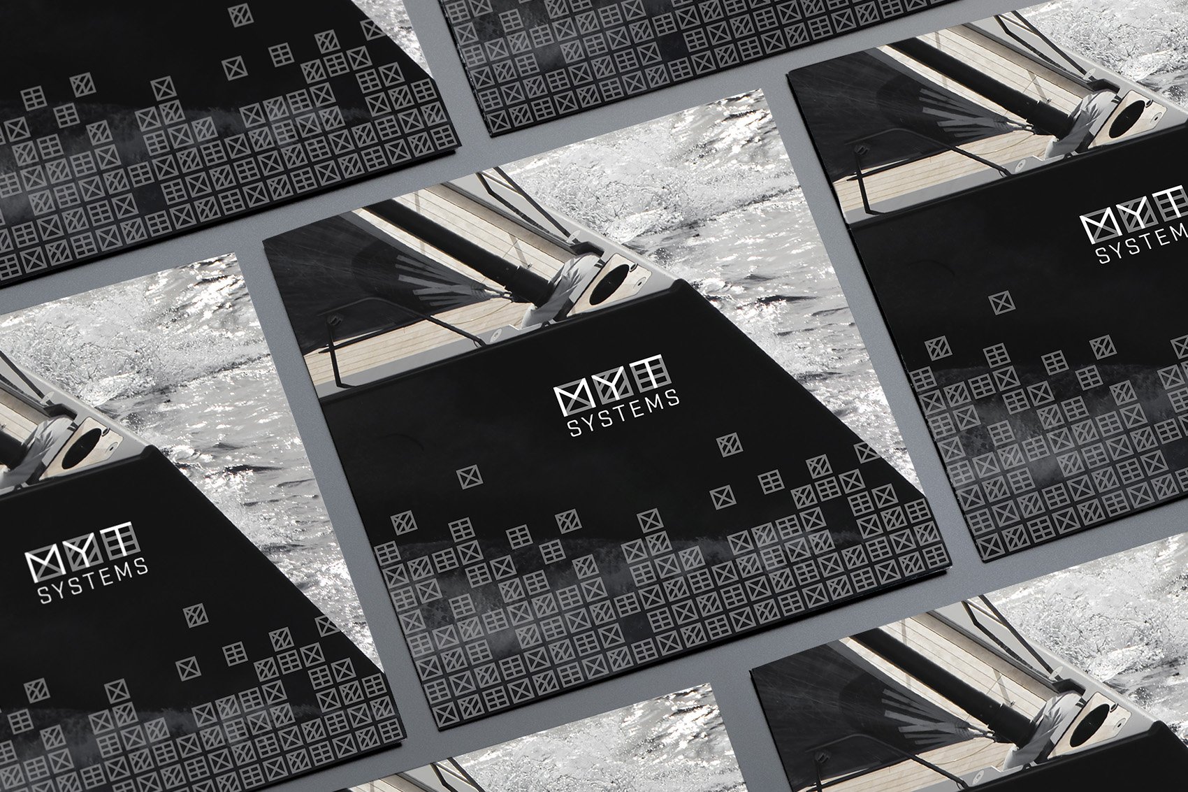
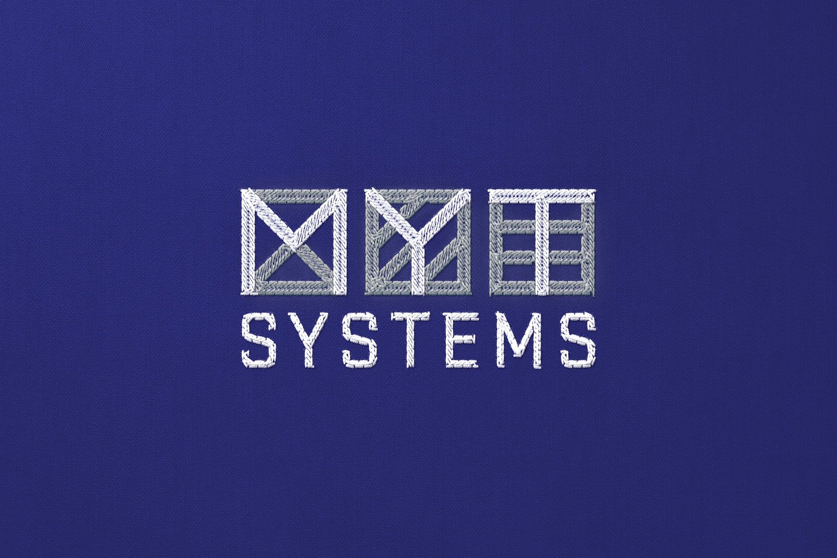
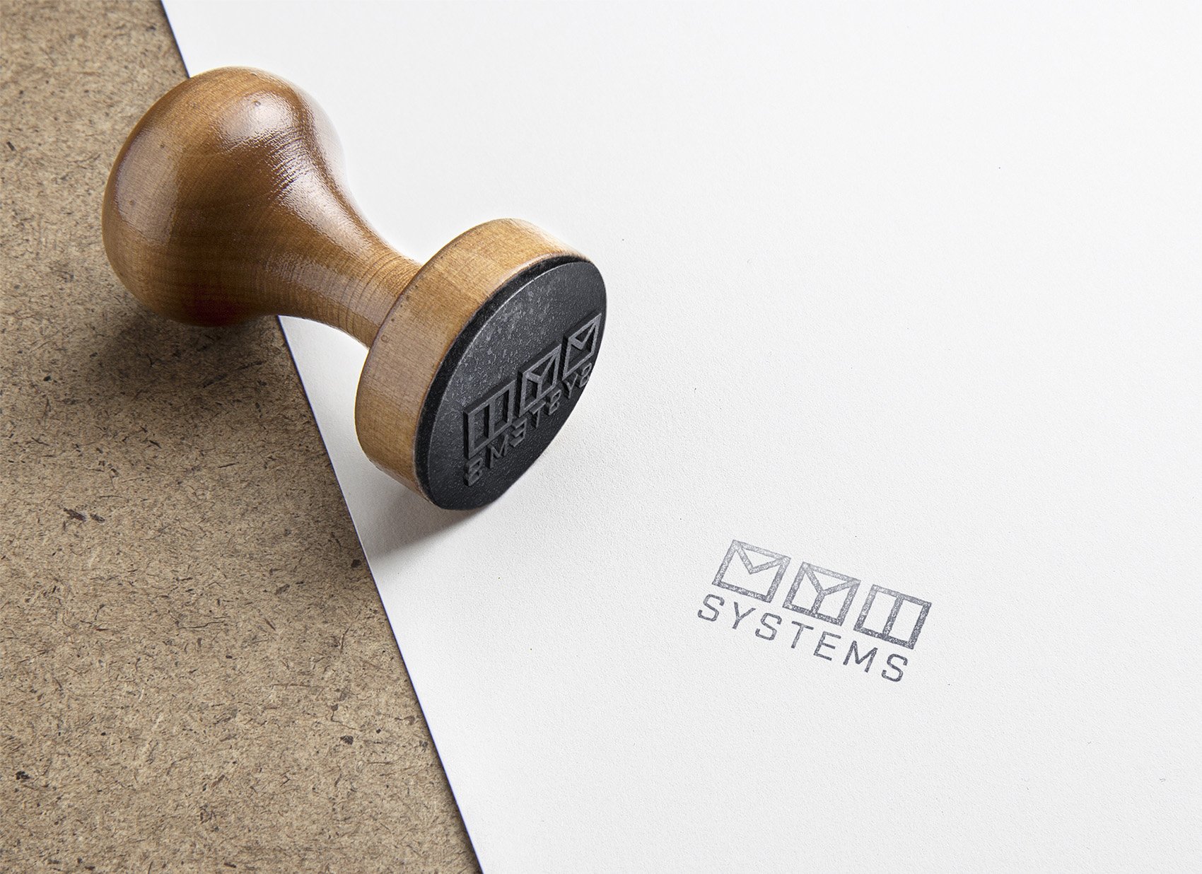
The identity takes ideas from one of the typical graphic elements related to boating: the nautical flags. The three capital letters have been represented as if they were three flags, using blue and gray as colors referring to the sea and construction. Starting from these modules, patterns and icons have been designed to enrich the necessary deliverables.
Designed in collaboration with TODO.
Project team: Andrea Clemente, Giorgio Olivero, Vanessa Poli.
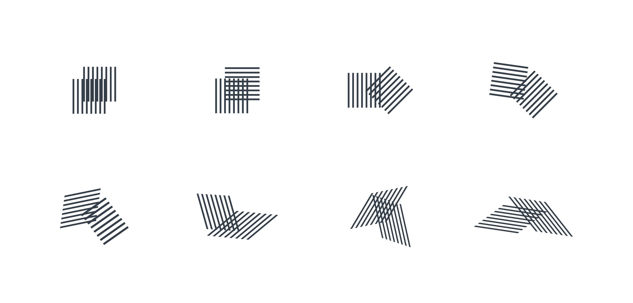
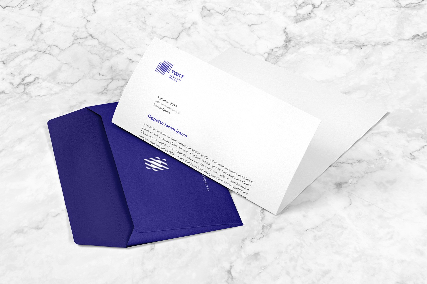
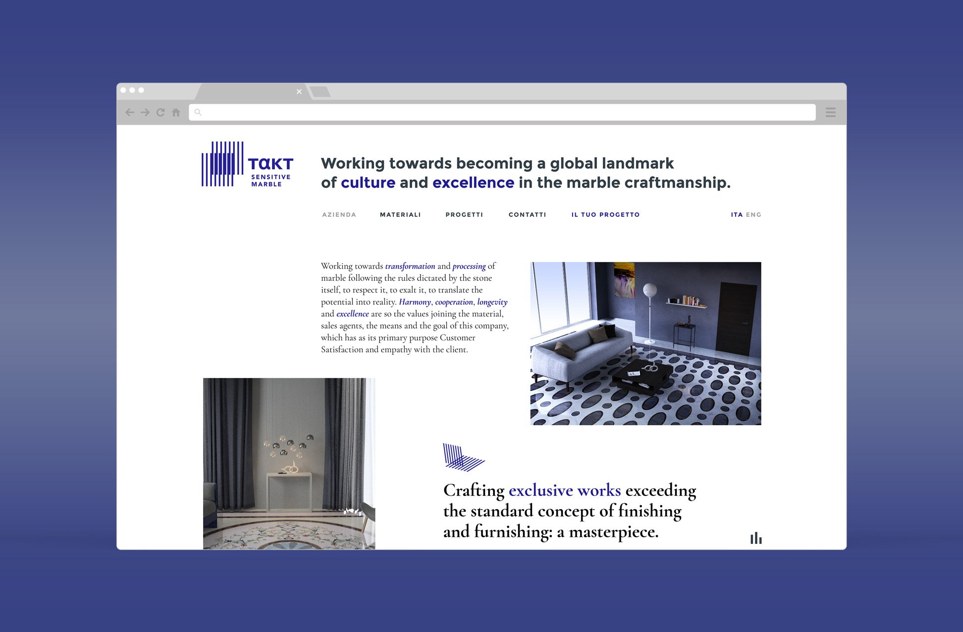
Takt is an innovative company producing the best marble together with a tailor-made design, spanning from classical to modern. The identity focuses on the concept expressed by the name itself: the touch. The symbol represents two surfaces in contact, metaphor both of the process that gives life to the material, and of the contact with the surface texture.
Creative agency: 515 Creative Shop
The two shapes can overlap in a variable way to customize visuals.