Bigiù

/ catalogue design /

The 2016 edition of Viaggio attraverso la ceramica di Vietri sul Mare is named Bigiù. It is an exhibition dedicated to italian and european ceramic jewellery, curated by Seminario Superiore di Arti Applicate and MIAAO (Torino). 
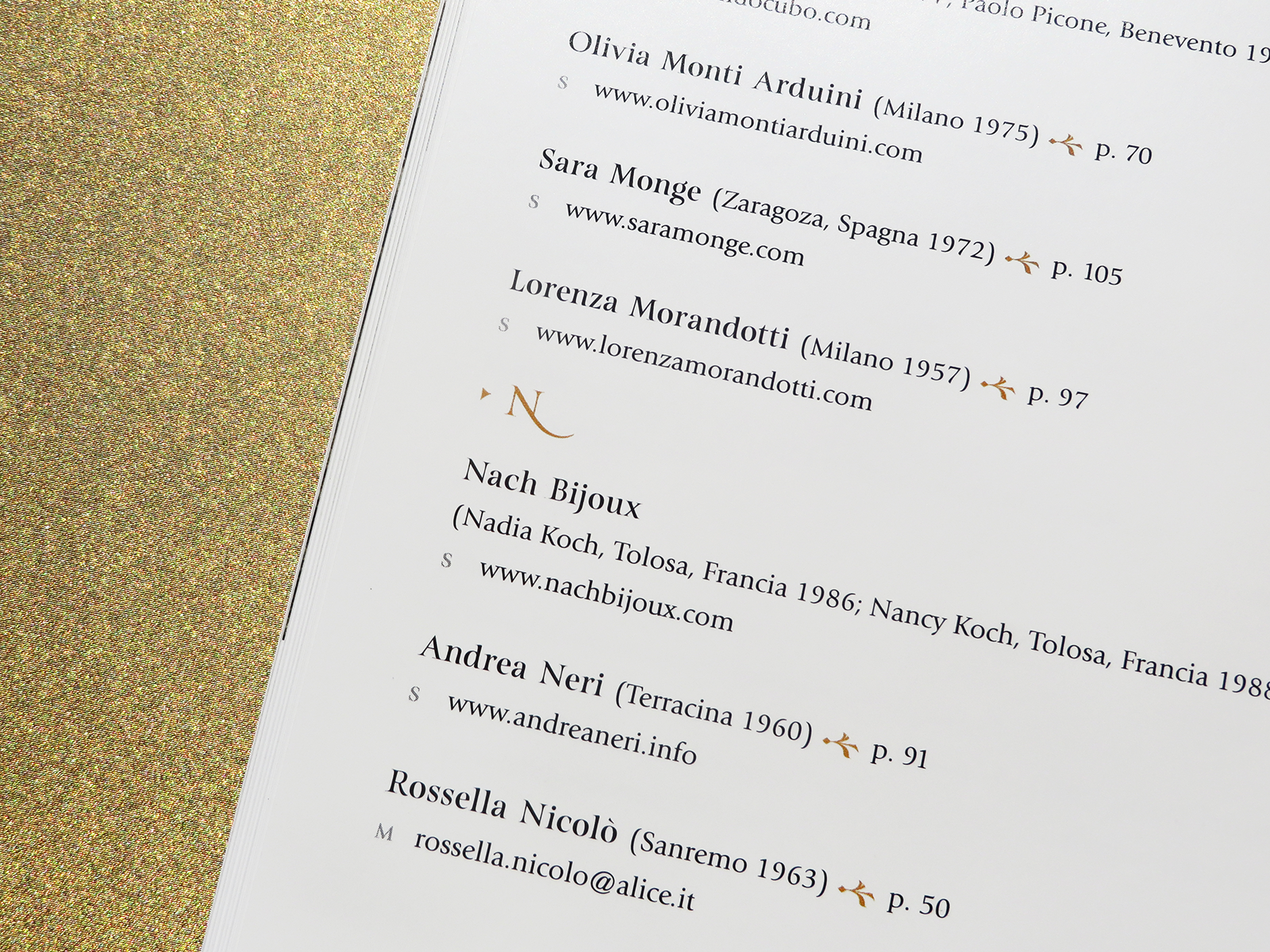
Here is the catalogue, collecting some jewels presented at the exhibition, which opened on June 4 at Vietri sul Mare. The main typeface is Turquoise (Resistenza.es), with its brushy nature-inspired ligatures and ornaments.


Buono, pulito e giusto

/ book cover design /

After 10 years since the first release, Buono, pulito e giusto, book that has deeply marked Slow Food history and reinvented the contemporary gastronomy, has been updated and published with a new cover and layout. 
Three adjectives, three circles, three colours.

VIRGILLO_bpg


The KitchenAid story

/   art direction   /   visual design   /

KitchenAid is one of the leading brands for small and major household appliances, born almost a century ago in the United States. The video is about the history of the company; in the gallery some of the graphic solutions proposed for the video are presented, starting from the KitchenAid beginnings to the new collections. Archive images and vintage typography have been used to remark the key moments of the company evolution. 

Creative agency: 515 Creative Shop


The KitchanAid story
in its final and published version.


Neogotico Tricolore

/ editorial design / book layout /

Neogotico Tricolore, Letteratura e altro deals with the italian neogothic literature history and evolution. It presents ten academical texts about the theme, and some illustrations, collected in three different sections.
Red, black and gold are the three main colors used, while green, red and white – italian flag colors – appear in endpapers. Capital letters and full color pages are the distinctive elements of this editorial project, that references to antique books in binding and layout. The book has been designed for the cultural project Il cuNeo gotico, promoted by Fondazione Cassa di Risparmio di Cuneo and curated by Enzo Biffi Gentili with Giorgio Barberi Squarotti, Valter Boggione and Barbara Zandrino.


Sunshine in November - C2C

/ visual design /

Sunshine in November is a documentary written and directed by Carlotta Petracci. It is about Club To Club festival in Torino, told by those who have witnessed it from the beginning, through their memories and projects.
Opening titles, subtitles and background graphics have been designed to guide this story, through a graphic project that refers to nightclubbing lights, that characterize the electronic music stage.

Written and directed by Carlotta Petracci

VIRGILLO_sunshine_november_c2c
VIRGILLO_sunshine_november_c2c_label


Watch the complete video on Vimeo

A White production
Written and directed by Carlotta Petracci
Photography: Corrado Marchigiano
Editing and post-production: Carlotta Petracci and Corrado Marchigiano
Graphic design: Silvia Virgillo
Sound editing: Alessandro Vendrame
English translation: Michelle Nebiolo

Kel12 magazine

/ editorial design /

The magazine, property of the tour operator Kel12, has been launched in this redesigned version in September 2015, in order to offer travel reviews and articles about foreign cultures to its customers.

Editor in chief: Stefano Ampollini
Managing editor: Marilena Roncarà
Art director and photo editor: Carlotta Petracci
Editorial designer: Silvia Virgillo
Graphic designer: Anna Tortora
Publisher: Contemporanea srl