/ book cover design /
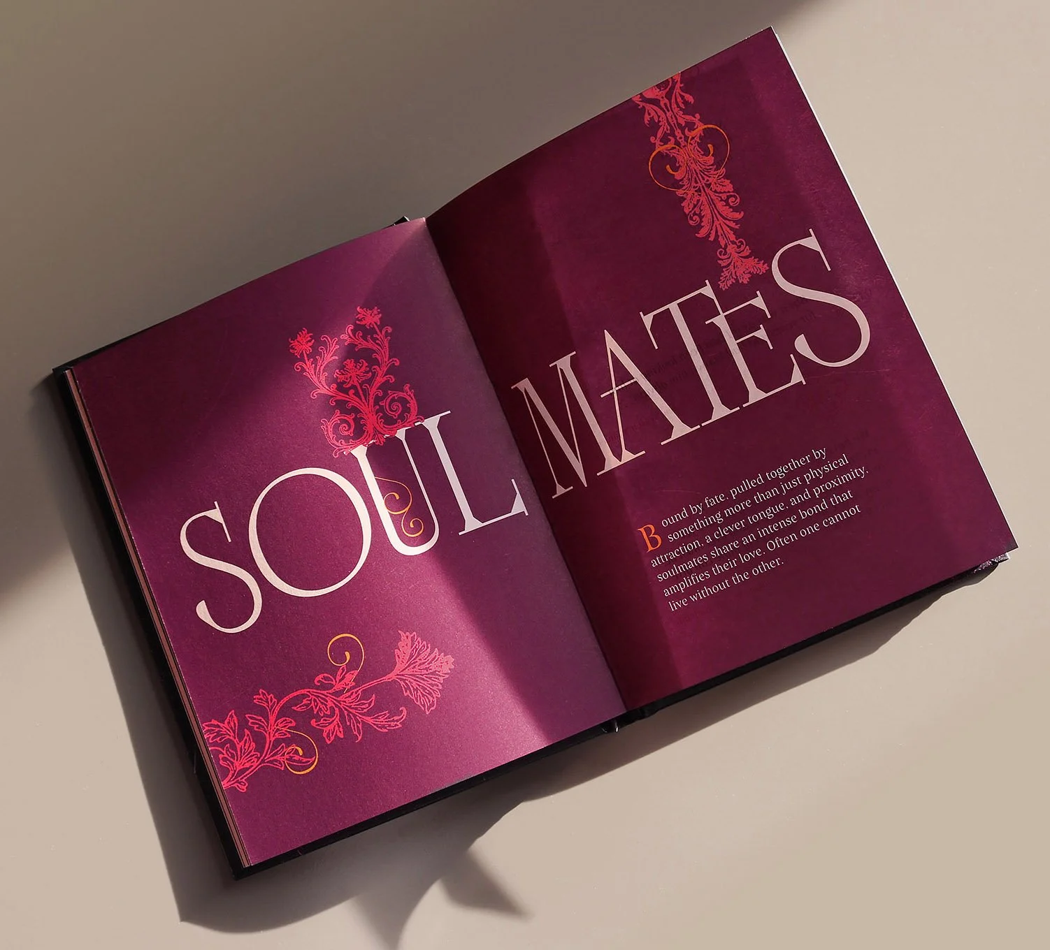
In Japanese, ai ai gasa means ‘to share an umbrella’ and it is used as a love symbol.
Book written by Tomás Navarro.
Publisher: Giunti Editore


In Japanese, ai ai gasa means ‘to share an umbrella’ and it is used as a love symbol.
Book written by Tomás Navarro.
Publisher: Giunti Editore
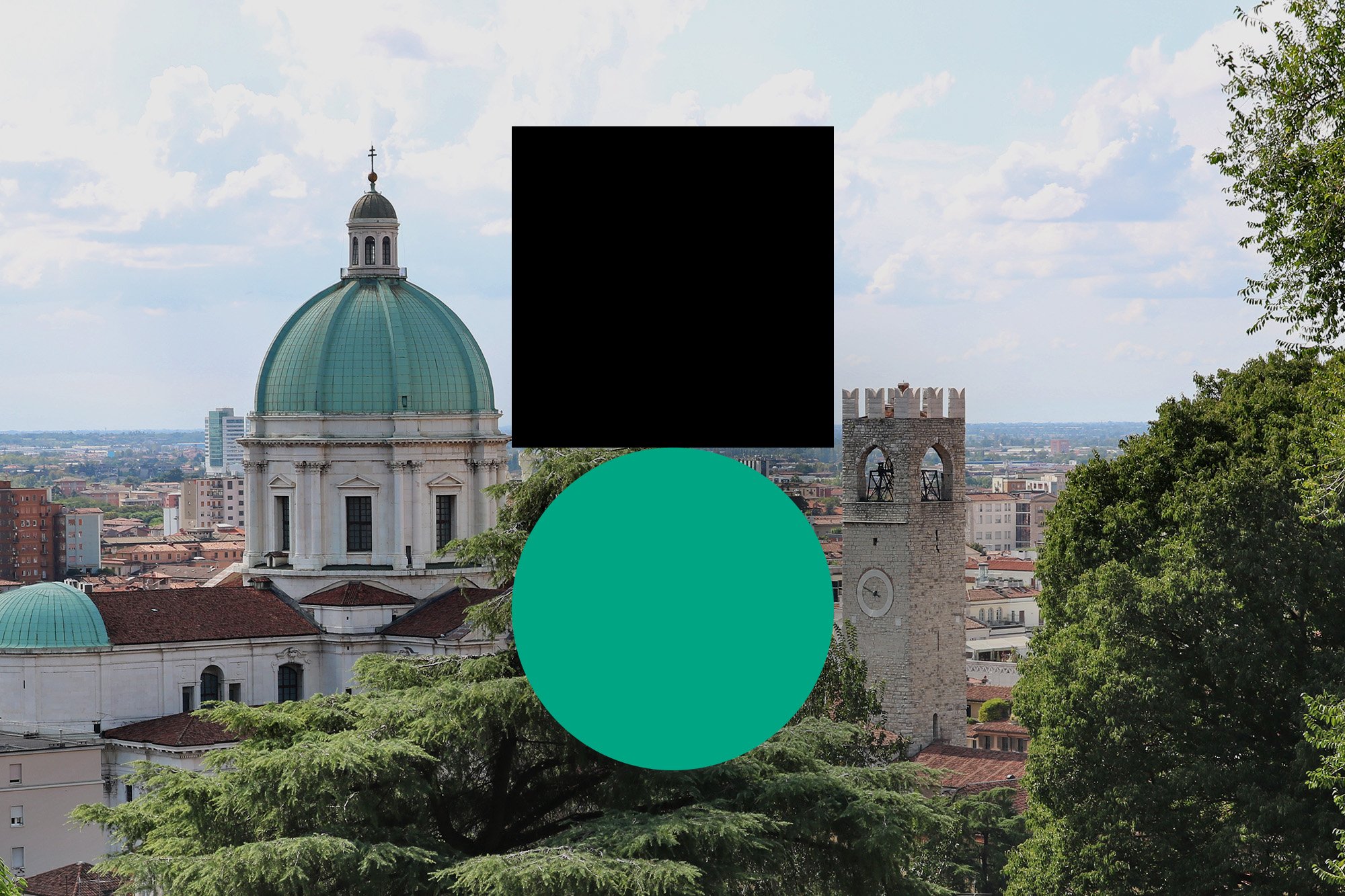
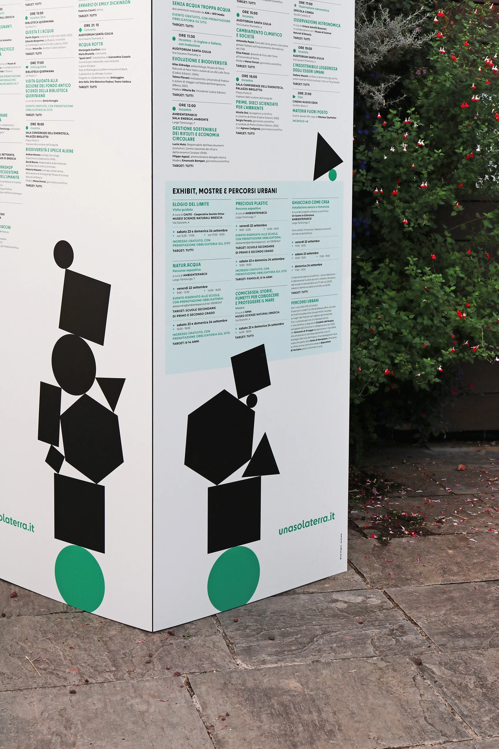
Una sola Terra (only one Earth) is a festival
about sustainability, environment and biodiversity, held in the city of Brescia, Italy.
The logo symbol geometrically depicts a weight standing on Earth, just like our actions are burden on the environment. The two shapes have the same width and are not optically corrected, so that the black square looks a little bigger than the green circle.
The symbol is accompanied by the name Una sola Terra written in Cy, a font with many alternative glyphs and with both soft and angular shapes.
The idea of burden conveyed by the symbol becomes even more clear in the identity system: other black shapes are added together on the logo symbol, creating a stack in a precarious balance.
Una sola Terra festival is promoted by
Comune di Brescia, Fondazione Brescia Musei, Museo Scienze Naturali Brescia and Codice Edizioni.
Selection of book covers designed and illustrated for Codice Edizioni
Have a look at the editorial design here.


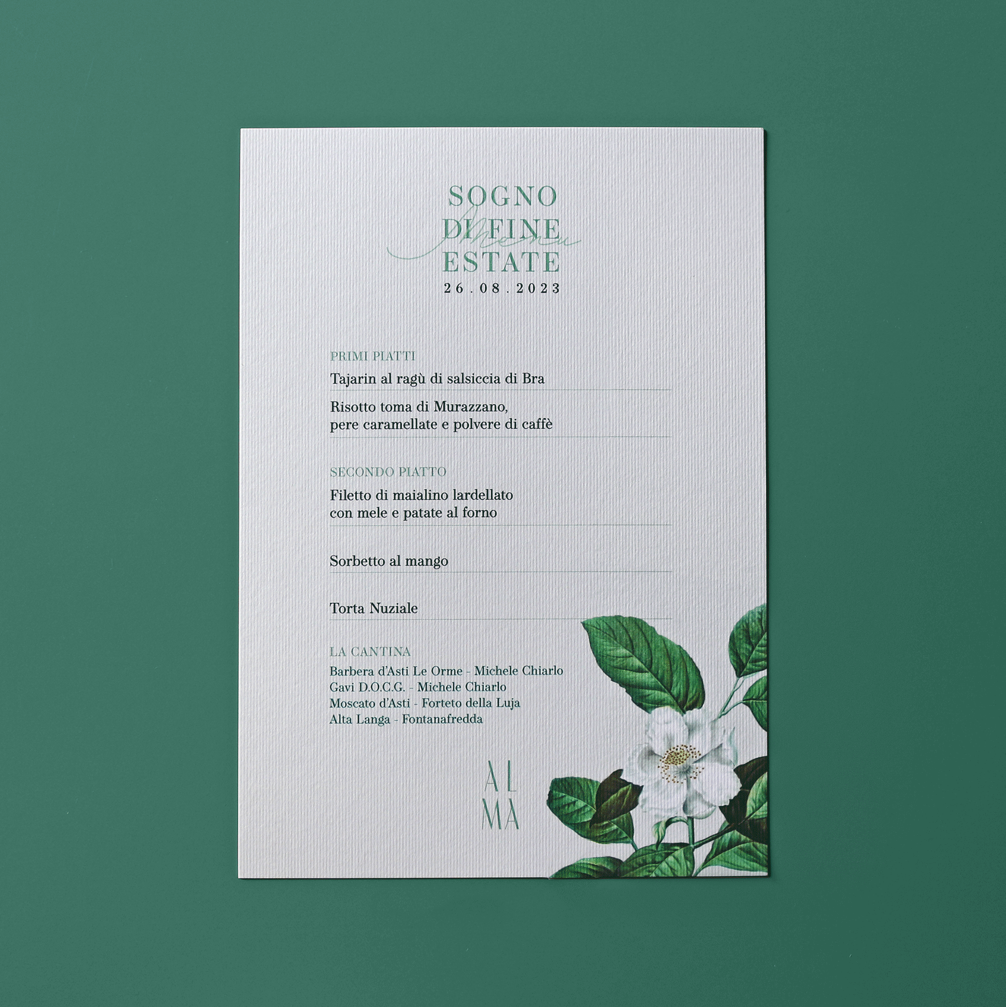
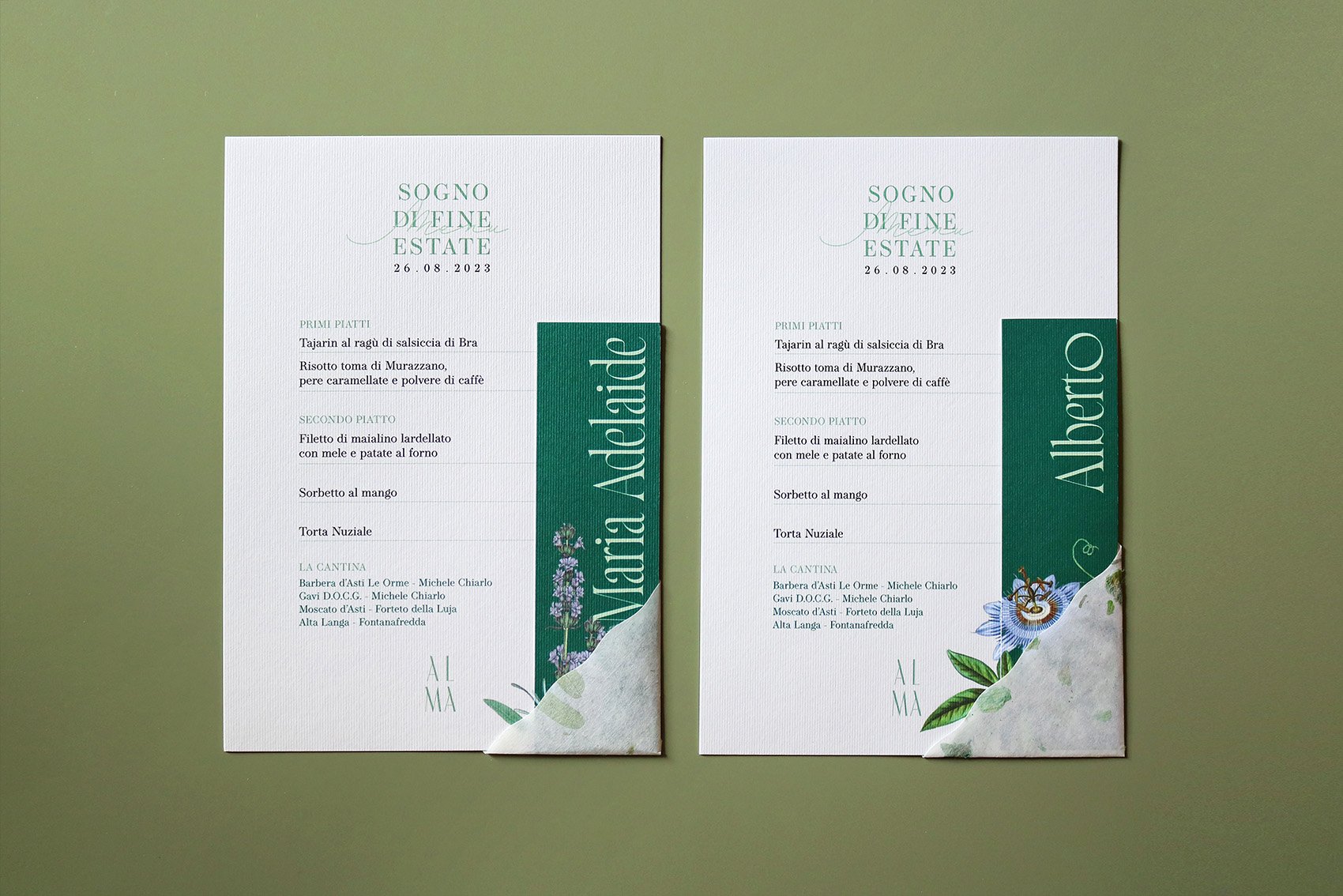
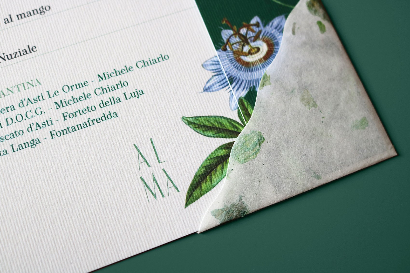
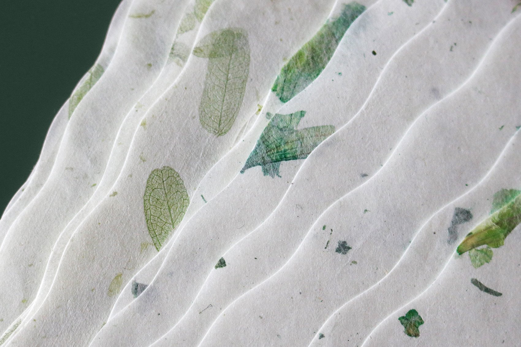
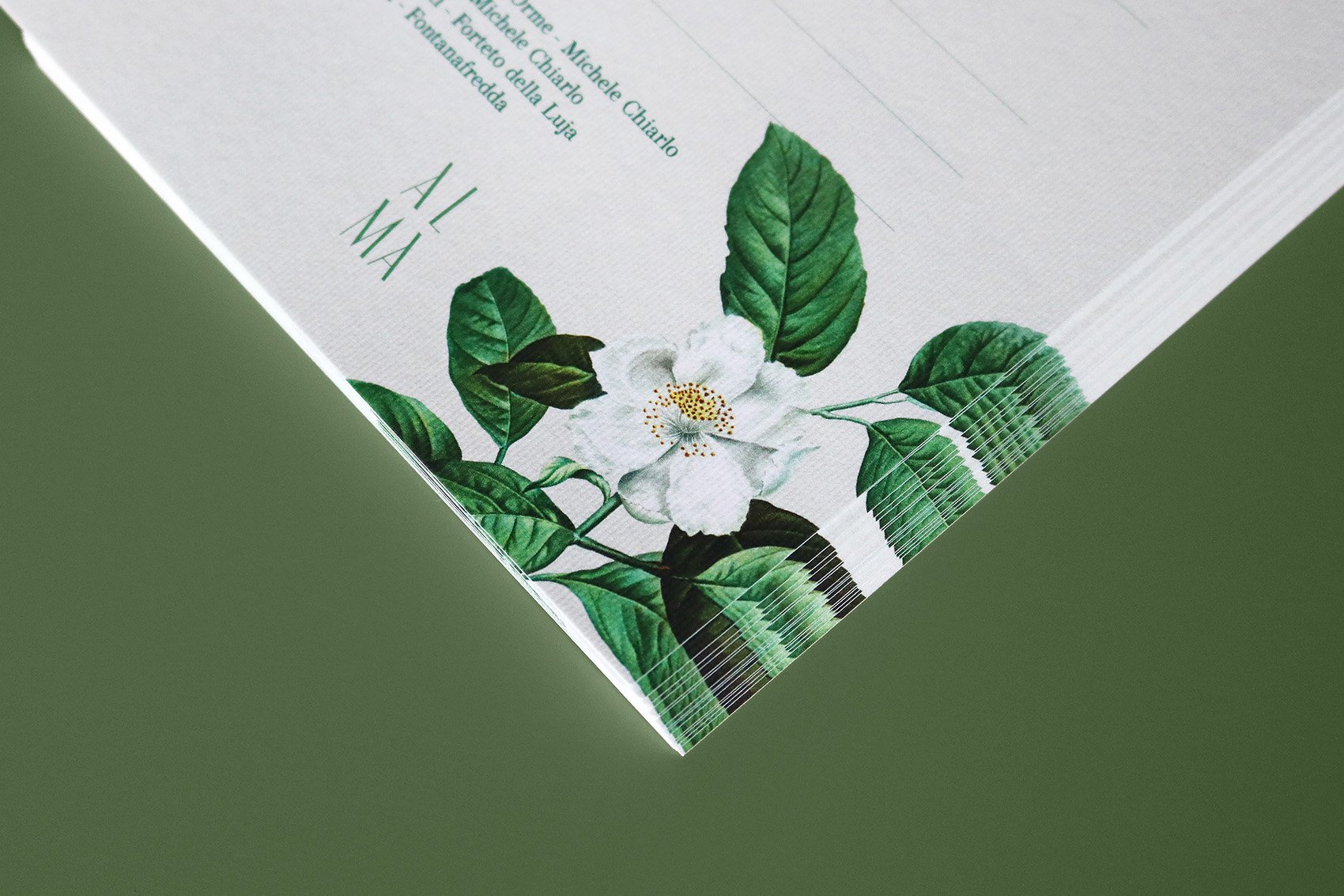
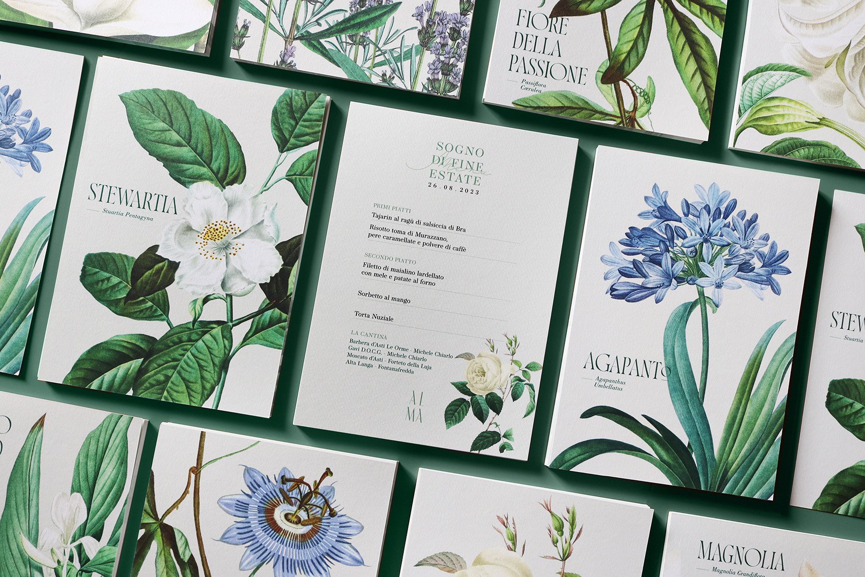
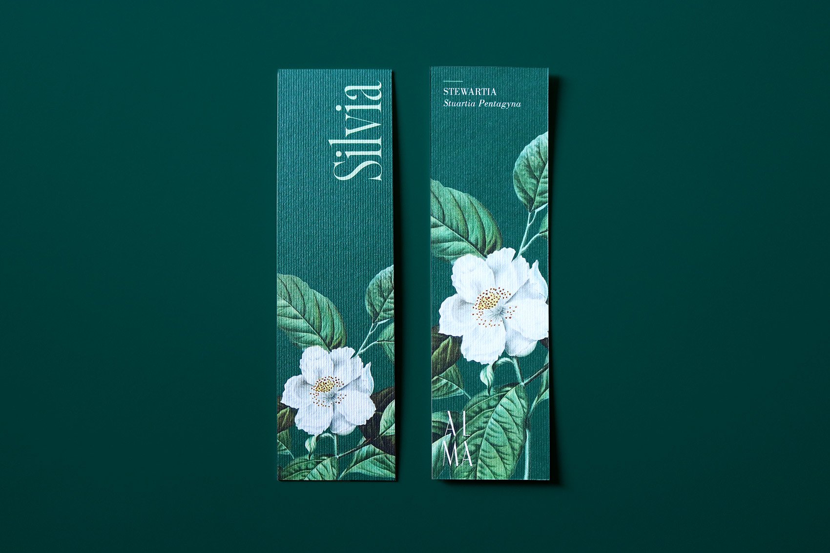
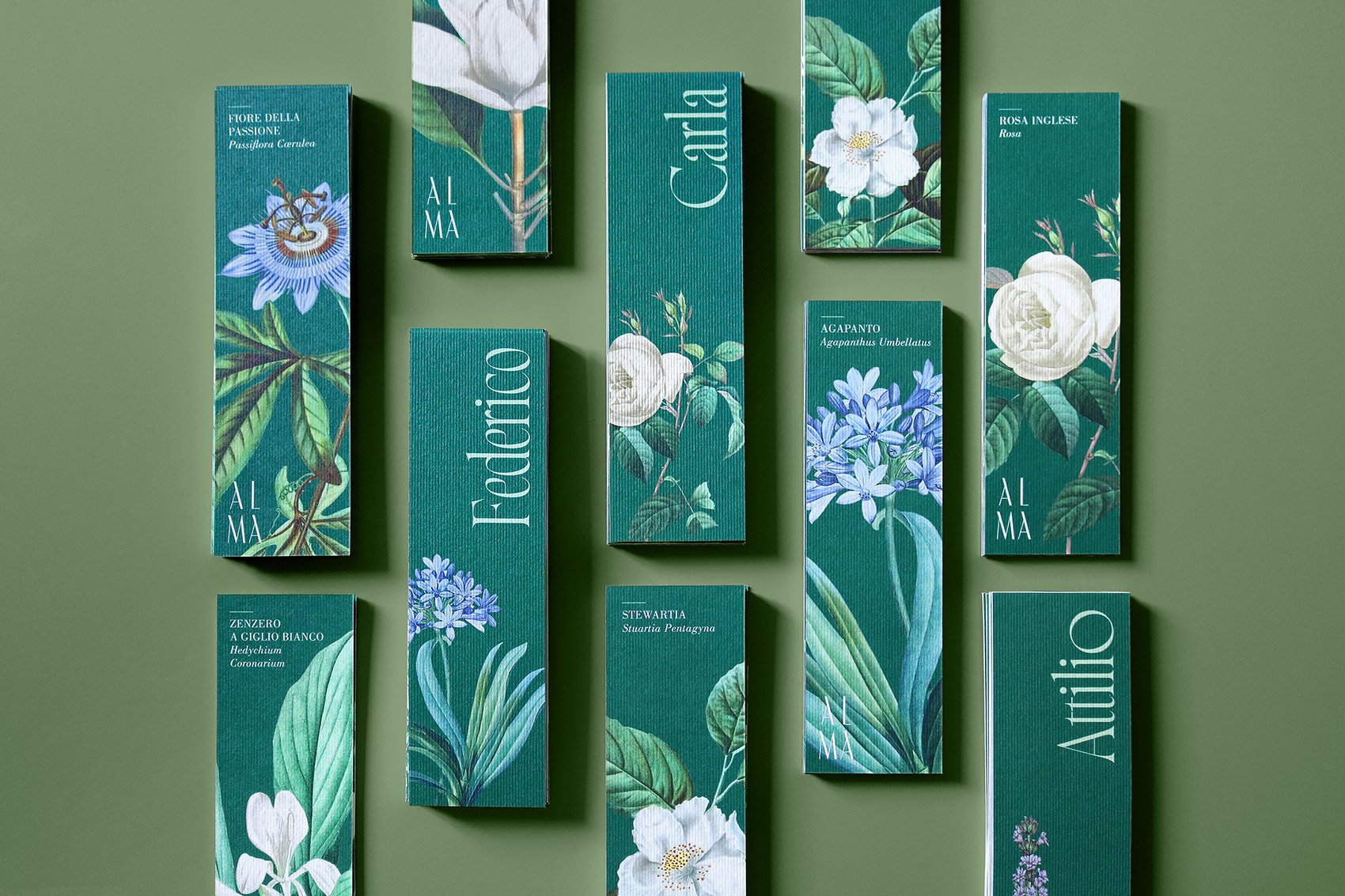
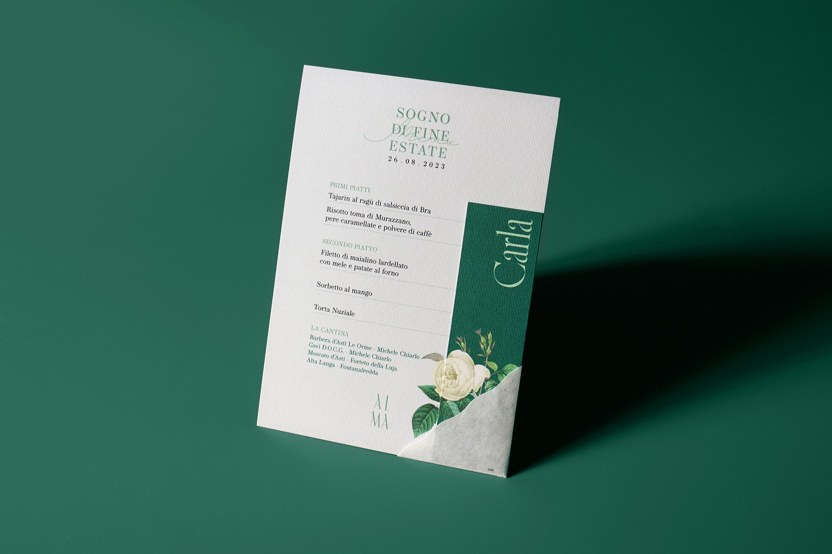
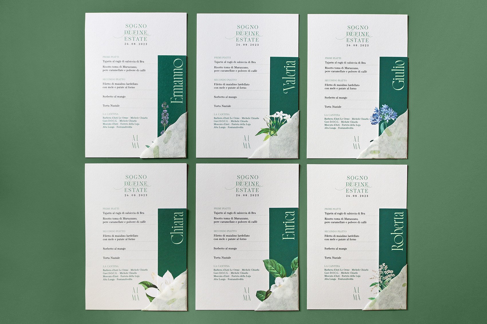
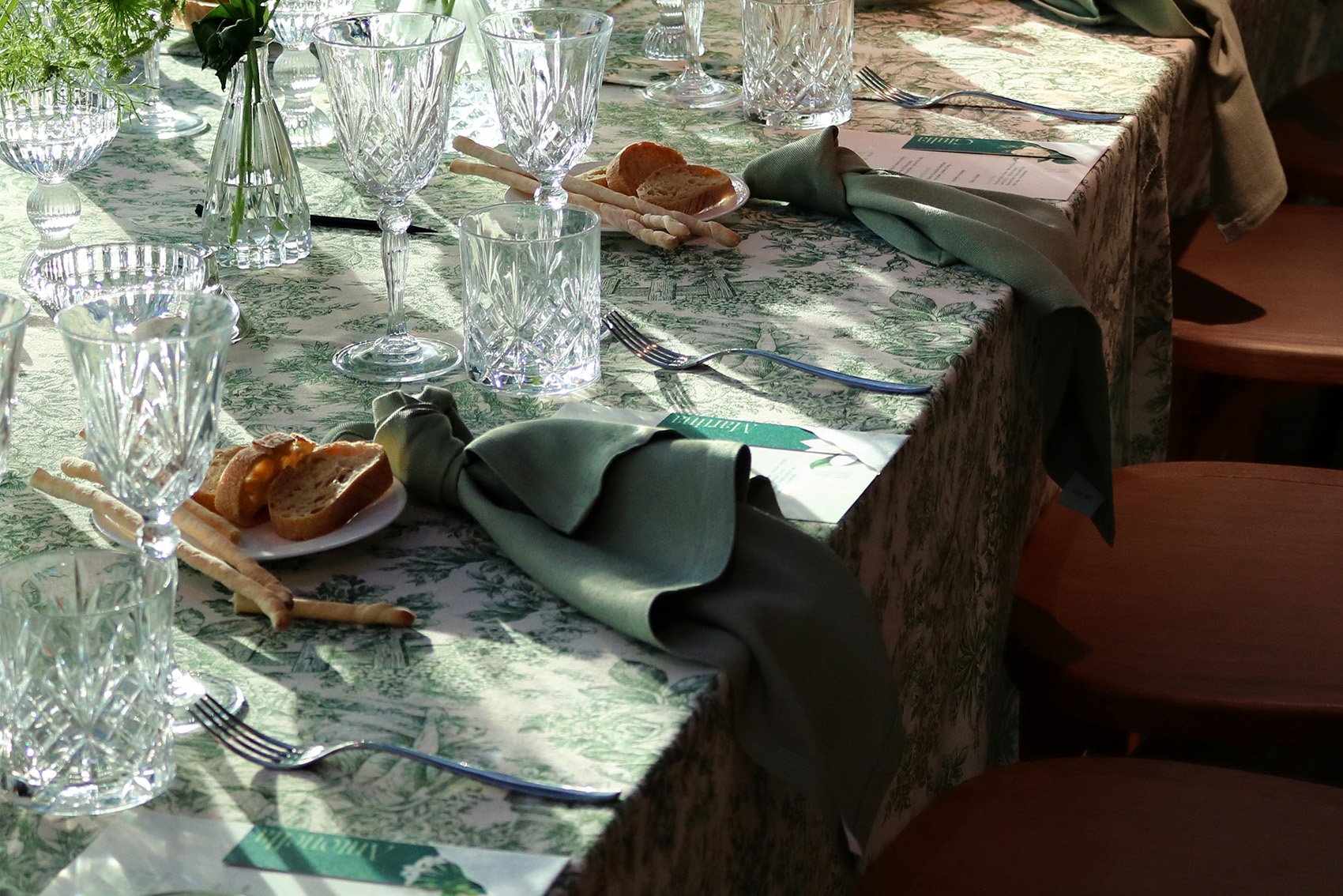
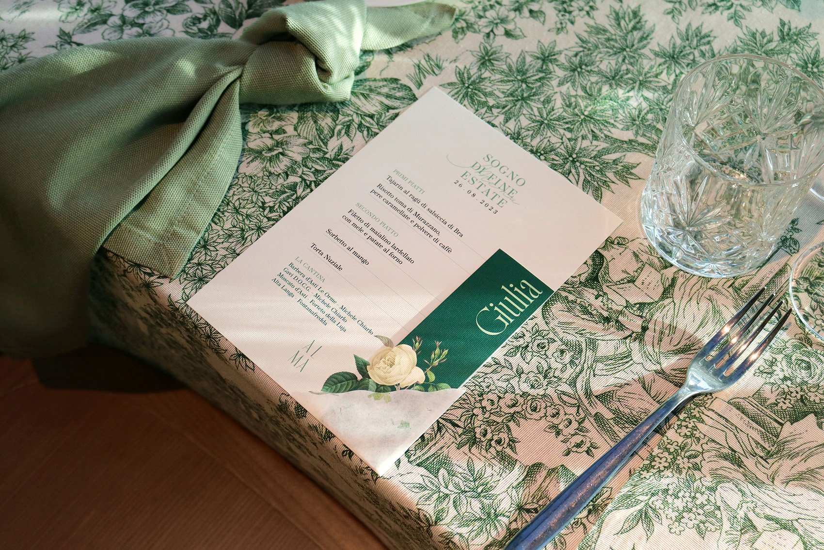
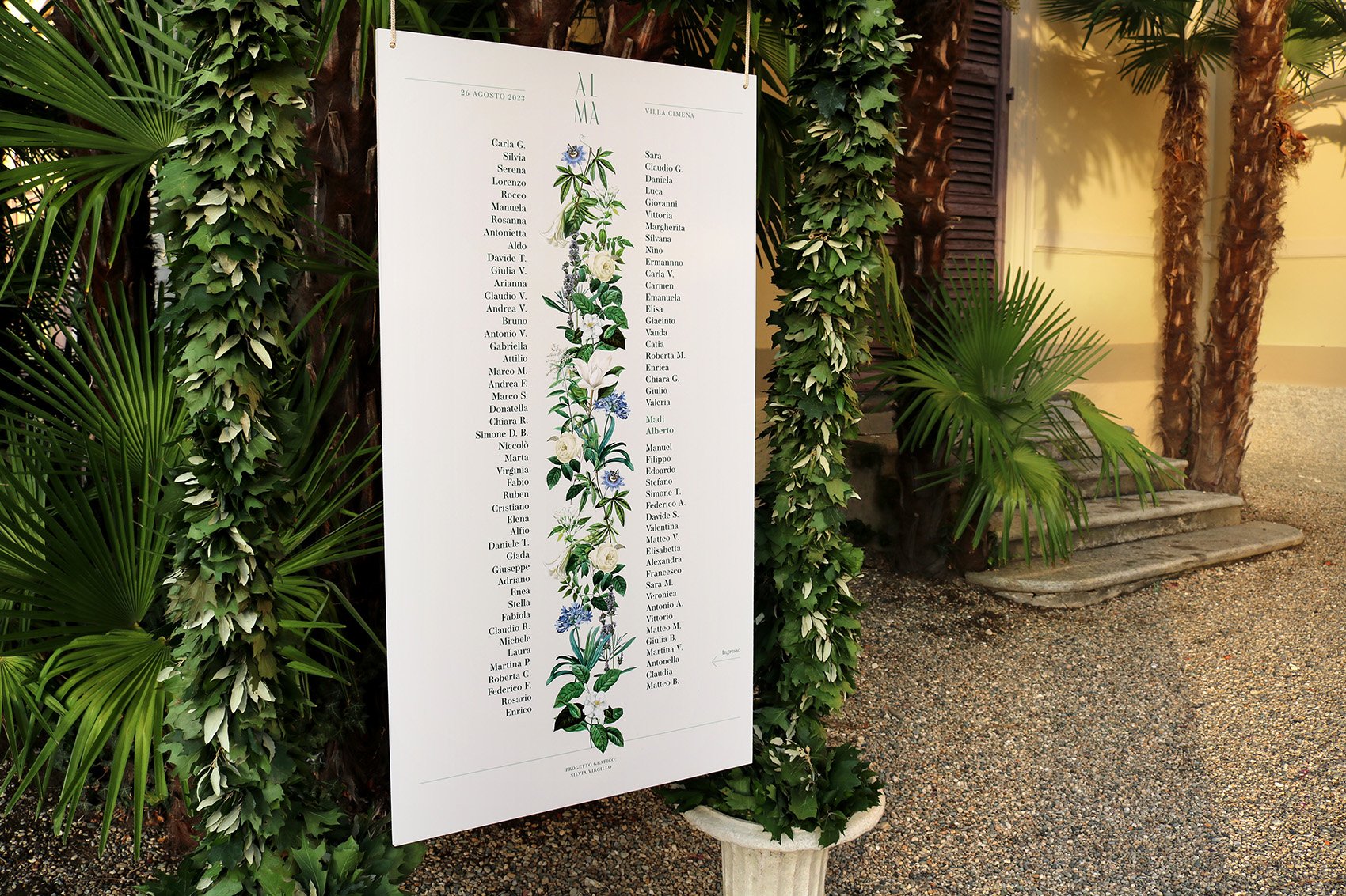
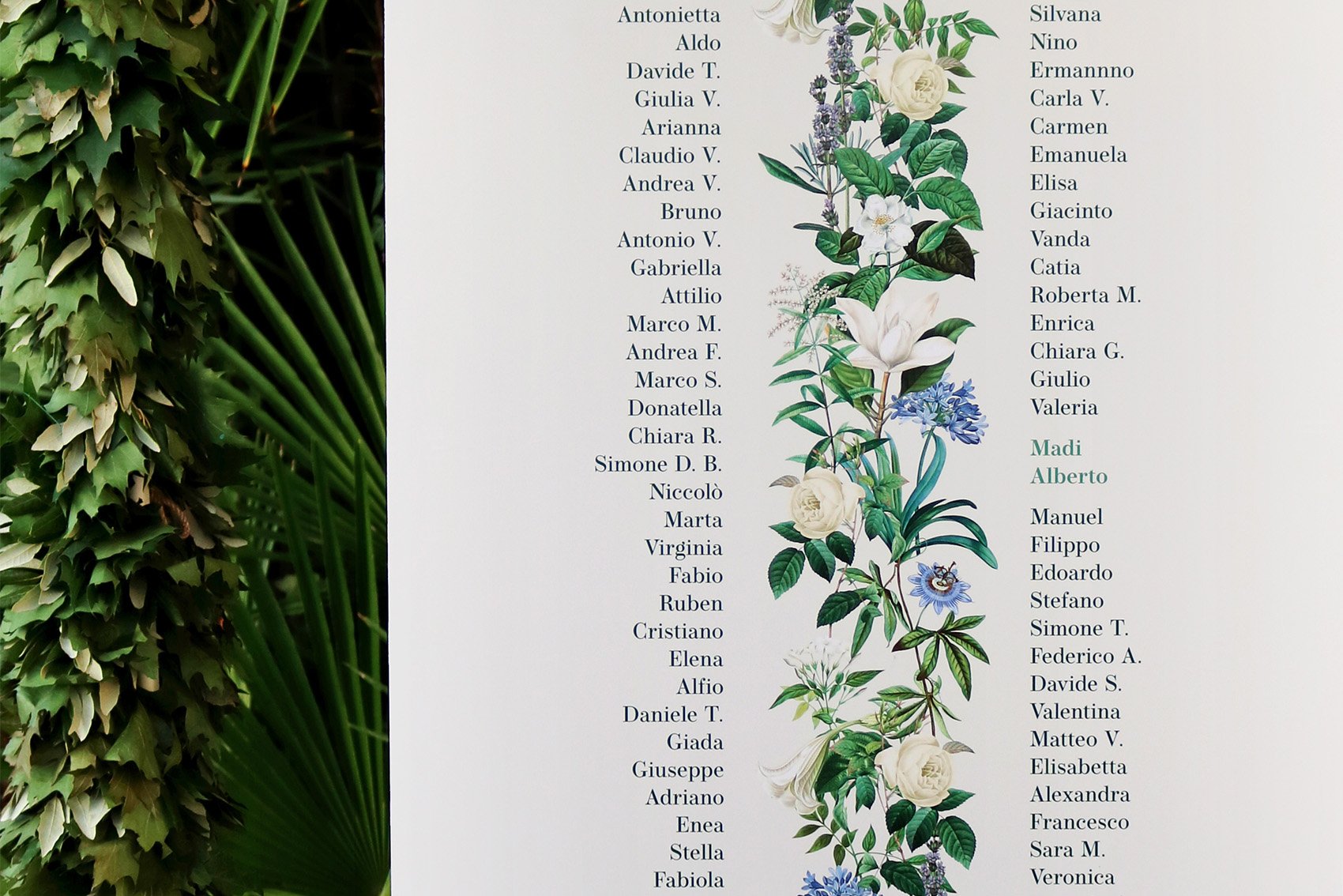
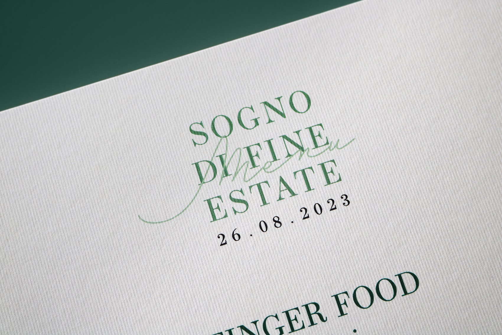
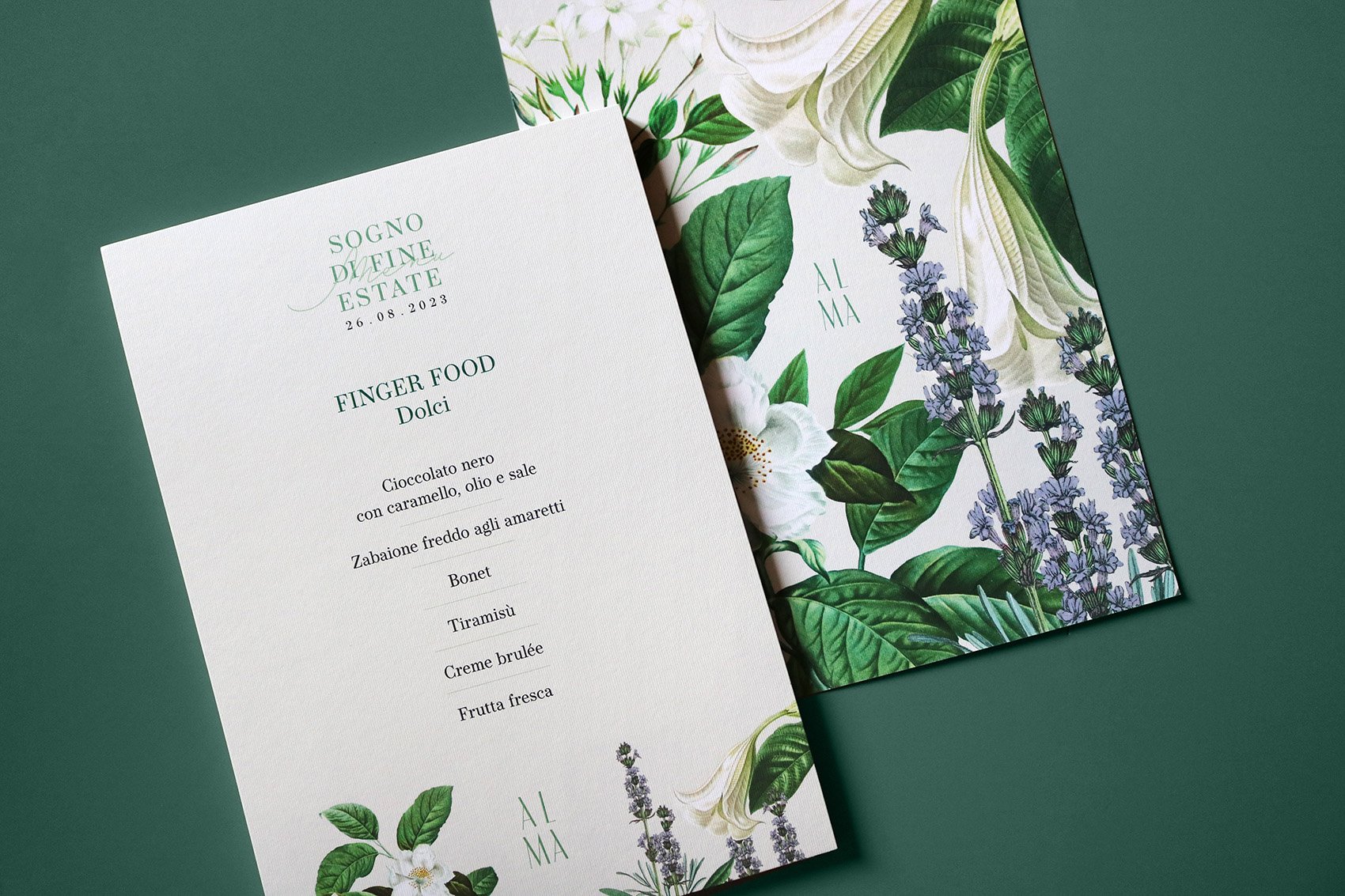
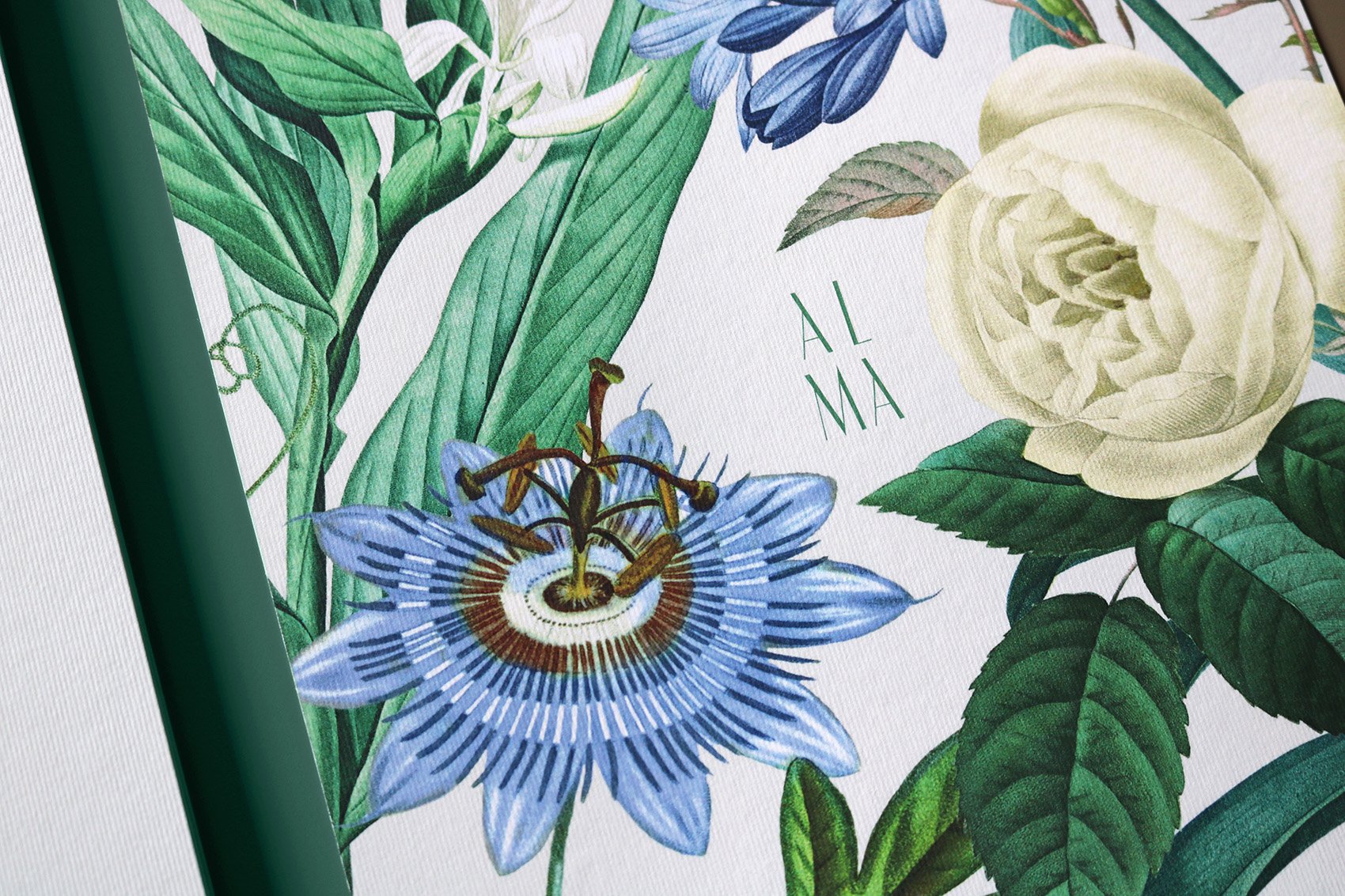
Menus, place cards and the tableau de mariage are designed according to the theme Sogno di fine estate: table places are customized with guests’ names and with vintage illustrations of summer flowers.
Wedding planner: Marta Ippolito
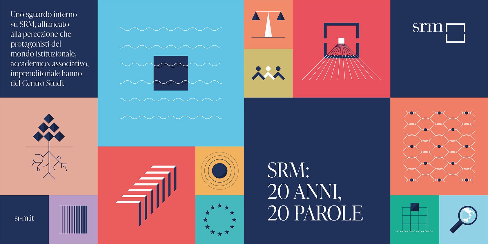
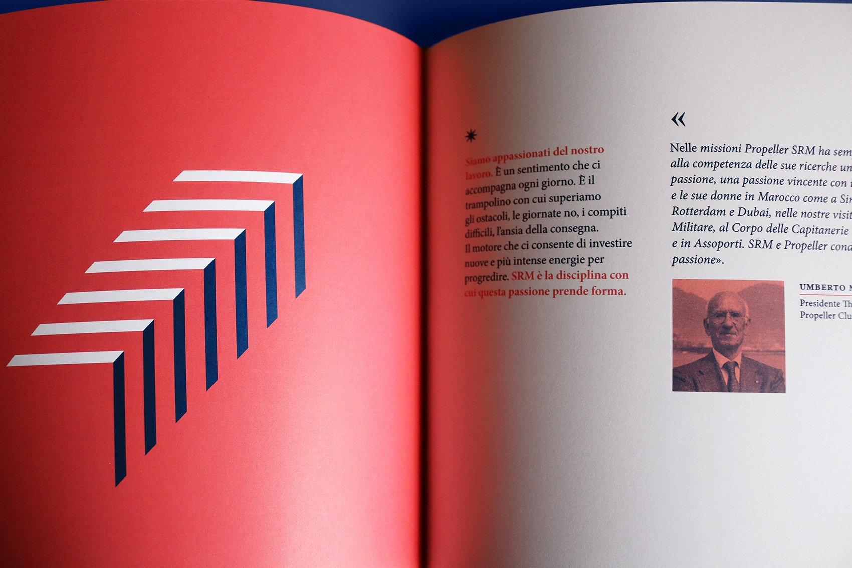
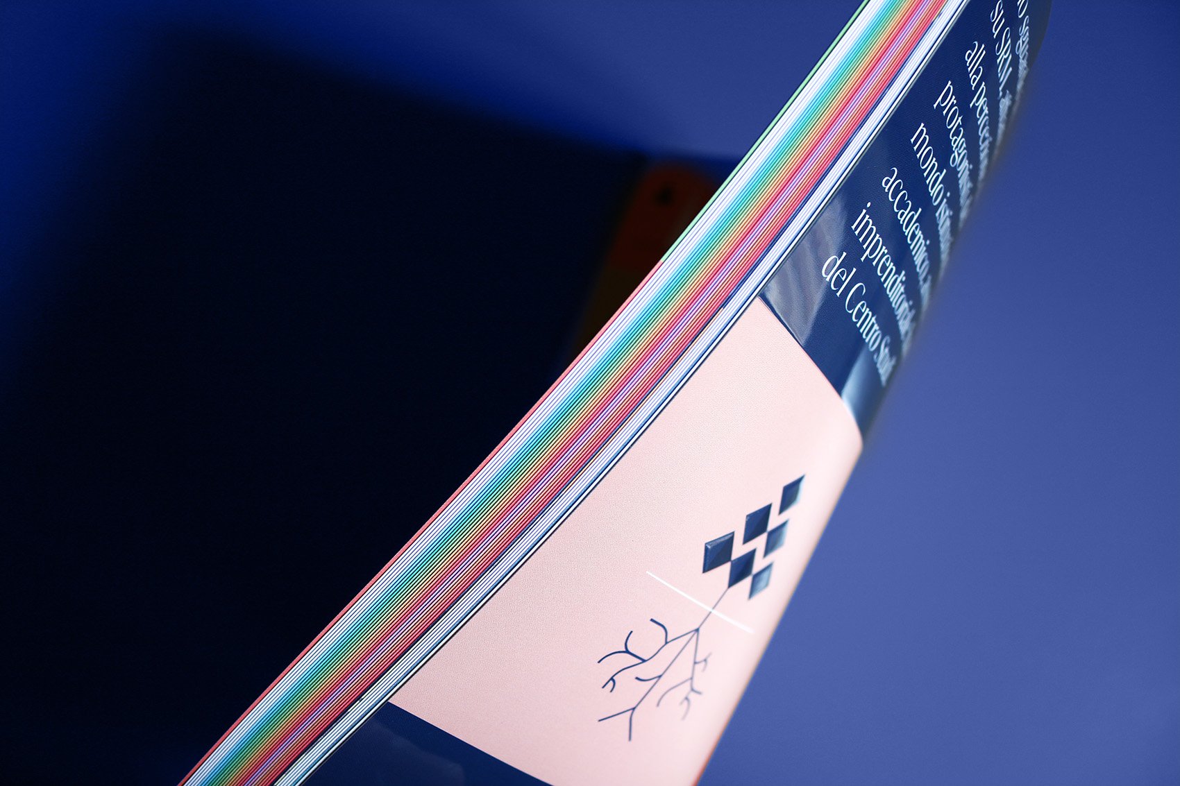
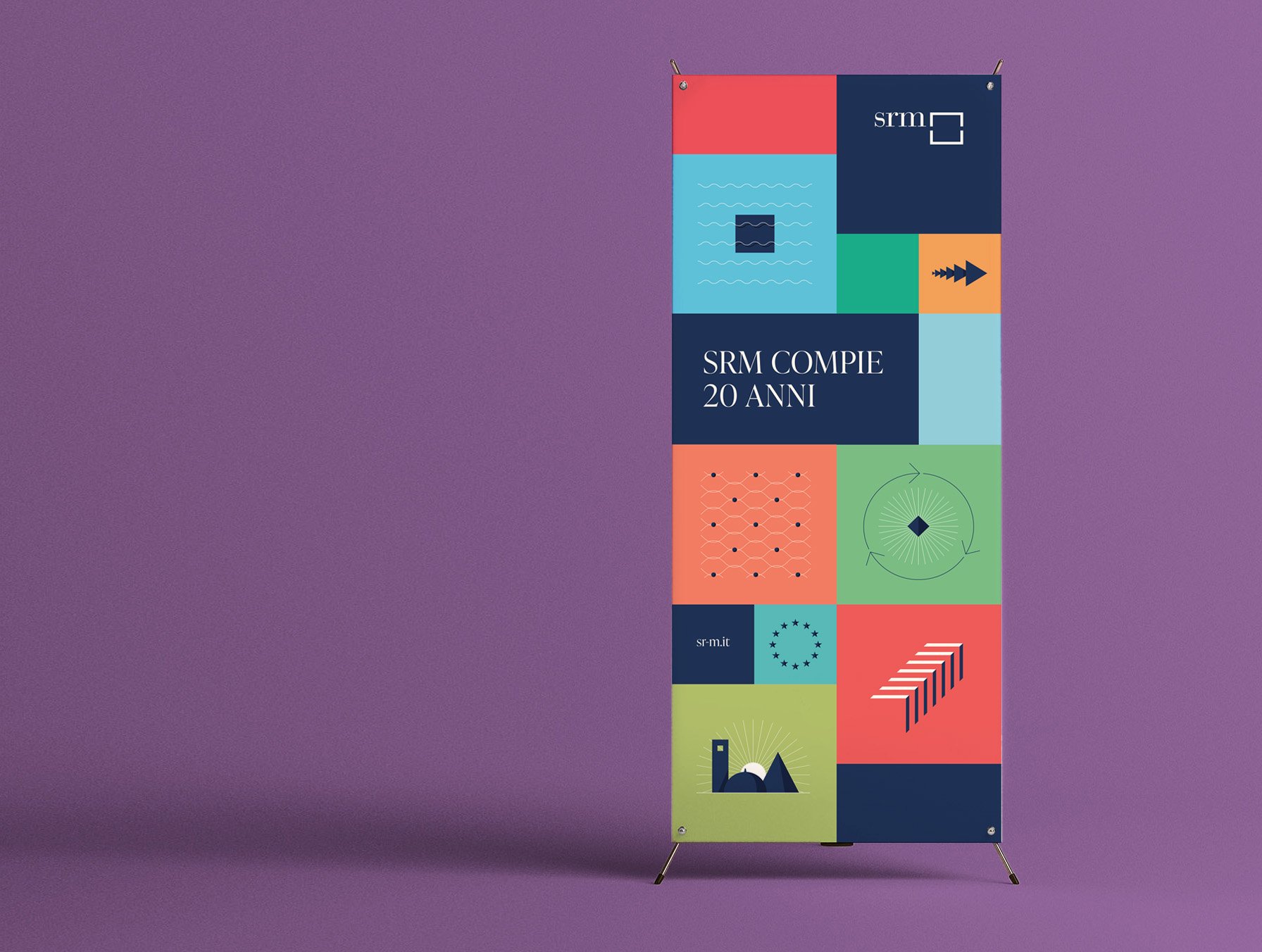
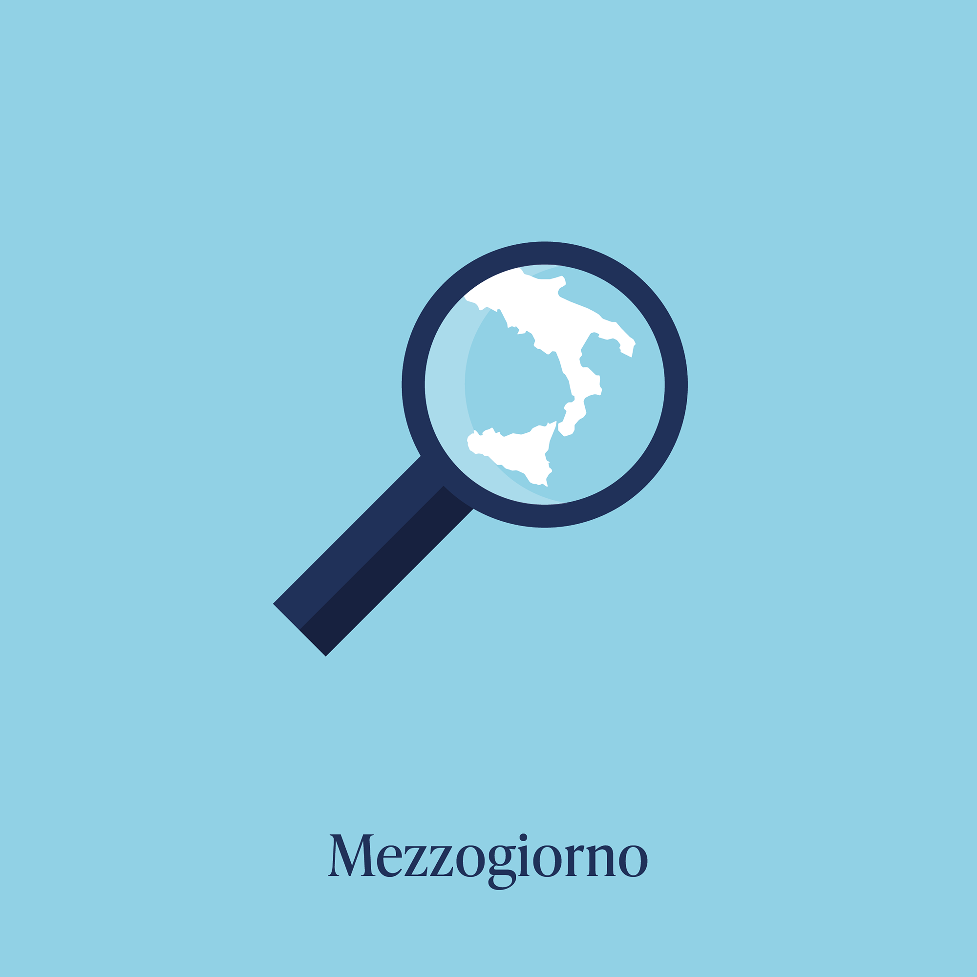
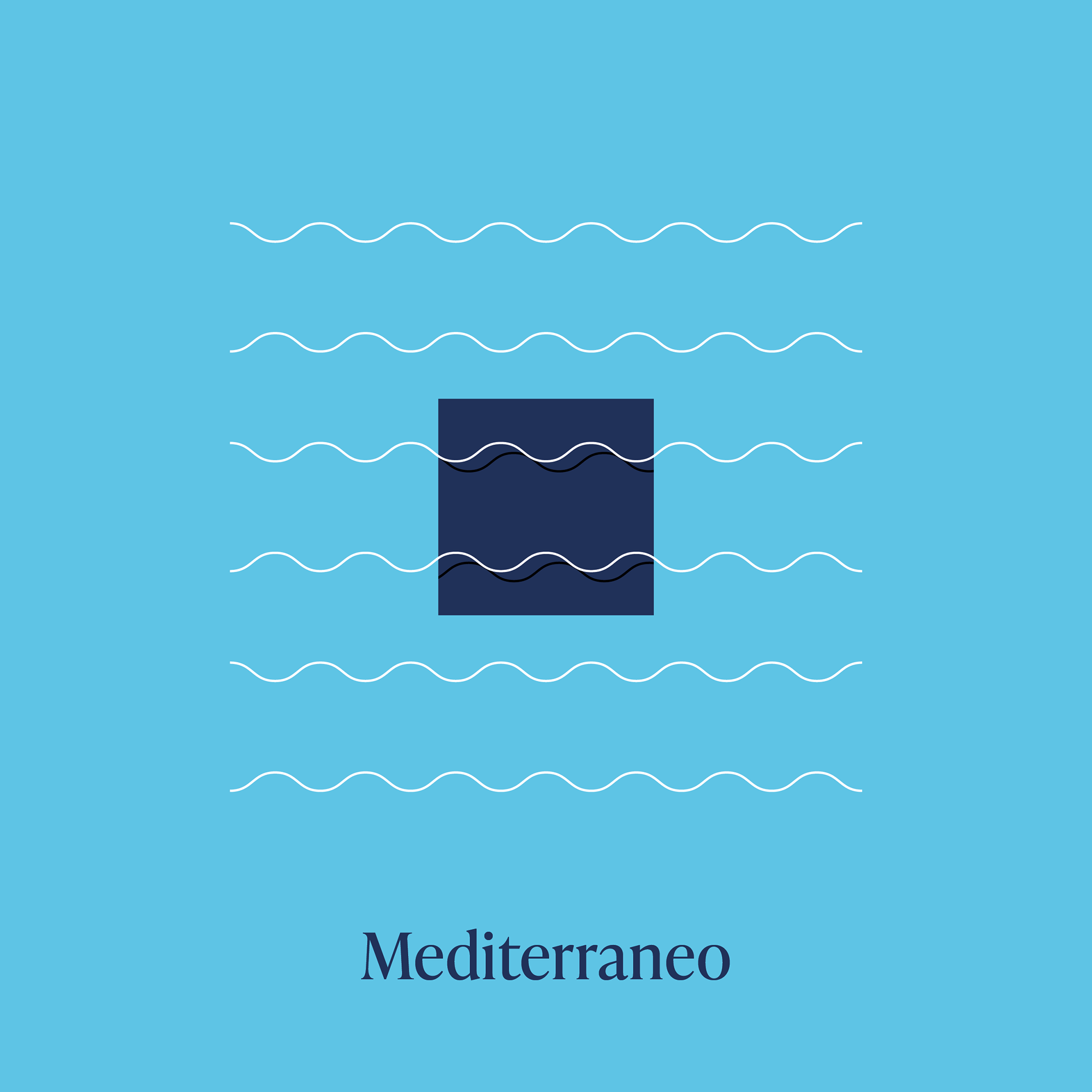
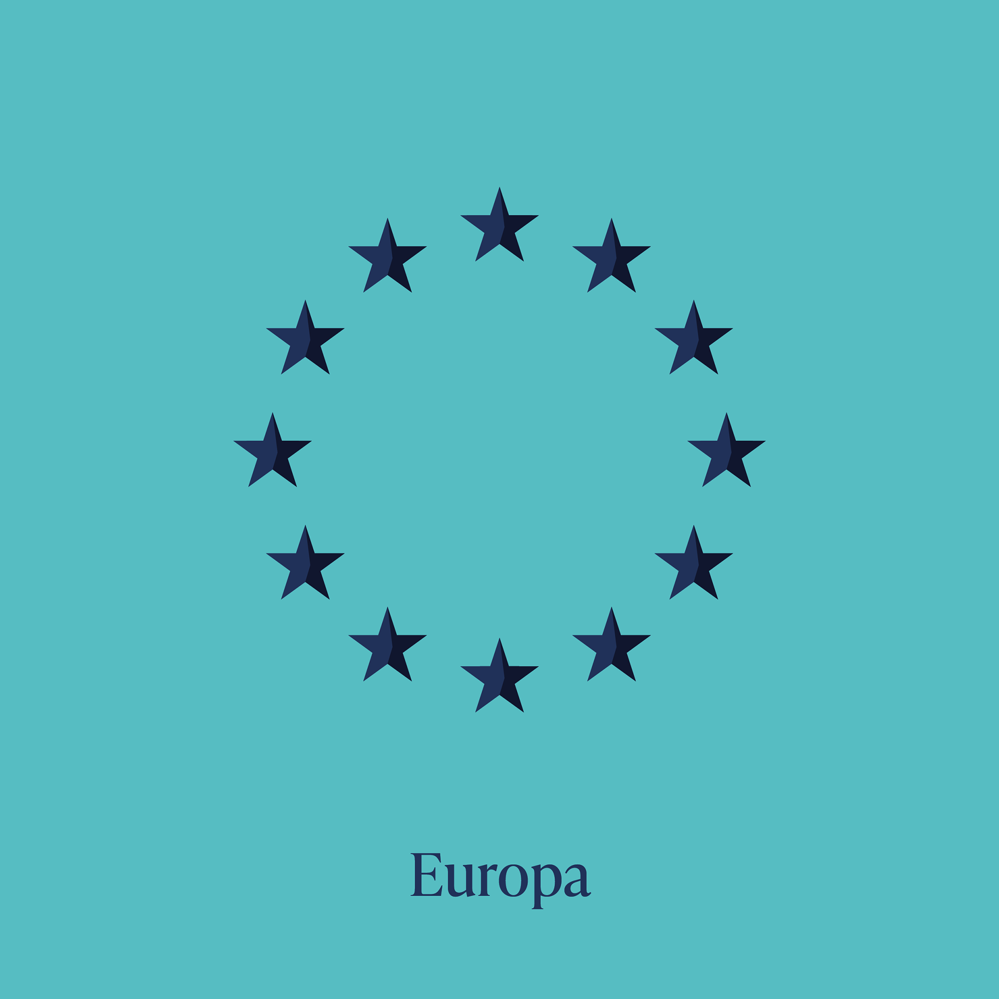
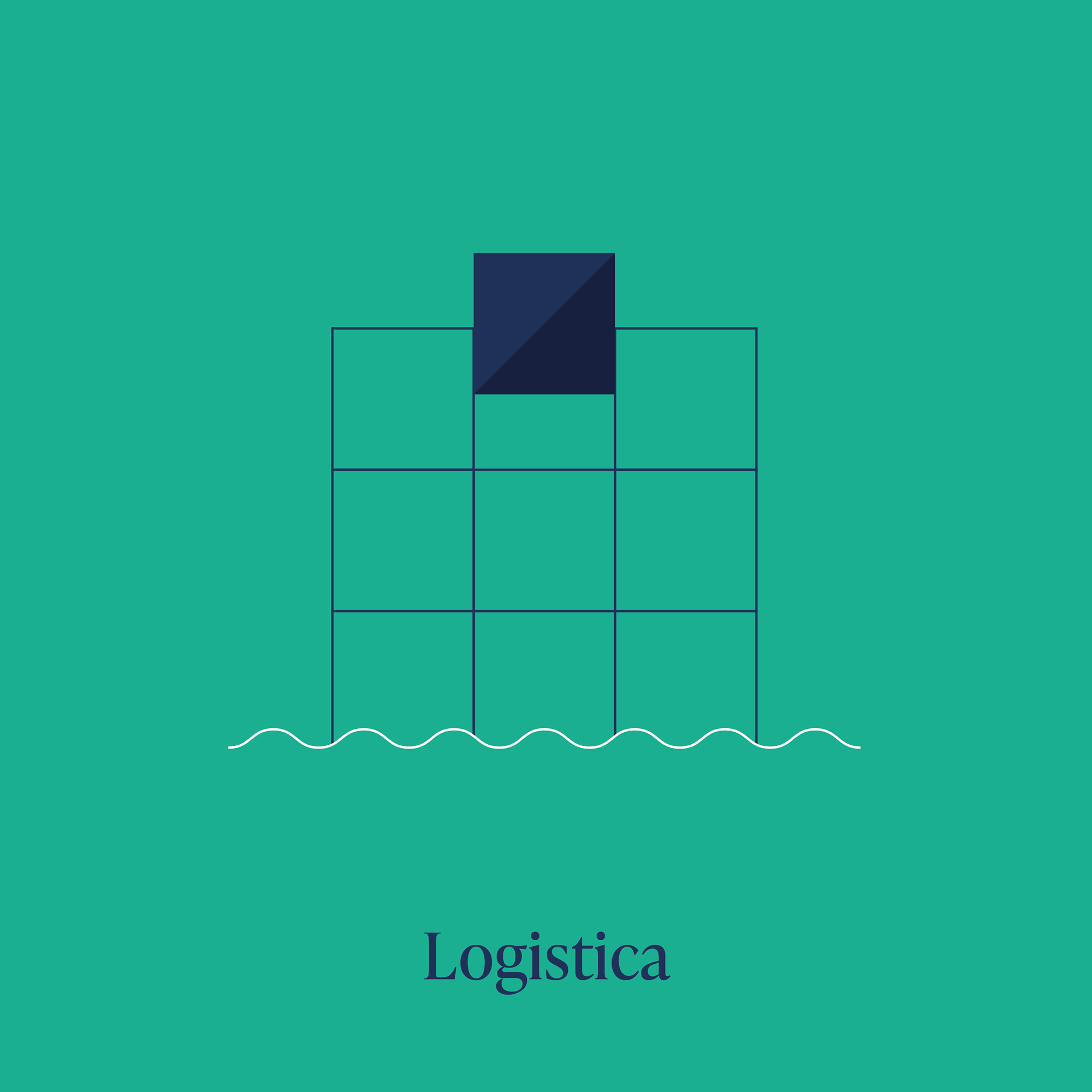
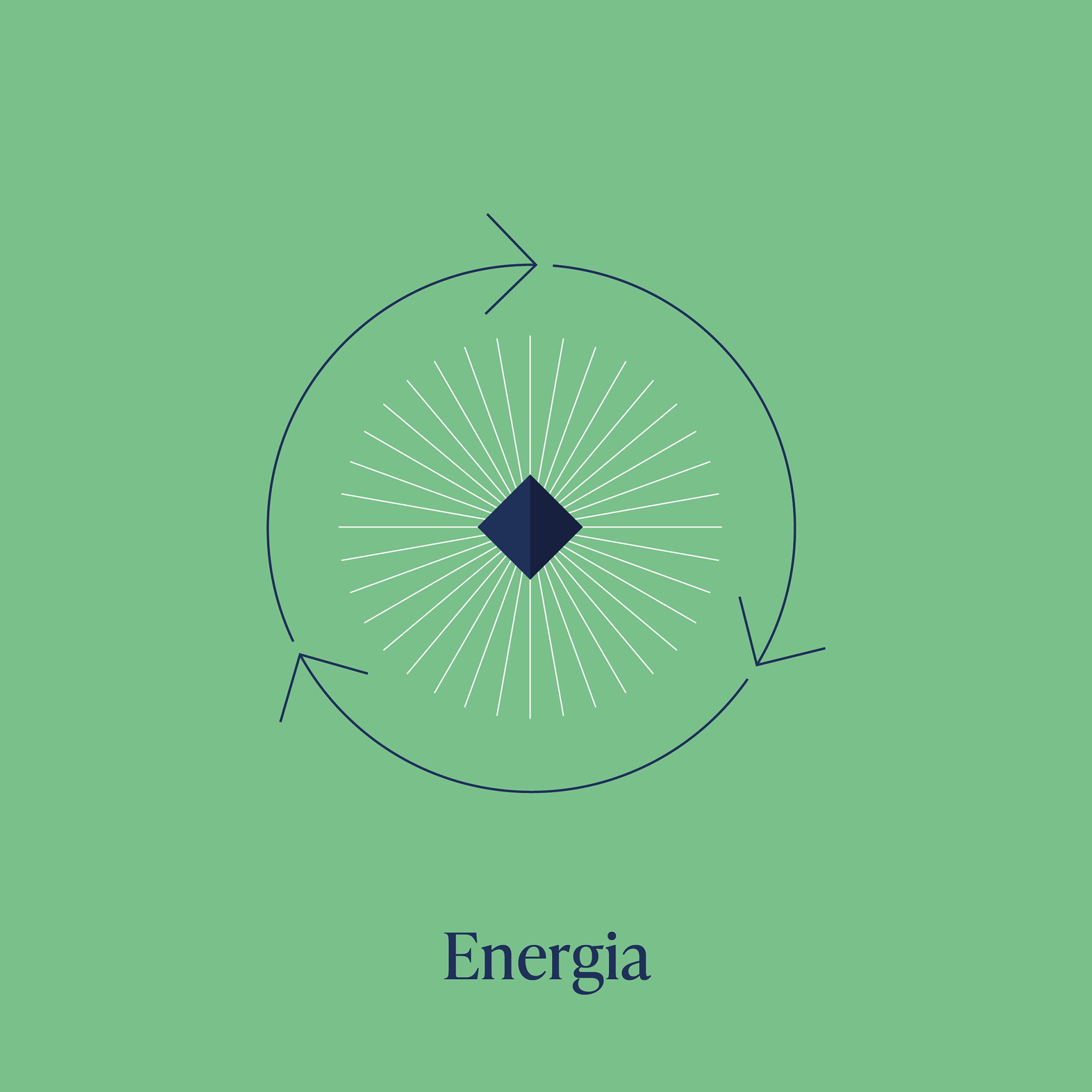
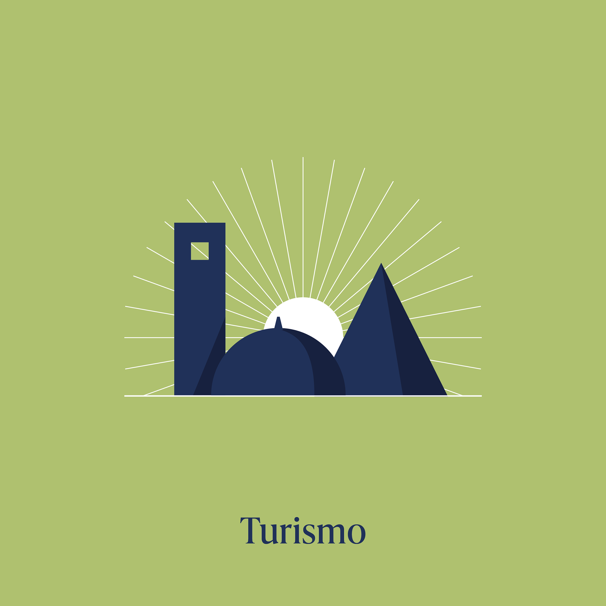
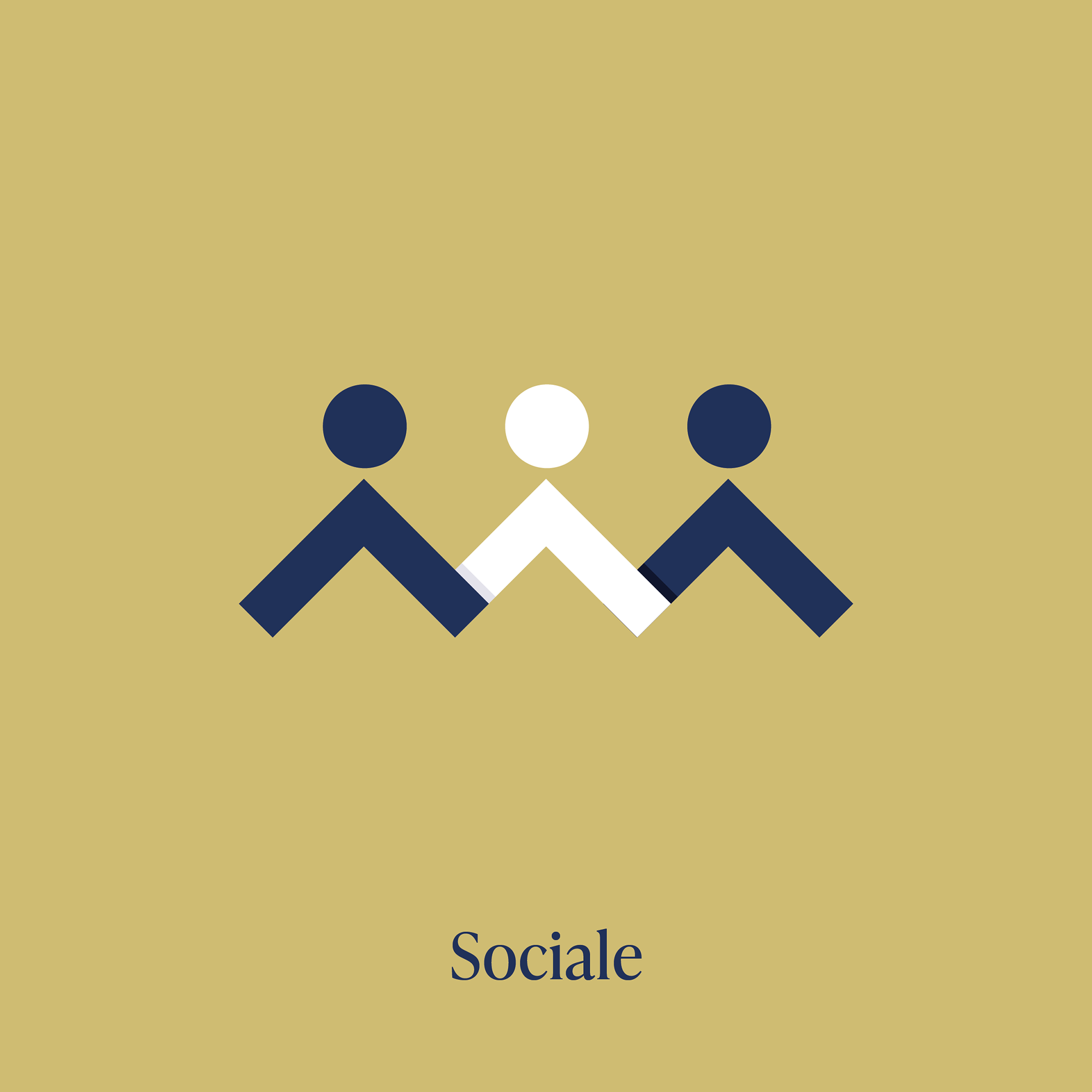
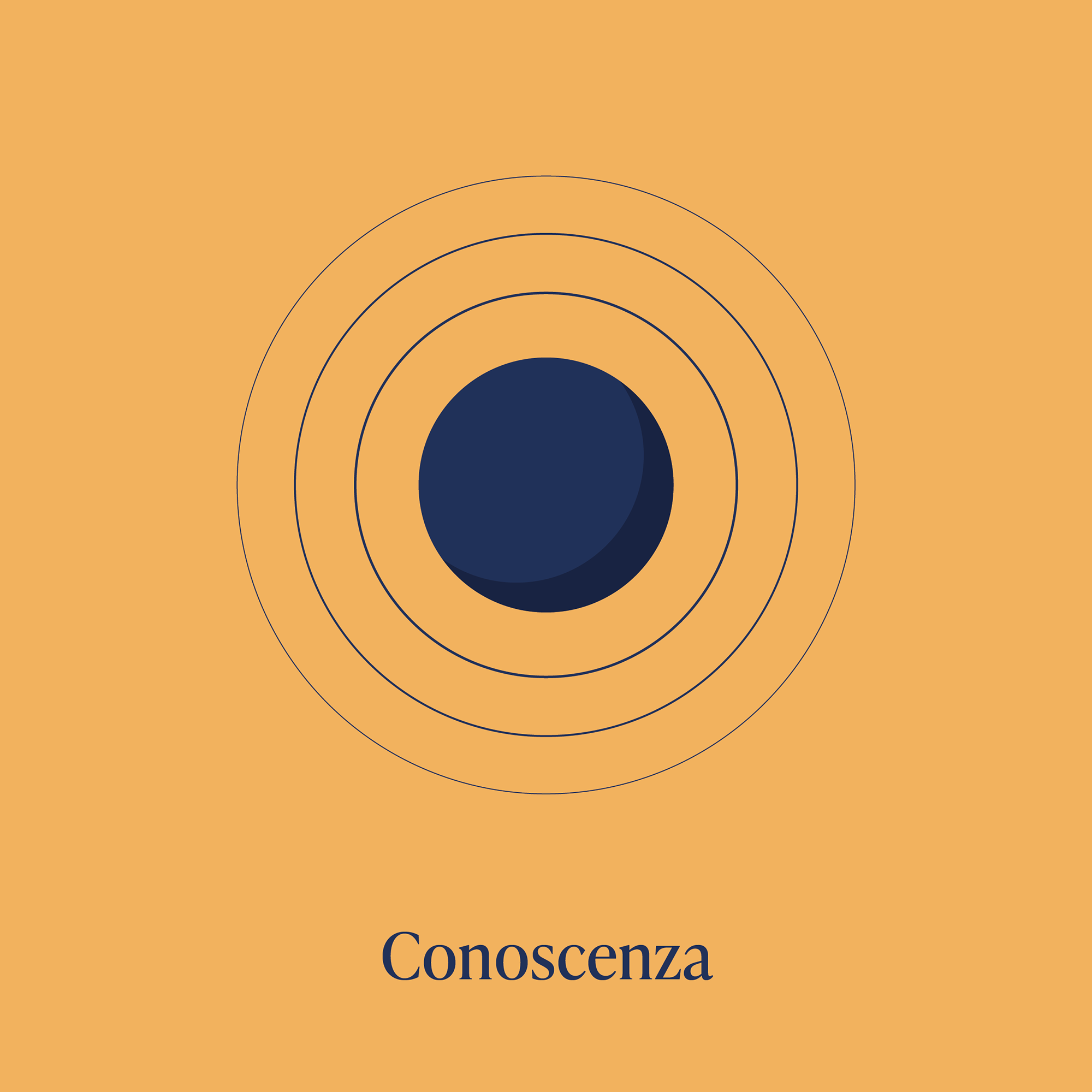
SRM is a research center born in 2003 and focused on the analysis of production and tourism chains as well as on the port-logistics and energy sectors in Southern Italy. For the twenty years anniversary, a celebratory book has been designed, introducing twenty identifying words illustrated and accompanied by perspectives on the Center from institutional, academic, associative and entrepreneurial representatives, who have approached SRM during these years.
SRM is related to Intesa Sanpaolo Banking Group and also supported by the Compagnia di San Paolo Foundation.

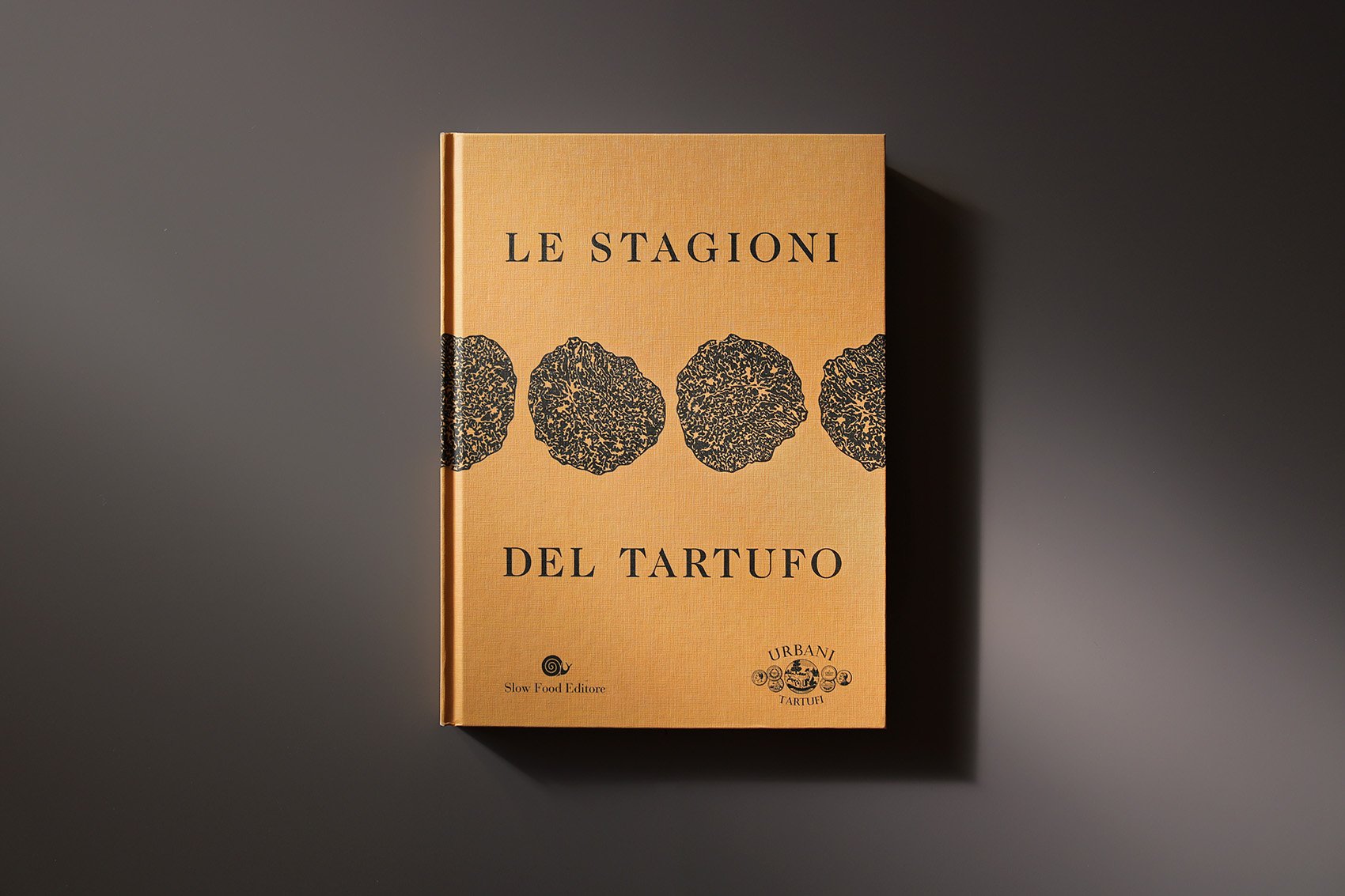
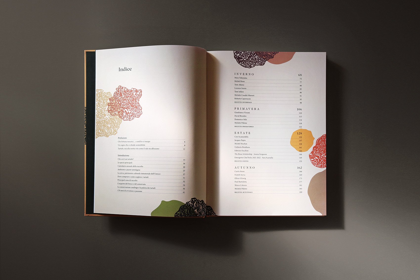
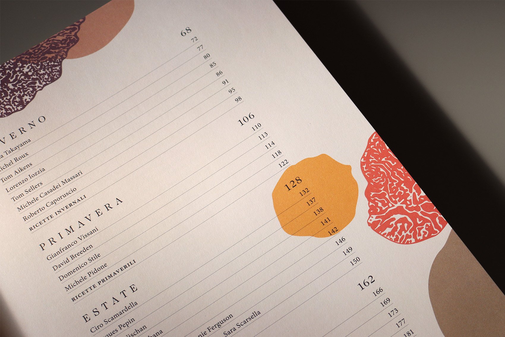
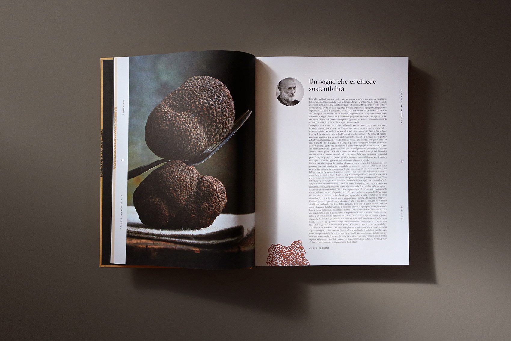
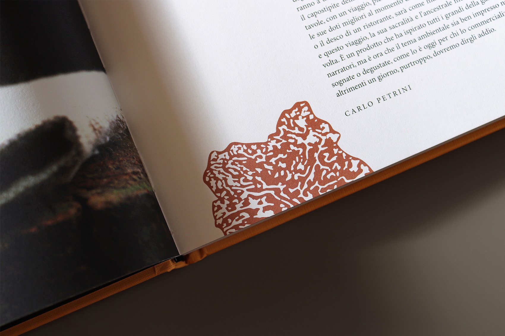
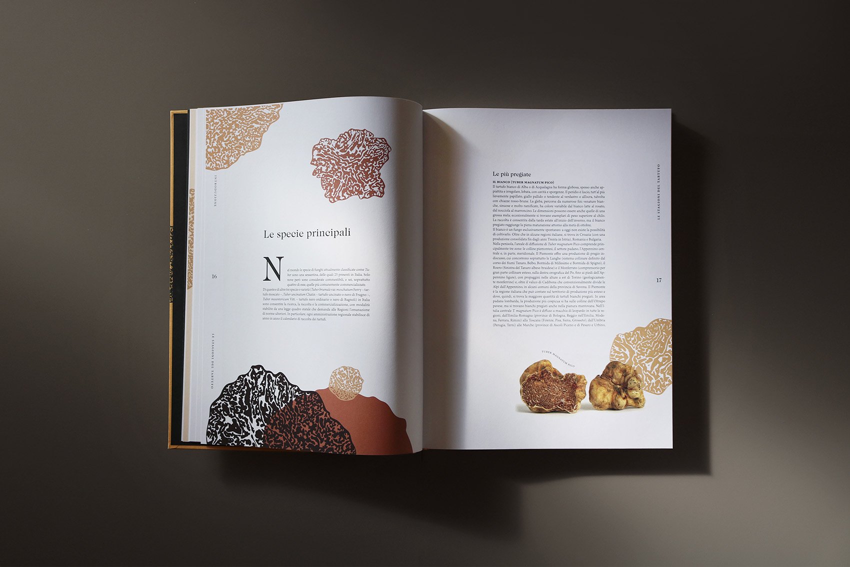
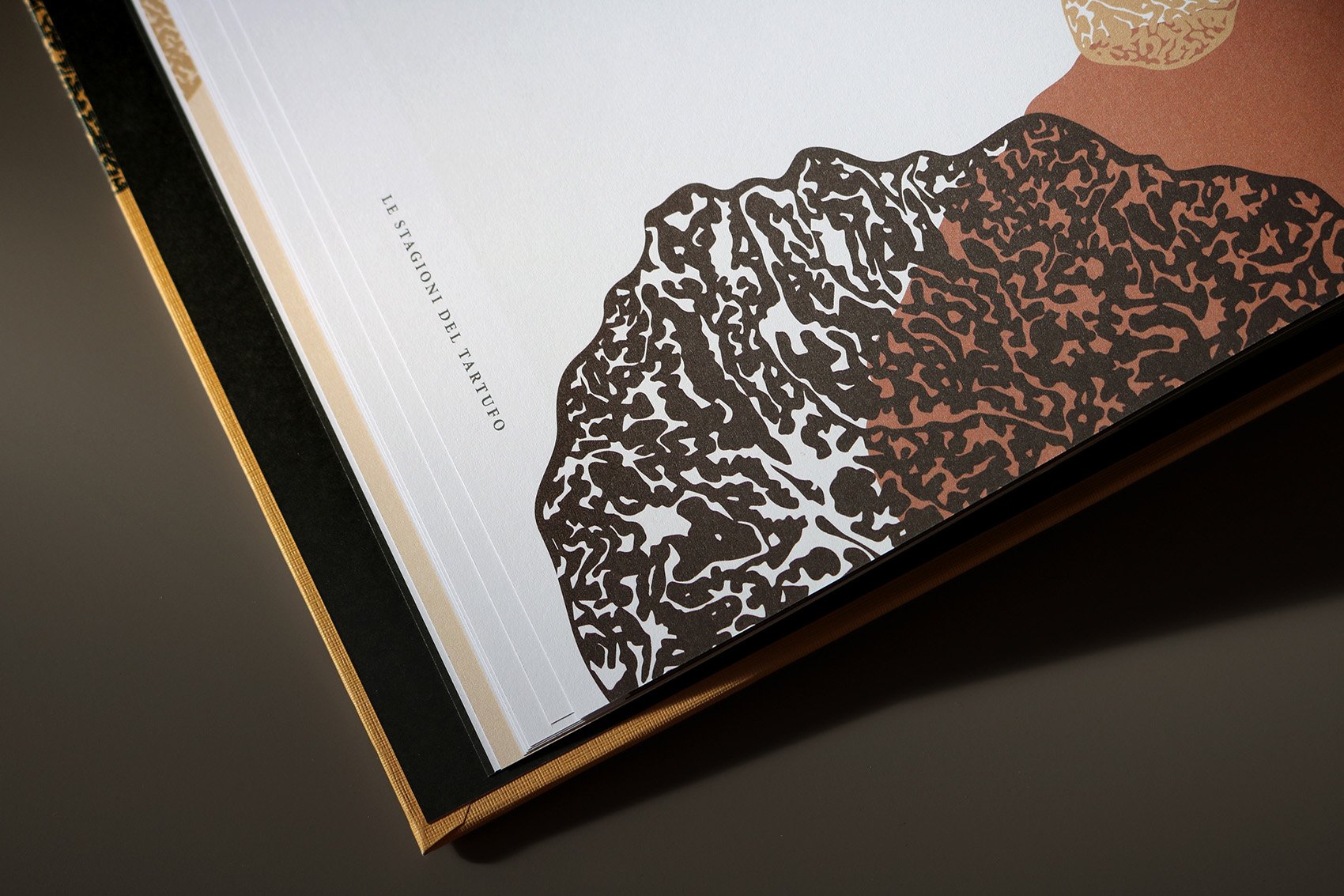
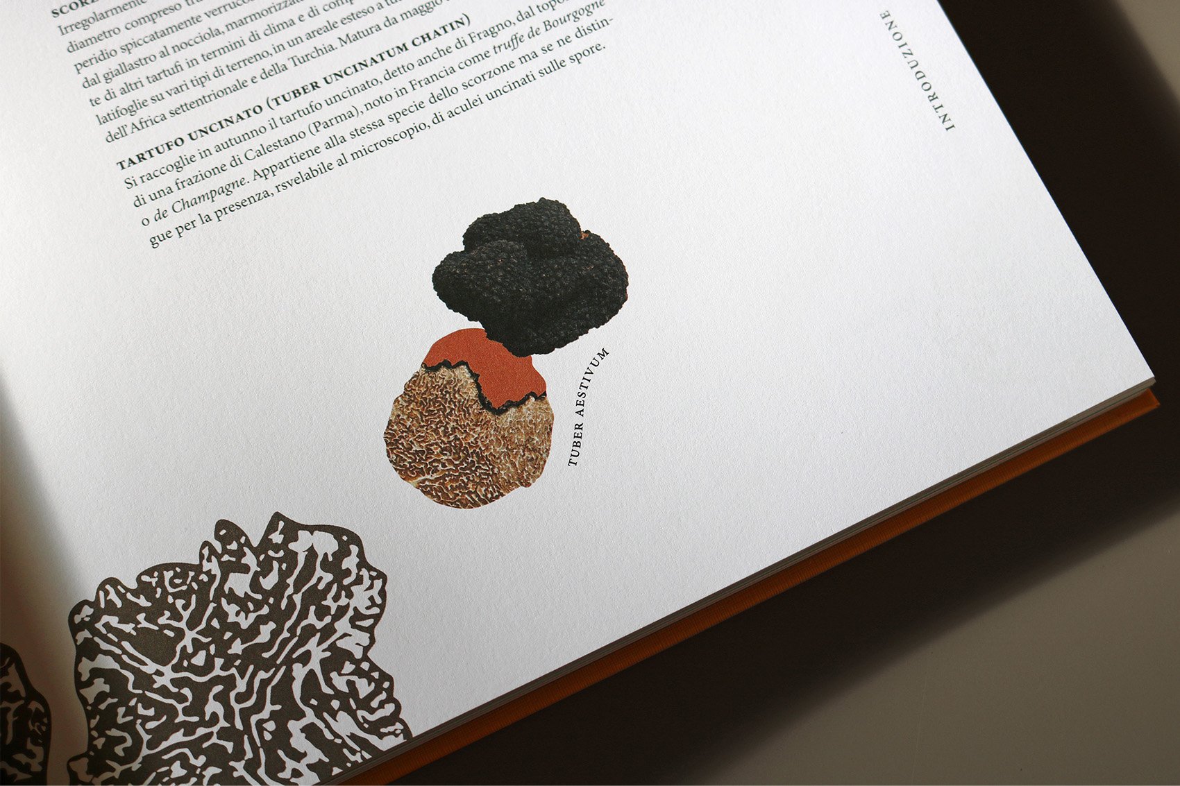
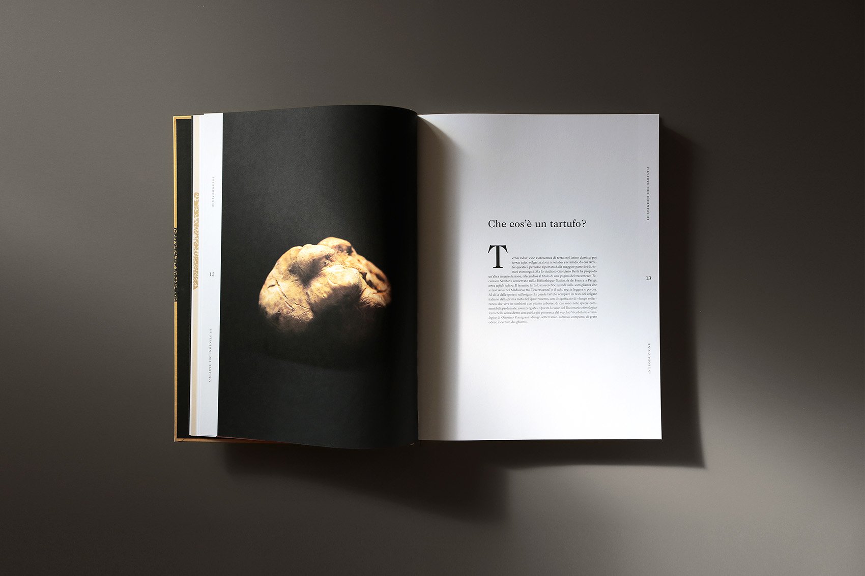
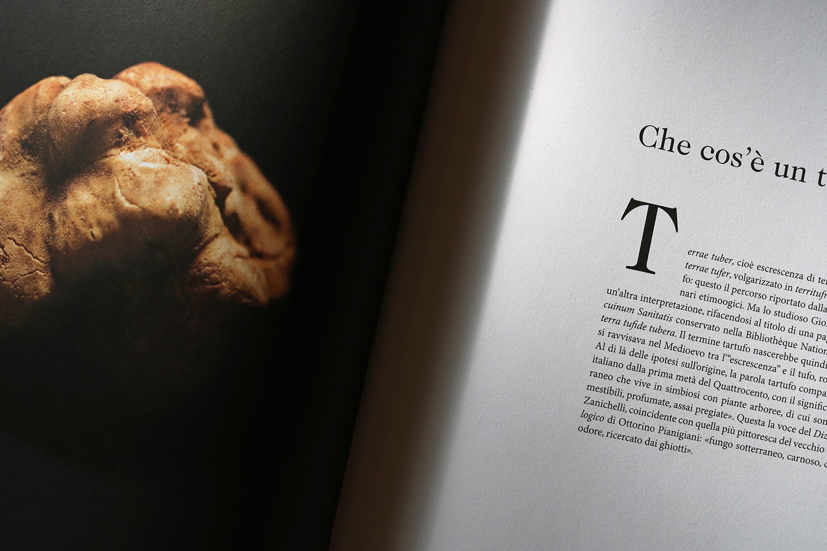
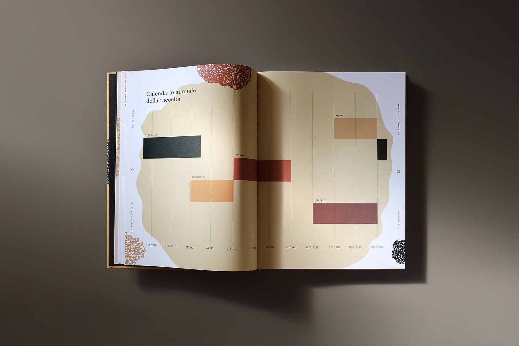
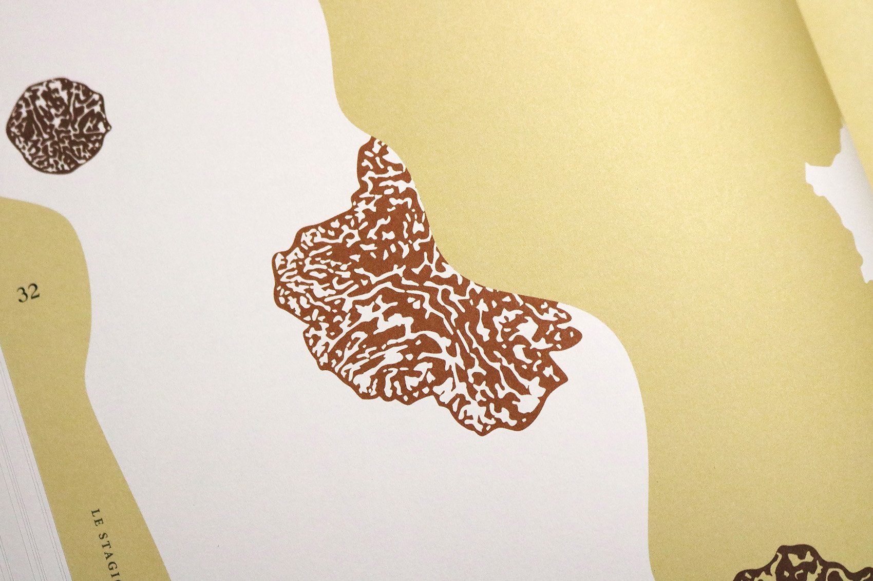
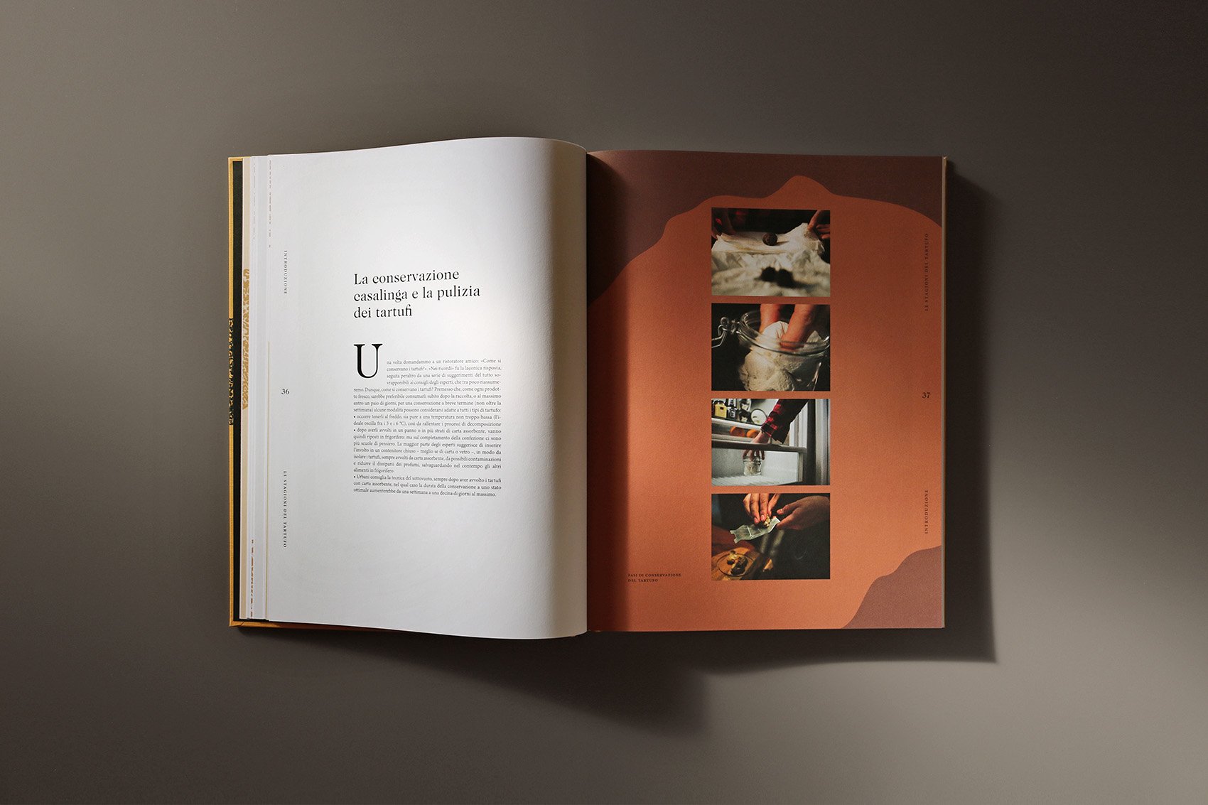
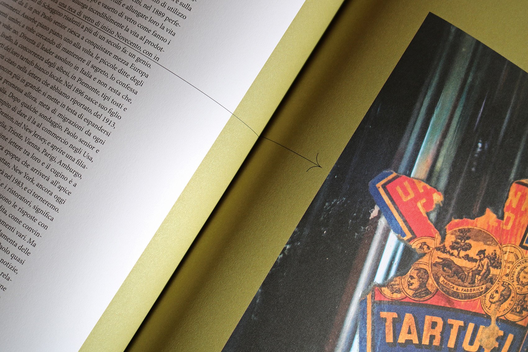
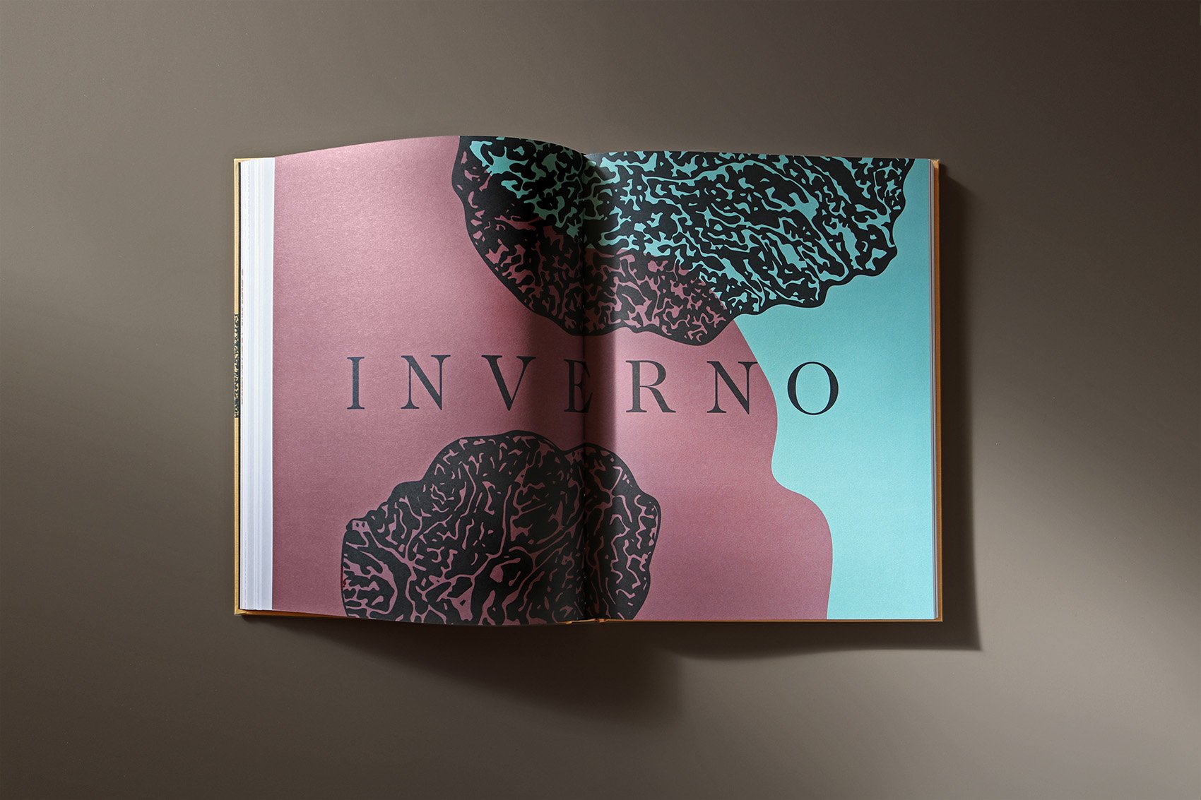
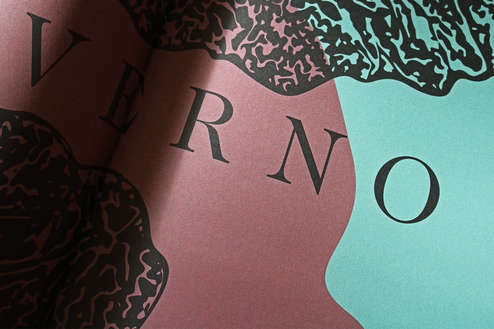
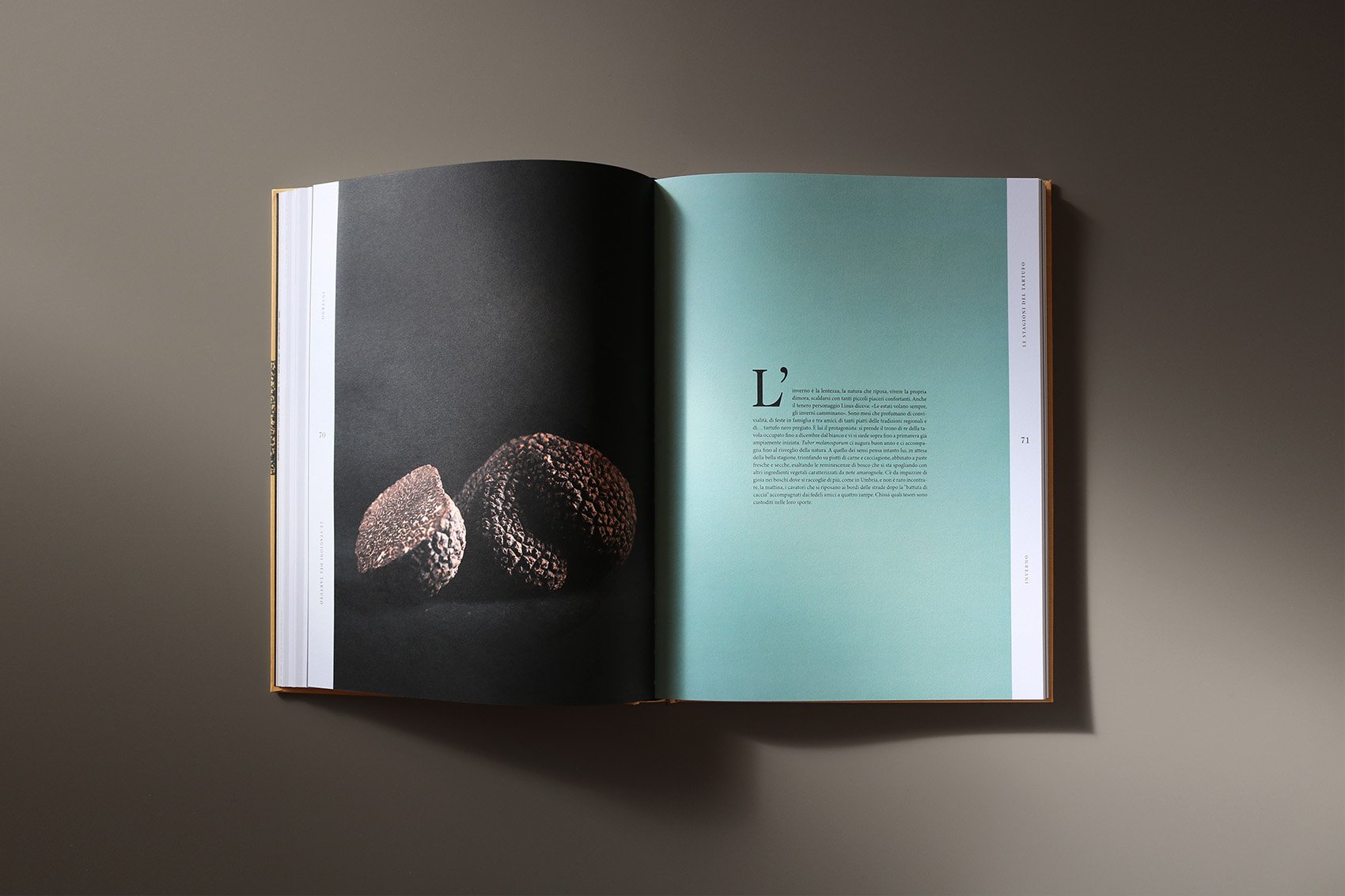
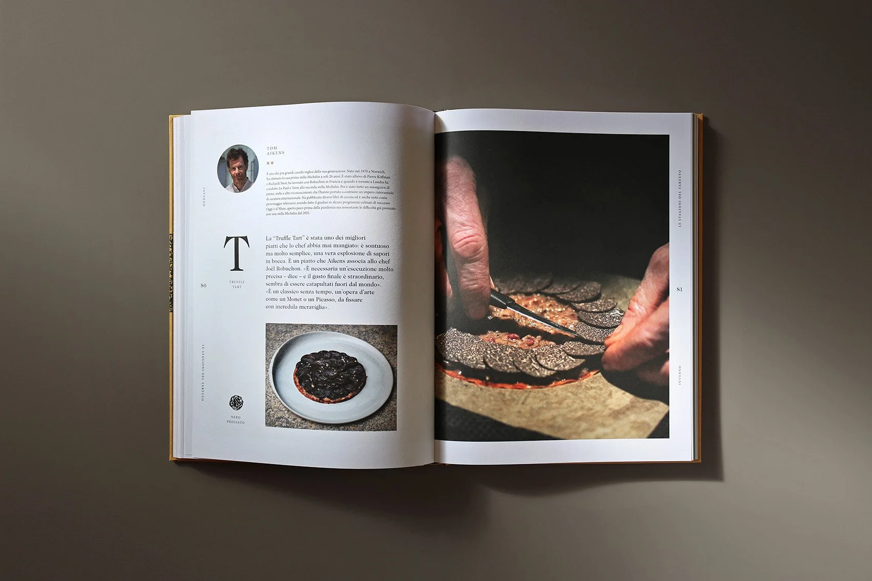
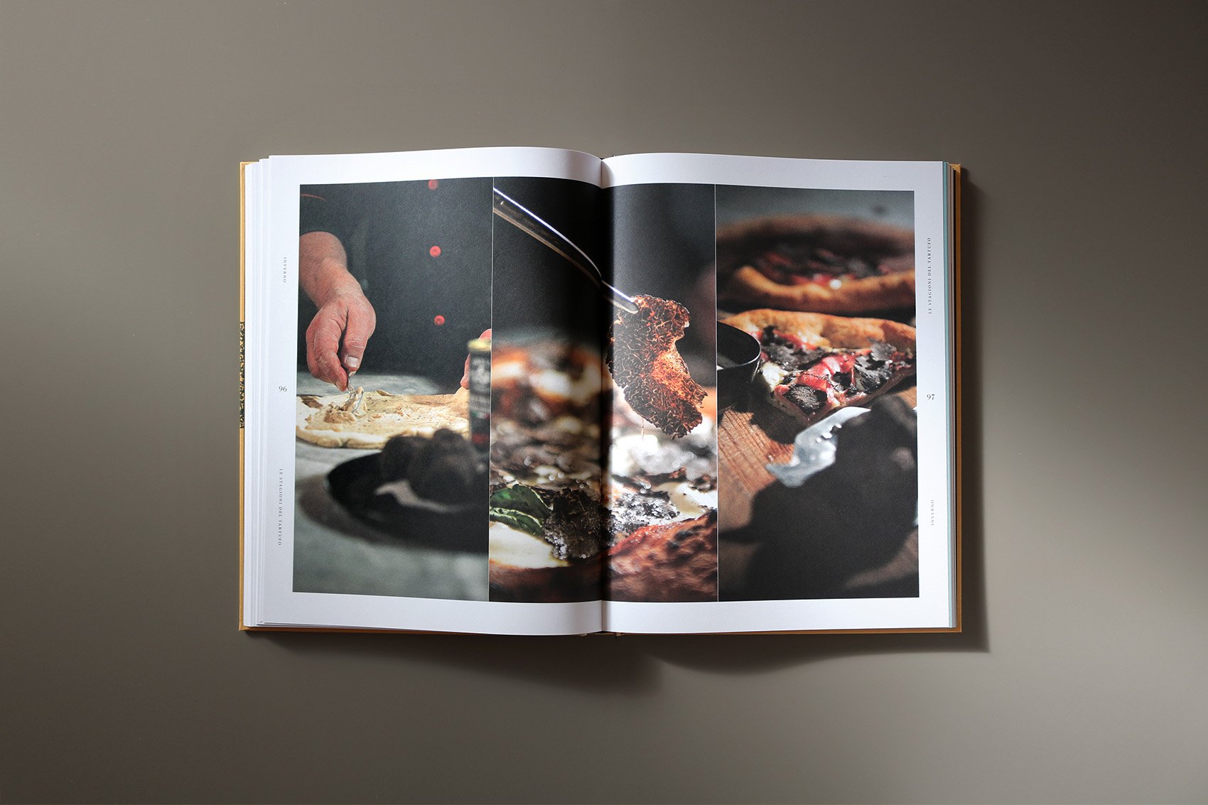
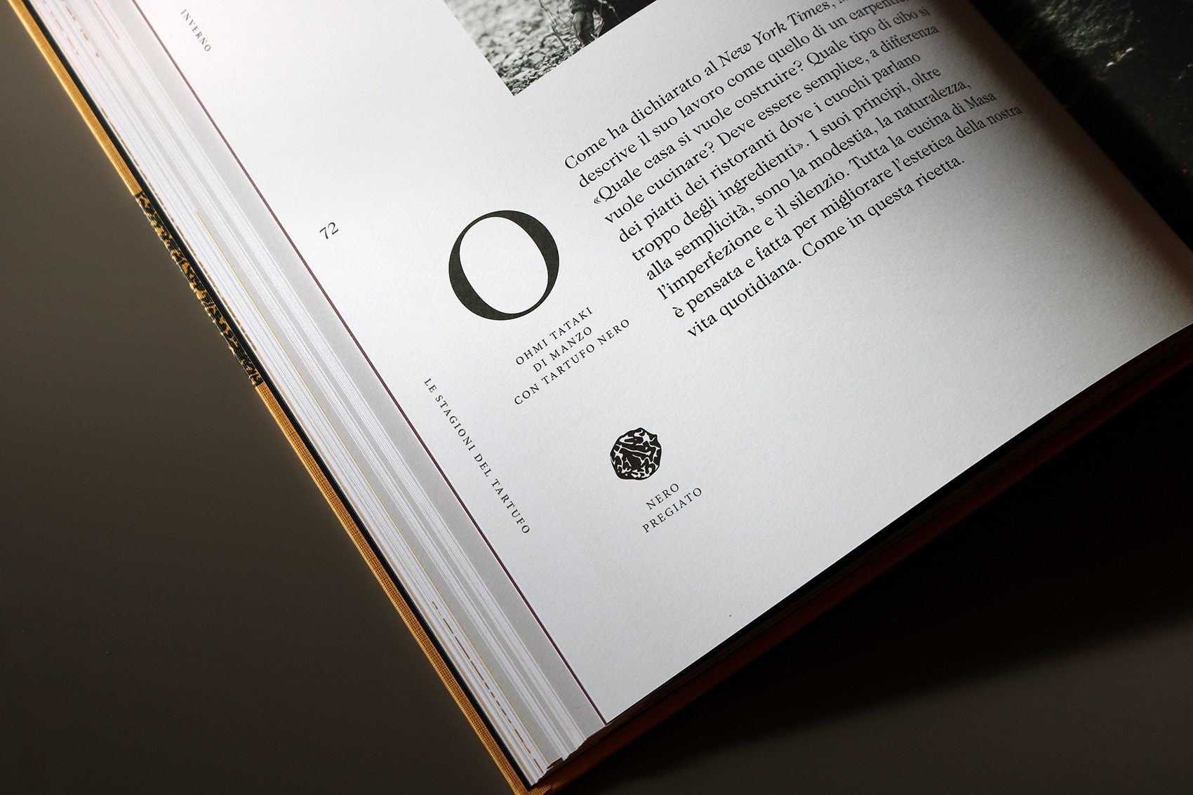
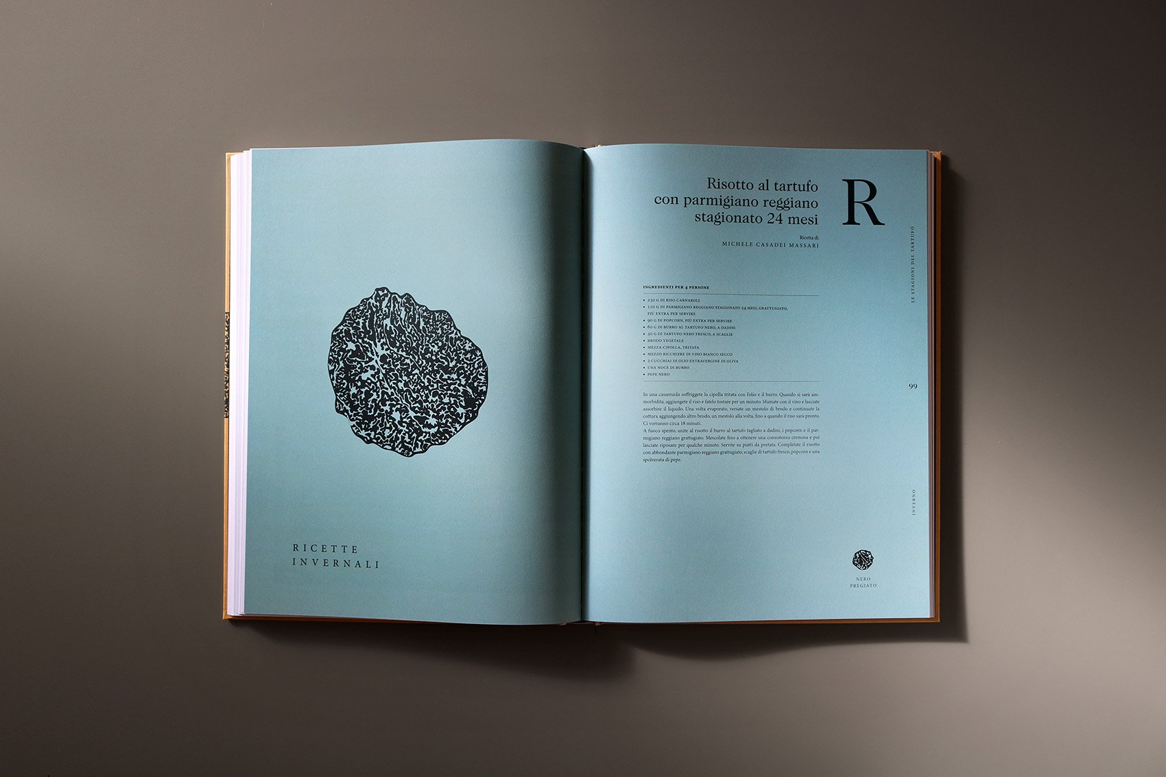
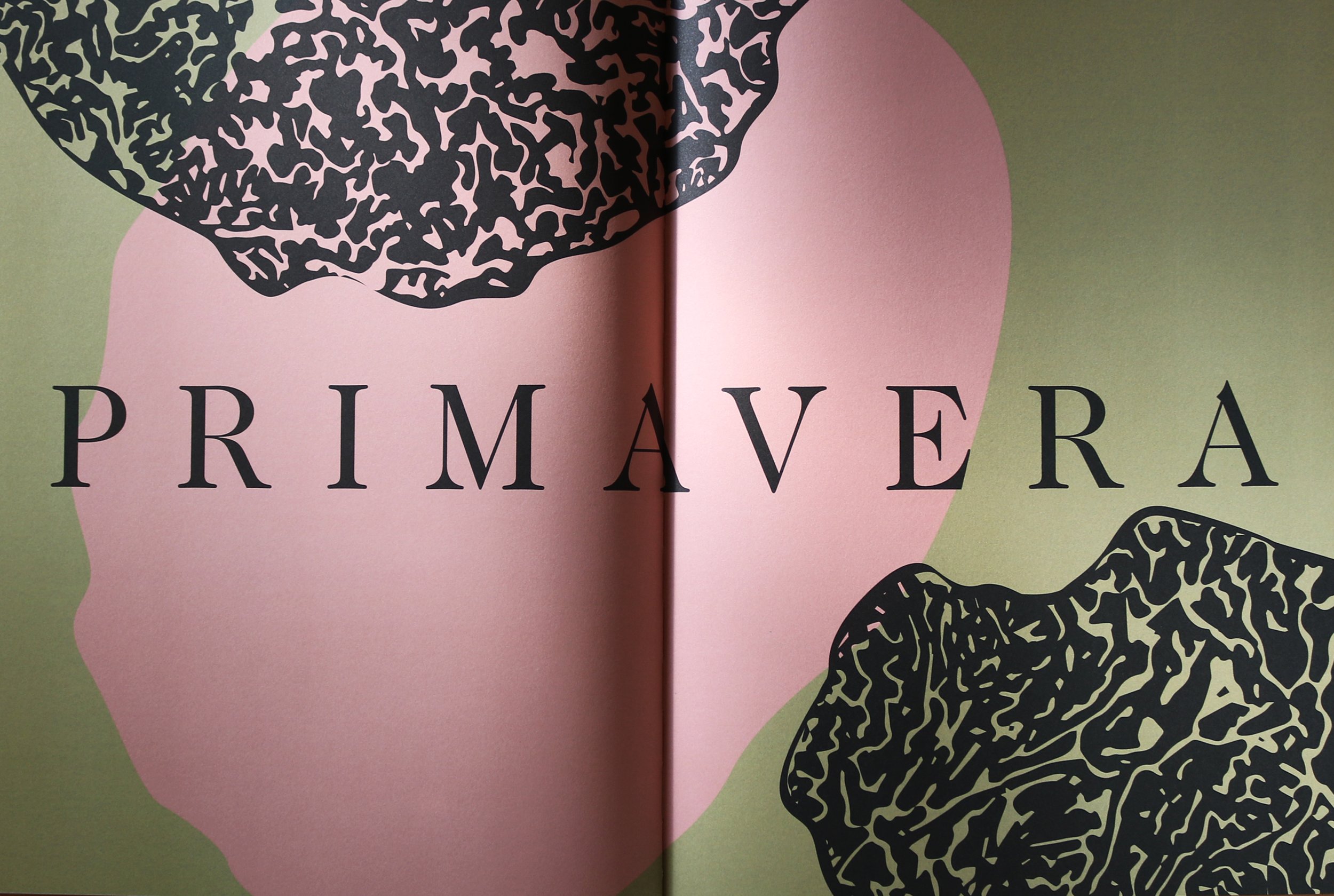
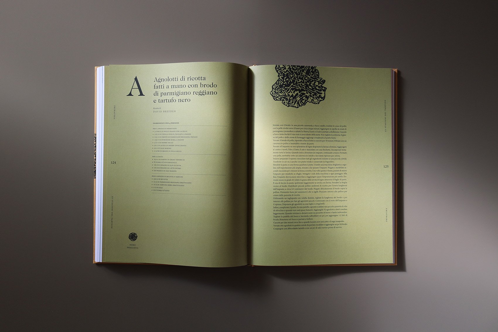
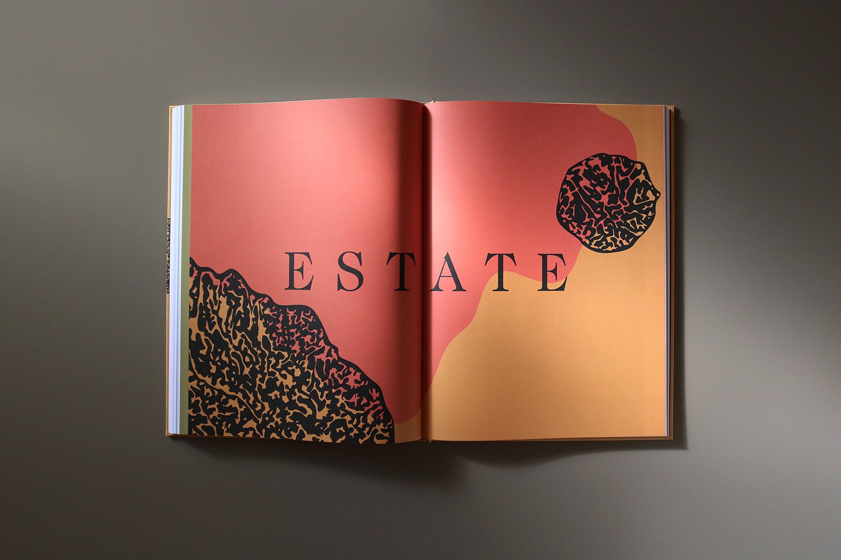
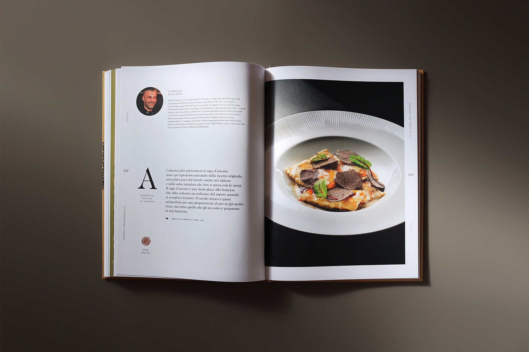
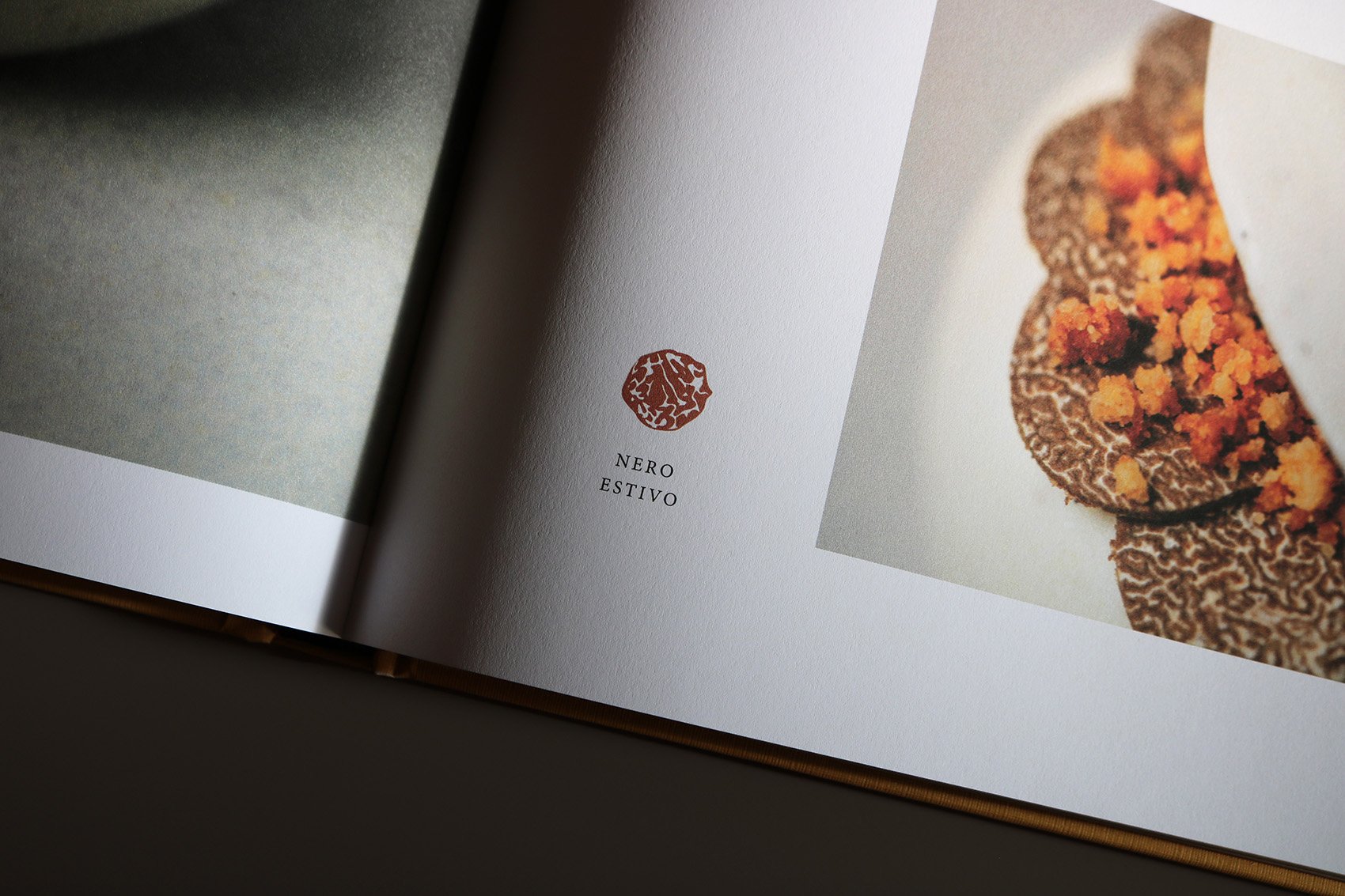
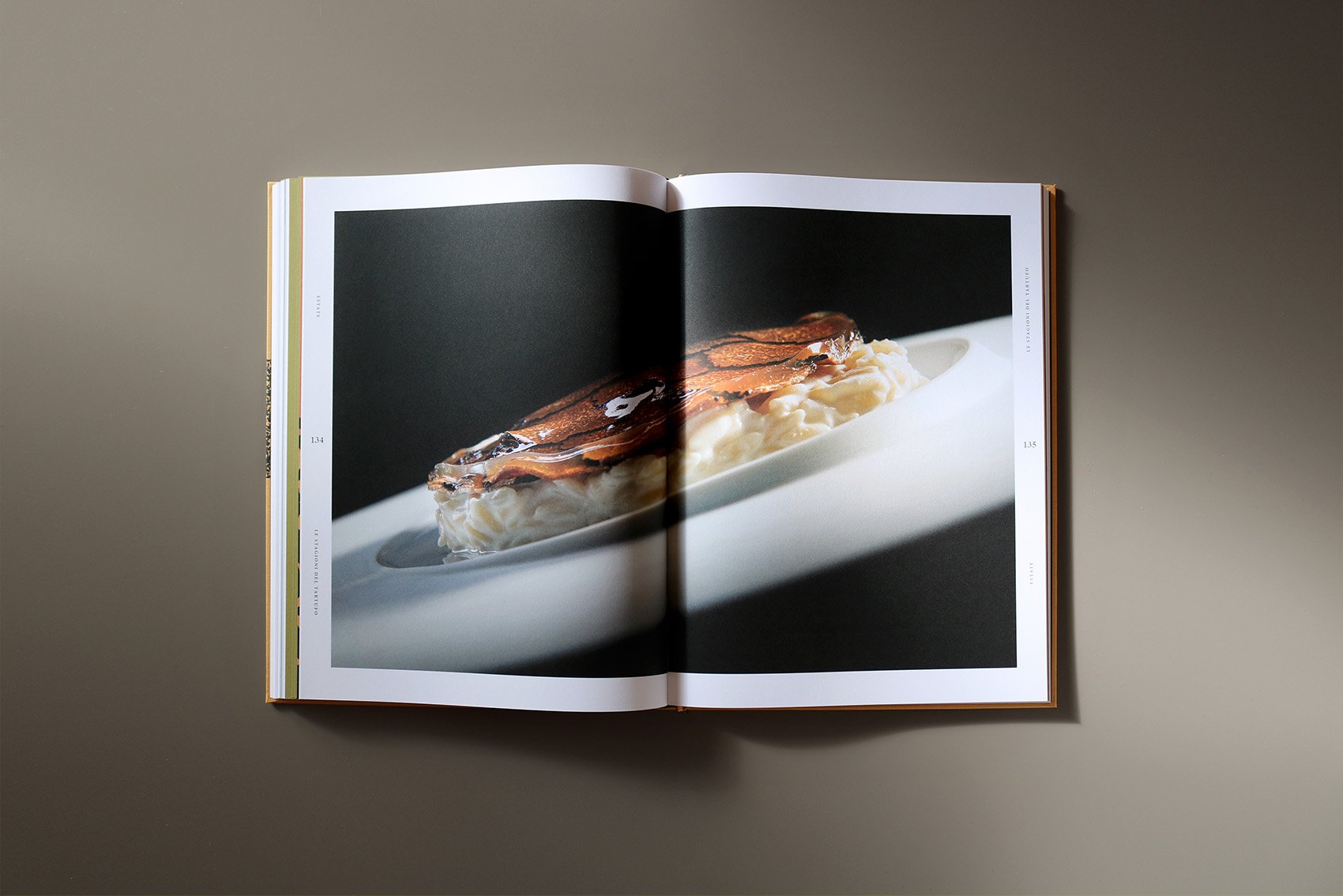
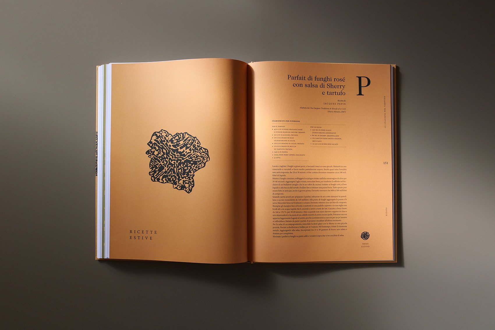
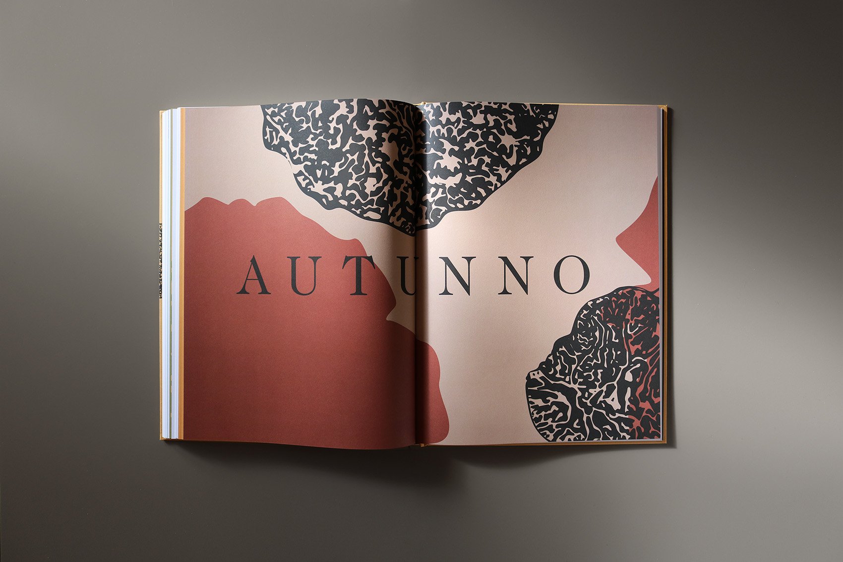
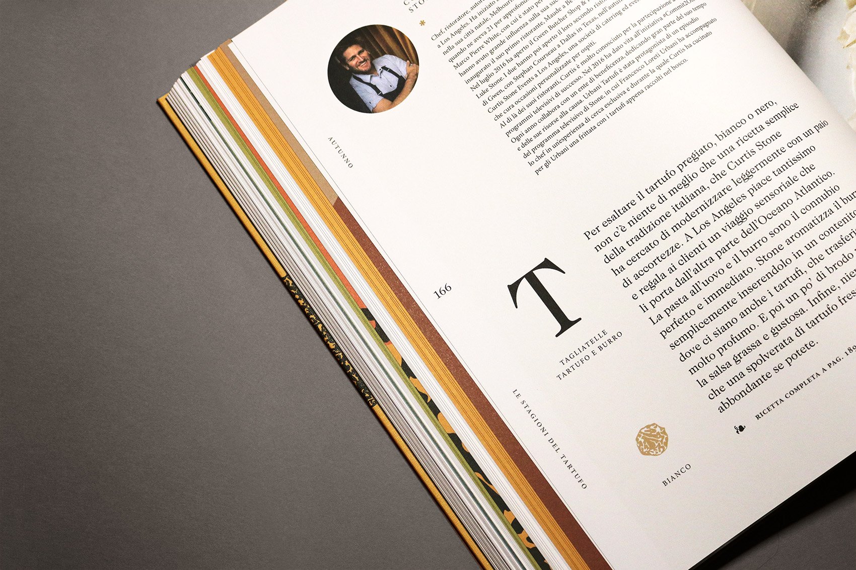
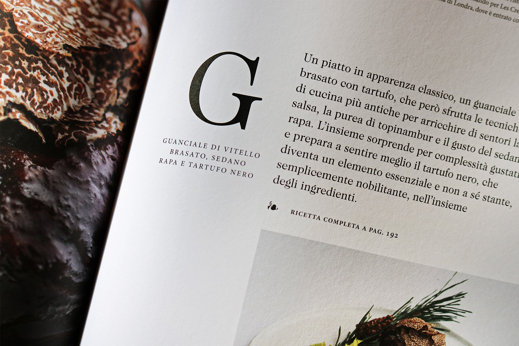
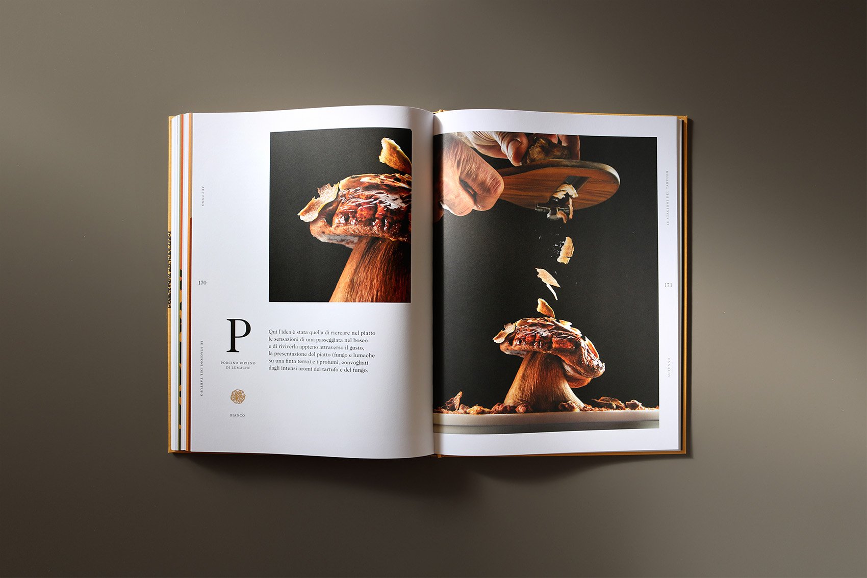
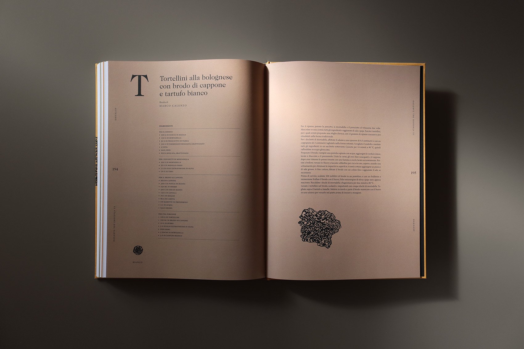
Le stagioni del tartufo is a book about the world of truffle. It features the fascinating story of Urbani Tartufi together with seasonal recipes by Italian and international renowned chefs interpreting truffle in their own way. Colours and shapes help readers identifying seasons and truffle species.
Book published by Slow Food Editore
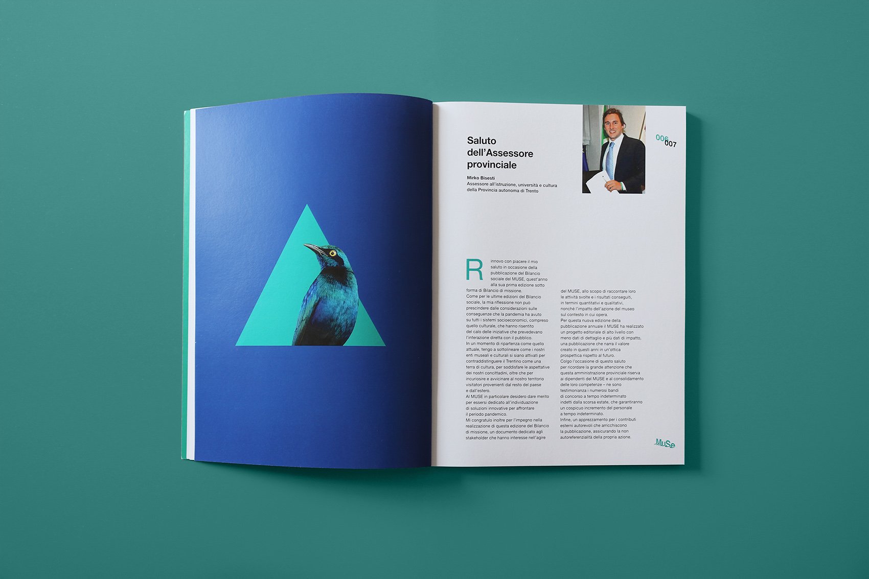
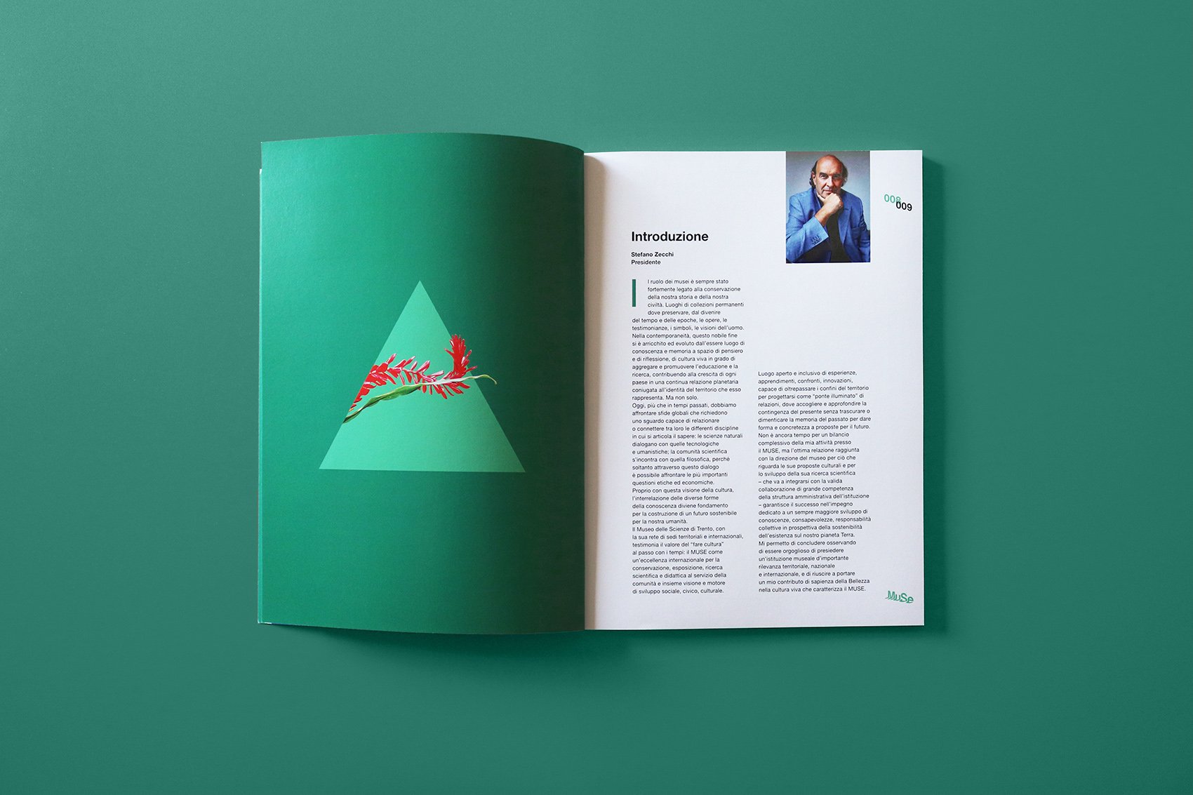
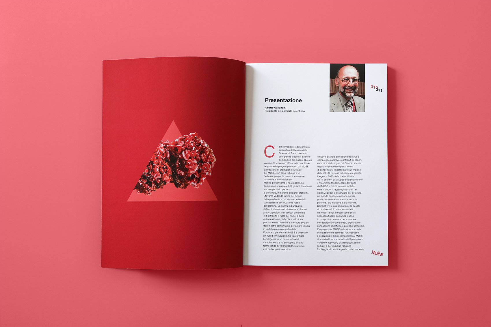
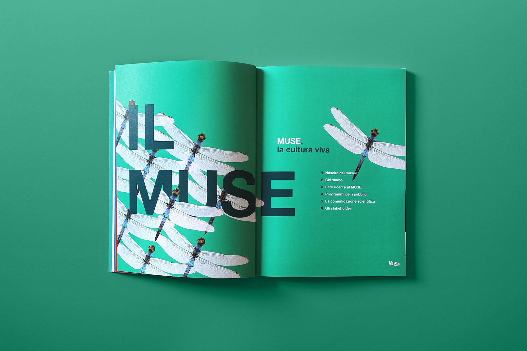
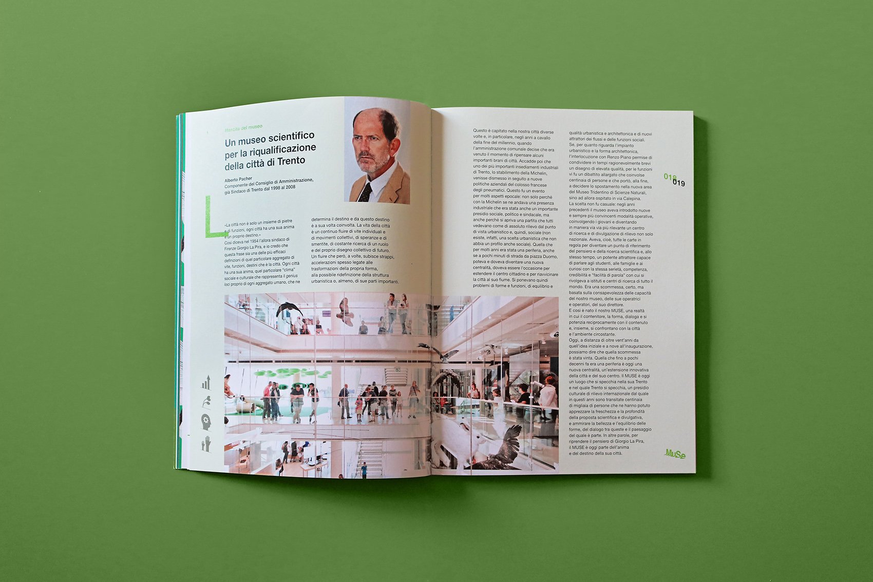
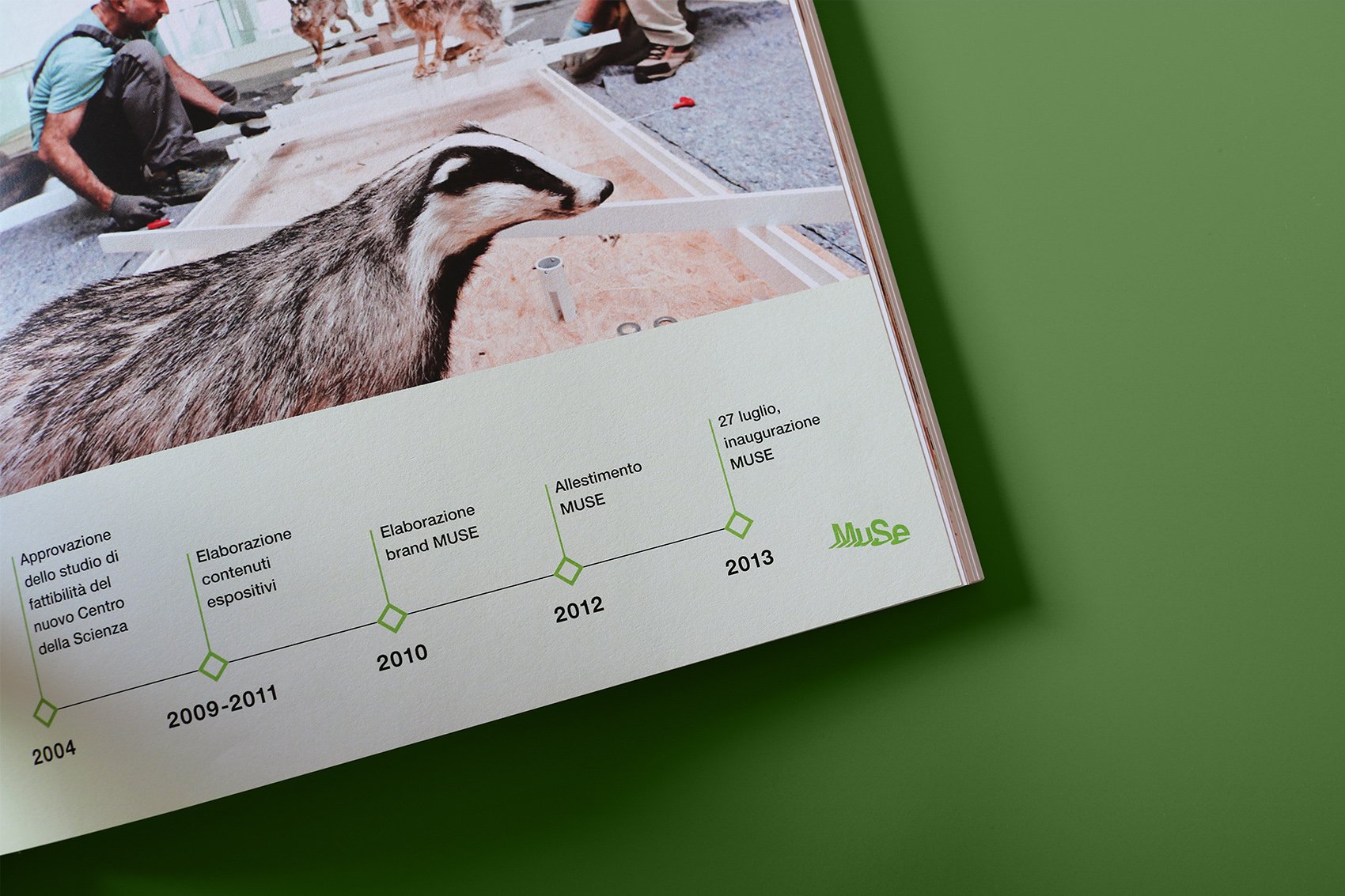
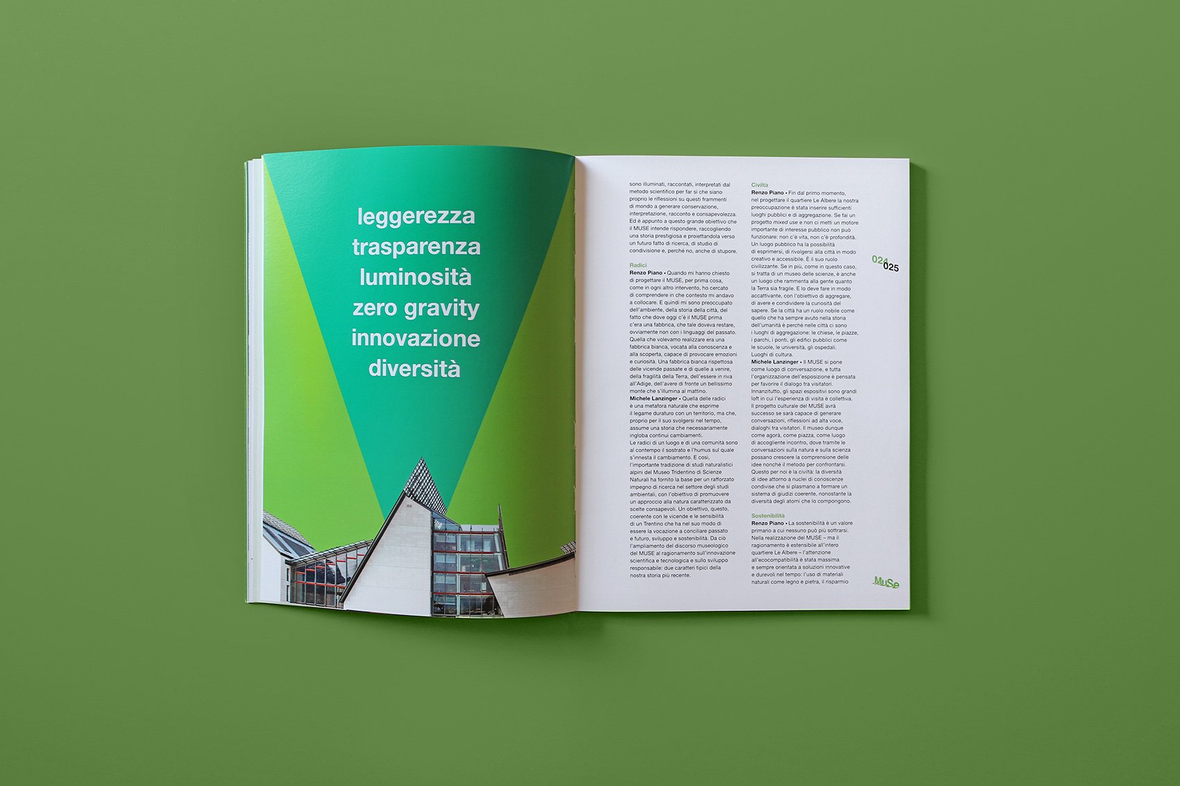
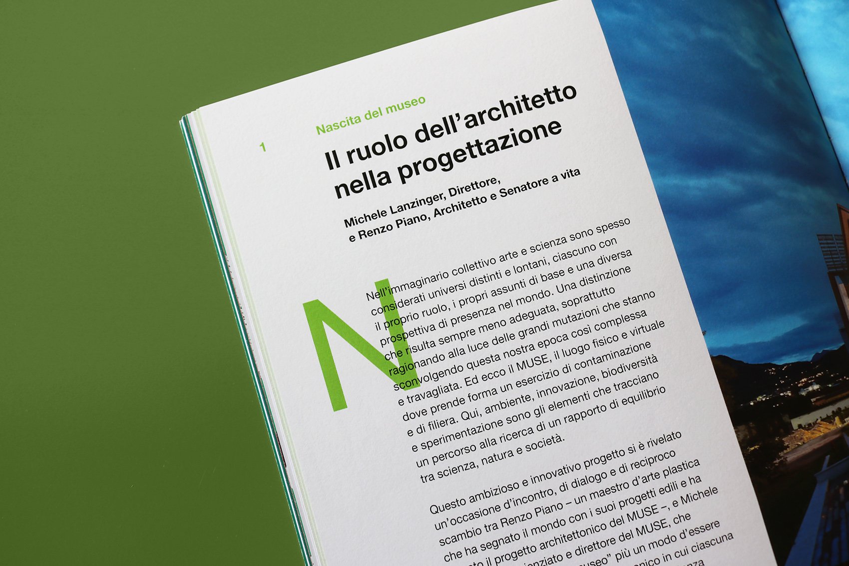
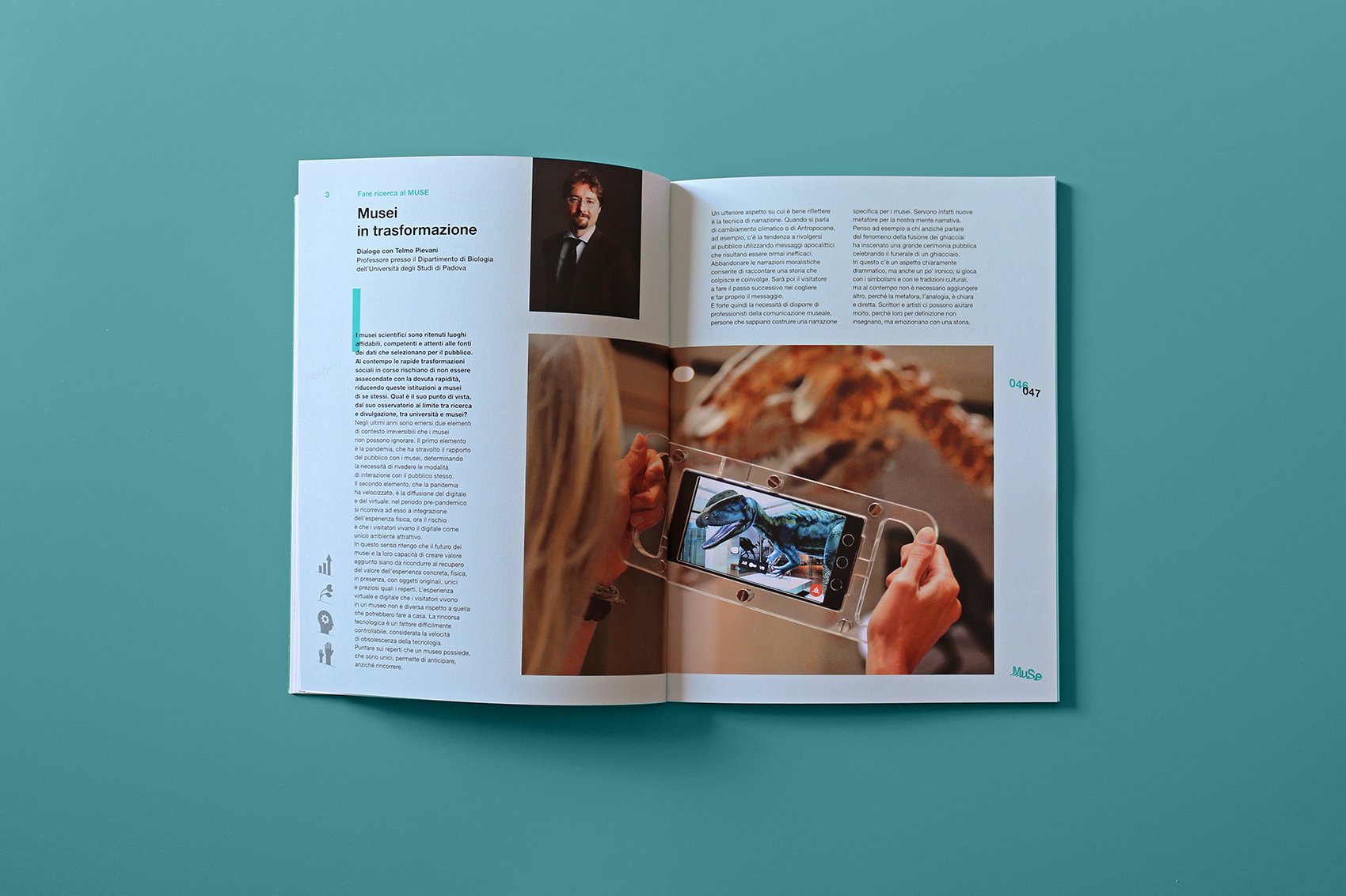
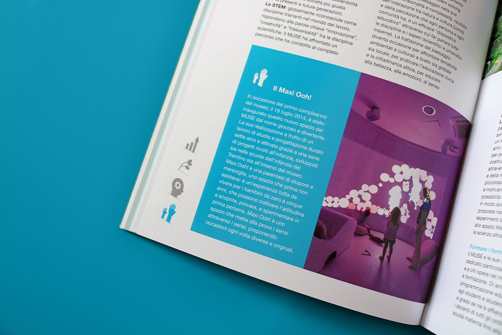
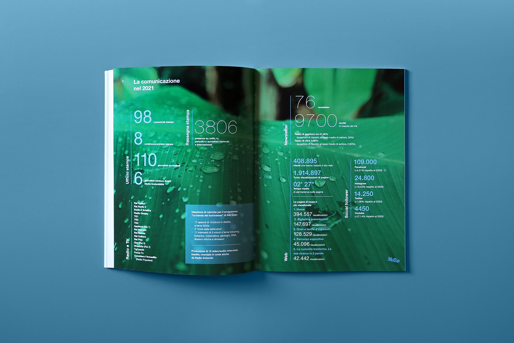
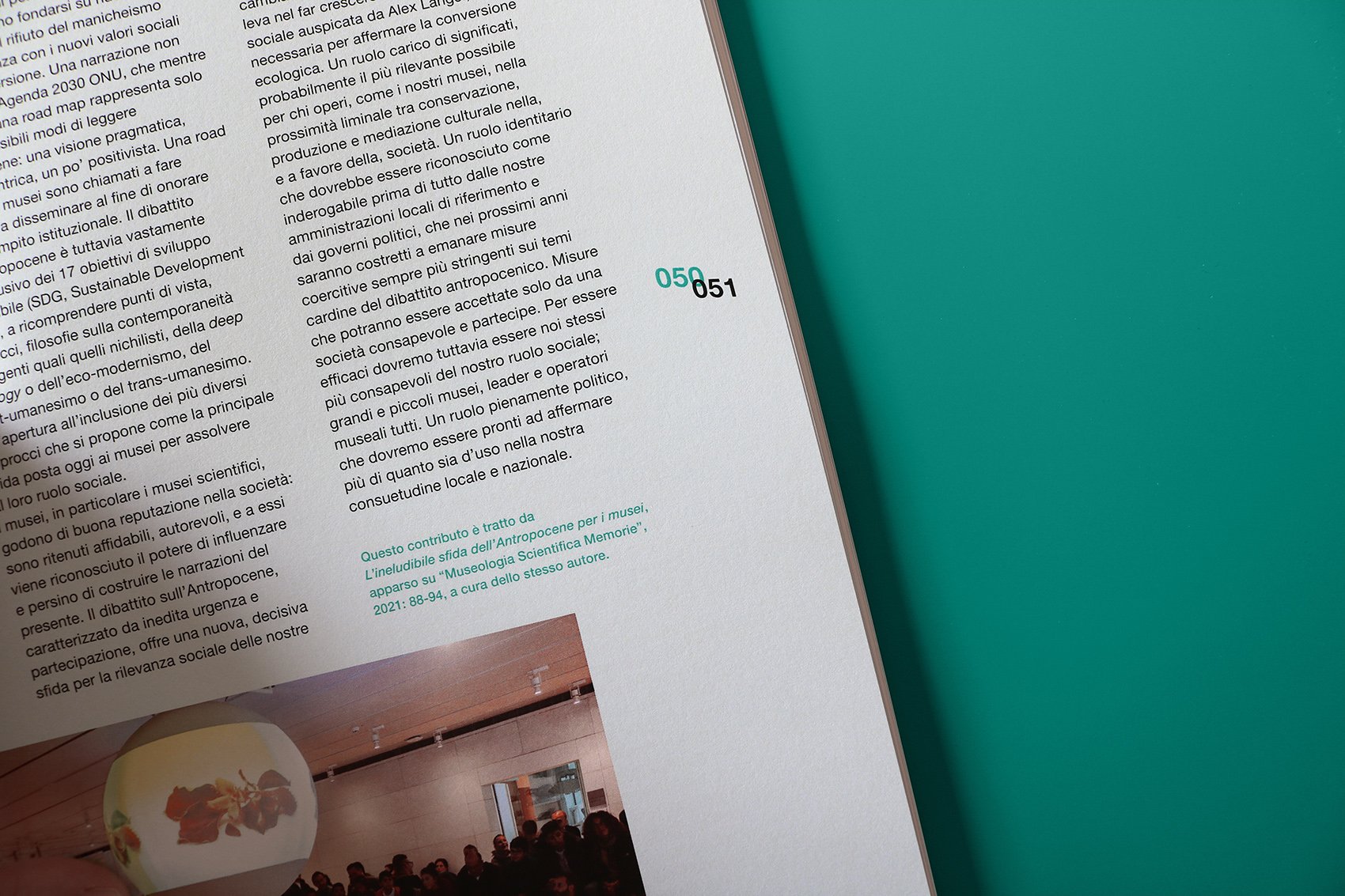
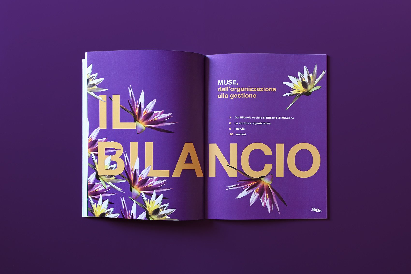
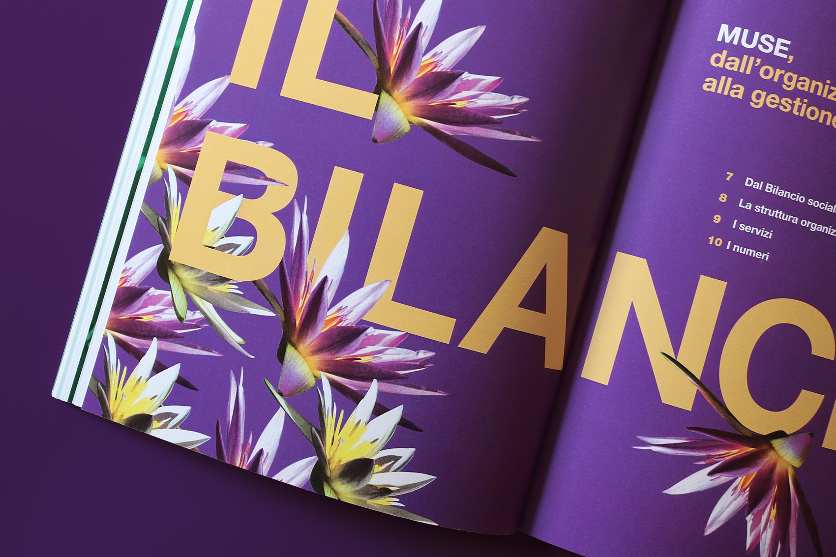
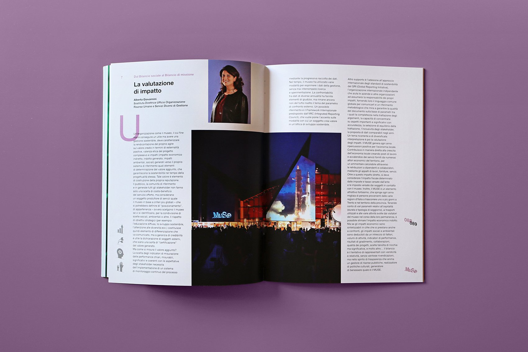
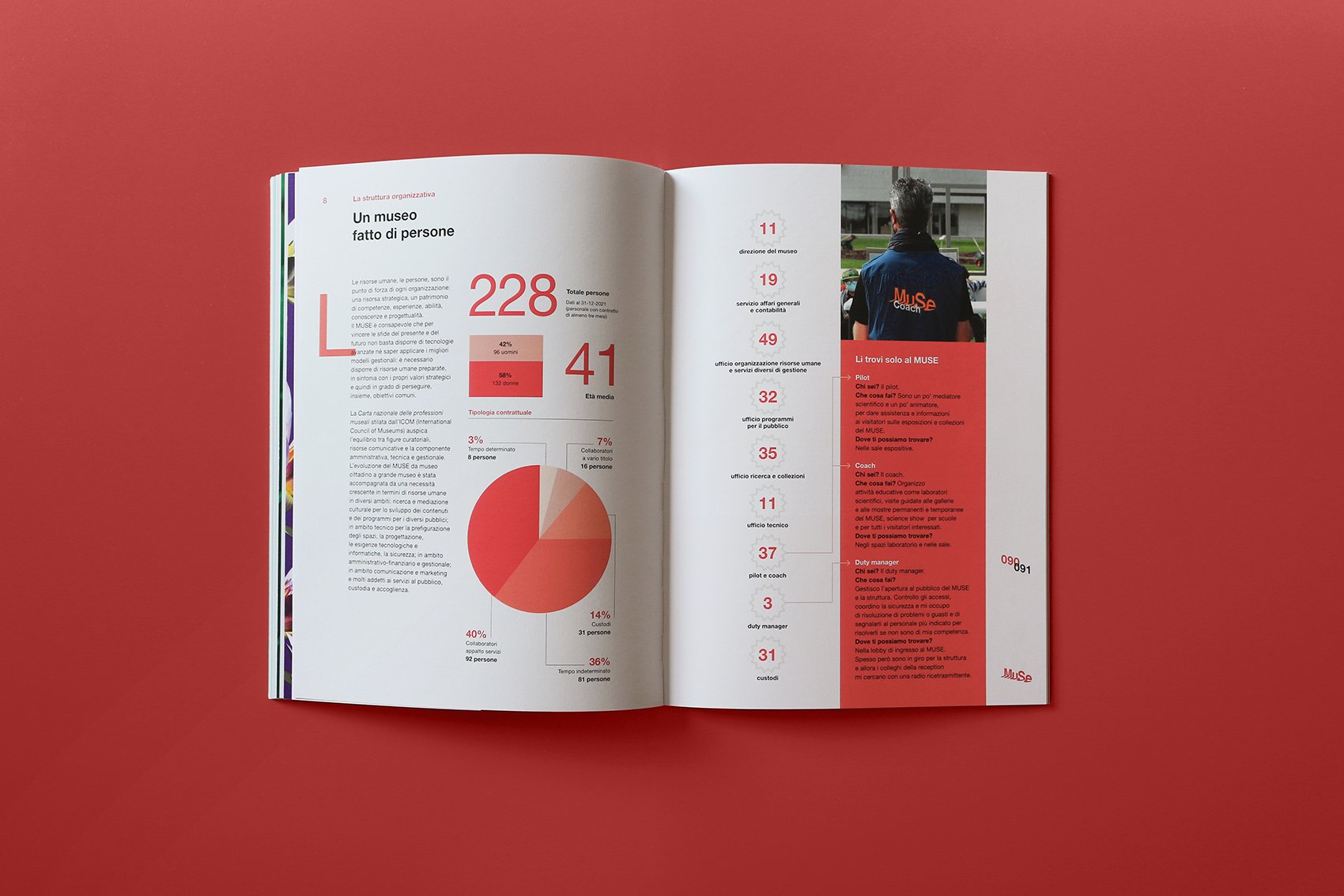
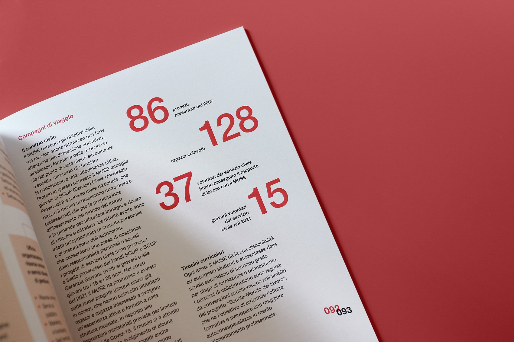
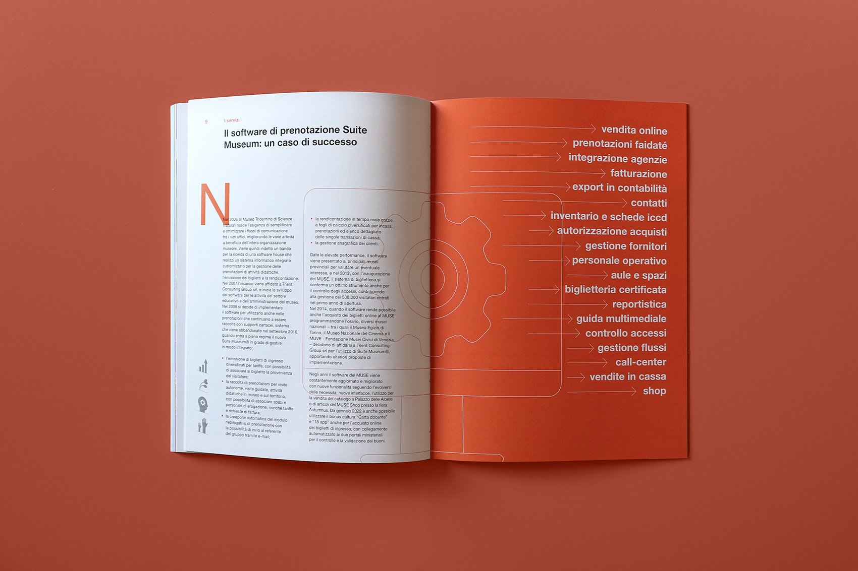
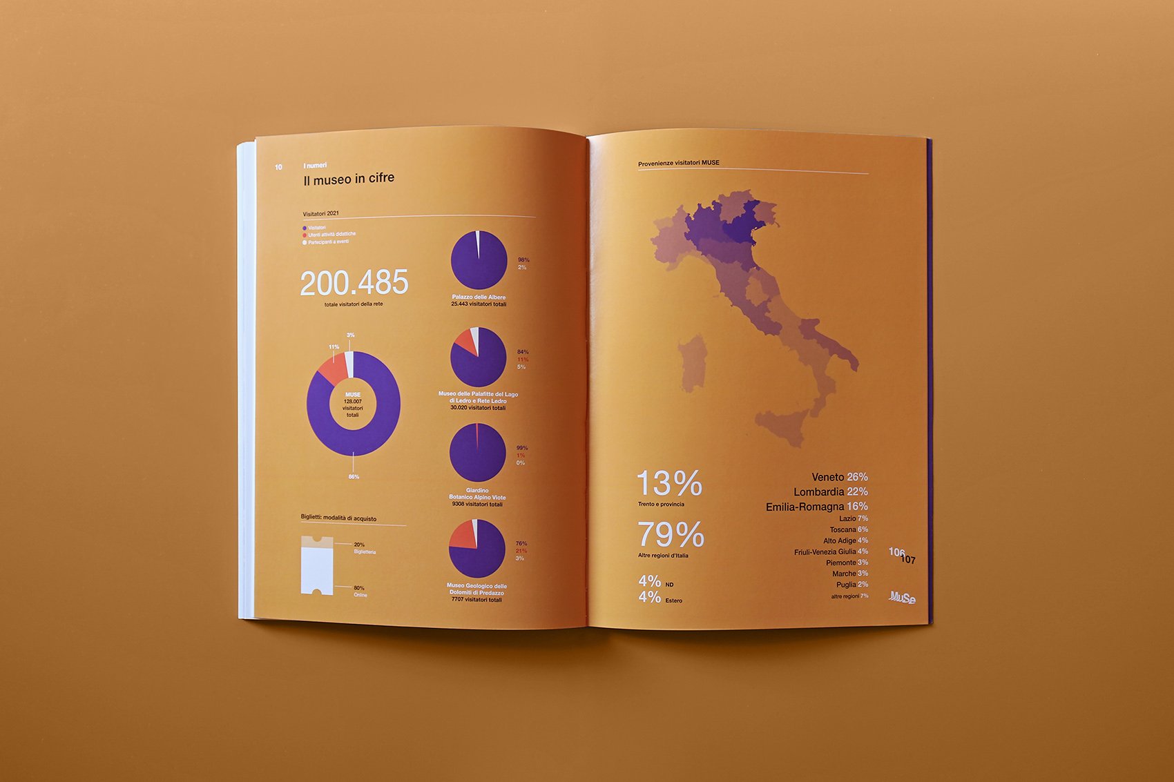
The publication is the annual report about the cultural and social impact of MUSE, the Science Museum located in Trento, Italy.
Natural elements from the museum archives are used together with geometric shapes to juxtapose text pages.
A project by MUSE and Codice Edizioni
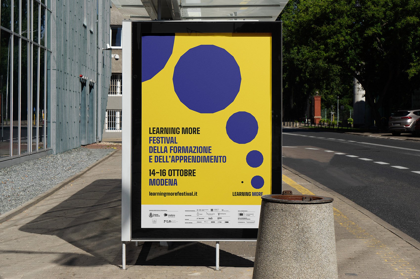
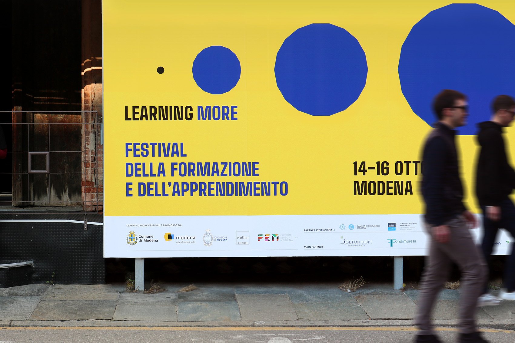
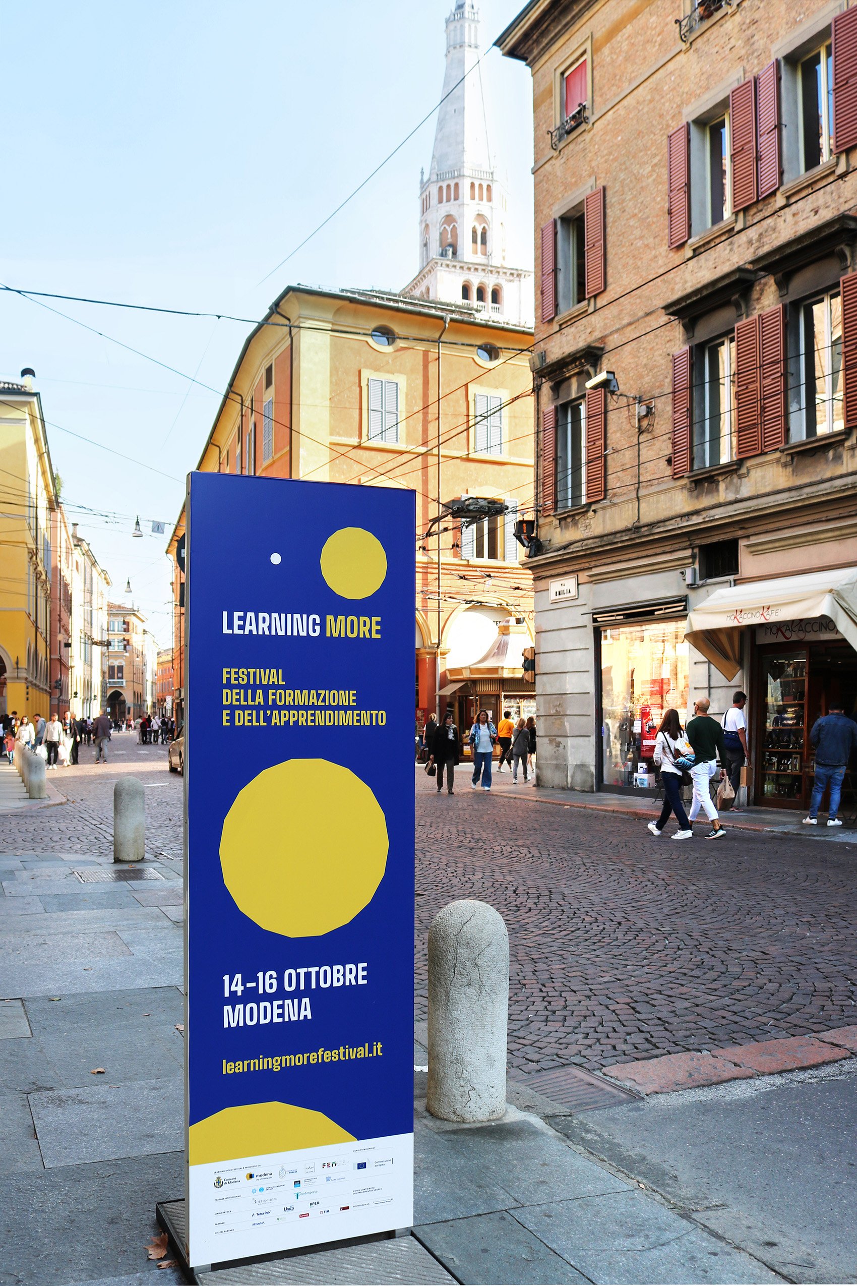
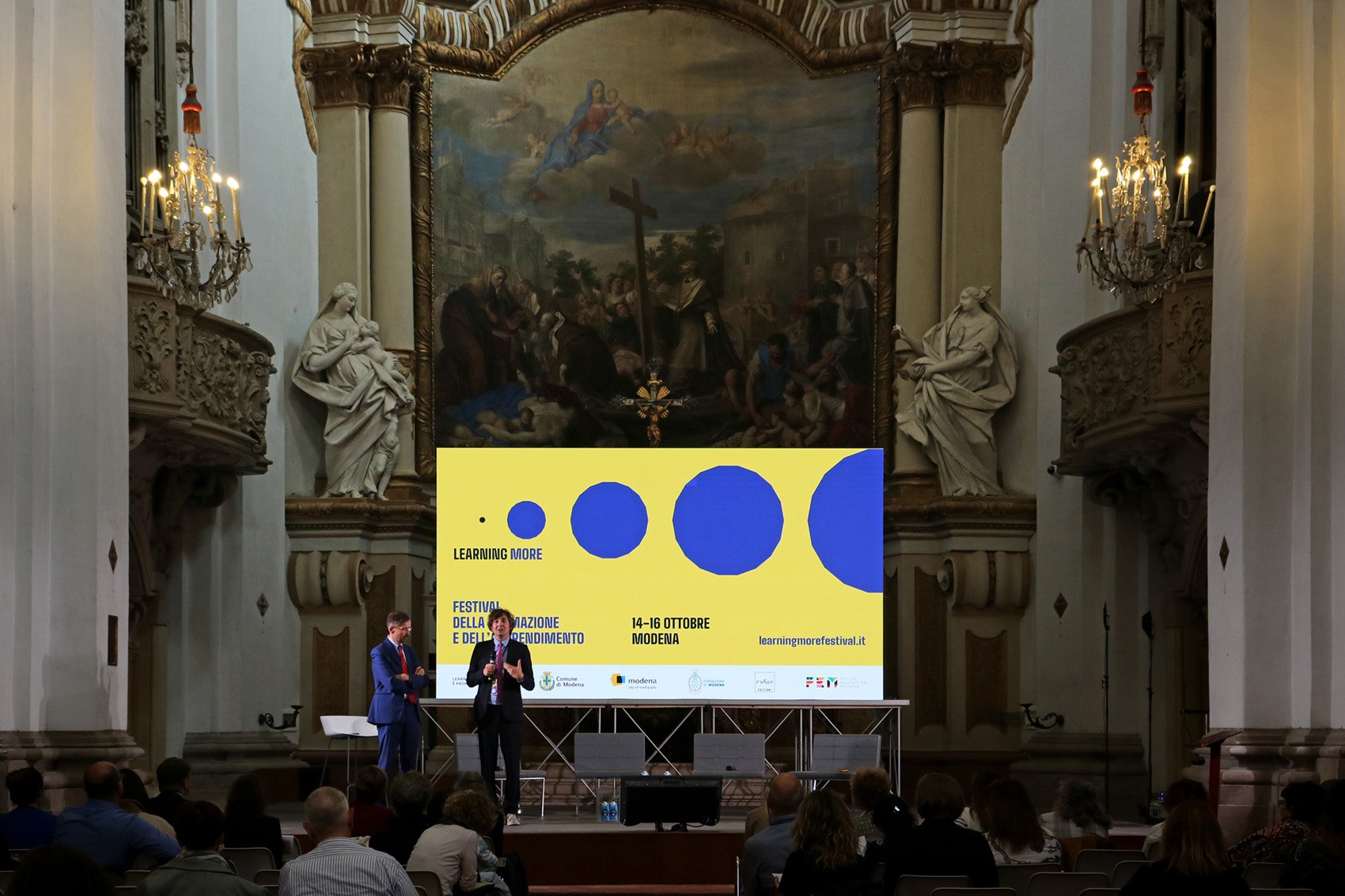
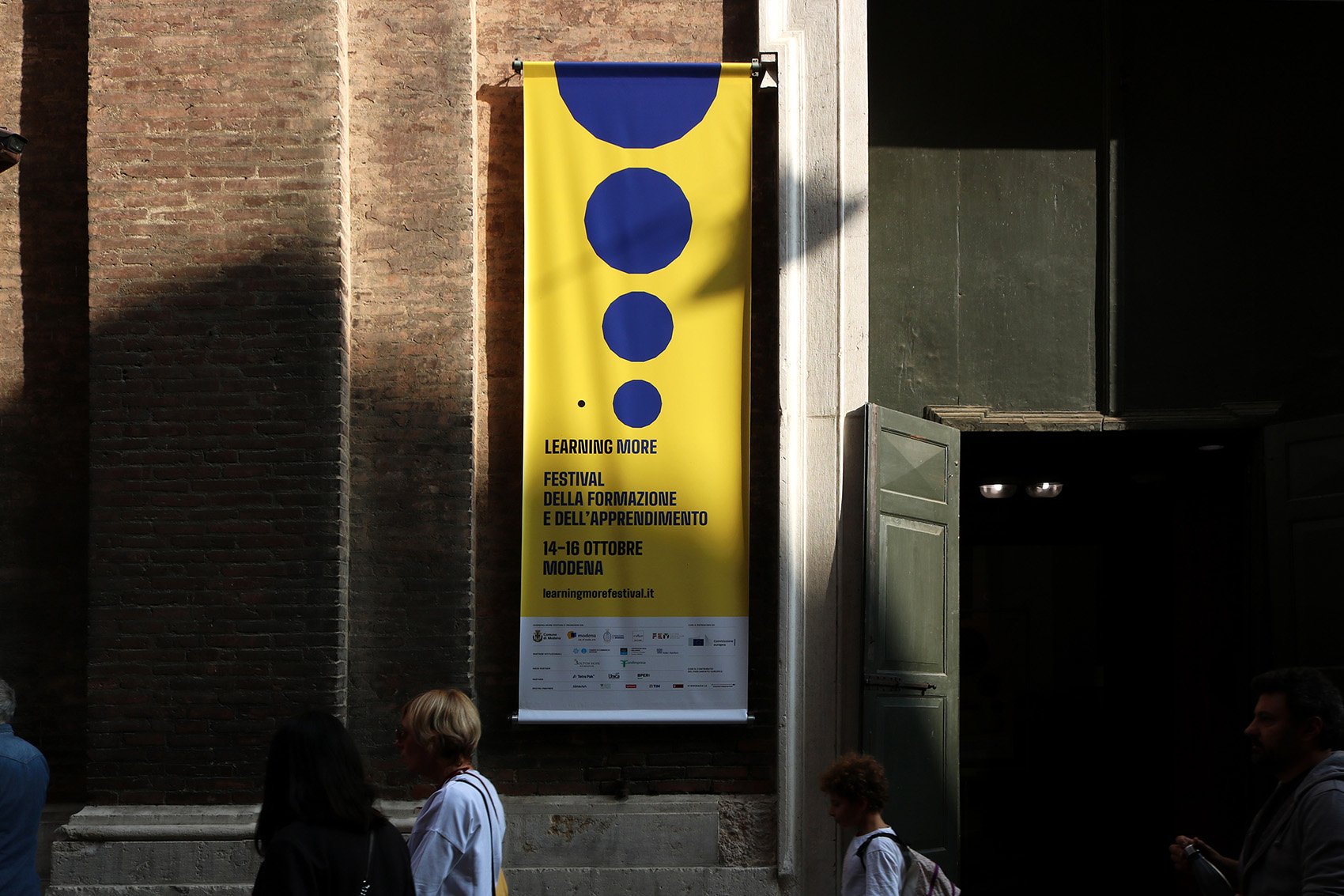
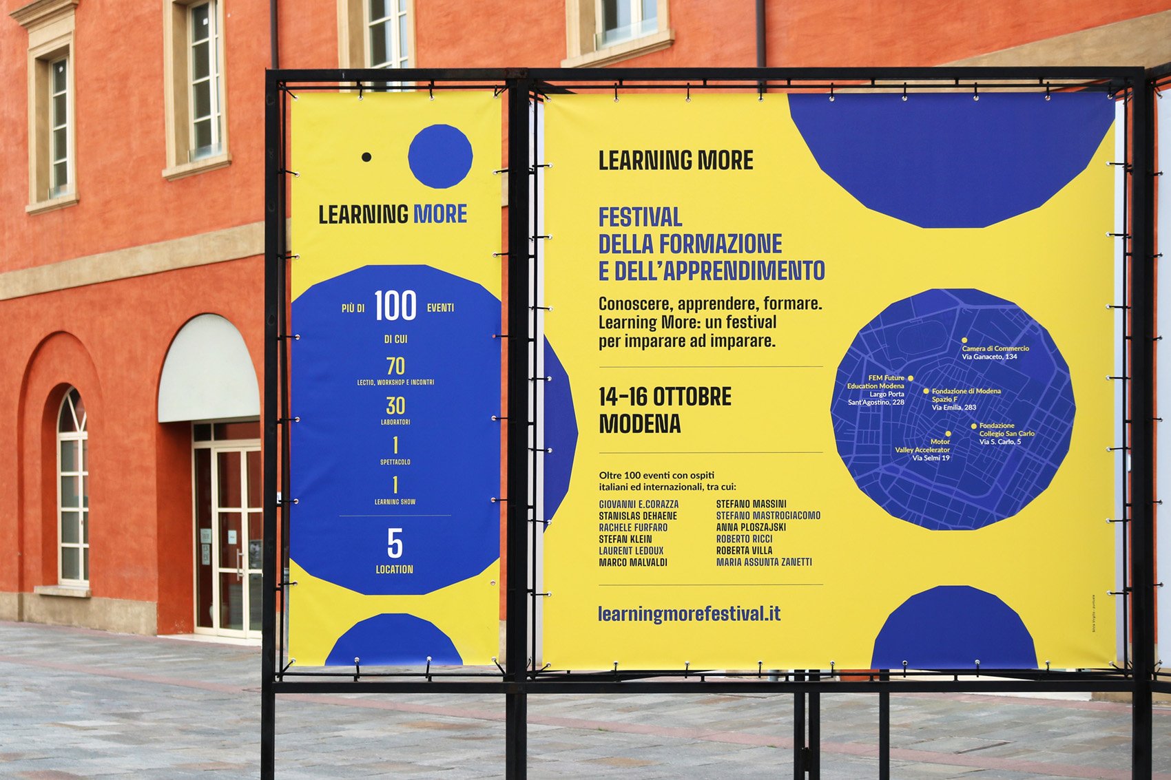
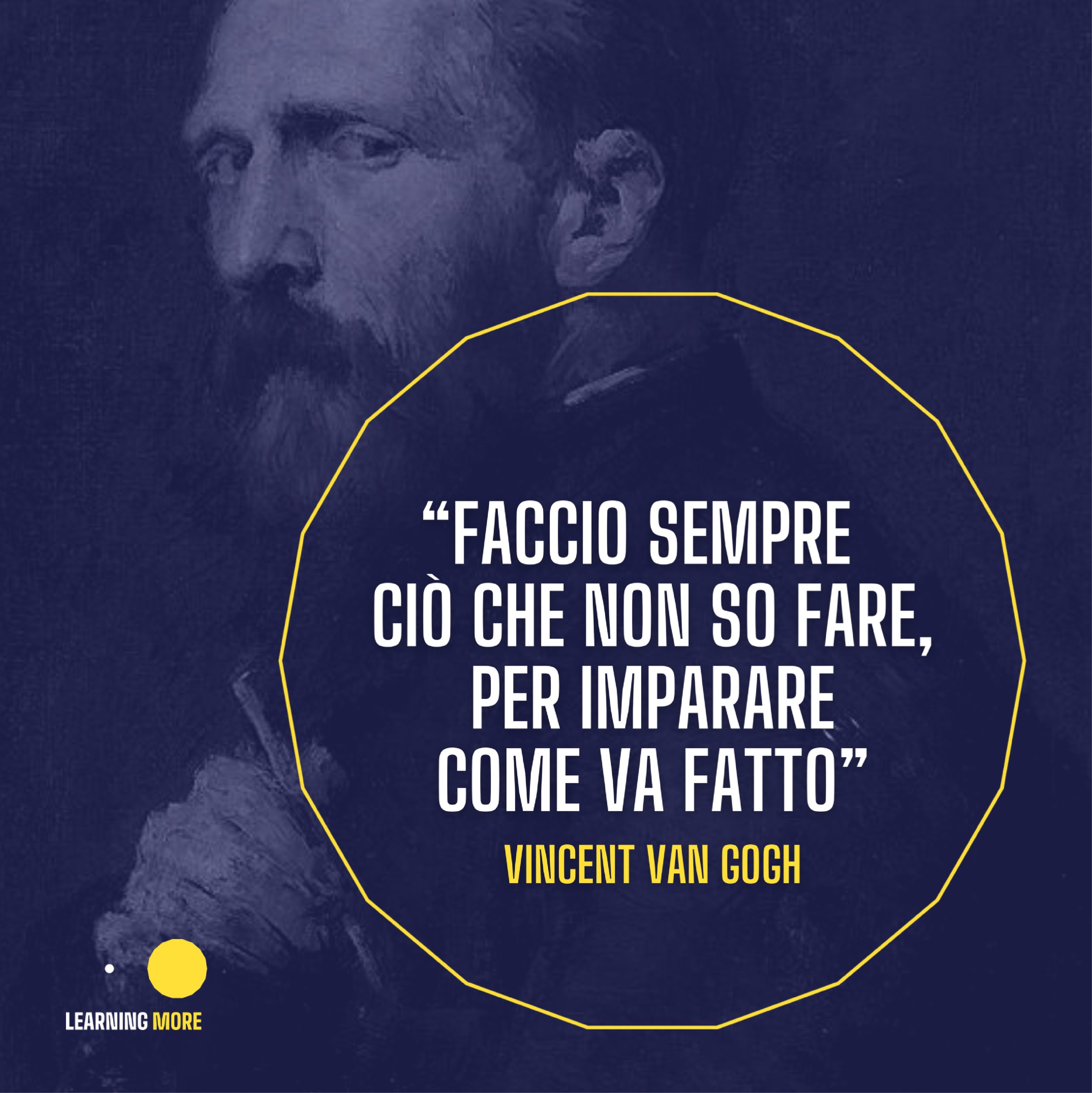
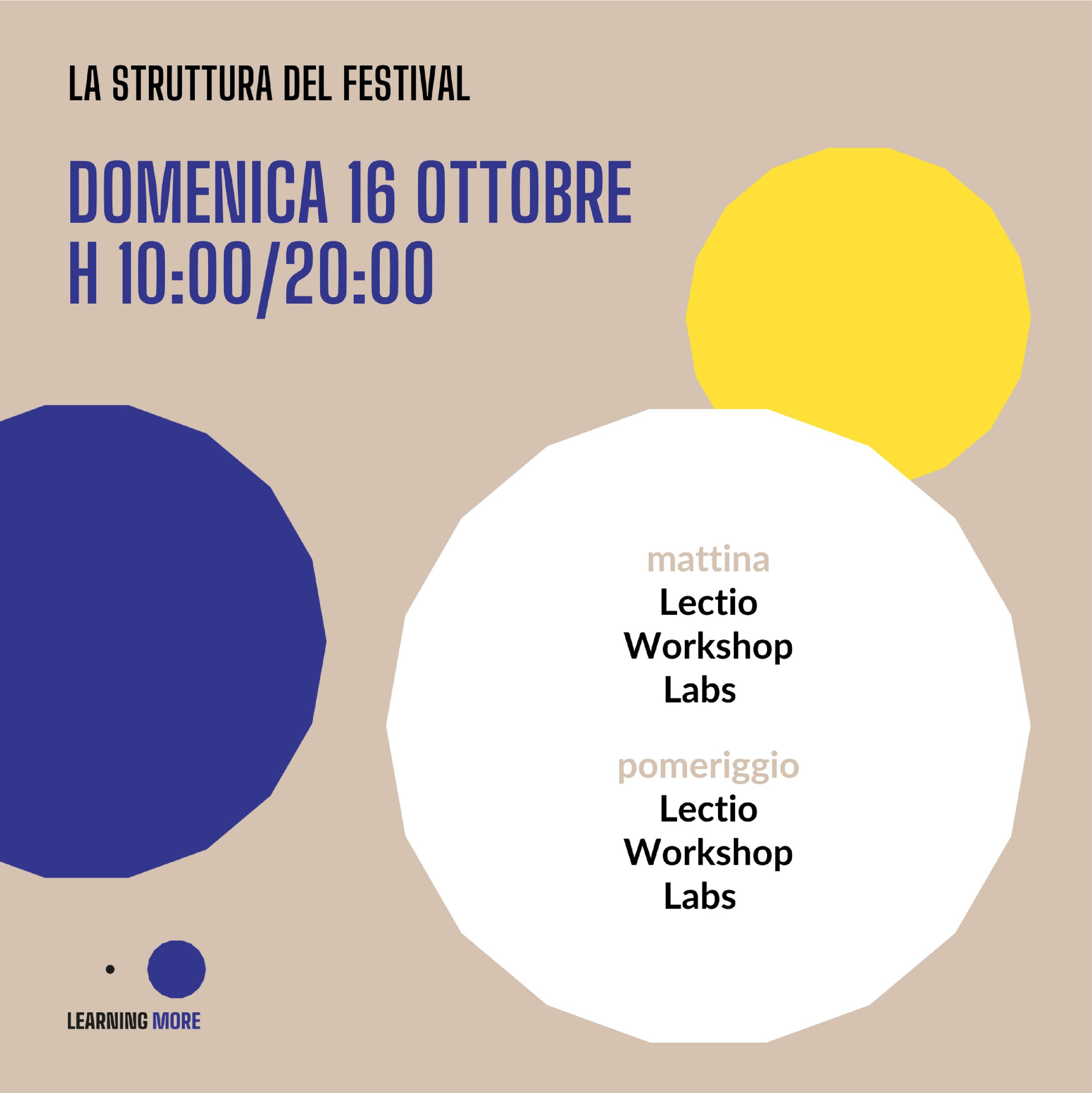
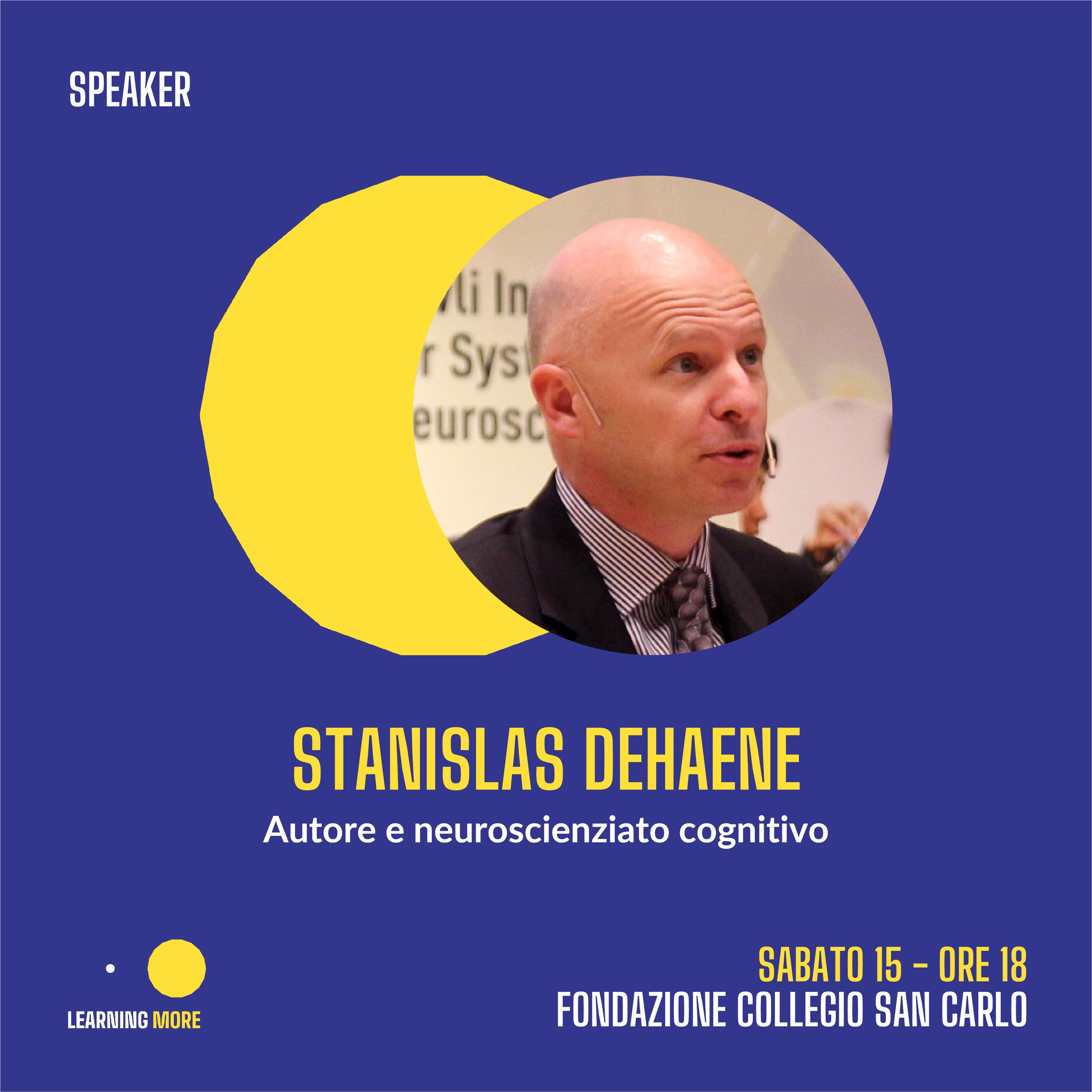
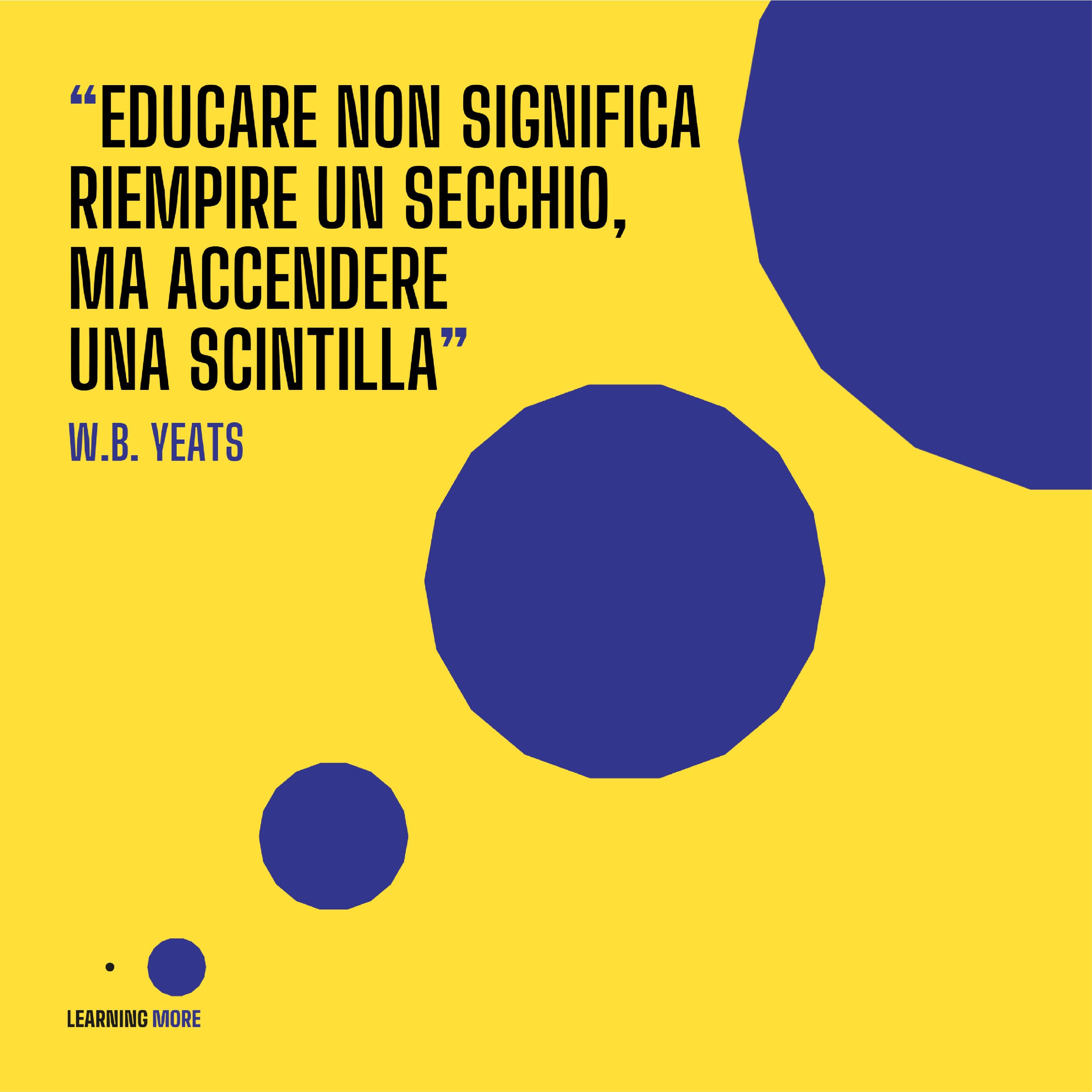
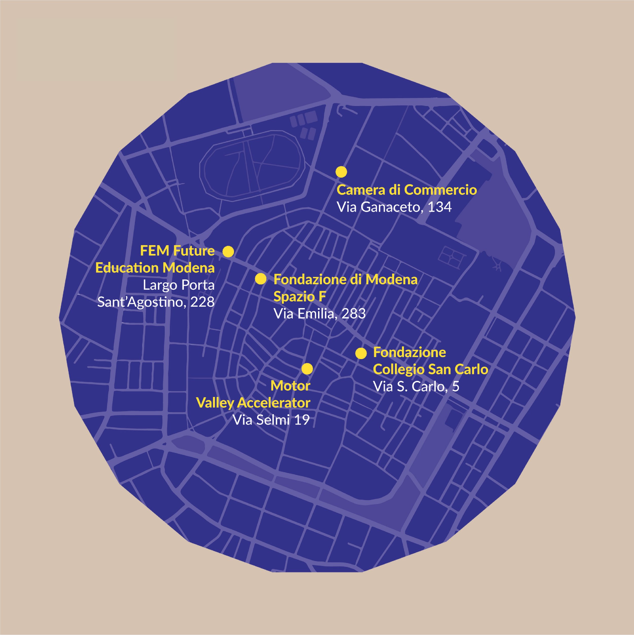
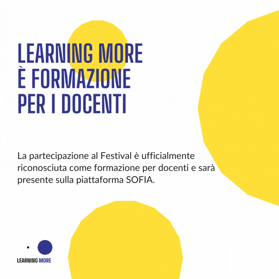
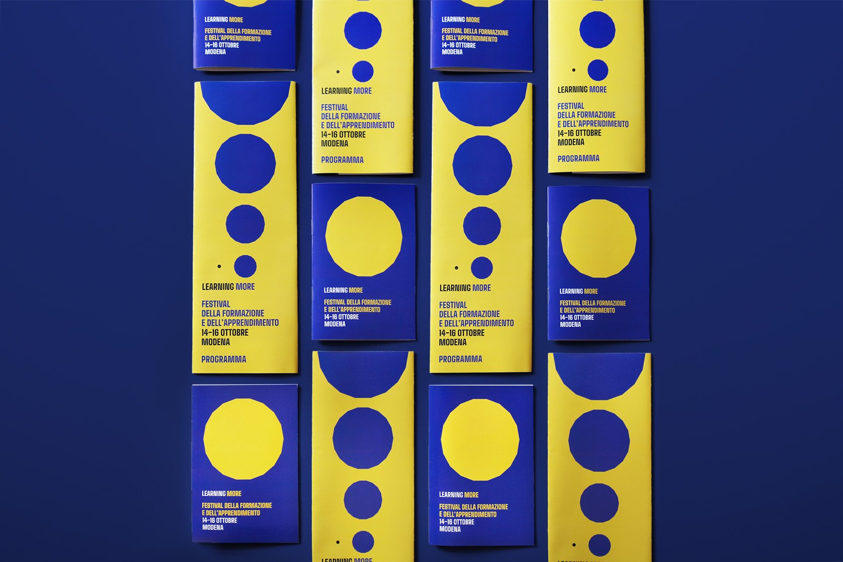
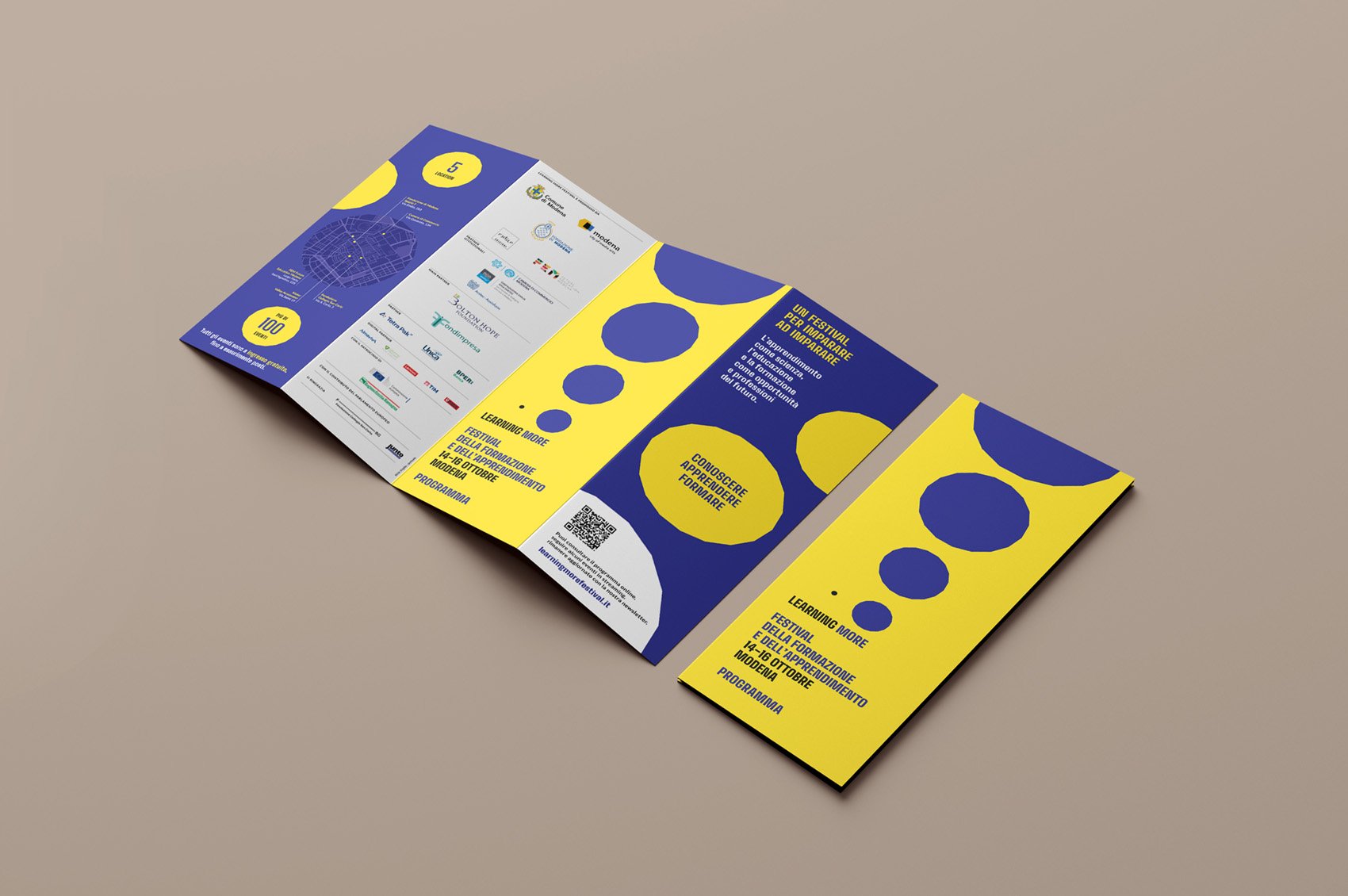
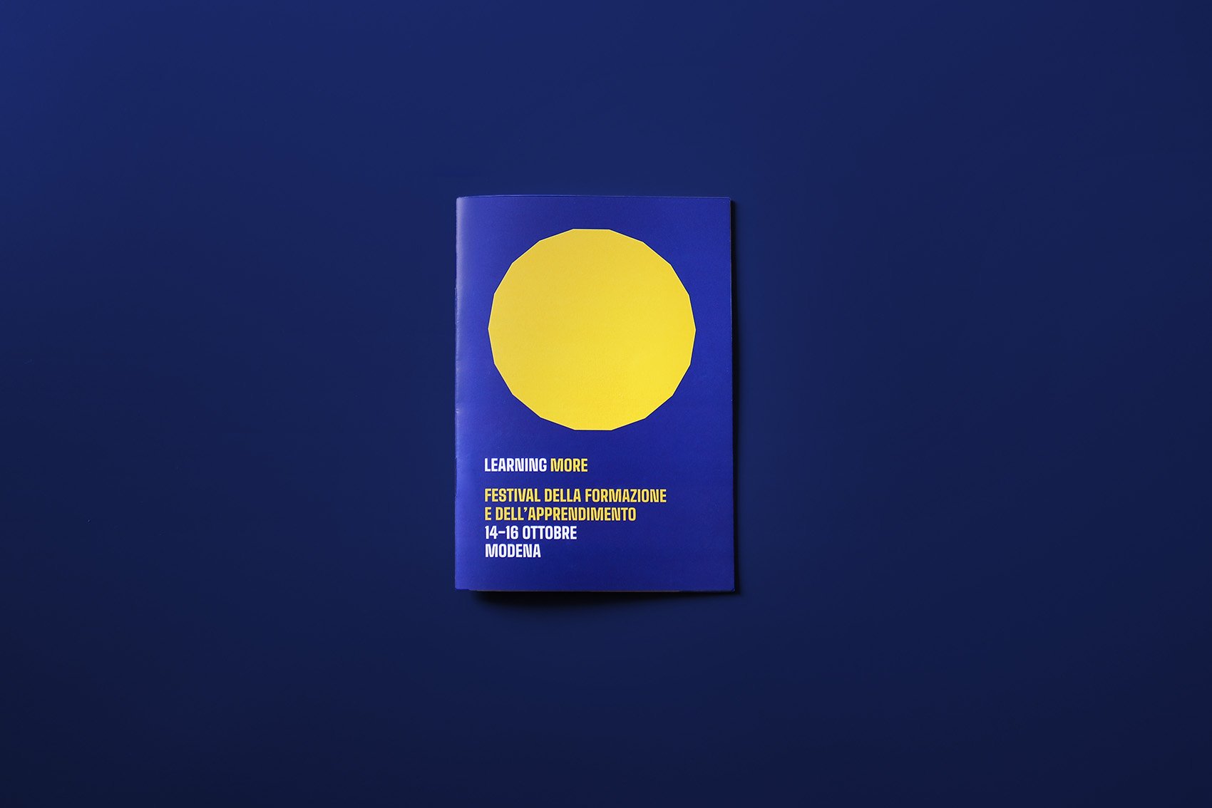
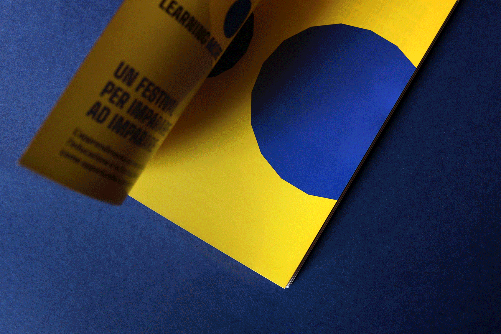
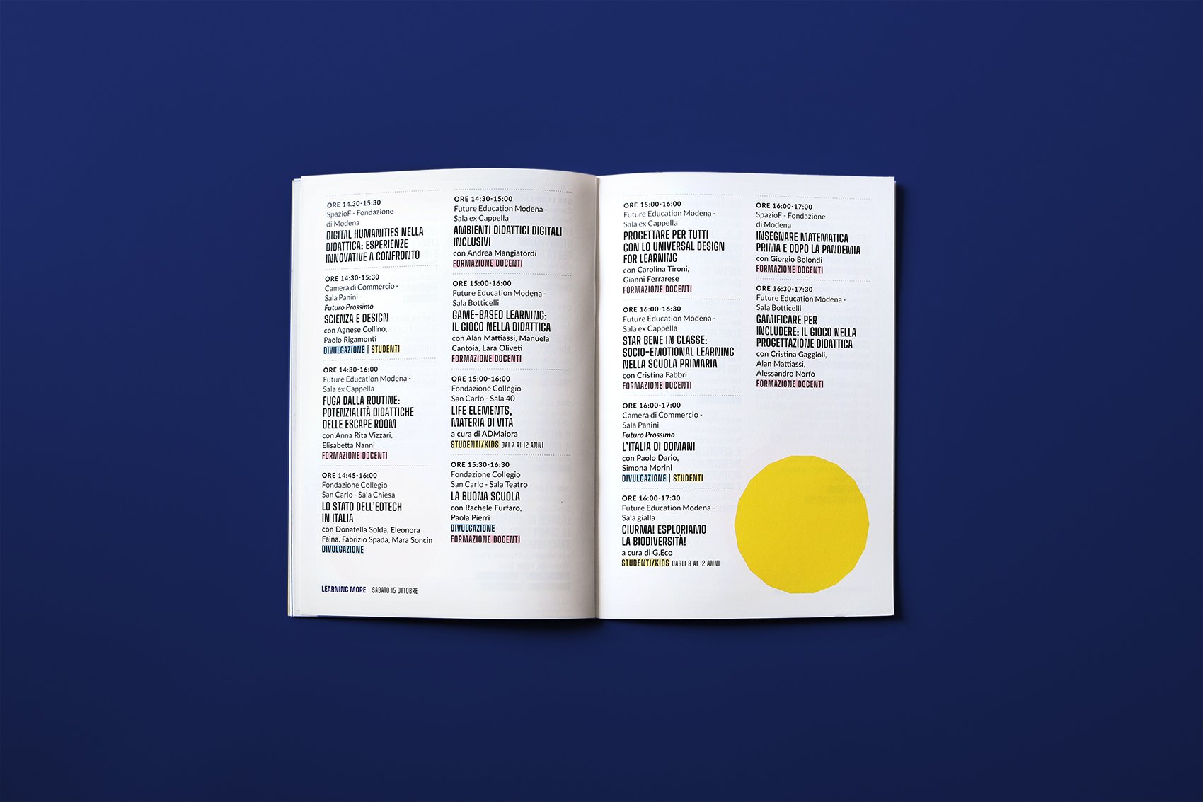
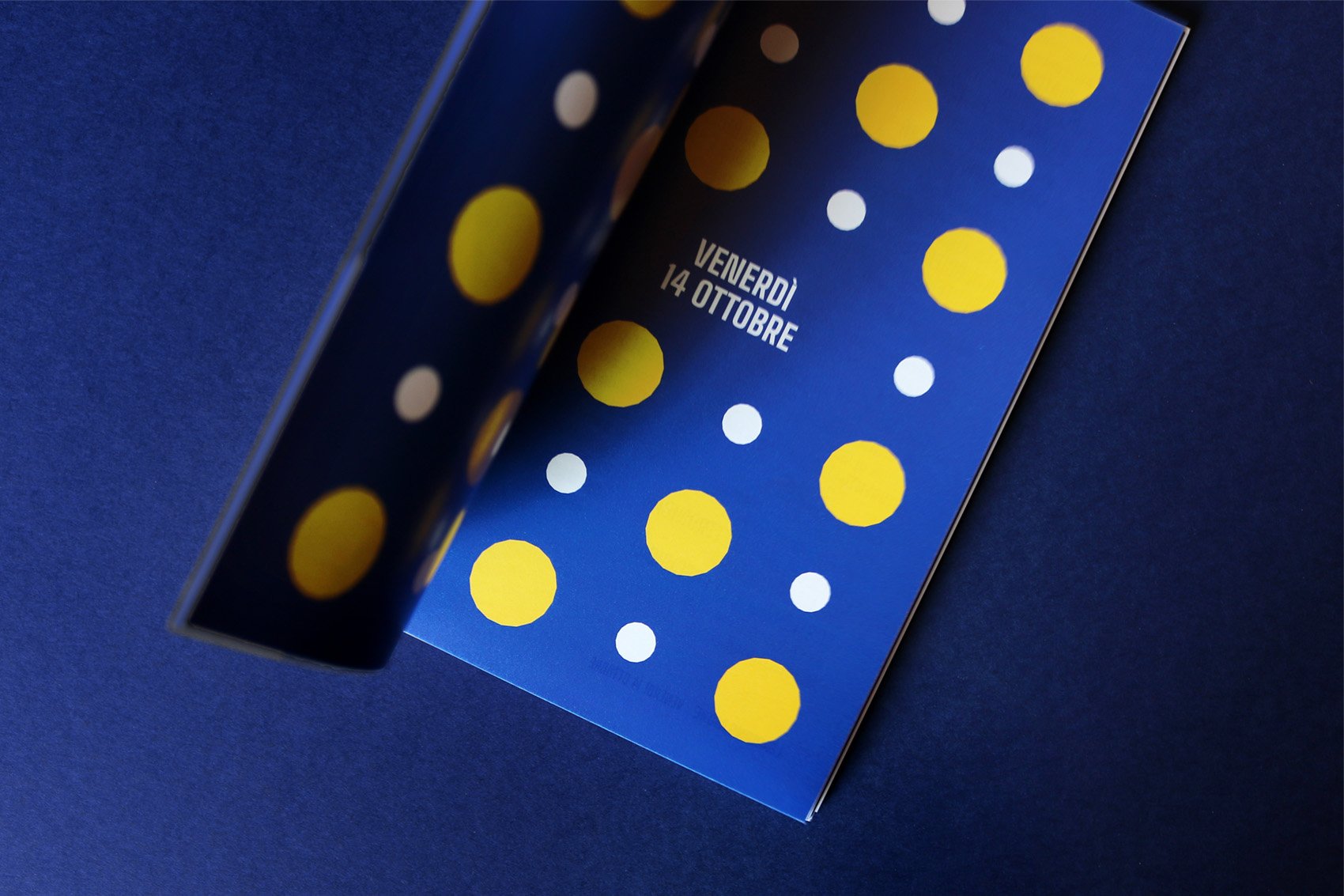
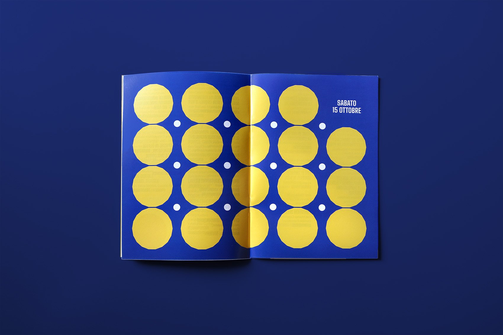
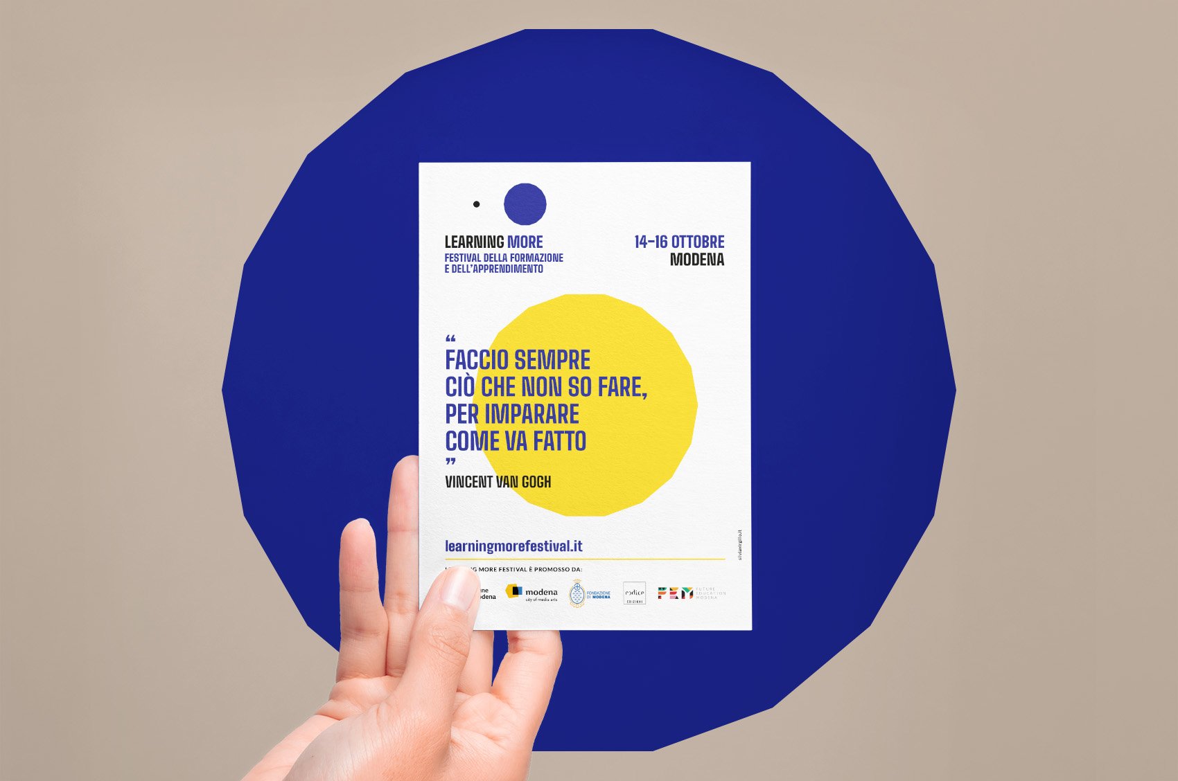
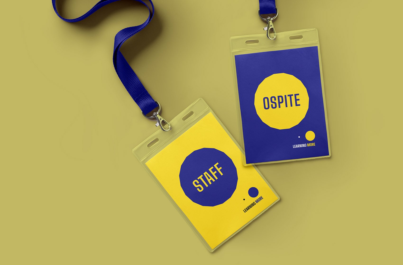
Learning More is a festival about education and learning science; it is held in Modena, Italy.
The logo symbol is made up of two shapes: the left one, that in small seems a circle, is actually the same polygon placed bigger on the right. The meaning is that only a deep view and an extended study of things can raise knowledge in all its facets.
Learning More Festival is a project by Future Education Modena and Codice Edizioni.
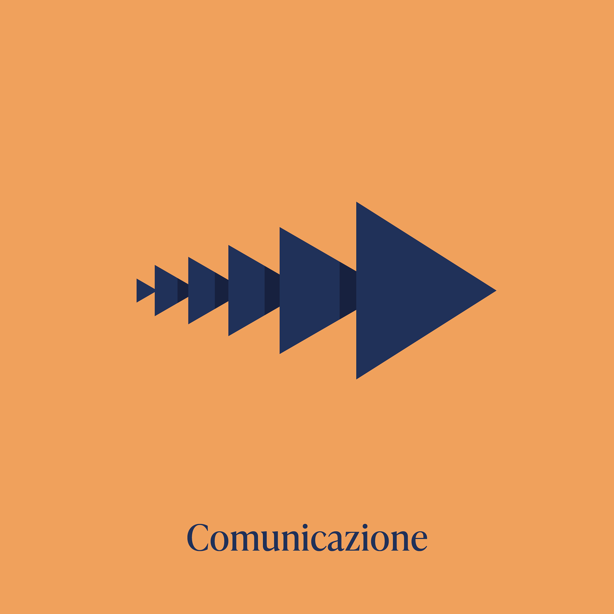
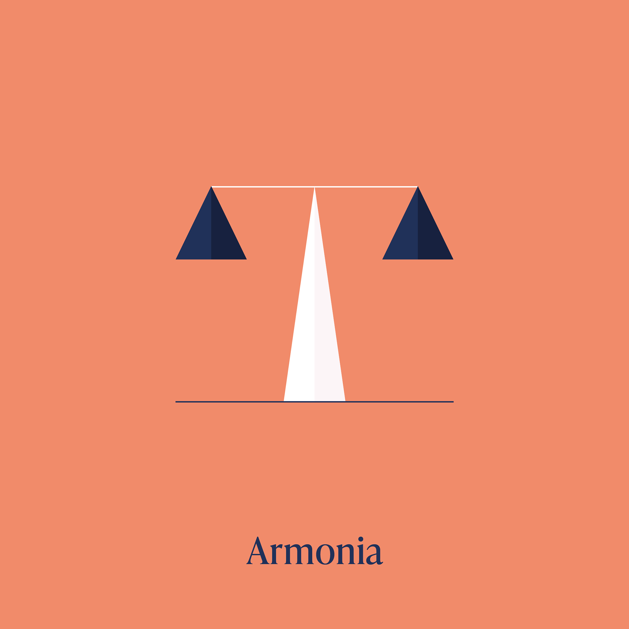
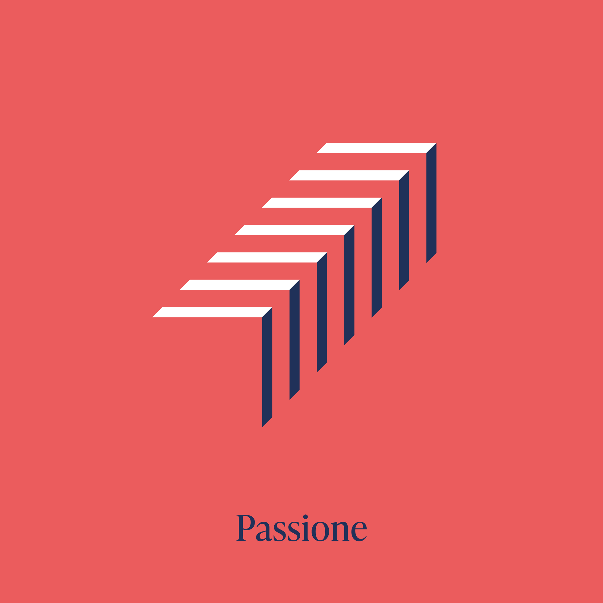
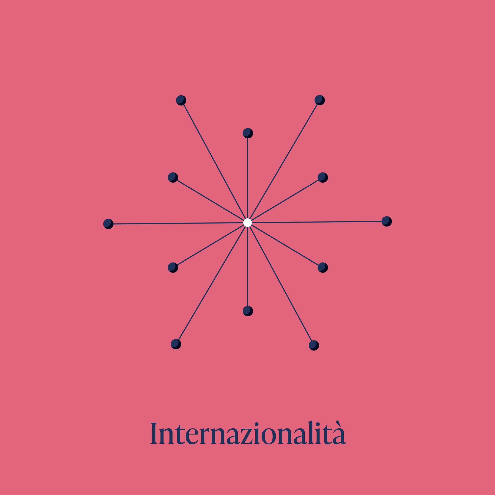
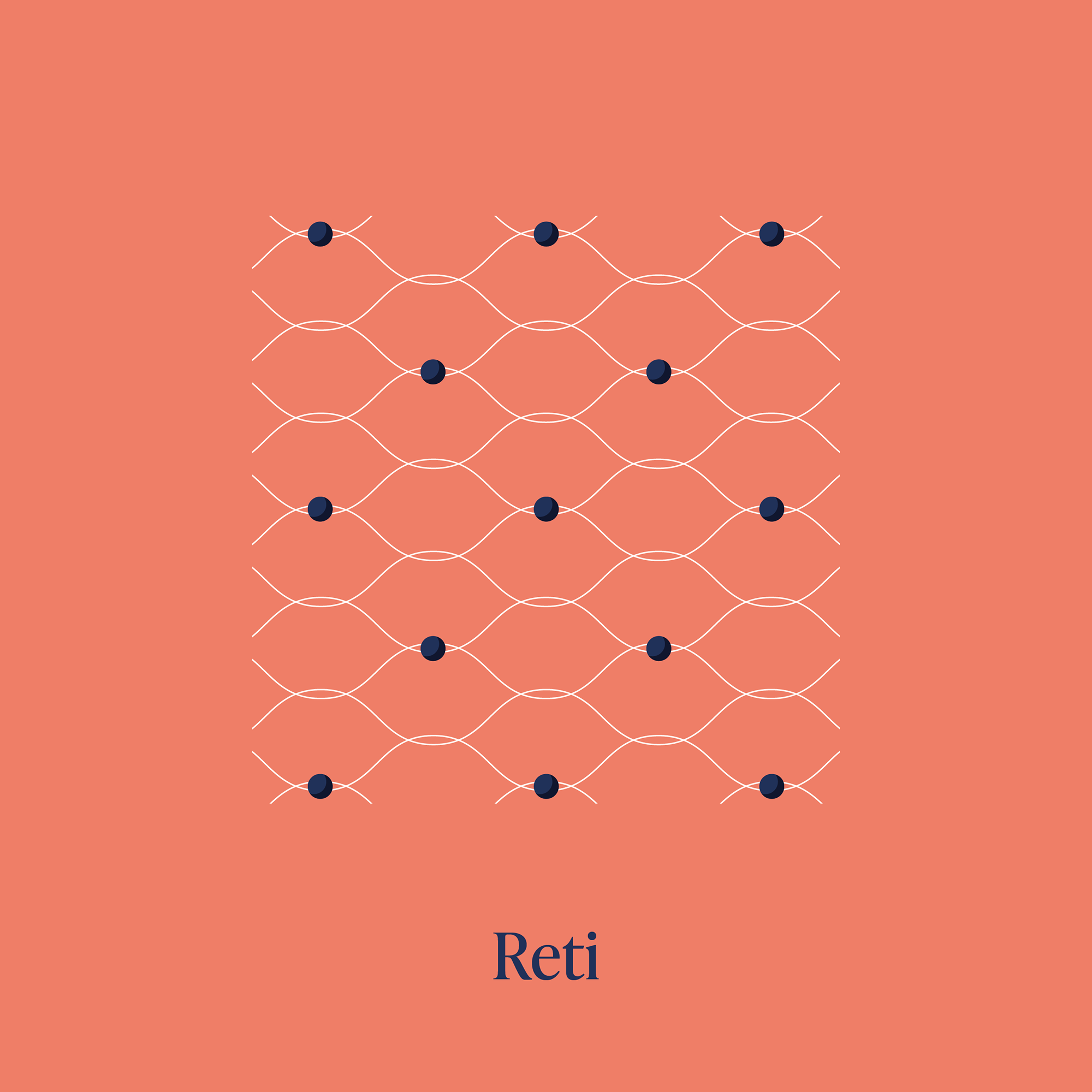
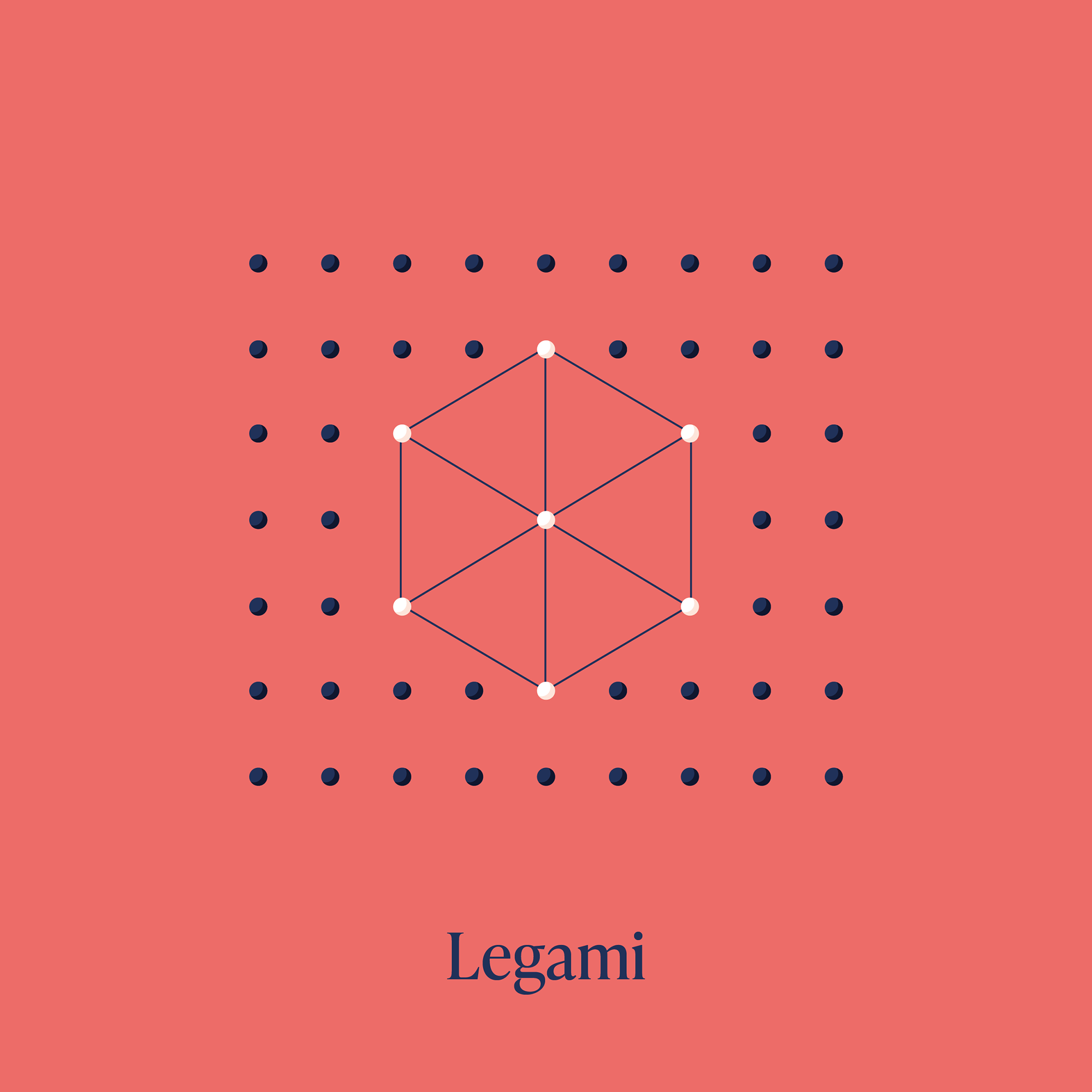
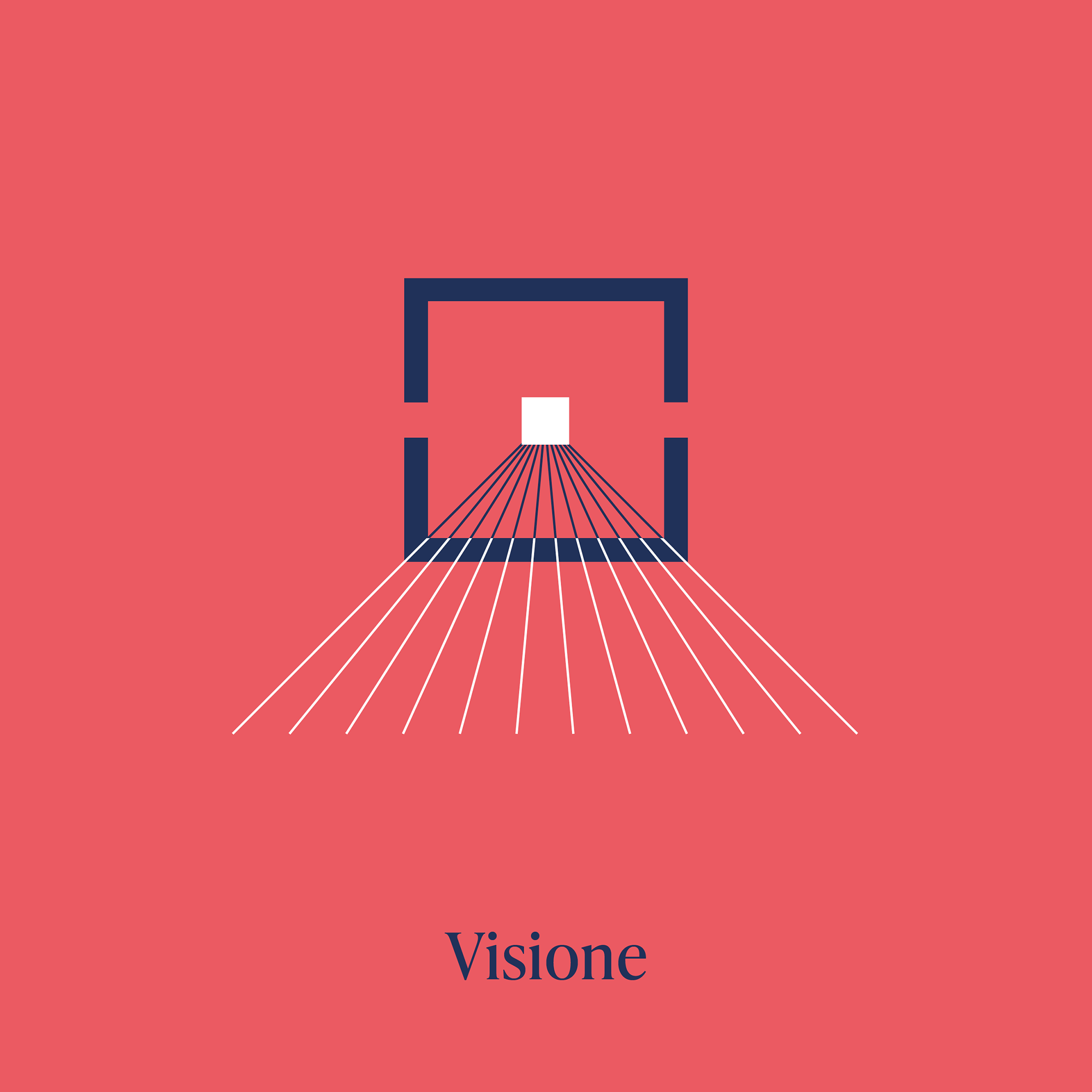
Social media post design:


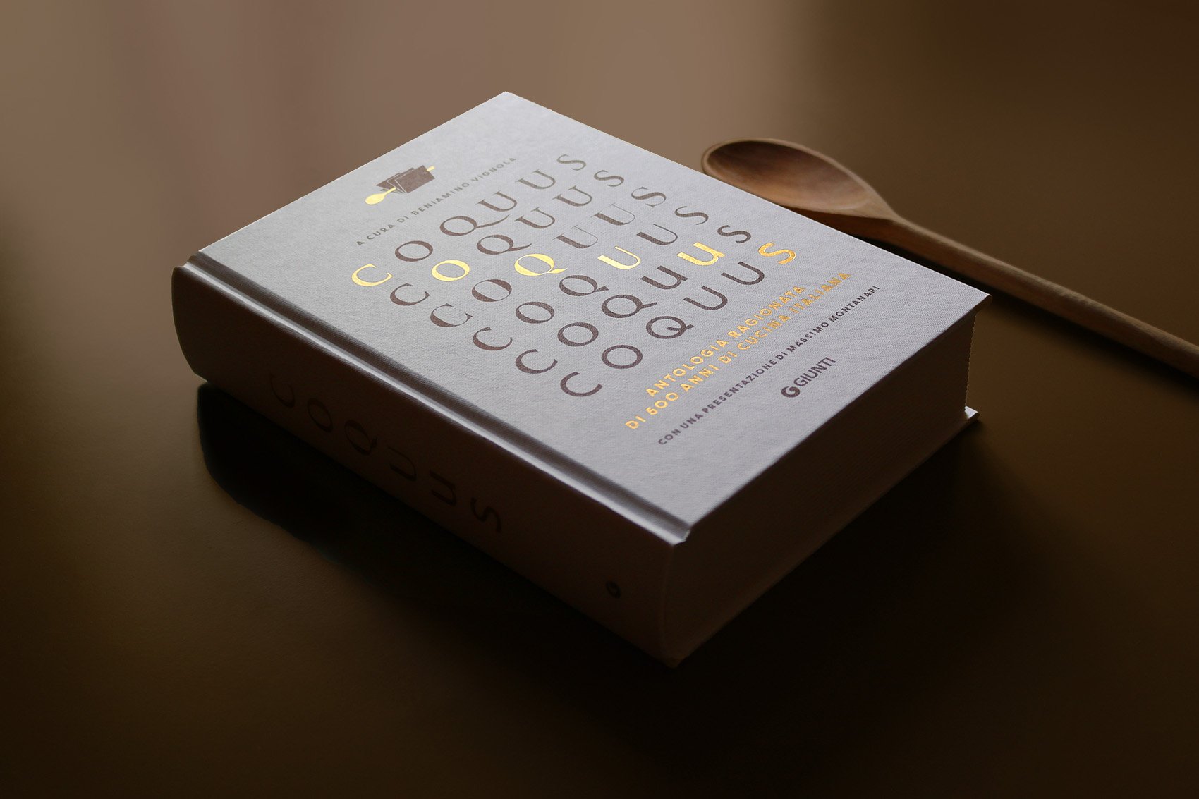
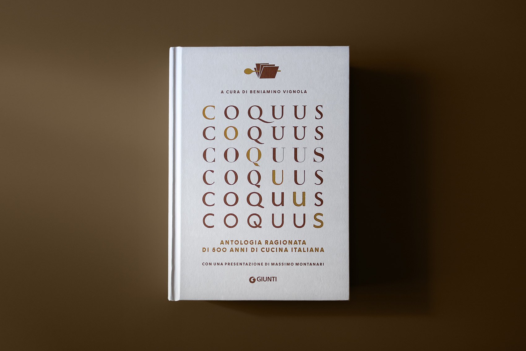
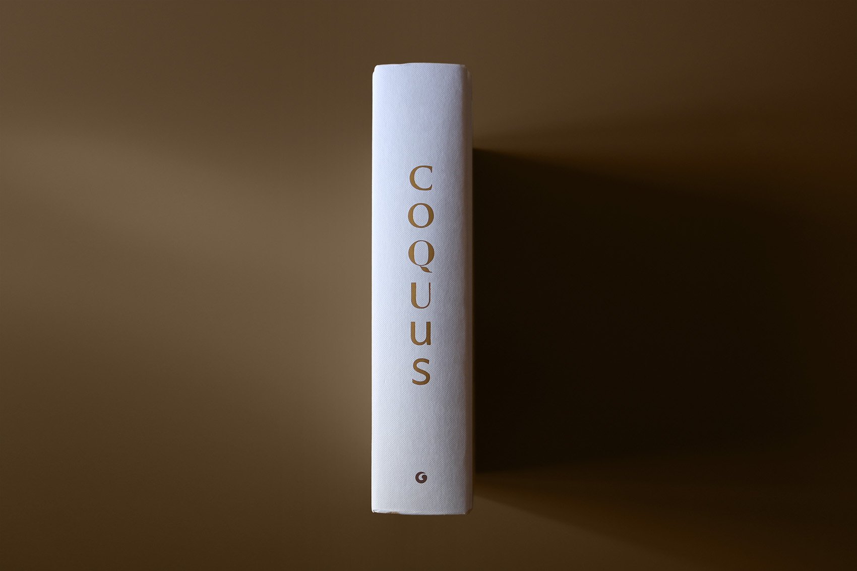
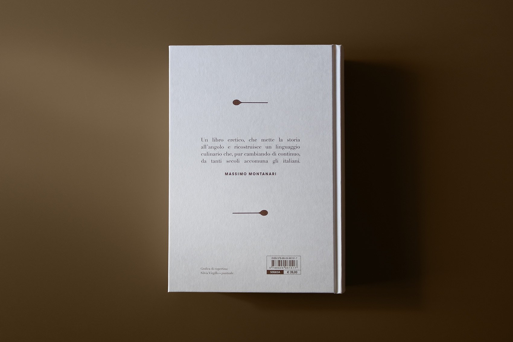
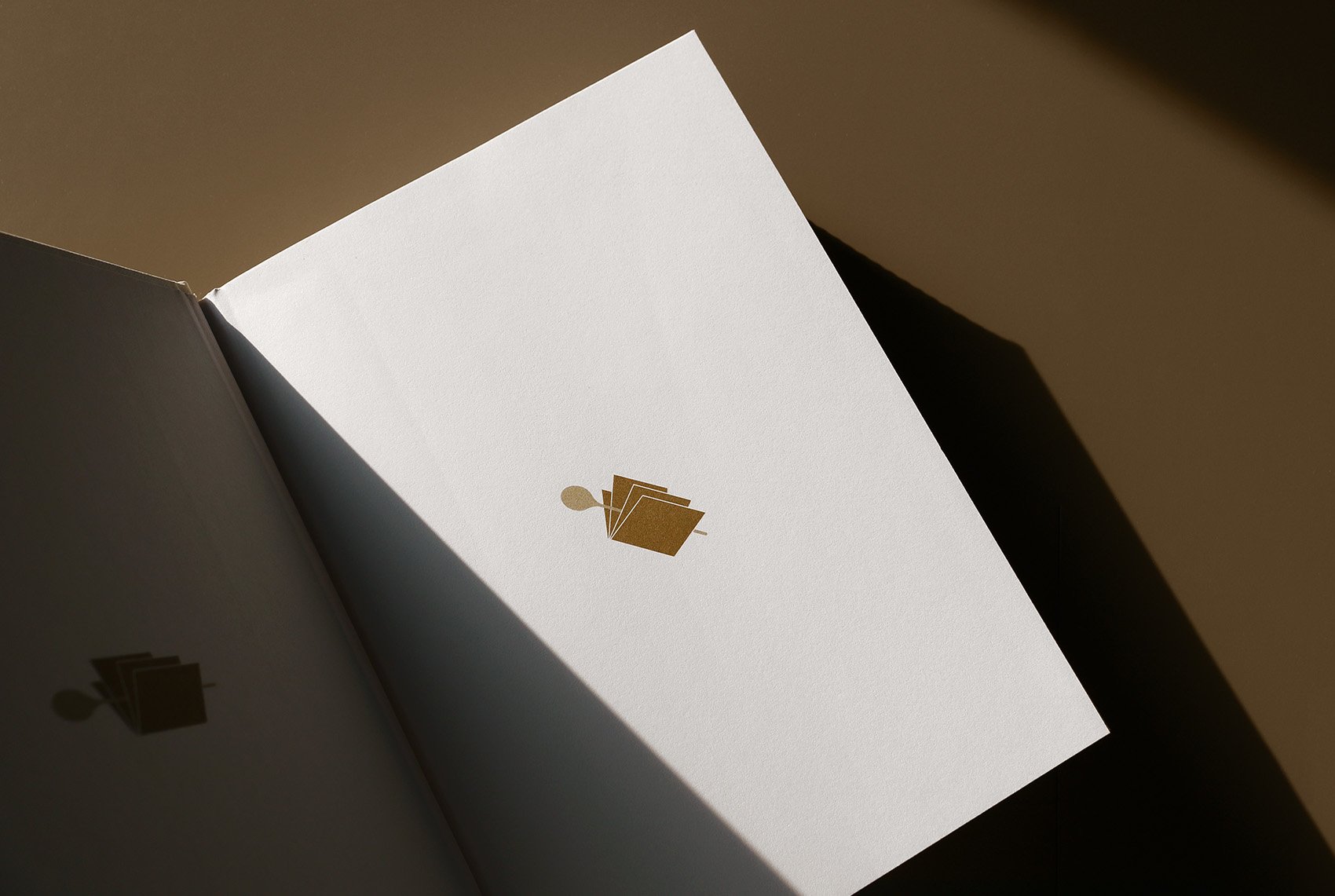
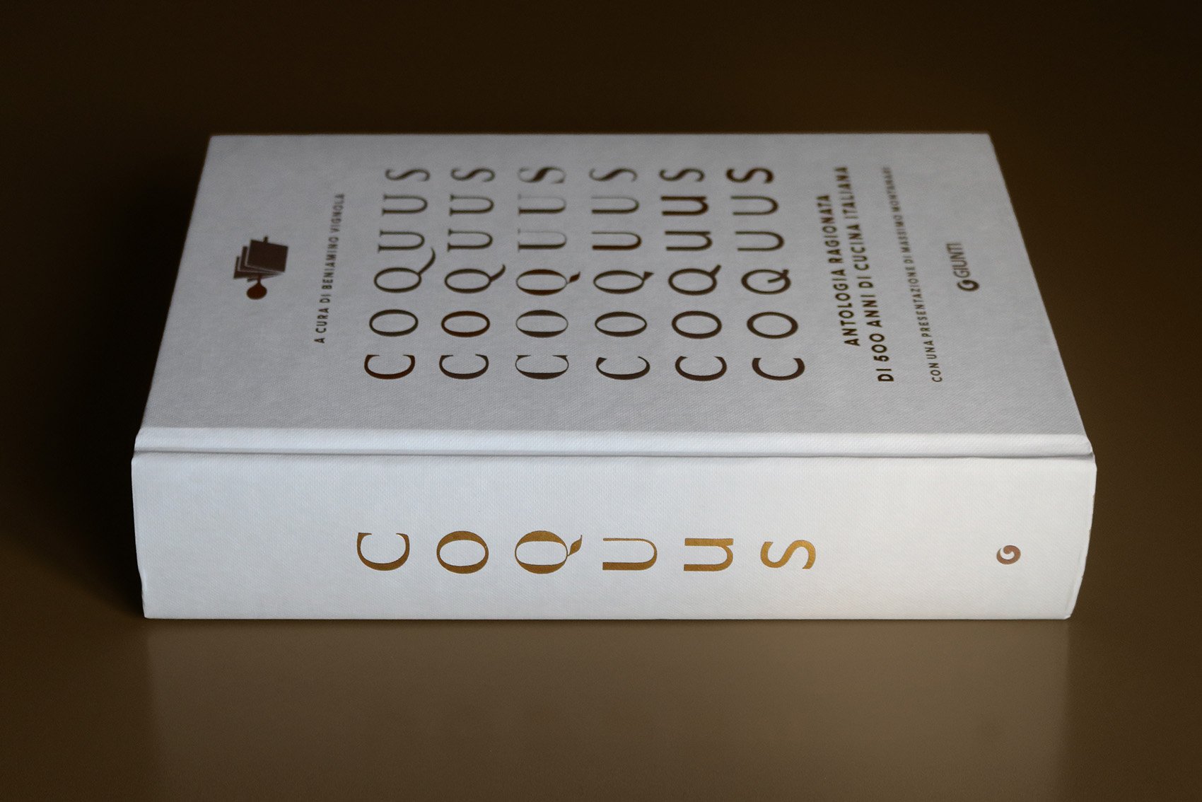
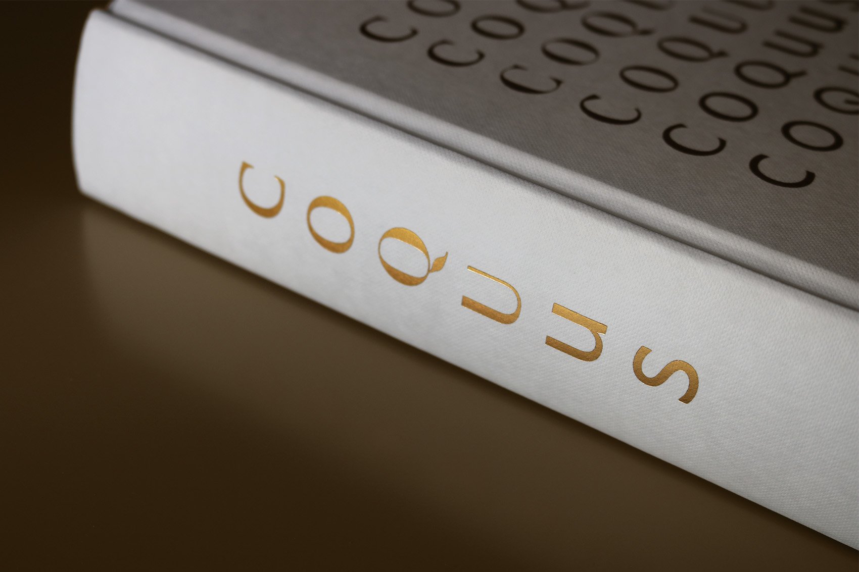
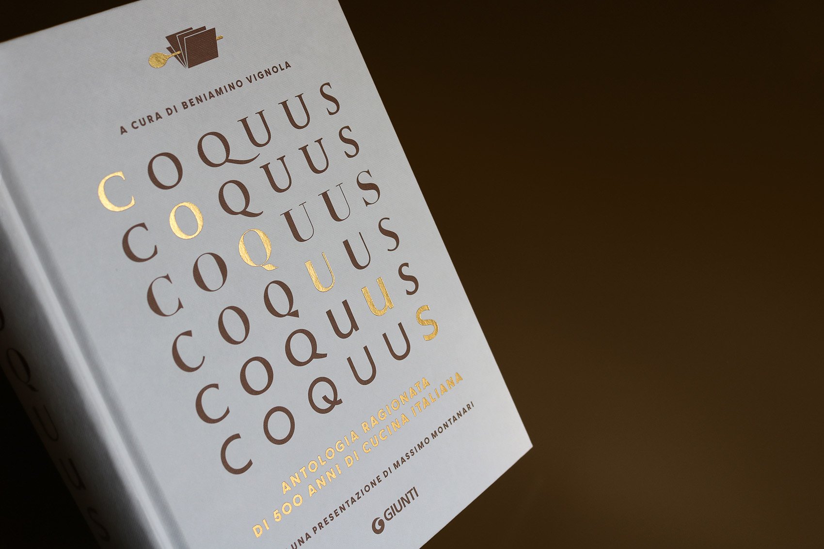
Coquus is an anthology about Italian historical cuisine, with recipes from the last five centuries. It is an unpublished collection of recipes still effective today.
Publisher: Giunti Editore
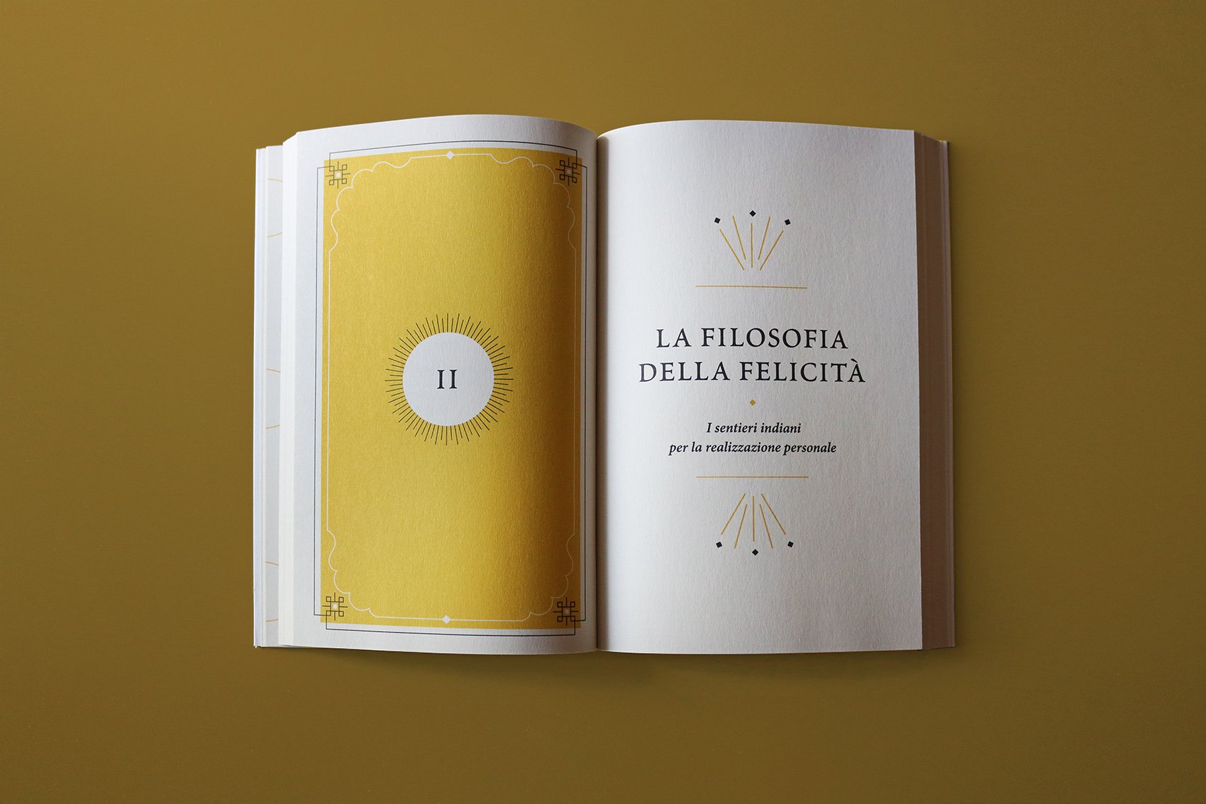
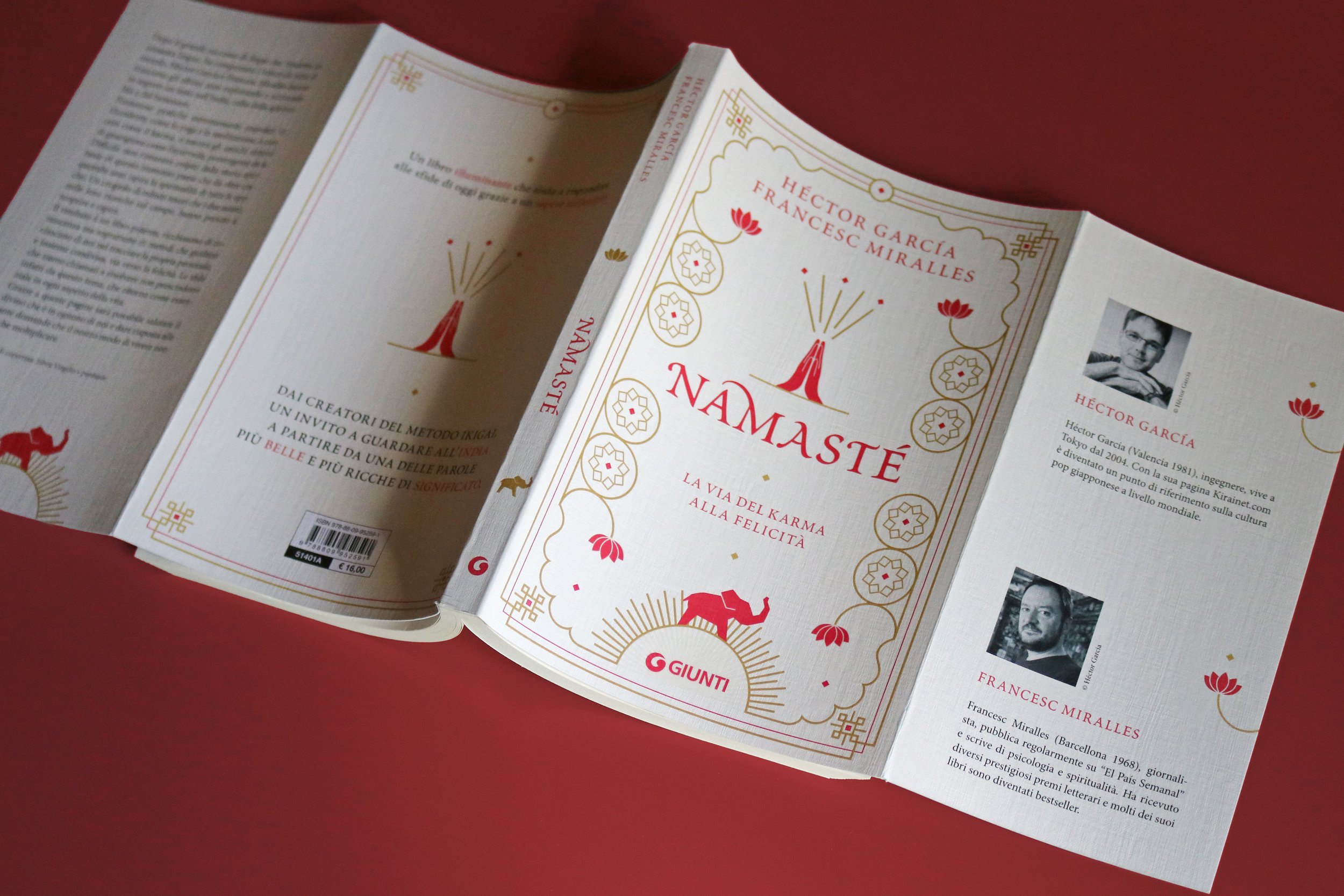
Namasté book cover and editorial design.
Written by Héctor Garcìa and Francesc Miralles.
Publisher: Giunti Editore